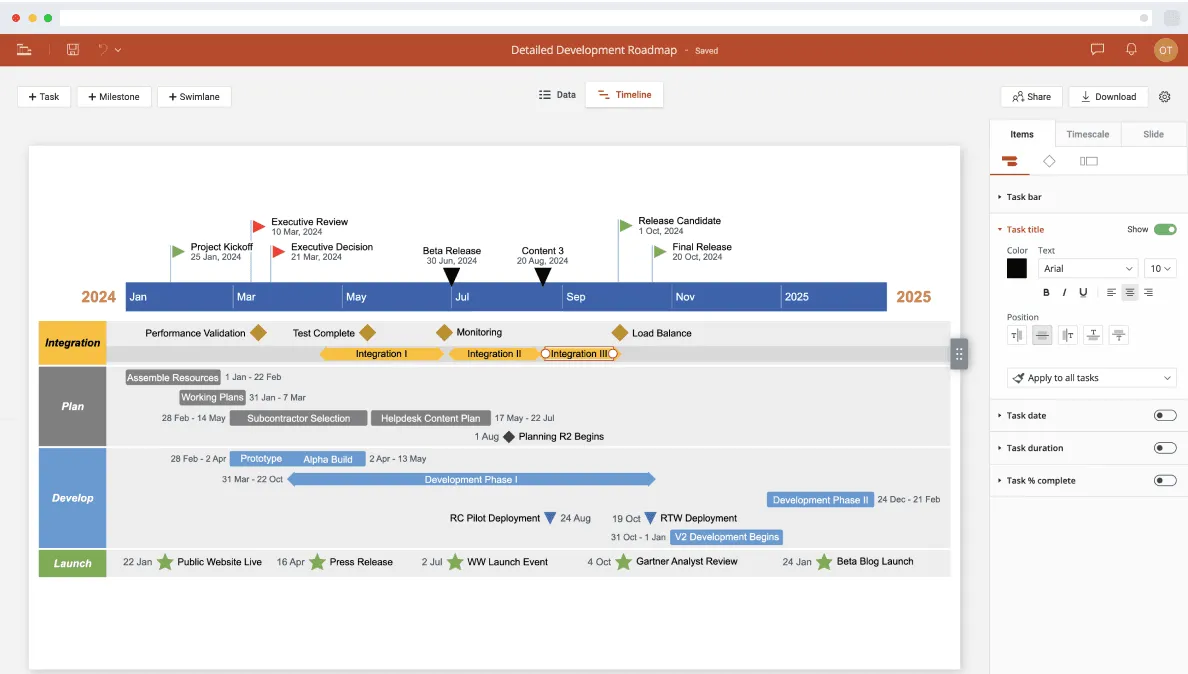
Although primarily designed for processing text content, Pages allows Mac users to also create basic timelines starting from a 2D Bubble Chart. However, the resulting visuals require manual formatting, which can prove time-consuming if you need to build more detailed plans or update them regularly.
Those who need to produce professional-looking visuals faster can try an online timeline maker such as Office Timeline Online to simplify their work. Accessible from any browser, the tool helps you to quickly generate, edit and download your graphic as a native PowerPoint slide, which makes it easy to share and include in presentations. This tutorial shows how to make a timeline both manually in Pages and automatically with Office Timeline Online.
Which tutorial would you like to see?
How to manually make a timeline in Pages
Follow the four steps below to manually create a timeline in Pages for Mac.
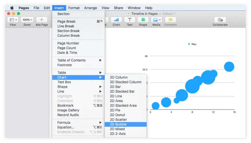
1. Add a 2D Bubble Chart to your Pages document.
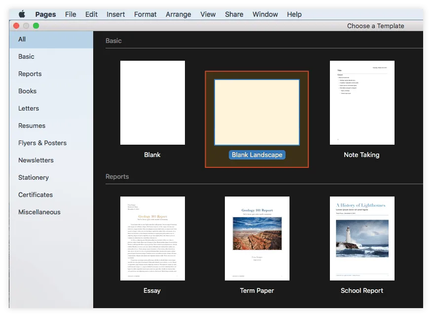
a) Open Pages and select Blank Landscape from the template gallery to ensure you'll have enough room for your timeline.
b) Go to Insert → Chart and select 2D Bubble from the menu that pops up. Pages will automatically generate a bubble chart that looks like the one in the image below:
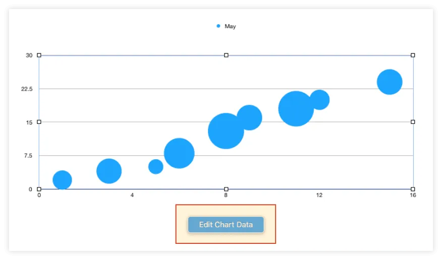
2. Add your project data to the bubble chart.
a) Click on the chart area and then on the Edit Chart Data button that appears.
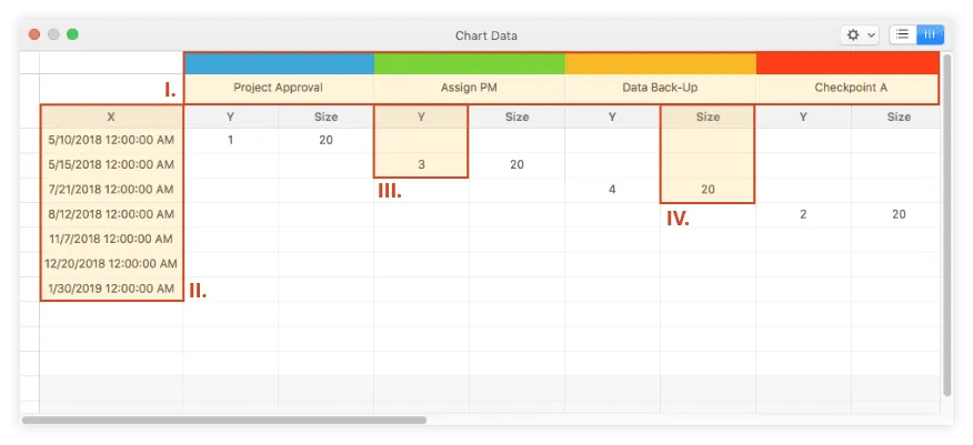
b) In the Chart Data table that pops up, add your project data as follows:
i. List your project’s key events (milestones) in the first row, the one populated by default with the month name. Keep the milestone descriptions as short as possible as these will be later displayed on the graphic and you want them to be fully visible.
ii. Use the X column to enter the due dates for each milestone, as shown in the image below.
iii. In the Y column of each milestone, on the same row of the milestone's due date, add a digit such as 1, 2, 3, or 4. These numbers will act as plotting elements that set the milestone bubbles' vertical positioning on the chart. Bubbles that have smaller plotting numbers will be shown closer to the X axis, while those with bigger digits will be placed higher up on the chart.
iv. Lastly, in each milestone's Size column, enter a number like 10, 20, 30 to set the size of the corresponding bubble on the timeline. In our case, we used the value 20 for all our milestones.
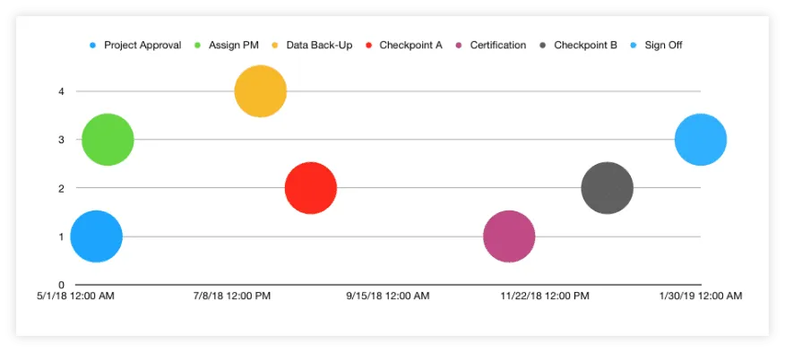
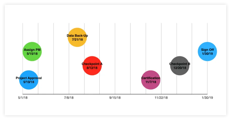
After adding all the project data, the resulting chart will look like this:
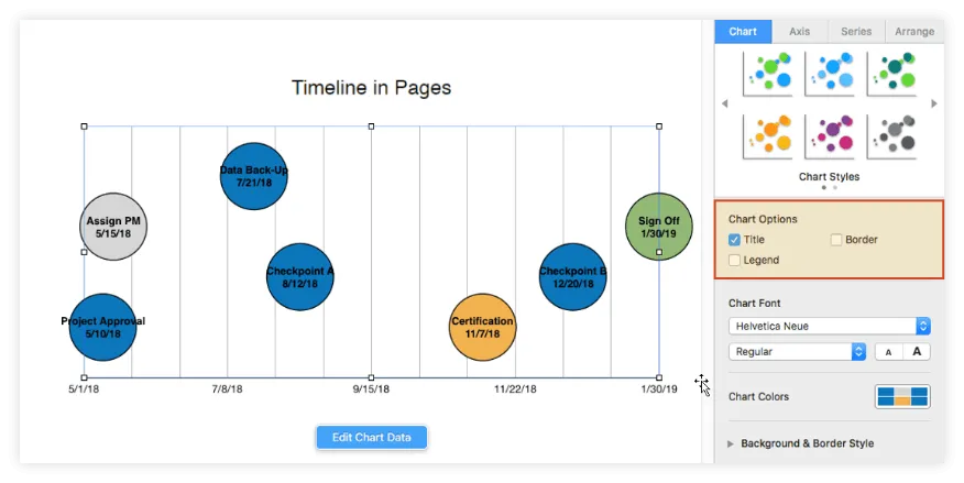
3. Format the graphic to optimize relevance and include key details.
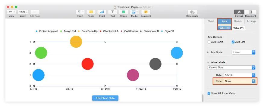
a) As you may have noticed, Pages has automatically added hours to the time series on the timeline’s horizontal axis. If you want to remove the hours for a cleaner look, select the chart area and then go to Axis → Value (X) in the Format pane on the right. Here, choose None from the Time dropdown menu under Value Labels.
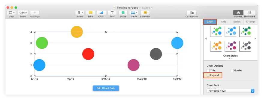
b) Although the legend situated above the graphic gives information about the chart milestones, it may be hard to follow for the viewer. A more efficient way to communicate your milestones' details is to have them displayed directly on their corresponding bubbles. If you want to go with this suggestion, then you need to:
i. Remove the legend: Go to the Chart tab and unselect the box for Legend under Chart Options.
ii. Add bubble labels displaying the milestones’ descriptions and due dates: From the Series tab, tick the boxes for Show Series Name and Values, making sure to select X from the dropdown menu, as shown in the picture below:
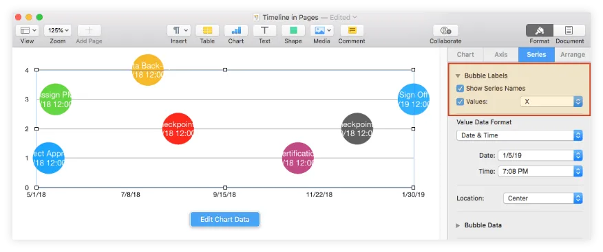
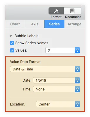
c) Within the same tab, you can change the labels' position using the Location feature, or their date & time format from the Value Data Format section. In our example, we kept the centered placement of the label, but selected None from the Time dropdown menu.
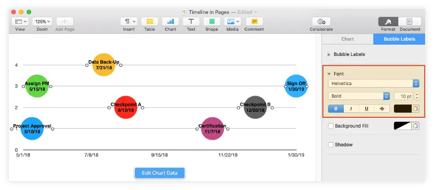
d) Next, you will need to make the label text more visible by adjusting its size and color. Select all the milestone labels (Shift + Click) and use the Font options within the Bubble Labels tab on the right. We chose to change the font from Regular Helvetica Neue to Bold Helvetica and decrease it from 12 to 10 points.
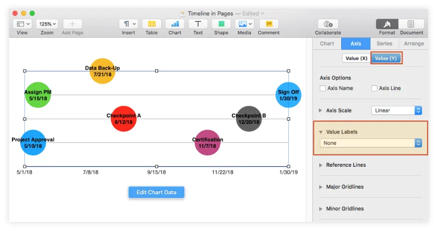
e) Seeing that the numerical values from the vertical axis overlap some of the milestone titles and don’t add much to the overall meaning of the chart, we decided to remove them. To do the same, go to Axis → Value (Y) and select None from the dropdown menu under Value Labels.
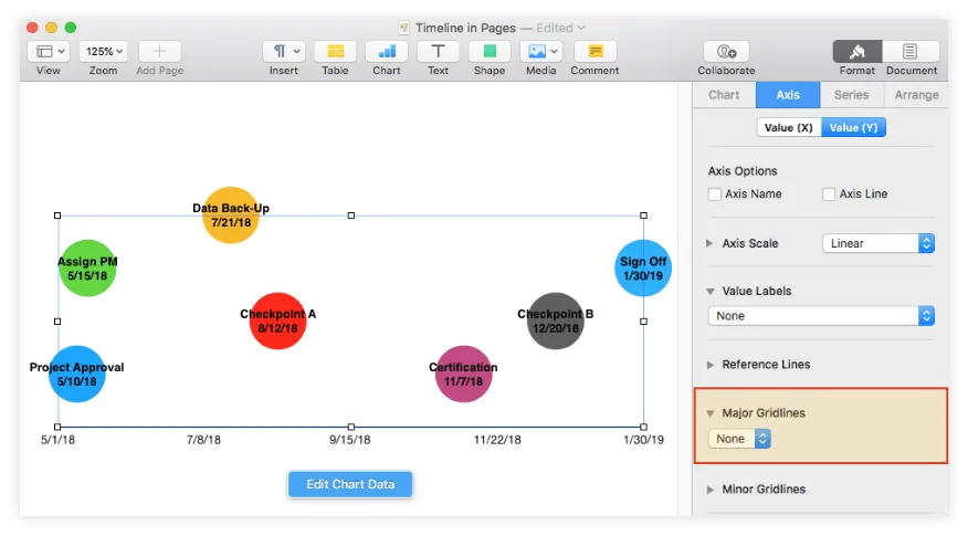
f) You may also want to remove the horizontal lines from the graphic as they aren't really relevant to the timeline. To do this, from the Value (Y) tab, go to Major Gridlines and select None from the dropdown menu.
g) Adding vertical lines to the chart will help you highlight the relative distance between milestones. This is done from the Value (X) tab and requires you to:
i. Choose the type of gridlines you prefer from the dropdown menus under the Major and Minor Gridlines sections. We opted for straight gray lines of 0.5 points for both of them.
ii. Insert more intermediary vertical lines from the Axis Scale section, increasing the number of Minor Steps.
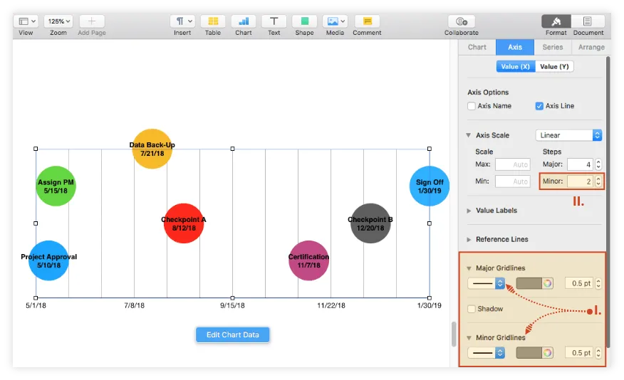
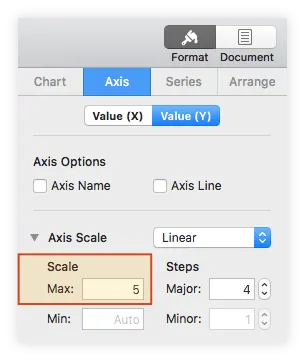
h) Given that the uppermost milestone of our timeline was not fully included in our gridline area, we corrected that by returning to the Value (Y) tab and setting the Max Scale value under Axis Scale to 5.
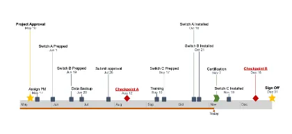
Once all the steps above have been carried out, the resulting timeline looks like the one below:
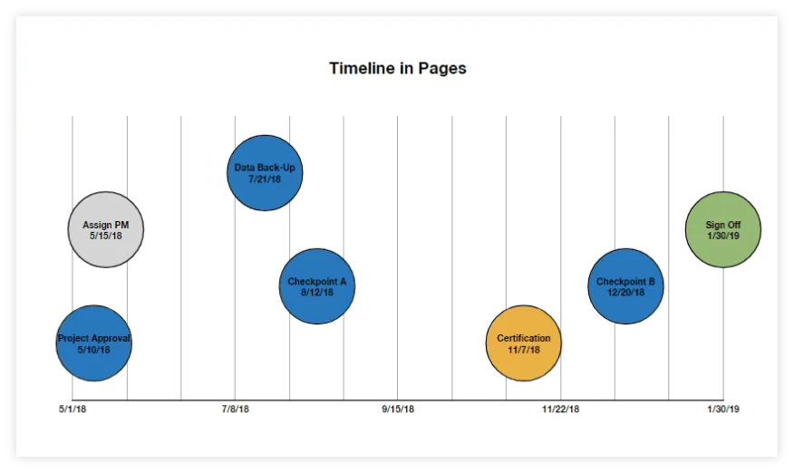
4. Customize your Pages timeline.
At this point, your timeline could use a few customizations to look more unique. Here are a few suggestions:
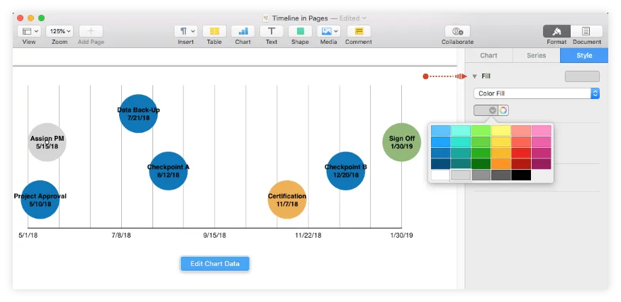
a) Change the default colors of the chart bubbles - select the milestone you want to recolor, go to the Style tab, and use the color indicator beneath Fill. Here is how we set the chromatics for our graphic.
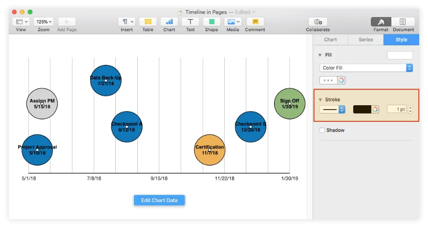
b) Add effects - from the same Style section, you can choose to apply a series of effects such as shadows and strokes. Make sure to select all the chart bubbles (Shift + Click) before making the styling change. Since we didn’t want to burden our graphic too much, we only added a simple black outline using the Stroke feature.
c) Add a title to your timeline - select the chart area, go to the Chart tab, and tick the box for Title under Chart Options. If you want to change the font, size, alignment, and color of the title text, double-click on it and use the options from the small pane on the right.
After following the steps above and adjusting sizes a bit more, our final timeline in Pages looks like this:
Download timeline template for Pages
If you’d like to use the timeline created in this guide as a template to help you move faster, you can download the file below, free of charge.
Get this free timeline template
How to make a timeline online automatically
Professionals can illustrate simple plans with timelines built in Pages, but they may encounter limitations in terms of customization and flexibility when dealing with more complex project data.
Creating professional visuals that can be easily updated becomes easier with Office Timeline Online. Allowing you to automatically generate an eye-catching graphic from any browser, the tool also offers a variety of features to help you quickly customize and update your timelines.
To get started, access the free online timeline maker here and follow the steps below. For advanced features like downloading or exporting your timeline, you will need the premium version of Office Timeline Online.
1. Add your project's data in Office Timeline Online.
a) Select Timeline from scratch from the New tab in the web app to start building your timeline. You also have the option to choose one of the pre-designed templates provided or to import a schedule from an existing Excel file. In our example, we chose to make a new timeline from scratch.
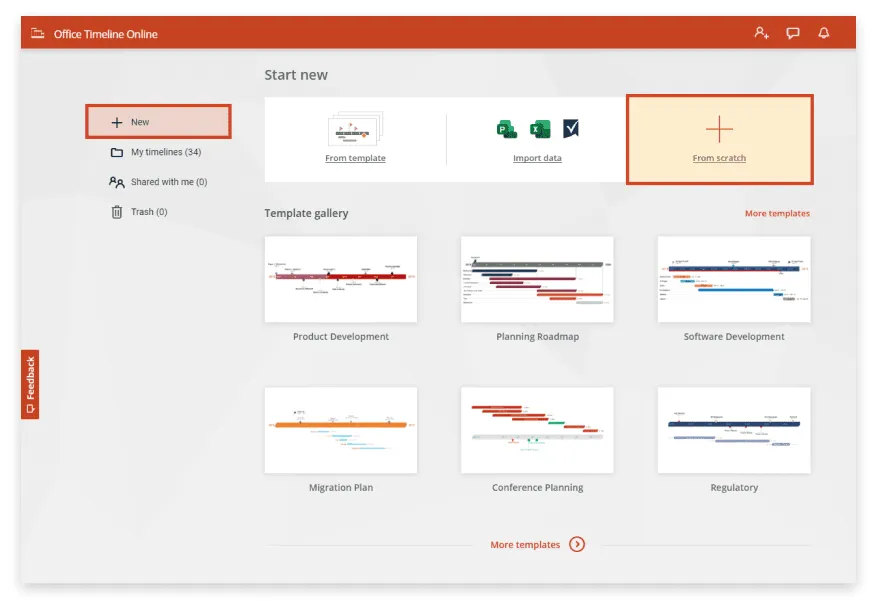
After selecting Timeline from scratch, you'll be taken to the tool's Data View, where you can enter and edit your project's details.
b) Enter your milestones and their due dates in the Data View section to generate your timeline. While still in the Data tab, you can also make a few preliminary styling choices, such as selecting the shape and color for each milestone. Once done, you can access your graphic in full size and personalize it further by clicking on the Timeline tab above your data table.
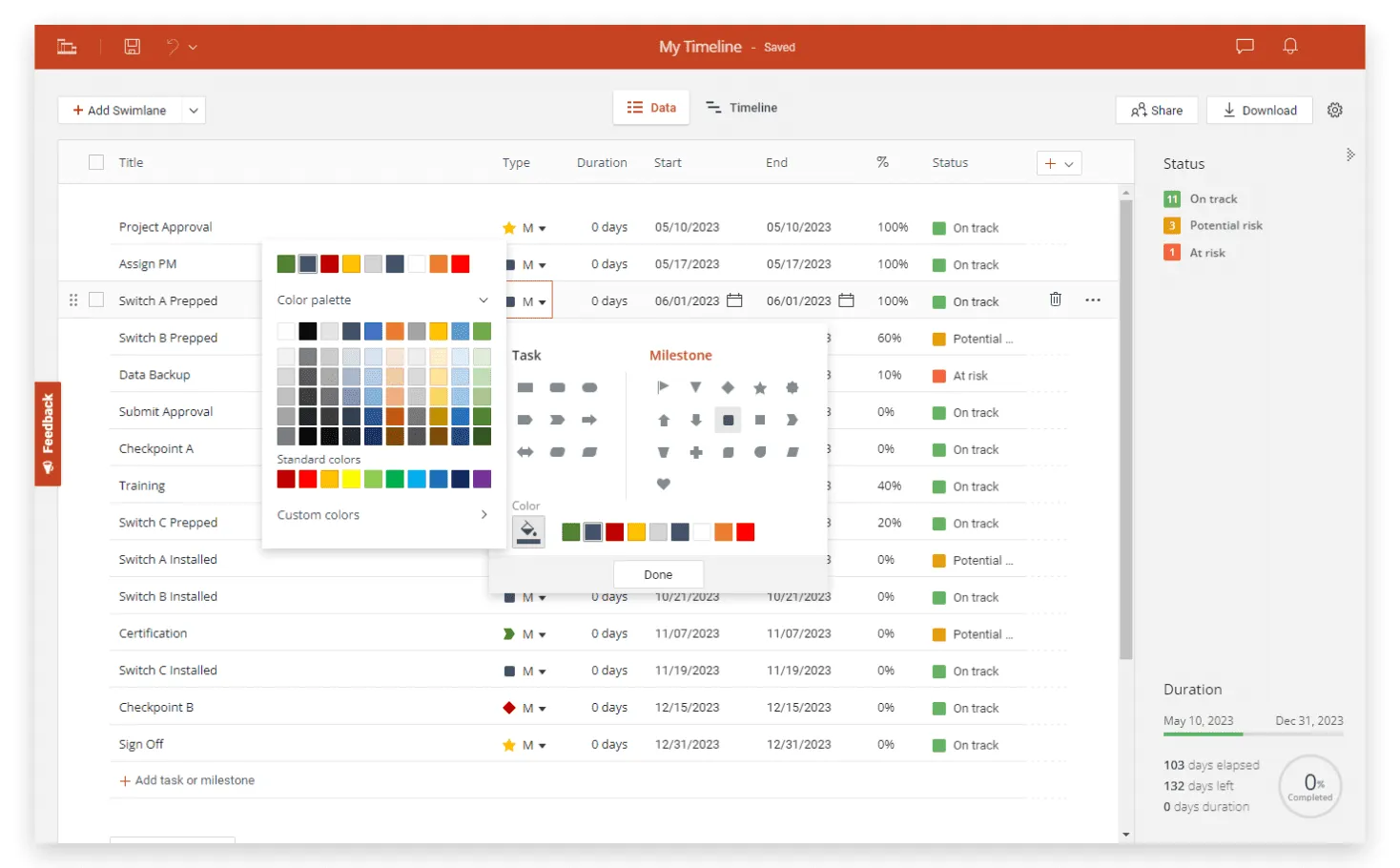
2. Quickly customize and update your timeline.
a) Now that your timeline has been created, you can easily customize and update it as often as necessary. Use the Timeline View to quickly set different colors, shapes, and sizes for your milestones, move them above or below the timeband, or add extras such as Time Elapsed and Today Marker.
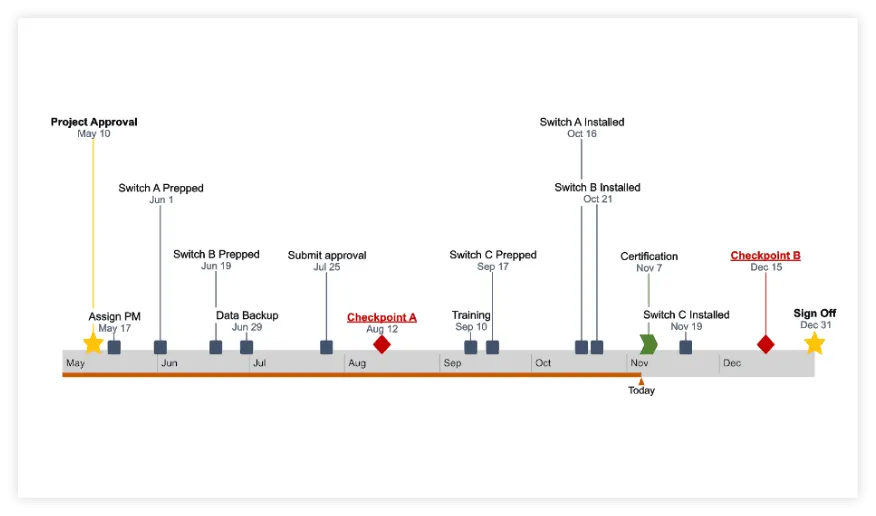
As you can see in the image below, our final timeline includes milestones and texts of different colors and sizes, which helps us draw attention to key details of our plan.
b) If you have a free Office Timeline Online account, you can automatically save your timelines in the cloud, access them at any time, and instantly update them when necessary. Add and edit data in the Data tab or adjust due dates directly on the timeline, simply by dragging your milestones left or right.
Once ready, if you have the premium version, your timeline can be downloaded as an editable PowerPoint slide that you can share with colleagues or present in meetings.
FAQs about making timelines on Mac
Yes, creating timeline samples in Pages is possible. To recap the main steps for you, here is what you need to do:
- Add a Bubble Chart to your Pages document.
- Add your project data to the auto-generated bubble chart.
- Format your graphic to make it cleaner and more legible by removing hours and legend, adding lables, customizing gridlines, changing bubble colors and adding a title.
When it comes to building basic timelines on Mac, you can do so using any of the following three applications of the iWork productivity suite:
- Keynote - learn how to make a timeline with Apple’s presentation software with our full tutorial on how to make timelines in Keynote.
- Numbers - follow the steps described in our comprehensive tutorial on how to make timelines in Numbers and start creating your first timeline in Apple’s spreadsheet application.
- Pages - review the steps and screenshots on this page and create your timeline by adding and customizing a bubble chart.
Alternatively, you can create a timeline on Mac with the help of an online timeline generator like Office Timeline Online and save yourself hours of manual work.
A timeline, which usually illustrates a series of events, milestones, or deliverables, can be created using timeline templates, office tools such as Microsoft PowerPoint or Excel (for Windows users), Keynote, Numbers, or Pages (for Mac users), or professional web-based timeline makers such as Office Timeline Online.
Check out our tutorial section to find out more on how to make a timeline using any of the above suggestions.