Mac users who want to create visual plans or chronologies in Apple’s Numbers can do so using the tool’s 2D Bubble Chart feature and some manual formatting to create a basic timeline. However, the resulting graphic may lack the flexibility and precision required for professional presentations such as project reports and client reviews.
Those who need to add more details to their timeline or to regularly update it for important meetings can build comprehensive yet clear visuals using a web-based timeline maker called Office Timeline Online. Helping you to quickly generate your timeline online, the tool includes the option to download it as a native PowerPoint slide, which can be easily edited, shared and included in presentations. Below, we will demonstrate how to make a timeline both manually in Numbers and automatically with Office Timeline Online.
Which tutorial would you like to see?
How to make a timeline in Numbers
Follow these five steps to manually create a timeline in Numbers for Mac:
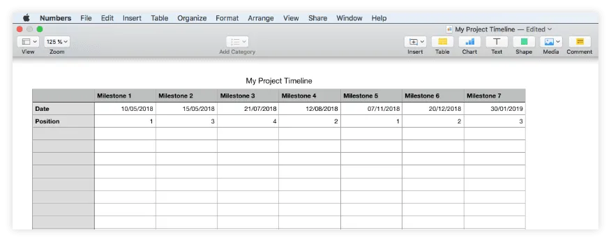
1. Enter your project’s milestones and dates into a table.
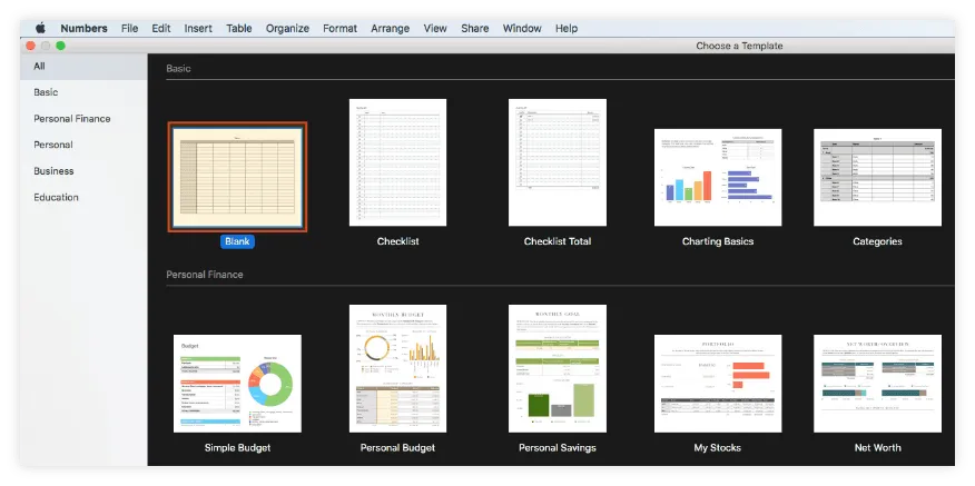
a) Create a new Numbers sheet by selecting the Blank type in the Basic section of the template gallery.
b) List the key milestones of your project in the first row of the default table displayed in the newly created sheet, as shown in the image below.
c) Use the row below to add the due dates for each of the milestones.
d) To start building your timeline in Numbers, you will also need to allot plotting numbers to every milestone in the table to define their vertical placement on the graphic. Therefore, use the third row of the table to enter a sequence of numbers such as 1, 2, 3, and 4 as in the example below.
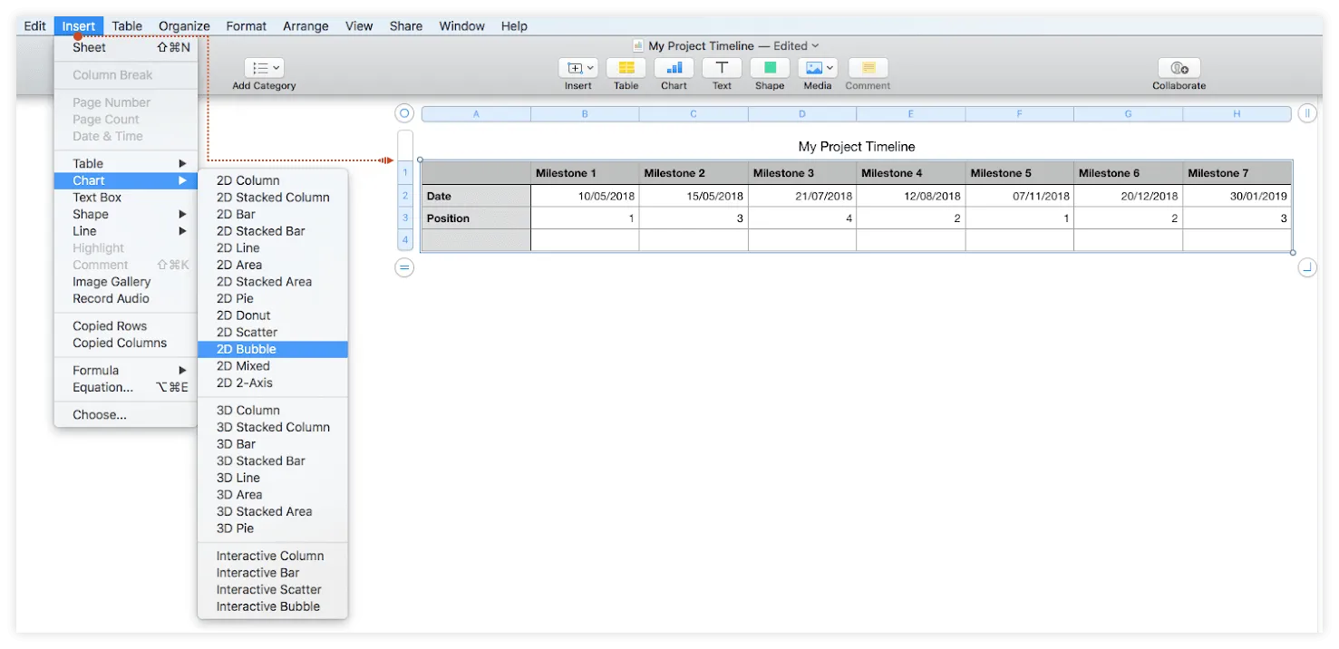
2. Create a basic timeline using the Bubble Chart feature.
a) Select all the data in your table, click on the Insert tab on the Numbers ribbon and go to Chart.
b) Choose 2D Bubble chart from the menu that pops up.
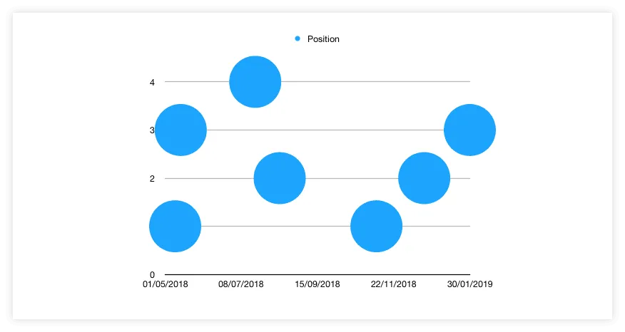
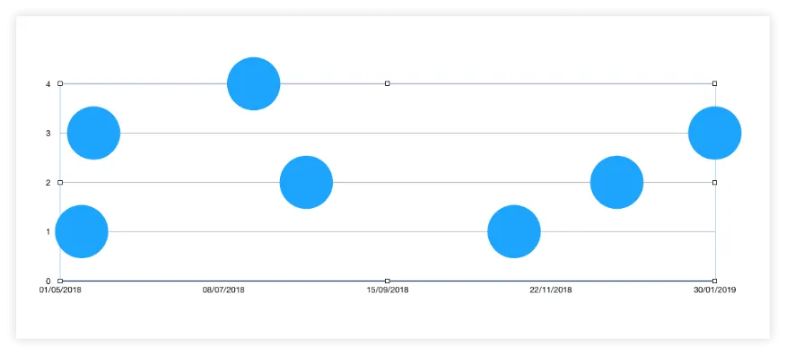
A simple bubble chart like the one below will be automatically generated on your Numbers sheet:
3. Format your graphic to optimize legibility and add key data.
a) Depending on the number of milestones you've entered, the auto-generated bubble chart might look a bit crammed, so you may want to resize it to ensure a better fit. To do this, simply select the chart area and drag its sizing handles to reach the desired height and width.
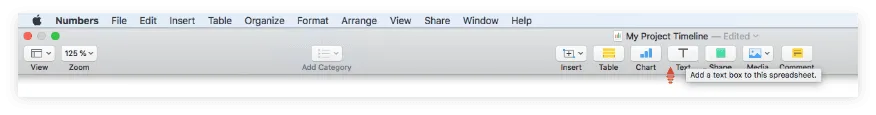
b) Since only your milestone dates and plotting numbers are taken as reference for the two axes of your chart, there is not much information shown on your timeline right now. To provide the audience with more details, you can manually add milestone descriptions to each bubble on the graphic using the Text feature of the app. To do so:
i. Click on the small “T” icon on the Numbers top taskbar:
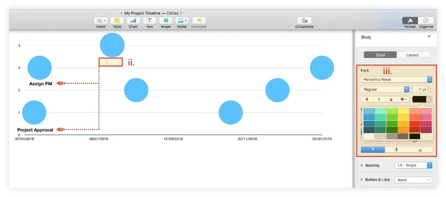
ii. Drag and drop the newly inserted text box below or near one of the milestone bubbles.
iii. Double-click on the text box to type in your milestone title and use the Style pane that appears on the right to change the text font, size, style and alignment. In our case, we used black, bold Helvetica Neue for the milestone titles.
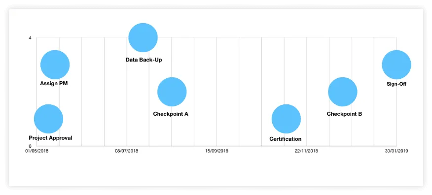
c) We also wanted to remove all the horizontal lines that cut across our timeline as they didn't add any value to the graphic. If you want to make this change:
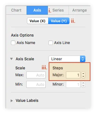
i. Select the chart area and go to the Axis tab of the Format pane on the right.
ii. Select Value (Y) to apply the change to the horizontal axis.
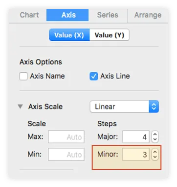
iii. In the Axis Scale section, under Steps, use the up-down controls next to Major to decrease the number to 1.
d) While in the Axis section, you may want to add vertical lines to better highlight the relative distance between your milestones. To do this, click on the Value (X) tab and:
i. Go to Major Gridlines and set the style, color, and width of your vertical lines. In our example, we used a straight, grey line with a width of 1 point.
ii. Repeat the action for Minor Gridlines. We kept the same choices as above for these as well.
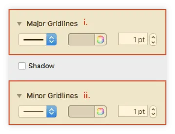
iii. Go to the Axis Scale section above and use the up-down controls to increase the value for Minor Steps. In our example, we increased it to 3.
After completing all the steps above, your graphic should look like this:
4. Customize your timeline's milestones.
Now that you've formatted your timeline properly, you can apply a few styling choices to the milestones (chart bubbles) to make them stand out more.
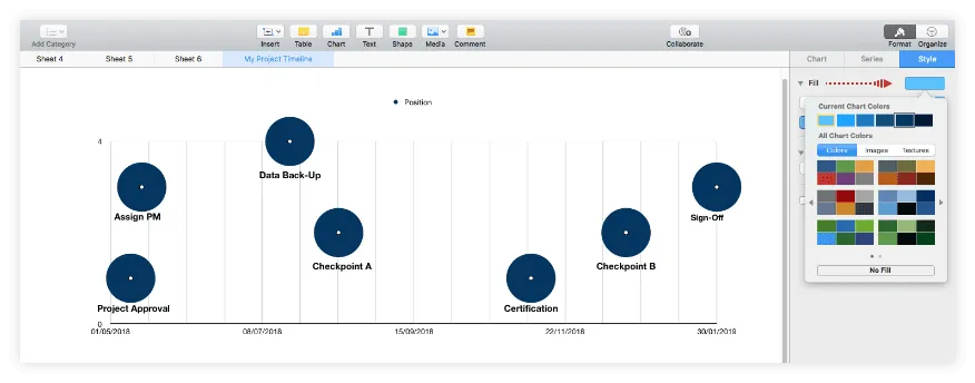
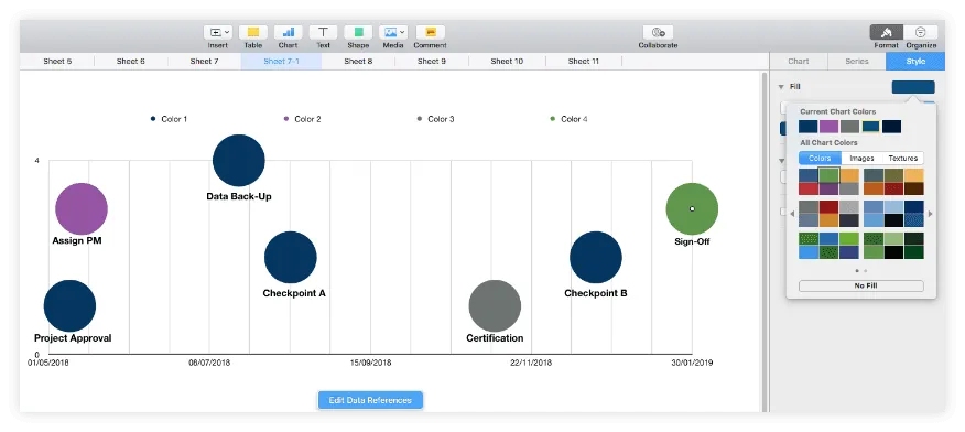
a) To recolor all your milestones simultaneously, select any of the bubbles and go to the Style tab of the Format pane. Here, click on Fill to choose a new color. In our example below, we went for a dark navy blue.
b) If you want to color the chart bubbles individually, you'll need to break down your milestones into separate series or categories. To do so, go to your project data table and:
i. Rename the Position row into Color 1 and then add a new line below, which will be called Size. Enter the same number in the Size cell of each milestone to keep all bubbles the same size. In our example below, we used "20" for all.
ii. Right beneath, insert a set of two rows for each new color category you wish to create. You can name them Color 2 & Size, Color 3 & Size etc., just like in the image below.
iii. Once finished, to move a milestone into a new category, cut its Color 1 (former Position) and Size values and paste them into whichever of the newly added pairs of rows. Don't worry if this seems to mess up your graphic – we'll fix it right away, in step "iv."
iv. To update the graphic with the different color categories created, select the chart area, click on Edit Data References, and then drag the table select handle to include the new rows as well. Numbers will automatically generate multiple-colored bubbles for your milestones.
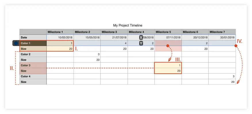
Note: Looking at our table, you'll notice that we've kept some of our milestones' Color & Size values on the same rows. This means they'll all belong to the same series, and any styling changes made will apply to all of them at once, while the rest of the bubbles can be customized individually.
v. To change the default colors generated by Numbers for your new milestone categories, select the bubble (or bubbles) you want to customize and use the Fill options from the Style tab. Here is how we set up the colors for our graphic:
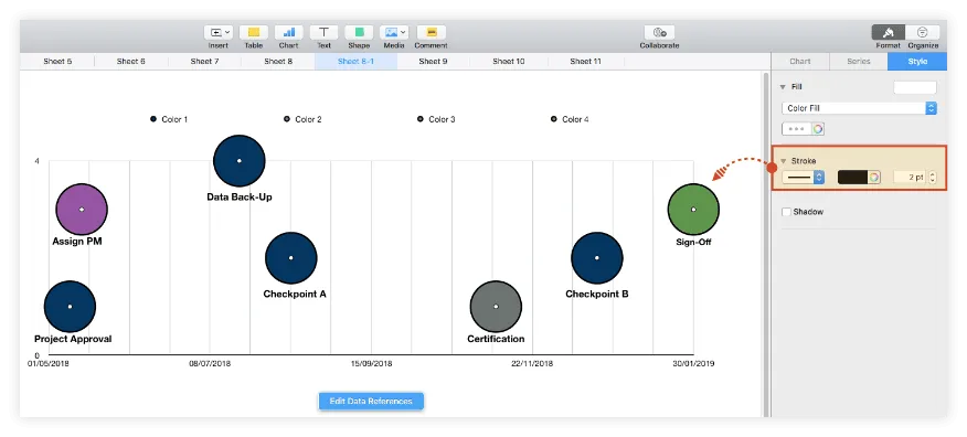
c) From the same Style section, you can also apply various effects to your chart bubbles, like adding shadows or strokes. However, it is recommended that you keep these to a minimum to not burden your visual too much. In our example, we selected all the bubbles with Shift + Click and added a simple outline to them using the Stroke feature.
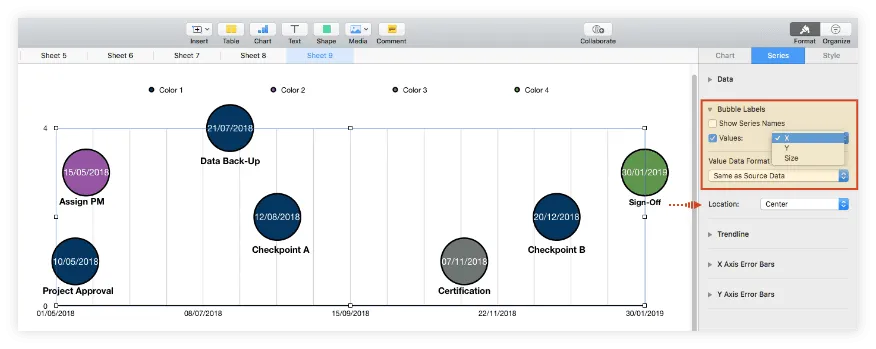
d) If you want to have the exact milestone dates displayed on your graphic, select the chart area, go to the Series tab of the Format pane, and, in the Bubble Labels section, check the box in front of Values. You will then need to choose X from the dropdown menu on the right, so that the dates appear inside the chart bubbles. To change the label placement in relation to the bubbles, use the Location feature beneath Value Data Format.
5. Customize your chart area.
To personalize your timeline further, you can also make some changes to the chart area using the customization options available in the Format pane’s Chart and Axis tabs of the Format pane. For instance, you can:
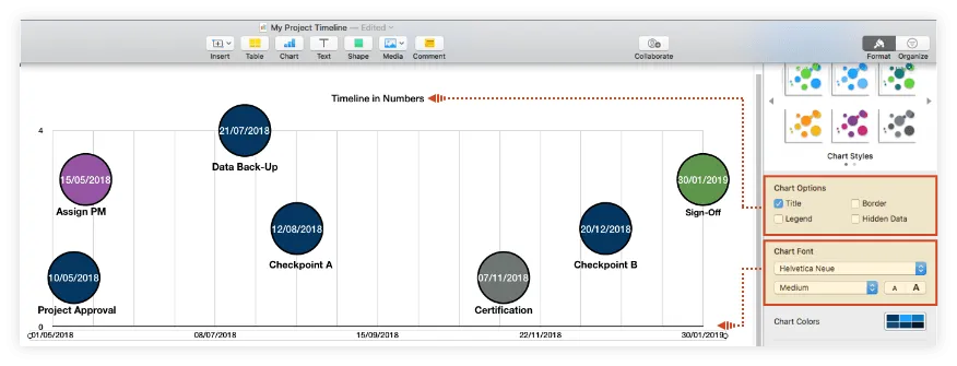
a) Add a title to your graphic: From the Chart tab, check the box for Title under Chart Options. In our example, we also removed the Legend of our timeline, by unticking its corresponding box.
b) Customize fonts: While still in the same tab, you can change the font type, style and size for the entire chart using the options under Chart Fonts. We chose to change the style from Regular to Medium to make the text more easily readable.
Note: You can further customize the title or text along the X axis separately by double-clicking on the desired element and then making changes from the pane that appears on the right.
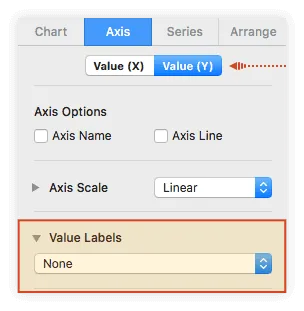
c) Remove unnecessary labels. In our example, we also wanted to remove the axis labels ("0" and "4") on the left of the graphic because we felt they could create confusion. If you want to do the same, go to the Axis tab in the Format pane, click on Value (Y), and select "None" from the Value Labels dropdown.
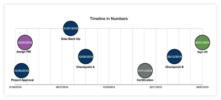
After carrying out all the steps above and trying out several font sizes, our final timeline in Numbers looks like this:
Download timeline template for Numbers
If you’d like to use the timeline created in this guide as a template to help you move faster, you can download the file below, free of charge.
Get this free timeline template
How to make a timeline online automatically
Numbers allows Mac users to build a basic timeline, but some may feel they need a bit more flexibility and customization options to create professional visuals and update them easily for recurring communications.
Professionals who want to make eye-catching timelines more quickly can do so using Office Timeline Online. The browser-based tool helps you automatically generate an appealing graphic that you can customize and update with a few clicks. To get started, access the free app here and follow the steps below. For advanced features like downloading or exporting your timeline, you will need the premium version of Office Timeline Online.
1. Enter your project data in Office Timeline Online.
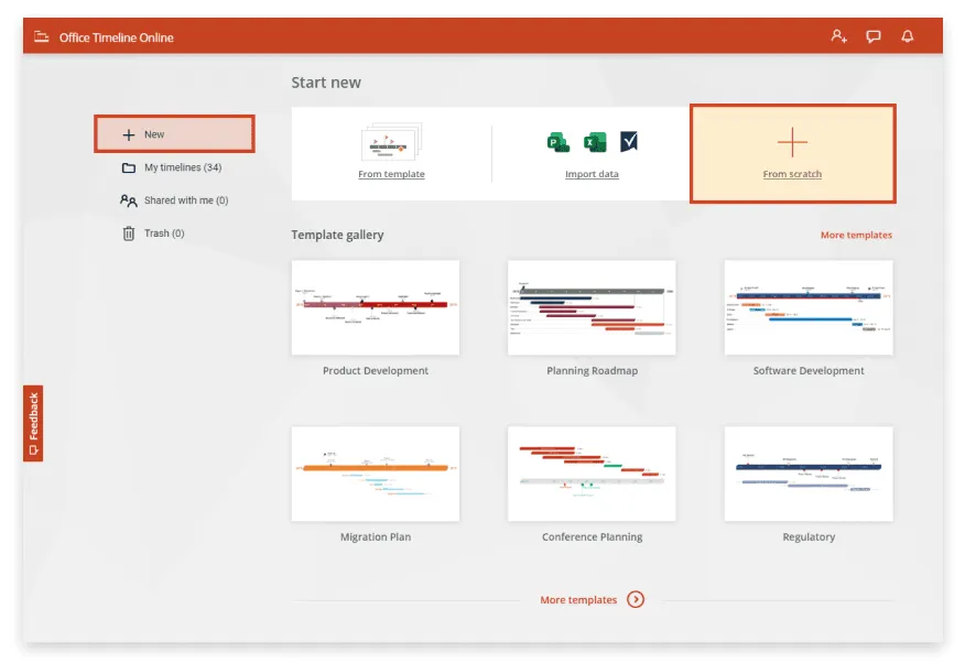
a) From the New tab in Office Timeline Online, select Timeline from scratch or choose one of the pre-designed templates provided to start building your timeline. You also have the option to import a schedule from an existing Excel file. In our example, we chose to make a new timeline from scratch.
After selecting Timeline from scratch, you'll be directed to the web tool's Data View, which lets you enter and edit your project's details.
b) In the Data View, list your milestones along with their due dates. The web app also lets you make a few preliminary styling choices here, such as setting the shape and color for each milestone.
Once you finish, select the Timeline tab on the ribbon, where you can see your graphic in full size and personalize it further.
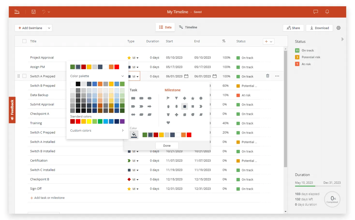
2. Customize and update your timeline with ease.
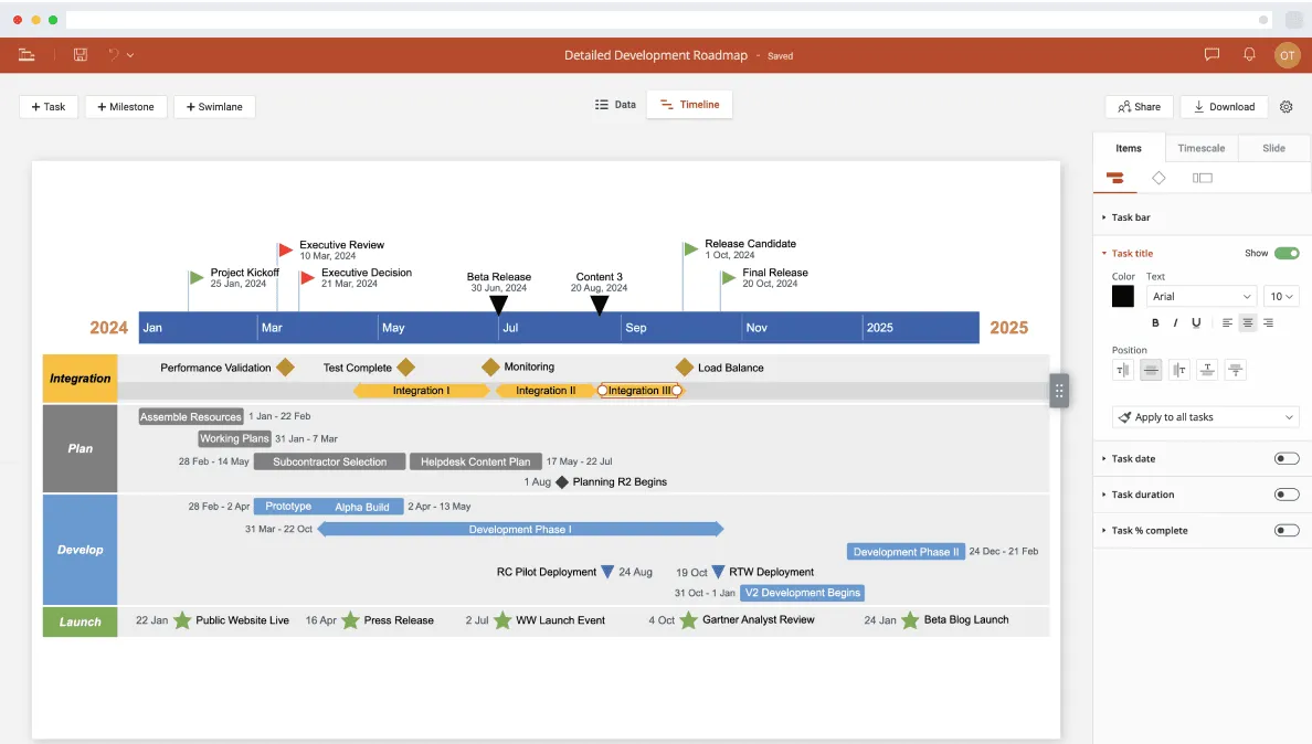
a) With Office Timeline Online, your newly created visual can be easily customized and updated as often as necessary. From the Timeline View, you can change colors, shapes, sizes, and fonts at the click of a button, add details such as Time Elapsed and Today Marker, or move milestones above or below the timeband.
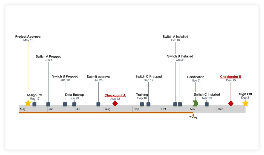
In our final timeline below, you can see that we've also added a few more milestones and played with colors, sizes, and fonts to draw attention to specific items.
b) With a free Office Timeline account, your graphic will be automatically saved in the cloud, so you can access it at any time and update it on the fly whenever necessary. You can add or edit data effortlessly from the Data tab, or drag & drop milestones to update their dates instantly directly from your graphic.
When finished, if you have the premium version, your timeline can be downloaded as an editable PowerPoint so you can easily present it or share it with others.
FAQs about making timelines on Mac
As shown above, you can make a timeline in Numbers with the help of the tool’s 2D Bubble Chart feature and some manual formatting. Here are the main steps of the process summarized for you:
1. Open a new, blank Numbers sheet and enter your project’s data on three rows as follows:
- Row 1: your milestones (short descriptive titles);
- Row 2: due dates for each of your milestones;
- Row 3: plotting numbers (a sequence of numbers such as 1,2,3,4) to define the vertical placement of each milestone.
2. Select the data in your table, go to the Insert tab, and then choose 2D Bubble chart from the Chart section of the menu that appears.
3. Format the auto-generated bubble chart to turn it into a more legible timeline by:
- adding text labels to the chart bubbles;
- removing the horizontal lines of the graphic to make it less crammed;
- adding vertical lines to better highlight the relative distance between the chart bubbles (which represent your milestones);
- customizing the color of each bubble, if necessary.
Mac users who want to make a timeline in Pages can do so by following the main steps below:
- Open a new document in Pages.
- Go to Insert → Chart and select 2D Bubble from the menu that appears next.
- Add your project data to the auto-generated bubble chart using the Edit Data Chart button that appears once you click on the graphic.
- Format the bubble chart to include text labels for each of the displayed bubbles (representing milestones), customize their colors, remove gridlines for improved legibility etc.
For more details on each of these steps, please see our full tutorial on how to make a timeline in Pages.