Professionals who need to present project plans and schedules in a visual way can manually create a basic timeline directly in Google Docs or Google Sheets. The resulting visual could be OK for simple projects with few data, but the process is tedious and time-consuming - you’ll have to manually add every item to the graphic. Also, the timeline may lack the flexibility and accuracy needed for project reporting or client reviews, which makes it unfit for complex projects.
Those who want to show more details or update their timeline regularly might want to try a specialized Google timeline maker like Office Timeline Online instead. This is a free web timeline maker that automatically creates beautiful timelines in minutes. It works in any browser, requires no installation, and you can even choose from a collection of professional built-in templates. You can then download your timeline as a PNG image or a PowerPoint slide and share it with clients and teams, or you can insert it into your Google Docs or Google Sheets files.
Below, we will explain how to make a timeline both manually in Google Docs and Google Sheets, and automatically with Office Timeline Online.
Which tutorial would you like to see?
Manually make a timeline in Google Docs and Google Sheets
How to create a timeline in Google Docs
This step-by-step tutorial explains how to manually create a Google Docs timeline and it consists of the main following steps:
1. Create a new document in Google Docs.
a) Go to docs.google.com > + Blank. Click on Untitled document and name the document to find it easily later. (You can name it later as well.)
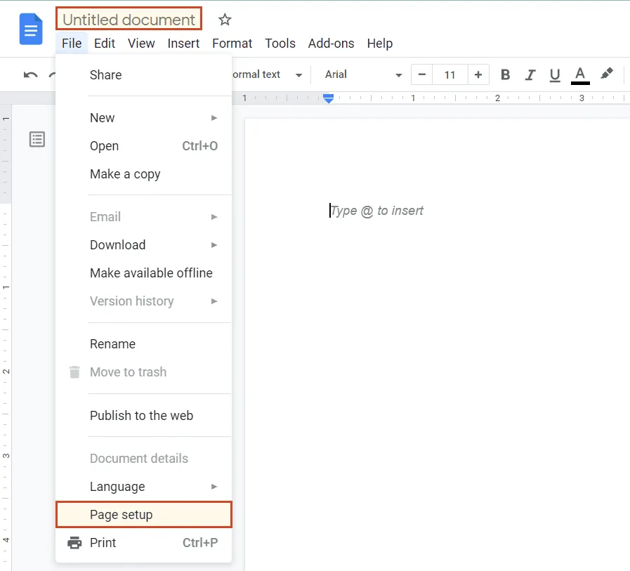
b) Now it’s a good time to change the default Portrait page orientation to Landscape in File > Page setup, so that you can have more space for your timeline.
2. Create timeline base from Drawing.
a) Go to Insert > Drawing > + New.
b) Click on Line > Arrow and draw a straight arrow, using the grid lines as reference. You can now format the arrow - pick the desired weight, dash type, start and end points:
3. Add events, dates, or tasks to your timeline.
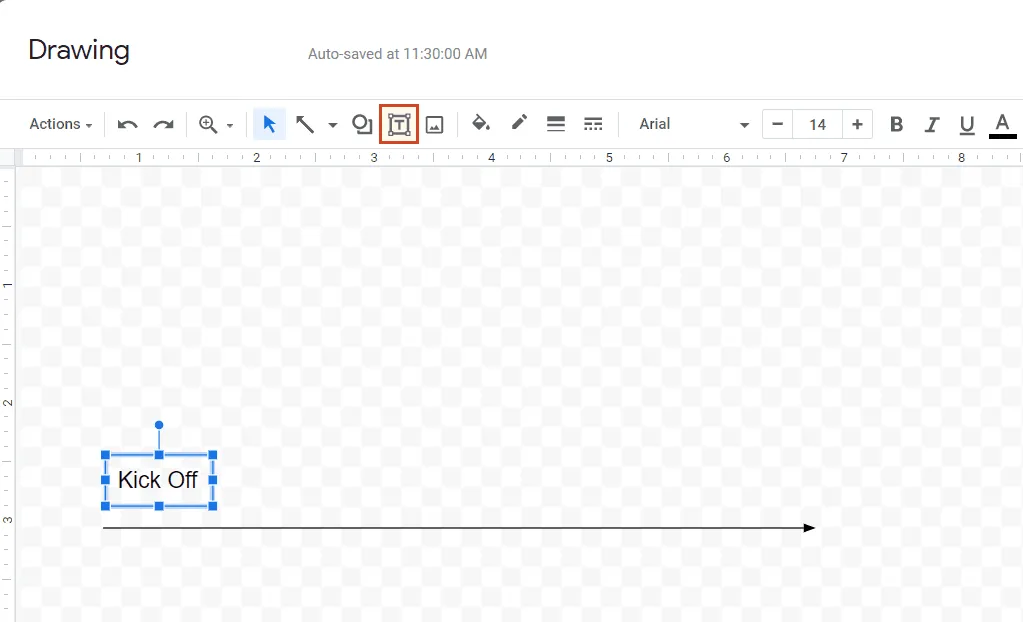
a) Click on T (Text box tool) and click on a spot above or below the horizontal line.
b) Type in an event, task, or date. Resize or reposition the text box as needed by dragging the corners or sides.
c) Then, copy-paste the text box and duplicate it as many times you need so that all your tasks and dates are covered. You can do this later, after formatting and coloring your text box content, in case you want more timeline items to look alike.
4. Format and style.
a) You can choose to color and format your timeline items as you like. To apply the same changes to multiple items at once, simply press and hold the CTRL key while clicking on the desired items one by one. We used the Highlight color and Text color options to change the font color for some of our milestones.
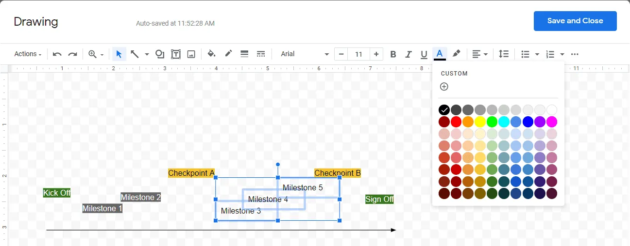
Now, your timeline should look something like this:
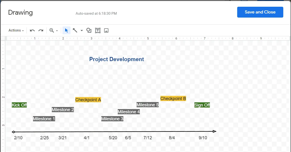
b) At this point, you need to connect the task titles and their corresponding time points through vertical lines. To do that, go to Line tool > Line, and then draw a vertical line under each task until it joins the horizontal arrow at the bottom of your document. The line will automatically adjust to connect the two items, so, if you want straight, perpendicular lines, you’ll need to realign each item as needed. Repeat for all the items.
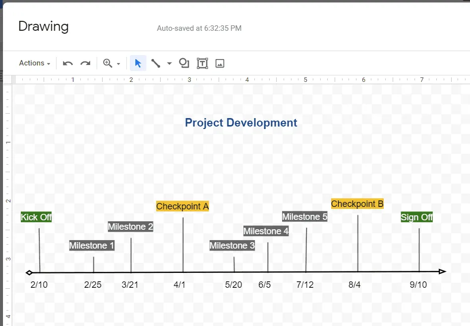
After carrying out all the steps above, your final Google Docs timeline should look like this:
How to make a timeline chart in Google Sheets
1. List your project milestones and dates in a table.
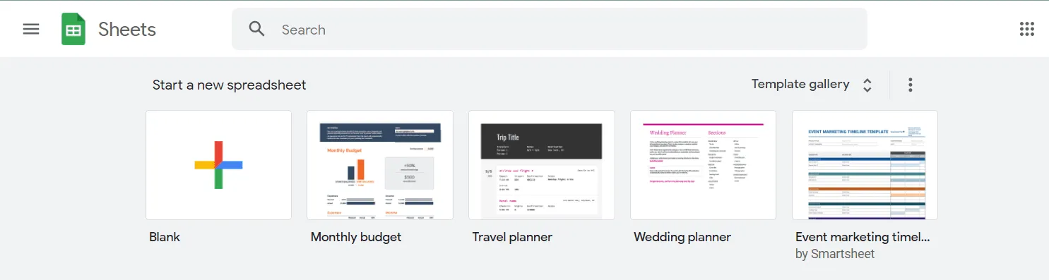
a) Start a new Google Sheets spreadsheet by clicking on the Blank type from the Template Gallery.
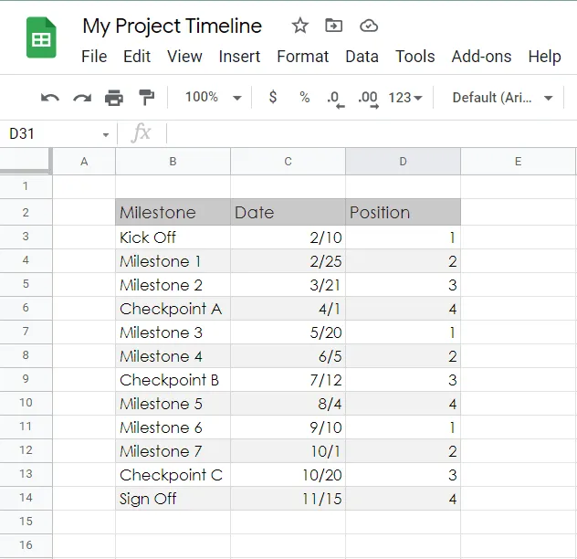
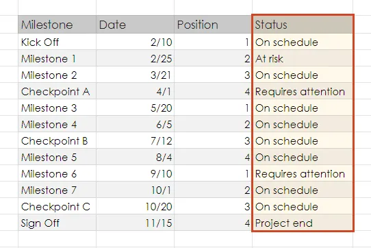
a) Enter the key milestones or events of your project in one of the columns, as seen in the image below. Keep the milestone descriptions as short as possible to ensure they'll be fully visible on the timeline.
b) In the next column, add the due date for each of your milestones.
c) To create a timeline in Google Sheets, your table also needs to include a third column with plotting numbers. Therefore, add this one next to your milestones dates and enter a sequence of numbers such as 1, 2, 3, 4 as in the example below. These plotting points will be used to define the vertical placement of each milestone on your timeline graphic.
2. Create a basic timeline by setting it up as a Bubble chart.
a) Select all the data in your table and go to Insert → Chart on the Google Sheets ribbon.
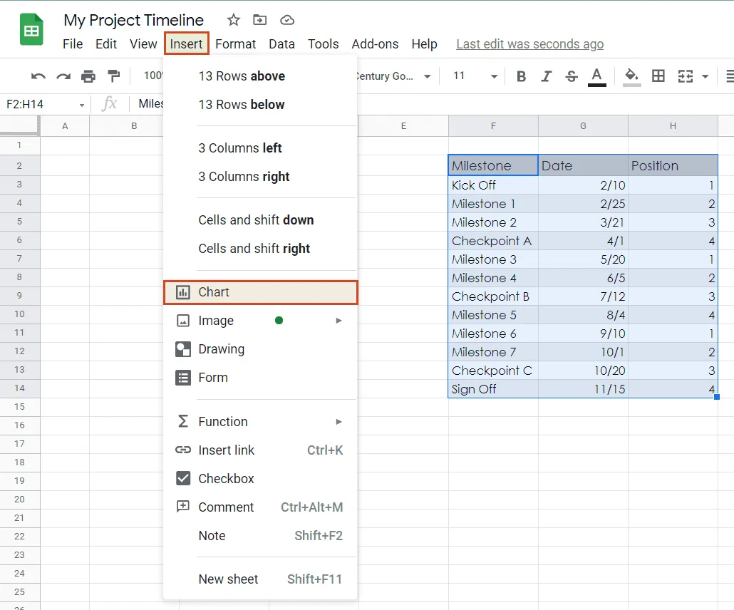
b) Within the Chart Editor pane on the right, go to the Chart Type section and click on the downward arrow next to Column chart.
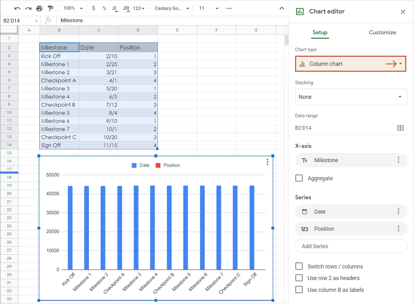
c) Now, from the Chart Type menu, select the Bubble chart option under the Scatter category, and Google Sheets will automatically generate a simple timeline out of your selected data.
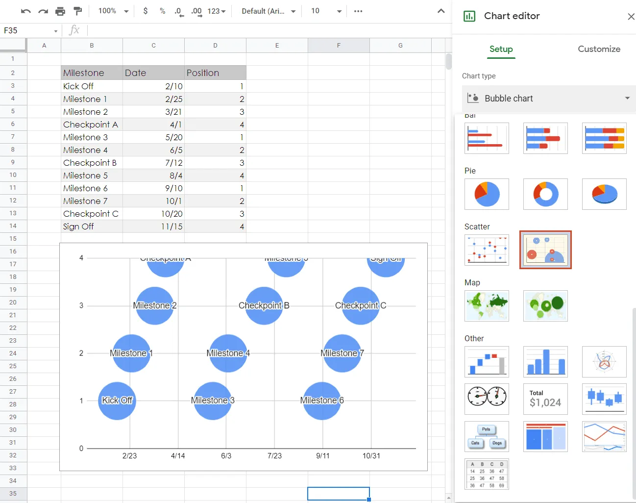
Note: Don’t worry if you notice some of your milestones are off the Chart Area. We'll fix this in the following steps, so your timeline items will be all fully visible.
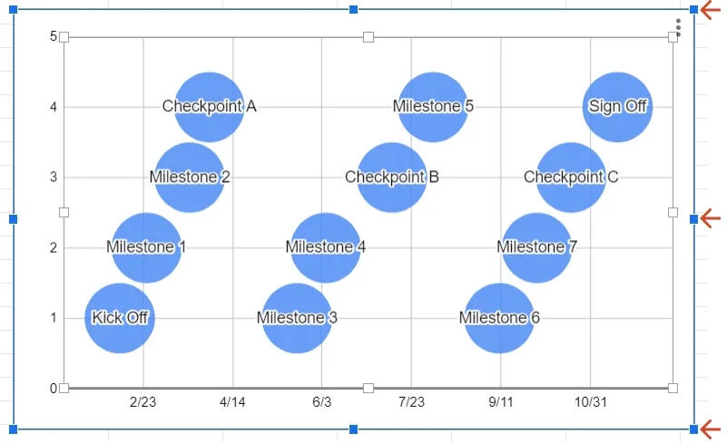
3. Format your graphic to ensure legibility.
a) First, if your graphic looks too crowded or some of your milestone titles overlap, resizing it may ensure a better fit. Simply click on the Chart Area to select it and drag its sizing handles to reach the desired height and width.
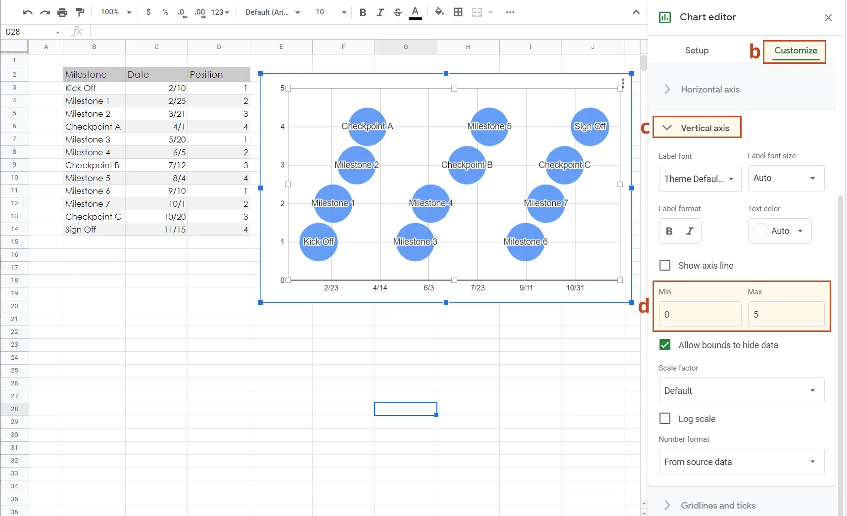
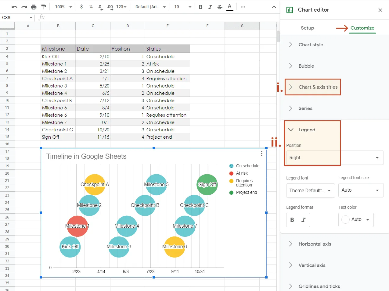
b) Now it's time to adjust the Vertical Axis to make the uppermost milestones fully visible. To do so, first go the Customize tab of the Chart editor (pictured below). You can open the Chart editor at any time by double-clicking your visual.
c) Here, click on the Vertical axis section to open it.
d) Type "0" in the text field under Min. In the Max field, you will need to add a value higher than the largest plotting number you've entered in your data table. In our case, the Max value will be "5".
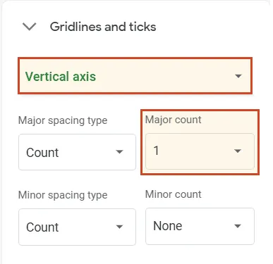
e) In our example, we also wanted to remove all those horizontal gridlines that cut across the graphic as they seemed to overcrowd the timeline needlessly. If you wish to do the same, open the Gridlines section on the Chart Editor and set the Major gridline count to 1 for the Vertical axis.
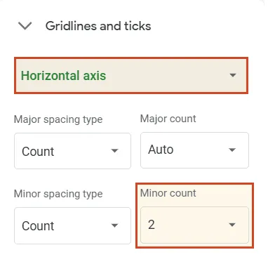
f) While you're still in the Gridlines section, you may wish to add more vertical gridlines to make it easier to see the relative distance between milestones. Click on the downward arrow next to Vertical axis and select Horizontal axis from the small drop-down menu that appears. Here, we set "2" as the value for the Minor gridline count.
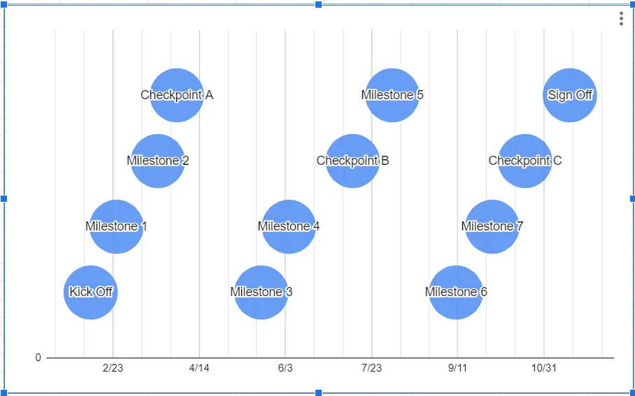
Once you’ve completed all the steps above, your graphic should look like this:
4. Recolor your milestone markers to differentiate or categorize them.
Google Sheets' chart editor offers a range of options that will allow you to change marker sizes and fonts, add a chart title, and more. However, the trickier part comes when you want to recolor individual milestone markers (bubbles) to differentiate them or show their status because Google Sheets, by default, applies your formatting options to the whole series. But no worries – we will show you below how you can do this too.
a) To help Google see your milestones as individual items, you will need to go back to your data table and create a 4th column that will break them up into categories. In this new column, you will enter a value or category name for each milestone. In our example, we'll differentiate the milestones by Status, as seen in the image below.
Note: If you wish some of your milestones to be colored the same, assign them the exact same value or category name.
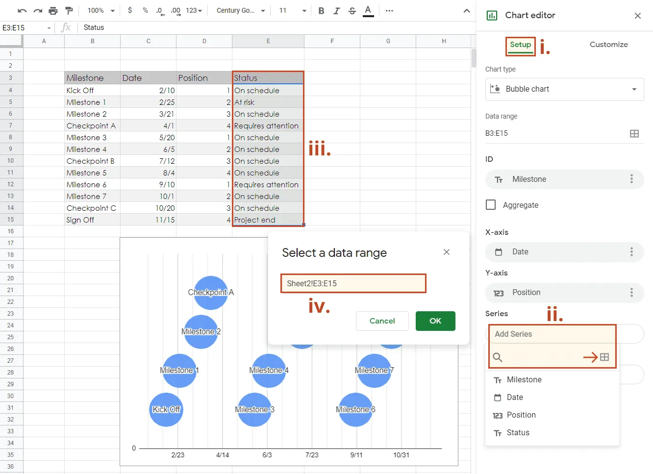
b) Once you've filled out your milestone categories, to apply them to your timeline, you need to:
i. Go to the Setup tab in the Chart Editor.
ii. Click on the Add Series box and then on the small spreadsheet icon on the right side, under it.
iii. Click inside the Select a data range text box, and then select the whole category column from your table. The Select a data range box will be auto-filled with the column's cell range.
iv. Click OK.
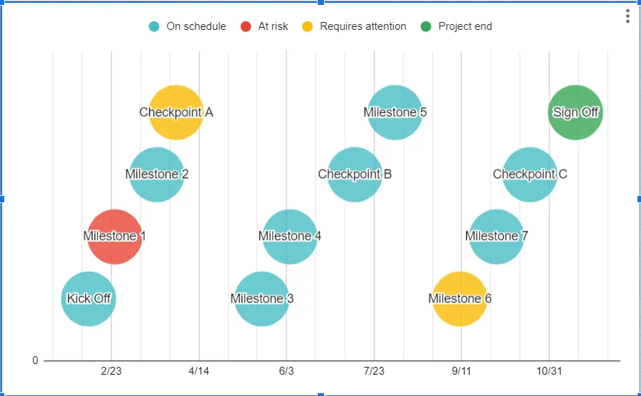
Google Sheets will automatically apply a different standard color to each of your milestone categories and it will also add a legend, as seen in the image below:
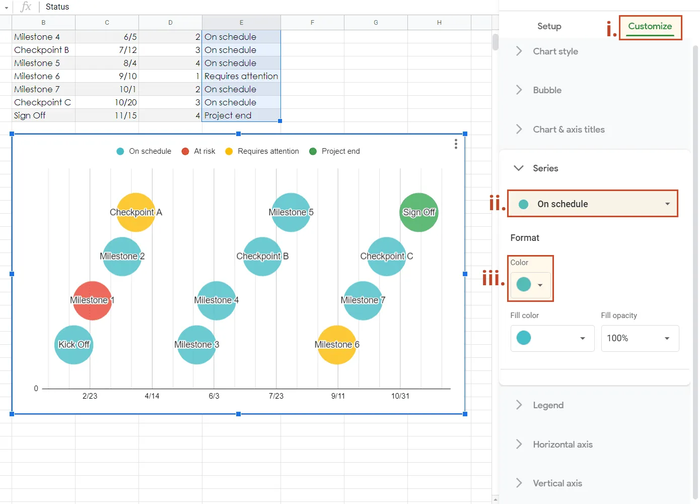
c) If you want to change the default colors:
i. Navigate to the Customize tab of the Chart editor.
ii. In the Series section, open the series selector and choose the milestone category you want to recolor.
iii. Under Color, select a new shade for your milestone.
d) Below, we suggest a few other customizations that you can apply if you choose so:
i. Add a title to your timeline. For this, double-click the timeline, click on Customize in Chart editor and then on Chart & axis titles. Here, you can select the elements you want to change (Chart title, Chart subtitle, etc.). Type in your title in the Title text field, and set the preferred size, color, type of font for the entered text, as well as its position.
ii. Move Legend to the right, so that the title section doesn’t look crowded. Go to Chart editor > Customize > Legend and change Position setting to Right.
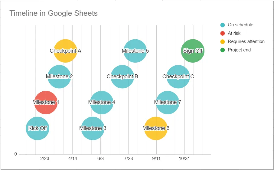
After trying out several colors, adding a title and tweaking font sizes, our final Google Sheets timeline looks like this:
How to make a timeline online automatically
Manually building a timeline with Google Docs or Google Sheets can be time-consuming, and the result may lack the clarity and precision expected by clients and executives. An online timeline generator like Office Timeline Online may be a better-suited alternative for creating professional-looking visuals required in business or project presentations.
Below, we will show you how to automatically make a timeline in Office Timeline Online and customize or update it with a few clicks. Whether you're looking for a timeline creator Google users can access from any browser or a faster alternative to building visuals manually, this tool has you covered. To begin, open the free tool in your browser and follow the steps below. For advanced features like downloading or exporting your timeline, you will need the premium version of Office Timeline Online.
1. Enter your timeline data into Office Timeline Online.
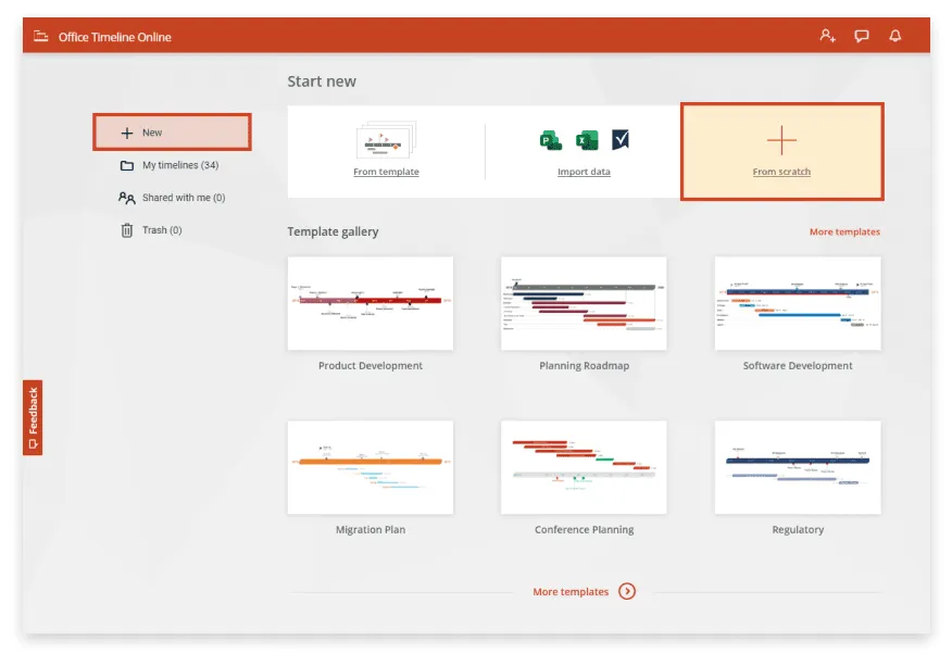
a) From Office Timeline Online's New tab, click on Timeline from scratch ("+") or select one of the various templates available to start building your graphic. If you usually manage your data in Excel, you can also import an existing .xls schedule into the web tool and turn it into a timeline. For this demonstration, however, we will create our visual from scratch.
After you select the type of timeline you want to make, Office Timeline Online will open the Data View, where you can enter and manage all the data on your visual.
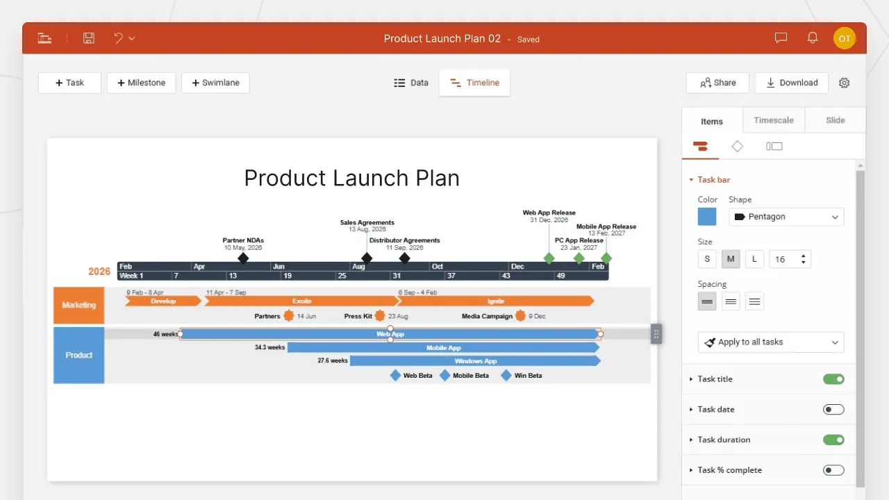
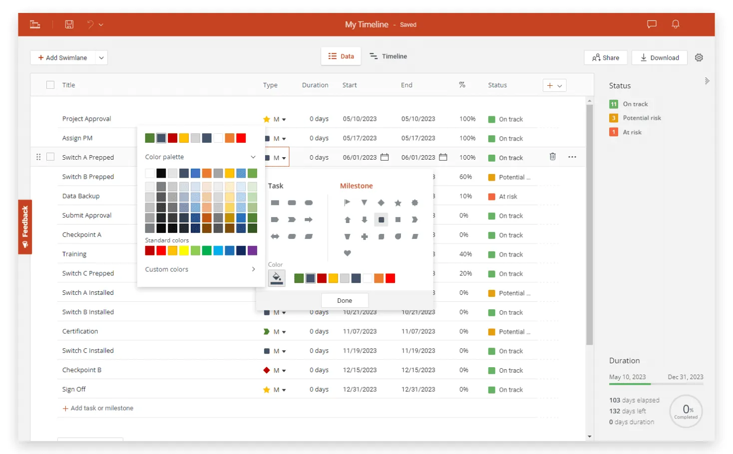
b) Here you can add milestones and tasks, give them titles, and set their dates. You can also choose a color and shape for each milestone marker. When you're ready, click on the Timeline tab above the data list to go to the Timeline View, where you can style every detail on your graphic.
2. Easily customize and update your timeline.
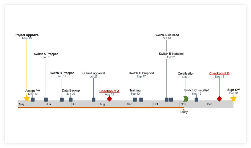
a) Once you've created your visual, personalizing and updating it is easy with Office Timeline Online. For instance, the Timeline View allows you to instantly change colors, shapes, positions, fonts, and date formats, add extra details such as Elapsed Time, or hide items your audience doesn't need to see. If you look at our final timeline below, you'll see we used multiple milestone shapes and sizes, customized texts to draw attention to important checkpoints, and added a Today Marker for a clearer view of where the project is standing.
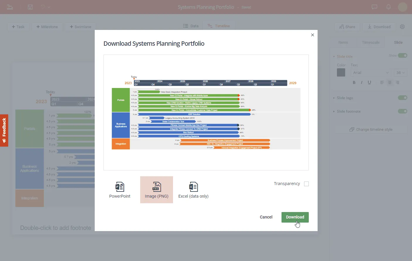
b) If you have a free account, the web app will save your timeline securely in the cloud so you can access it whenever you need it and update it fast if plans change. Drag & drop milestones in the Timeline View to instantly adjust their due dates, or use the Data tab to quickly add, edit or remove items. When done, if you have the premium version, you can download your timeline as an image or as a native .pptx slide that anyone who has PowerPoint can view, update or present.
FAQs about timelines in Google Docs and Google Sheets
The simplest way is to use the Drawing tool in Google Docs (Insert > Drawing > +New), then build your timeline with lines, arrows, and text boxes. For a faster, more professional result, use a dedicated timeline maker like Office Timeline Online and insert the finished visual into your document.
For a more detailed breakdown, here are the three main ways to make a timeline in Google Docs:
- Manually create your timeline in Google Docs with the help of the Drawing tool. (Time-consuming)
- Insert a timeline chart created in Google Sheets. (Time-consuming)
- Use an automated timeline creator and insert the timeline in Google Docs. (Time-saving, better results)
Let’s have a closer look at each of these three options.
Option 1. Here’s how to make a timeline in Google Docs from scratch using the Drawing tool:
- Insert a new drawing canvas by going to Insert > Drawing > +New.
- Draw your timeline with the help of the Line/Arrow and Shape options in the menu.
- To add text, just click on the Text box option, then click anywhere you want to write on the drawing canvas and start typing.
This method is manual and requires a bit of time and effort. It only allows manual, item-by-item updates of the timeline, using the Drawing tool.
Option 2. As an alternative solution, you can create your timeline as a chart in Google Sheets and import it in Google Docs. For this, go to Insert > Chart > From Sheets. Check out our tutorial on how to make a timeline in Google Sheets for a detailed walk-through of the process.
Option 3 (recommended): Use a professional, free, web-based timeline maker like Office Timeline Online.
Professional timeline maker tools like Office Timeline Online can save you hours of manual work. The tool creates beautiful timelines using the professional free, web-based, timeline creator Google users can access from any browser: Office Timeline Online, or the desktop edition Office Timeline add-in for PowerPoint. Both come with a rich template library, offering you multiple choices for simple or complex timelines, roadmaps, or Gantt charts.
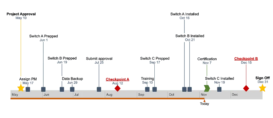
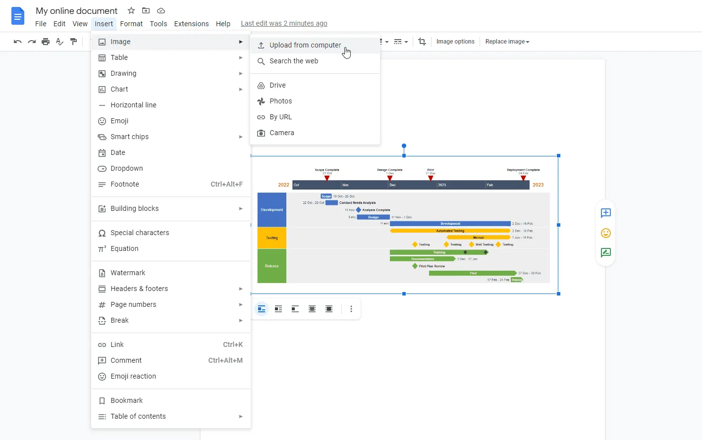
The timelines created with these tools can be saved as images, which you can insert into your Google Doc file using the Insert > Image > Upload from computer option. Here’s how your online document could look with a visual created by Office Timeline:
Yes, you can build a timeline in Google Sheets by creating a Bubble chart from your project data and formatting it into a timeline layout. You can also use the built-in project timeline template in File > New > From template gallery, or create one with a professional tool and insert it as an image.
There are several options to create timelines in Google Sheets:
- Use Charts and customizations to build a timeline.
- Use the Drawing tool and draw your timeline item by item.
- Use templates, add your own data, and make customizations.
- Use a web-based professional timeline maker and insert your timeline in Google Sheets.
Let’s dive into more details.
Option 1: Make a timeline using the Chart option.
First, you’ll need to organize your data in a table, then go to Insert > Chart and format your chart as a timeline. Find more detailed information in our tutorial on how to make a timeline in Google Sheets.
Note that the customization might take some time and effort to create a basic timeline for simple projects, with few lines of data.
Option 2: Use the Drawing function.
You can manually draw your timeline item by item. Just go to Insert > Drawing to insert a drawing canvas, then use Lines, Shapes and Text box in the menu to turn your drawing into a timeline.
This method is highly manual. It will take a lot of time and effort to create a basic, simple timeline.
Option 3: Use the templates in Google Sheets.
You can use the table-shaped templates on Google Sheets start page in File > New > From Template gallery.
Note that these timelines are fit for smaller, very simple projects, and will only respond to limited aspect and functionality requirements.
Option 4 (recommended): Use a web-based free timeline maker like Office Timeline Online.
Professional timeline makers like Office Timeline Online are very easy to use and save you a lot of time, offering a timeline creation wizard, and a rich template library to choose from. You just pick your template, fill in your data, and the tool automatically generates your timeline. Download it as a .png image, then insert it into your Google Sheets file, or use the free
If you need to learn how to use this tool, refer to our Office Timeline Online Quick-Start support article, which provides detailed instructions.
Yes, there are a few timeline templates in Google Sheets. You can find them under File > New > From template gallery. Then, on the page that opens, scroll down to go to the Project management section where you’ll find the timeline templates:
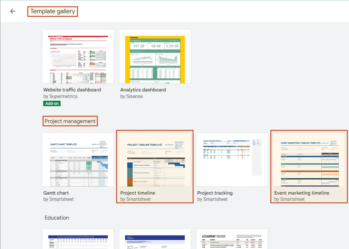
These templates don’t have the classic timeline look one might expect. They are shaped like timetables and their customization is highly manual, requiring a lot of time and effort. They can be OK for simple projects with few lines of data, and limited requirements in terms of aspect and functionality.
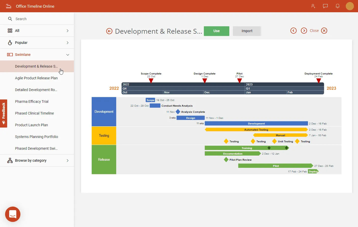
For professional timelines that you can build for complex projects, you’ll need a professional timeline maker like Office Timeline Online. With this free, automated tool, the timelines are easy to make and look elegant, crisp, and clear. And you save a lot of time. Timelines can be downloaded as .png images or PowerPoint slides, then you can bring them into your Google Sheets file by simply copy-pasting the png. file or inserting it with the Insert > Image option in the Google Sheets menu. Here’s a preview of a timeline created with Office Timeline Online:
For step-by-step instructions on how to use this tool, check out our support article Office Timeline Online Quick-Start.
No, there are no native Google Docs timeline templates. However, there are a few workarounds:
- You can use Google Sheets' project timeline template (found in File > New > From template gallery) and import the chart into Google Docs.
- You can use a professional timeline maker that users love, like Office Timeline Online. You get to choose from multiple timeline templates, and your polished chart is ready in just a few minutes. Here’s a preview of a template:
You can download your timeline as a .png image, then insert it into your Google Docs file by using the Insert > Image option in the Google Docs menu. For an even faster workflow, you can use Office Timeline's add-on for Google Workspace™ to embed your timeline into your Doc and refresh it with one click when plans change.
To make the most out of Office Timeline Online, check out Quick-Start tutorial and our guide on using Office Timeline for Google Docs™.
The fastest way is to open Google Sheets, go to File > New > From template gallery, and select the Project timeline template under Project management. For more design options and a professional finish, use a free tool like Office Timeline Online, which offers a full gallery of project timeline templates.
Below are step-by-step instructions to use the project timeline template in Google Sheets:
- Open a new Google Sheets file and go to File > New > From template gallery.
- On the page that opens, scroll down, and go to Project management where you can find the Project timeline template.
However, this process will take some effort and a lot of time for customization. Also, you might find it inconvenient that Google doesn’t offer many template options to choose from: it’s just one project timeline template that you can use.
A more efficient and simple solution to create project timelines for your Google presentations can be to use the online, free timeline maker Office Timeline Online, which comes with an extended gallery of project timeline templates and it's fast and easy to use. With just a few clicks to customize looks and data, your timeline is ready in minutes. Here's a preview of a sample project template:
For detailed instructions, check out our support article Office Timeline Online Quick-Start.
Go to Insert > Chart, select Scatter > Bubble chart in the Chart editor, and format it into a timeline by adjusting axes, colors, and labels. The process takes about 30 minutes — for a quicker alternative, use a dedicated Google Timeline maker, such as Office Timeline Online.
Here are step-by-step instructions to make a timeline chart in Google Sheets by following these steps:
- Group your data in a table.
- Select all the data in your table and go to Insert > Chart on the Google Sheets ribbon.
- Then, go to the Chart editor section on the right and select Scatter > Bubble chart or Scatter chart in the Chart type drop-down.
- Format your chart into a timeline.
The process of adjusting your chart to transform it into a timeline is quite tedious and will take a lot of time. You might need detailed instructions as guidance. Check out our step-by-step tutorial "How to make a timeline in Google Docs and Google Sheets".
If you need a faster and easier online method to make beautiful timelines, use the free, professional timeline maker Office Timeline Online. It offers a rich collection of templates and is simple to use. Here just one of the templates that you can find in Office Timeline Online:
No, there is no dedicated Google timeline maker. You can use its native tools, like the Drawing feature in Google Docs and the Charts feature in Google Sheets, to manually build basic timelines. Ultimately, you can choose to make your timeline in Google Drawings, and then insert it into your Google Docs, Sheets, or Slides presentation. But these methods require significant time and effort, and the results may not look professional enough for client or executive presentations.
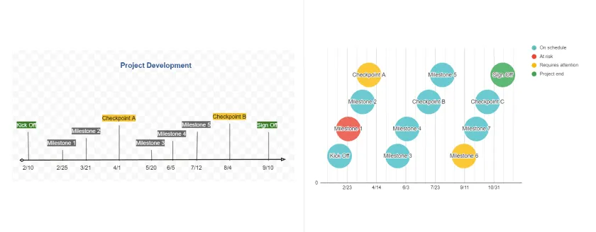
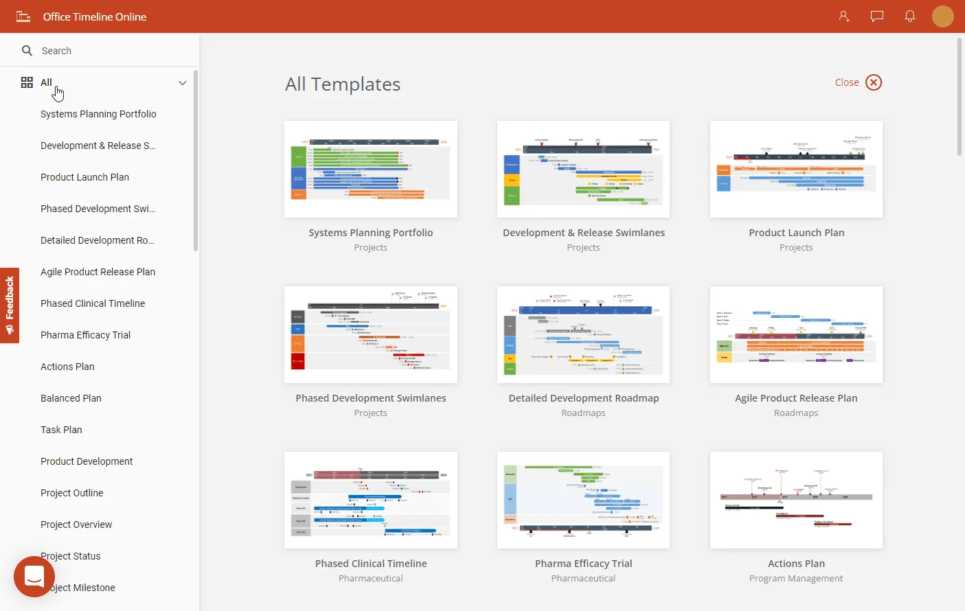
Unfortunately, there is no easy way to build your timelines from scratch with the available Google tools, but there are easier alternative solutions. Making a timeline online and inserting it in your Google files can be easy if you use a free, professional timeline maker such as Office Timeline Online. Timeline creation is fast and simple, there are plenty of templates you can choose from, and the final result looks professional. Here’s a sneak peek of several templates from the rich collection that Office Timeline Online offers:
You can make a timeline for free using Google Docs, Google Sheets, or a free online timeline maker. In Google Docs, go to Insert > Drawing > +New and build your timeline manually with lines, shapes, and text boxes. In Google Sheets, create a Bubble chart from your data and format it into a timeline layout. Both methods work but require significant manual effort.
For a faster free option, Office Timeline Online lets you create professional timelines in minutes — no installation, no account required to get started. Choose from dozens of templates, enter your data, and the tool builds your timeline automatically. You can download it as a .png image and insert it into Google Docs, Google Sheets, PowerPoint, or any other tool your team uses.
The best free Google timeline maker depends on what you need. If you want something built into Google's ecosystem, the Drawing tool in Google Docs and the Charts feature in Google Sheets are your only native options — but both require manual formatting and offer limited design flexibility.
For professional-quality timelines that you can insert into any Google Workspace file, Office Timeline Online is a stronger option. It's a free web-based timeline creator Google users can access from any browser, and it comes with a library of templates designed for project management, roadmaps, and executive presentations. You build your timeline in the tool, download it as an image, and insert it into your Google Doc or Sheet using Insert > Image.
Yes — Google Sheets can work as a basic project timeline if you're tracking a small number of tasks with clear start and end dates. The most common approach is to create a Bubble chart (Insert > Chart > Scatter > Bubble chart) and customize it into a timeline layout. Google Sheets also has a built-in project timeline template in File > New > From template gallery, though it's table-formatted rather than a visual timeline.
The main limitations are customization and maintenance. Formatting a Google Sheets chart into something that looks like a proper timeline takes time, and updating it when plans change means manually adjusting the data and chart settings. If your project has more than a handful of milestones or you need to present the timeline to clients or executives, a dedicated tool like Office Timeline Online will save time and produce a more polished result. You can import your Google Sheets data directly into Office Timeline Online and generate a professional visual in minutes.