Mac users who want to illustrate a series of events, milestones or deliverables in Keynote can create a basic timeline starting from a 2D Bubble Chart. The graphic will, however, require manual formatting, which may become a time-consuming task if it is to be done repeatedly for regular presentations such as project reviews or client meetings.
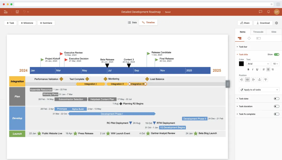
Building professional-looking timelines that are easy to update may be simpler with a web-based timeline maker like Office Timeline Online. Allowing you to quickly generate your visual, the tool also lets you download it as a native PowerPoint slide and share or present it in meetings. On this page, we will demonstrate how to create a timeline both manually in Keynote and automatically with Office Timeline Online.
Which tutorial would you like to see?
How to manually make a timeline in Keynote
1. Add a 2D Bubble chart to your slide.
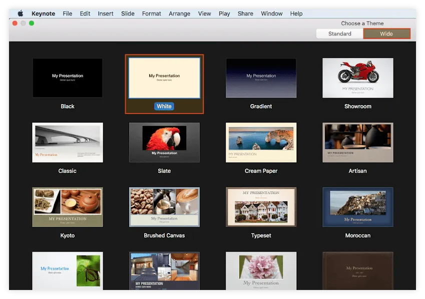
a) Open Keynote and double-click to select your preferred presentation style from the Theme Gallery. In our example, we went for a simple, white presentation set on Wide to enhance its display.
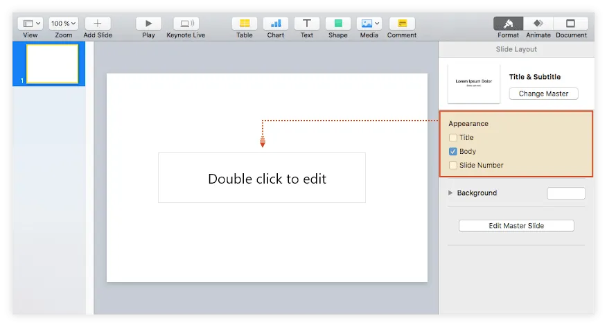
b) To have more room for your graphic, turn the standard Title & Subtitle slide generated by Keynote into a blank one. To do this, you need to unselect the first two boxes under the Appearance section of the Format pane on the right.
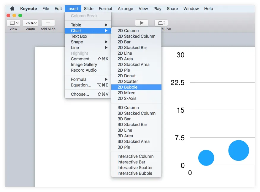
Go to Insert → Chart in Keynote's toolbar and select the 2D Bubble chart from the menu that appears. Keynote will automatically generate a bubble chart that looks like the one below.
2. Add your data to the bubble chart.
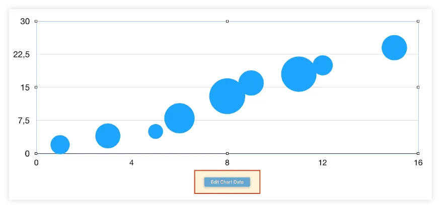
a) Select the chart area and click on Edit Chart Data.
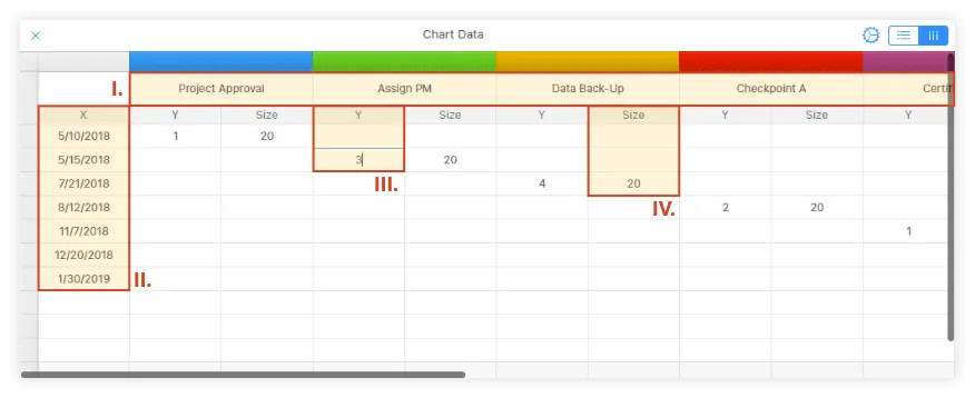
b) In the Chart Data table that pops up, enter your timeline data as follows:
i. Insert your milestone titles or descriptions in the first row, where you can see the month name auto-populated by Keynote. We'd recommend keeping these texts as short as possible so that they’ll fit well on the timeline.
ii. Add the milestones' due dates in the X column, as shown in the image below. The first date will correspond to the first milestone, the second date to the second milestone, and so on.
iii. In the Y column of each milestone, on the same row as its corresponding due date, you will need to enter a plotting number (e.g. 1, 2, 3, or 4) that will define the milestone's vertical placement on the graphic. The bigger the number, the higher the milestone bubble will be placed on the timeline. You can see in the image below how we've set up the plotting numbers for our graphic.
iv. Finally, in the Size column of each milestone, right next to its plotting number, add the size you want each bubble to have. In our example, we used the value 20 for all our milestones.
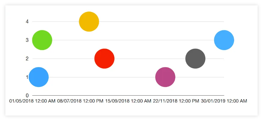
Once you’ve entered all your project data, the resulting chart will like much closer to a timeline:
3. Format your graphic to add key data and enhance clarity.
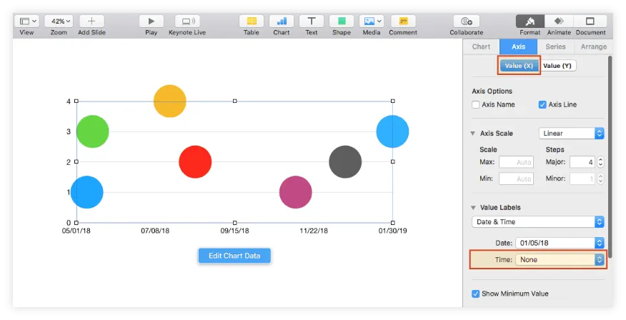
a) You may notice that, when updating the graphic with your data, Keynote automatically adds hours to the timeline's horizontal scale, besides dates. If you wish to clean up the slide and remove the hours, select the chart area, and go to Axis → Value (X) in the Format pane on the right. Here, select None from the Time dropdown menu in the Value Labels category.
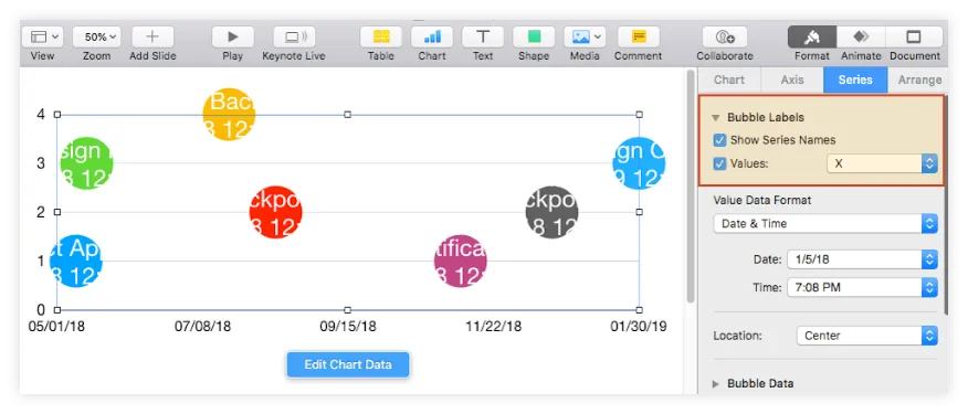
b) Now, your timeline looks cleaner, but it doesn't say much about the milestones or events you want to illustrate. To display the milestone descriptions and due dates on the graphic, go to the Series tab in the Format pane and tick the Show Series Name and Values boxes. Choose X from the dropdown menu next to Values, like we did in the image below:
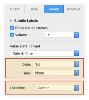
c) While here, you can also set a different position for the milestone labels from the Location menu or change the labels' date & time formats from the Value Labels section. We chose to show a short date, remove the time, and have the labels placed in the center.
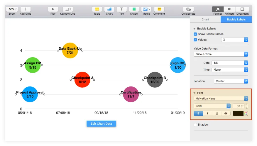
d) Now, to make the labels clearly visible on the timeline, you will want to tweak their font size and color. Select all your milestone labels (Shift + Click) and then use the Font options available within the Bubble Labels tab visible on the right. In our case, we decreased the text size from 50 to 30 and set black as the font color.
e) What we wanted to do next was to remove the Axis Y labels because they overlapped some of our milestone descriptions and didn't really add much meaning to our timeline. To do the same, select the chart area and, from the Format pane, go to Axis → Value (Y) and choose None from the dropdown menu under Value Labels.
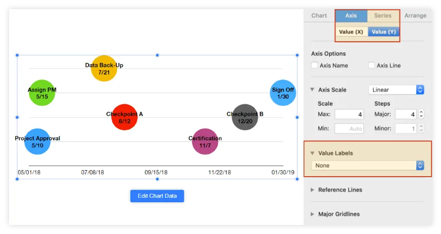
f) While still in the Value (Y) tab, we also want to remove the horizontal lines that cut across the graphic to improve legibility. To do so, simply select None from the menu under Major Gridlines.
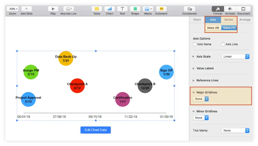
g) You may also want to add some vertical gridlines to show the relative distance between milestones more clearly. This can be done from the Axis → Value (X) tab:
i. Choose the type of Major and Minor Gridlines you want to add to your graphic from the corresponding sections. In our example, we opted to use a straight 0.25 pt. line for both.
ii. Add more intermediary vertical gridlines by increasing the number of Minor Steps under Axis Scale.
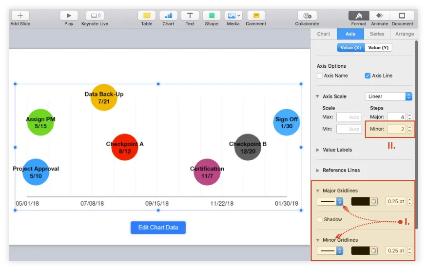
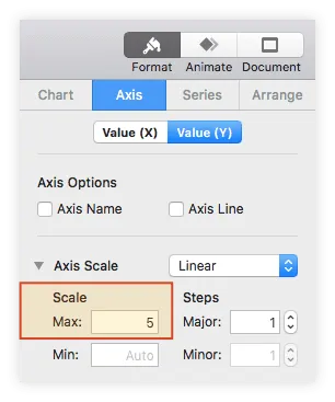
h) In our example, we also wanted to fully include the uppermost milestone in the gridline area. So, we switched back to Value (Y) and increased the Max Scale value in the Axis Scale section from 4 to 5.
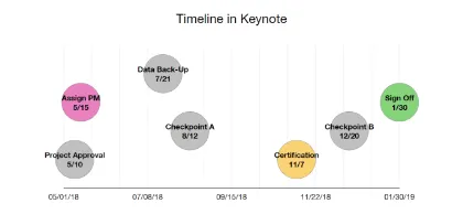
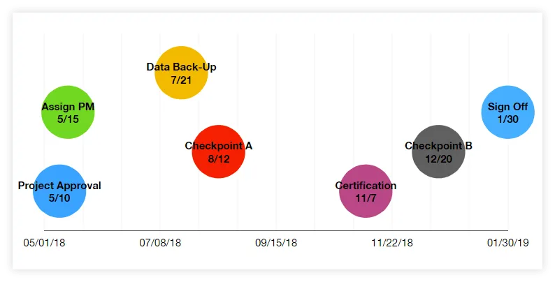
After completing all the steps above, the resulting timeline should look like the one below:
4. Customize your graphic.
With your bubble chart properly formatted, you can now personalize it by applying a few styling choices.
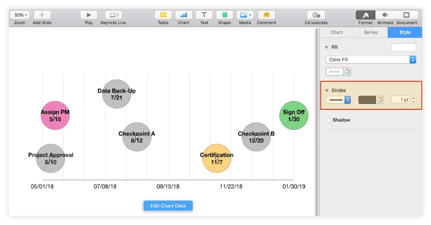
a) Change milestone colors. If you want to change the default colors generated by Keynote, you need to select the chart area, click on the bubble you want to recolor and use the Fill color indicator under the Style tab. This is a great opportunity to categorize your milestones by setting a color code that shows their status, for instance.
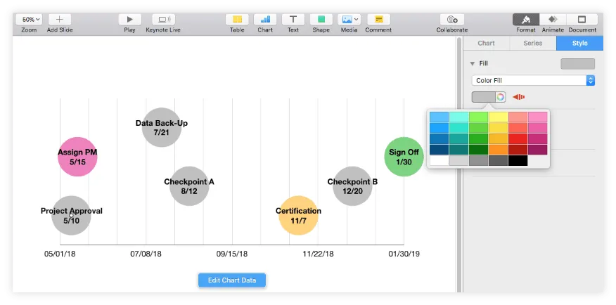
b) Add effects. While on the Style tab, you may also choose to apply some effects to the chart bubbles such as strokes or shadows. However, to avoid burdening the visual too much, it is recommended that you keep these to a minimum. We opted for adding a simple gray outline to all our milestones using the Stroke feature.
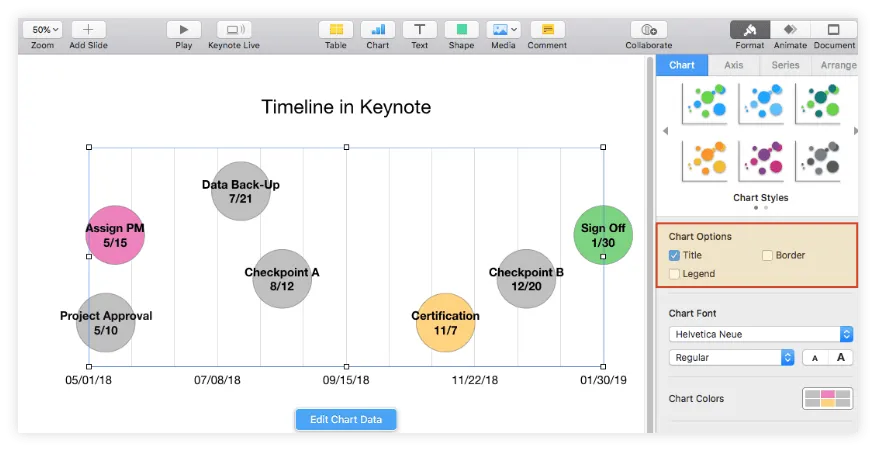
c) Add a title. Select the chart area, and tick the Title box under the Chart Options section of the Chart tab. To change the type, size, color, and alignment of your title, double-click on it and use the options in the pane on the right.
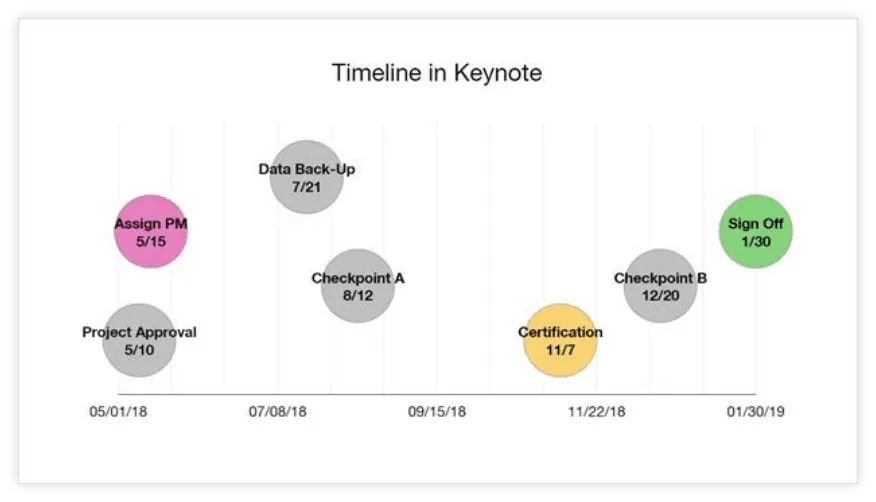
After all the steps above have been completed, our final timeline in Keynote looks like this:
Download timeline template for Keynote
If you’d like to use the timeline created in this guide as a template to help you move faster, you can download the file below, free of charge.
Get this free timeline template
How to make a timeline online automatically
Manually creating a timeline in Keynote is relatively easy, if the visual relies on simple project data. However, when you’re dealing with more complex schedules that undergo regular changes, building a graphic and adjusting it periodically to reflect all these variables may prove too time-consuming.
In the following section, we will show you how to use the web-based timeline generator called Office Timeline Online to automatically make a timeline, which can be then customized and updated with only a few clicks. To begin, access the free tool here and follow the steps below. For advanced features like downloading or exporting your timeline, you will need the premium version of Office Timeline Online.
1. Insert your project's data in Office Timeline Online.
a) To get your timeline started, click on Timeline from scratch from the web tool's New tab. Alternatively, you can either select one of the templates provided or you can import an existing schedule from Excel if you have access to Microsoft Office. In our example, we chose to make a new timeline chart from scratch.
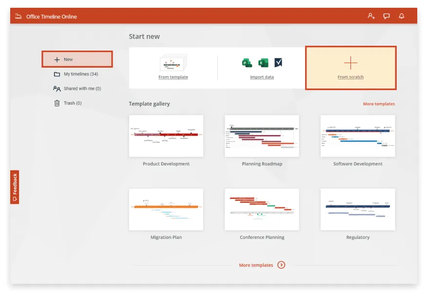
Once you click on the Timeline from scratch button, you will be taken to the Data View.
b) Here in the Data View tab, you can enter your project's milestones and their due dates. This is also where you can make a few preliminary styling choices, such as selecting the shape and color for each milestone marker.
When you’ve finished, go to the Timeline View by clicking on the Timeline tab above the data list.
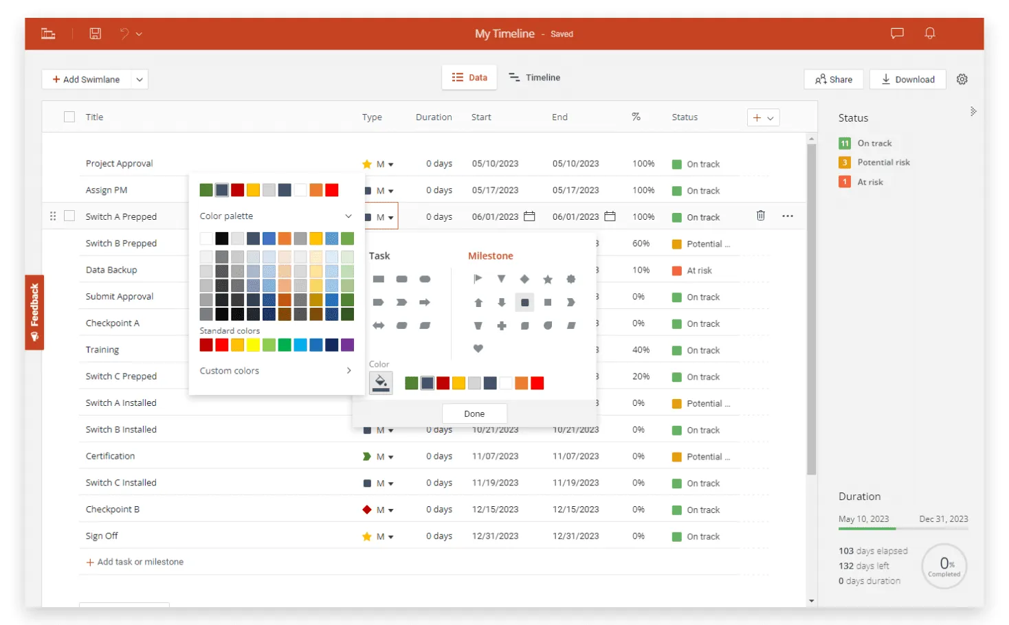
2. Easily customize and update your timeline.
a) Once you've set up your timeline, you can easily personalize it further from the Timeline View. You have the option to choose new colors and shapes for your milestones, change fonts and date formats, or hide items that your audience doesn't need to see.
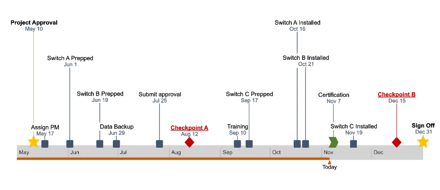
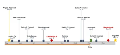
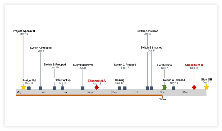
Our final timeline – which you can see below – features milestones of different shapes and sizes, customized texts, and a Today Marker for a clearer view of where the project is standing.
b) With a free Office Timeline Online account, your graphic is securely saved in the cloud, which allows you to access it whenever you need it, as well as update it fast if plans change. To instantly adjust your milestones’ due dates, simply drag & drop them in Timeline View or use the Data tab to quickly add, edit or remove items.
After you finish working on the graphic, if you have the premium version, your timeline can be downloaded as an image or as a native .pptx slide that any PowerPoint user can view, update or present.
FAQs about making timelines on Mac
You can create a timeline in Keynote by starting from a 2D Bubble Chart that you will then format to look more like a linear display of events, milestones, or deliverables. Here is what you need to do:
- Add a Bubble Chart to your Keynote slide from the Chart menu under the Insert tab.
- Click on the newly added bubble chart, and then on the Edit Data Chart button that appears next to add your data to the chart.
- Format the graphic to look like a timeline by adding labels to the displayed bubbles.
Mac users who want to make a timeline can do so:
- Manually - by using iWork productivity suite applications such as Keynote, Numbers, or Pages.
- Automatically - by using the free online timeline maker app from Office Timeline, which works from any type of browser.
Yes, Mac users can make a timeline using Pages. Although primarily designed as a word processor, Pages lets you create a basic timeline example starting from a 2D Bubble Chart.