Why use project management charts?
Every experienced project manager knows that clear data visualization is key to a project’s success. That’s where project management charts come in. These visuals help you:
- Plan, schedule, and track essential tasks.
- Understand project data yourself before communicating it to others.
- Share information in a way that boosts productivity and drives smoother implementation.
Beyond execution, charts also showcase the value of project management work, especially for complex initiatives. By making effort and progress visible, they demonstrate results in a way everyone can grasp.
In short, project management charts help you:
- Organize project information systematically.
- Consolidate relevant details in one place and cut down on time spent chasing data.
- Stay updated on project progress.
- Align teams and foster collaboration.
- Track status and performance effectively.
- Spot deviations from the original plan and adjust quickly.
- Identify bottlenecks and support smarter decisions.
What are project management charts?
Project management charts are any visual representation of project tasks, processes, or data. They help you explain, forecast, report on, or organize your initiative.
Depending on their purpose, charts can:
- Support the planning phase.
- Track progress and milestones.
- Show cause-and-effect relationships.
- Visualize specific datasets.
- Capture the full project lifecycle – or just one stage of it.
The takeaway: charts are only effective in context. The right chart depends on what you need to show and to whom.
To make it easier, we’ve rounded up 7 of the most popular project management charts that will help you visualize and communicate project data effectively.
Want to broaden your perspective first? Check out our project management guide before diving into the list.
7 chart types commonly used in project management
Project management charts come in many shapes and sizes. Below are seven of the most widely used types that help teams plan, track, and deliver projects effectively:
Kanban board
A cornerstone of Agile project management, a Kanban board visualizes workflow processes through simple status columns (e.g., To Do, In Progress, Review, Complete). Tasks are represented as cards that move across the board as work progresses.
Most modern Kanban boards are cloud-based and interactive, enabling teams to:
- Assign tasks to individuals.
- Track progress through predefined workflows.
- Collaborate in real time.
Best suited for:
- Agile, flexible teams working on short, fast-moving deliverables.
- Pull-based workflows where tasks are picked up from a shared backlog.
- Projects that benefit from pairing Kanban with chronological charts like Gantt charts, timelines, or roadmaps for added clarity.

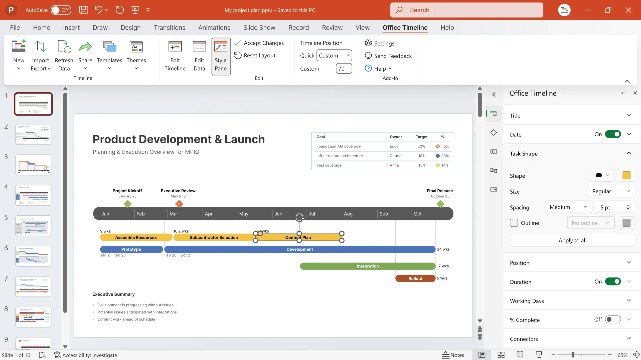
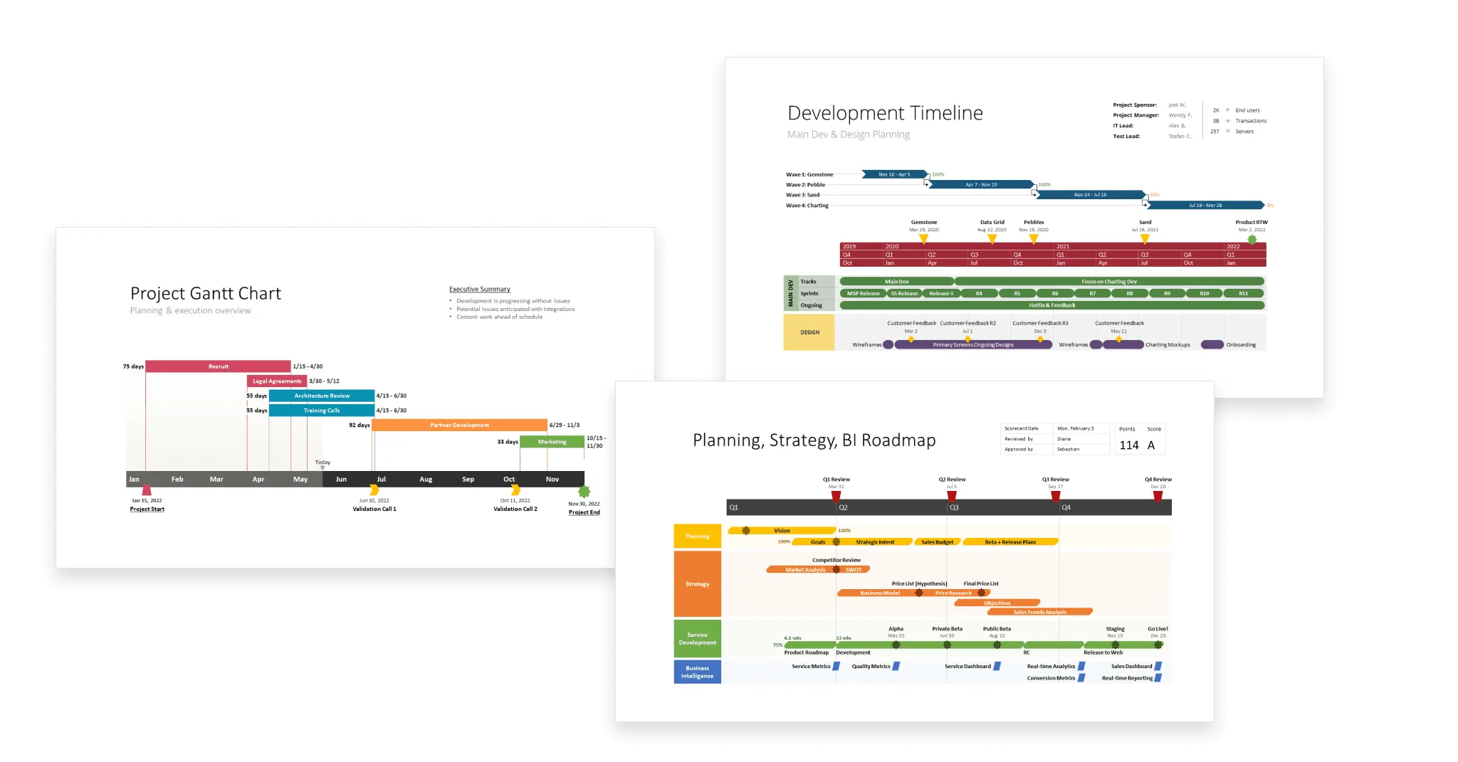
Gantt chart
Among the most popular project management charts, a Gantt chart uses a bar chart format to show how a project develops over time.
- The X-axis represents time (weeks, months, or quarters).
- The Y-axis lists project elements such as tasks, milestones, and phases.
This simple structure makes it easy to see what needs to be done, when, and by whom.
What you can do with a Gantt chart:
- Schedule tasks and define dependencies.
- Map out milestones tied to key tasks.
- Identify the project’s critical path.
- Track progress against the plan.
Because of their versatility, Gantt charts are best for projects with overlapping tasks or complex dependencies. They’re also a powerful way to align teams and stakeholders around a shared timeline and vision.

Project timeline
A project timeline is a visual sequence of events, tasks, and milestones arranged in chronological order along a project’s duration. It gives managers a clear overview of the entire plan at a glance.
Most project timelines appear as horizontal bar charts, with each bar representing a task along with its start and end dates. This format makes it easy to track both detail and big picture – from project kickoff to completion.
With a project timeline, you can:
- Organize and prioritize tasks.
- See when tasks begin and end.
- Track deadlines.
- Link dependent activities.
- Break work into manageable phases.

Roadmap
A roadmap is a high-level visual of a strategic plan. It highlights a project’s main goals and the key steps needed to achieve them within a set time frame.
Roadmaps help project managers move from vision to execution by showing how aspirations translate into concrete actions, aligned with available resources and capacity.
At their core, roadmaps connect:
- The why – strategic objectives and goals.
- The what – the tasks and deliverables required.
- The when – the schedule for reaching completion.

Project portfolio
A project portfolio is a collection of projects and programs – sometimes including related responsibilities and activities – managed together for greater oversight.
Its purpose is to provide a centralized approach to governing multiple initiatives, ensuring consistency and standardized practices across the organization.
By building and managing a portfolio, organizations can:
- Select and prioritize the right projects.
- Ensure alignment with business values, strategies, and goals.
- Apply consistent governance and resource allocation.

Dashboard
A dashboard is a type of project management chart that provides a 360-degree view of a project’s status, metrics, and progress. By pulling data from multiple touchpoints into one unified display, dashboards give teams and stakeholders a single source of truth.
In project management, dashboards are commonly used to:
- Track KPIs such as task status, project progress, workload, risks, budget, or revenue.
- Display progress reports.
- Highlight issues that need attention.
- Turn raw data into actionable insights.
Why dashboards matter:
- Help teams see what’s working, what isn’t, and where to adjust.
- Monitor the success of campaigns, processes, and projects.
- Measure results and manage multiple moving parts in real time.

Work breakdown structure (WBS) diagram
A work breakdown structure (WBS) diagram is a hierarchical, deliverable-focused chart that breaks a project into smaller, more manageable components.
Visually, it resembles an organizational chart:
- At the top sits the overall project.
- Below are high-level phases, deliverables, or specialties.
- These branch into categories, initiatives, and eventually detailed tasks.
Why use a WBS diagram:
- Provides a clear overview of all work required.
- Helps organize responsibilities across departments.
- Makes large, complex projects less overwhelming by clarifying scope.
Keep in mind: while WBS diagrams are excellent for showing what work needs to be done, they don’t convey who does the work or when. For that, combine them with a timeline or Gantt chart to capture sequencing and ownership.

For more examples of charts that you can use to manage project work effectively, check out our collection of free, downloadable project management templates.
Frequently asked questions about project management charts
This section addresses the most common questions on project management charts. Find our answers below.
Because project management covers many dimensions, there’s no single chart that fits every scenario. The “best” chart is the one that delivers the most useful insights for your specific case.
A strong project management chart should help you and your team:
- Clarify project scope – give at-a-glance visibility into the bigger picture, not just isolated stats like deadlines or percentages.
- Boost efficiency – simplify complex data into clear, digestible visuals.
- Foster collaboration and transparency – make it easy to see task order, ownership, and accountability.
Need inspiration? Check out our list of popular project management charts to analyze, monitor, and communicate different aspects of your project.
A project management chart is a visual representation of project activities and processes. It turns complex data into an easy-to-understand format, helping managers streamline tasks, allocate resources, and improve time management.
Browse our gallery of free project management templates to find ready-made chart examples you can download and adapt to your own projects.
According to the PMBOK® Guide (Project Management Institute), the five fundamental phases of project management are:
- Initiation – define goals, build the business case, draft the project charter, and identify stakeholders.
- Planning – set scope, create the plan, establish a budget baseline, and assign roles and responsibilities.
- Execution – allocate resources, build deliverables, and manage issues as they arise.
- Monitoring – track progress, control costs, ensure adherence to plan, and mitigate risks.
- Closing – deliver outputs, secure approvals, and document lessons learned.
Project management charts support each phase by making data-driven insights more accessible and by improving how plans, progress, and outcomes are communicated.