A graphic chart makes it easier for project managers to convey project information, and for their audiences to interpret it. Organizing data in a visual way which is more readily understood, graphic charts are a great aid to important project presentations and communications.
Since many graphic charts display information in different ways, it is important to know the various types of charts so you can choose the right fit for your purposes. To help you in this respect, this page offers you a series of key points about graphic charts, along with a free template that you can easily customize into your own professional project chart.
What is a graphic chart used for?
A graphic chart is a type of diagram, timeline or table that is used to illustrate large amounts of data in a way that is easy to understand and remember.
In project management, professionals often resort to a graphic chart to represent and track a sequence of planned events and activities and to make predictions based on which future actions are taken.
What are different types of a graphic chart?
Here are some of the most common graphic chart types:
- Flowchart – it helps organize the steps and actions in a process from start to finish. Often including more than one shape to illustrate separate parts of a process, a flowchart displays the different path you can take in that process.
- Timeline chart – it depicts project schedules. Its horizontal axis represents the timeframe for the project (in years, months, weeks, or days), while the vertical axis displays the tasks required to complete the project. Project managers use this type of graphic chart to monitor the progress and status of each task.
You can make a timeline chart using a timeline template like the one provided on this page, or with the help of various office tools.
- Waterfall chart – it reflects variance over time, demonstrating how different factors can positively or negatively impact an initial value, such as an opening balance. For instance, you can use a waterfall chart to highlight an allotted budget versus the actual amount spent.
- Pie chart – looking like a circle divided into several pieces, it shows the different parts of a whole. The size of the constituent pieces within a pie chart varies based on how much of the whole each of them represents. Professionals can use a pie chart to define population segments, budget allocations or market research responses.
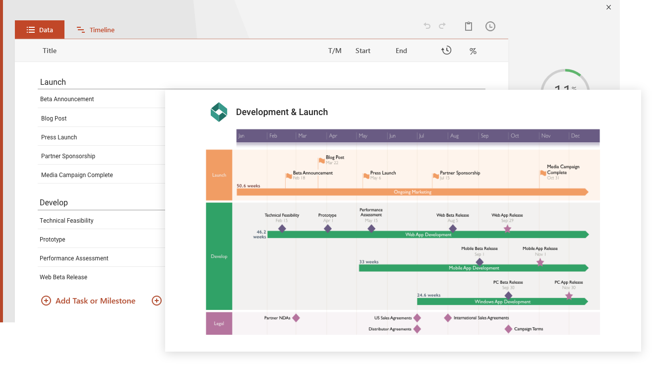
Using and updating the Graphic Chart Template
Building a timeline chart from scratch in PowerPoint requires effort and a lot of patience. This free graphic chart template was created as an easier and time-saving solution to make timelines for clients and executives. It was designed to be simple to understand, and easy to present in an impressive and visual manner.
As every project manager knows, project planning and management software usually produces complicated timeline charts made from lists of tasks. This type of detailed output is suitable for project teams; however, it is difficult to present to audiences who need a high-level timeline that is visual and intuitive.
Customers and executives expect to see visual timeline charts in a way that is familiar to them. They also expect to be able to edit the timeline graphs or include them in their own scorecards and presentations. Taking these expectations into account, we created this free graphic chart as a timeline template that anyone can edit, use and share with peers, customers, partners or upper management.
Once downloaded, the timeline chart template can be edited with Microsoft PowerPoint. This means that any colleagues and other team members using the presentation platform can contribute to updating the template, or even create new timeline graphs from it. Any of PowerPoint’s native controls can be used to manually change all the objects on the graphic chart.
The timeline chart was created with Office Timeline, a free timeline maker that plugs natively into PowerPoint. You can use Office Timeline’s automation to quickly update the template’s placeholders with your own data. You can also instantly change any dates, objects, shapes and styles with a few clicks from the Office Timeline ribbon inside PowerPoint.
If you use other project planning applications, you can integrate with tools like Microsoft Project or Microsoft Excel using Office Timeline’s free 14-day trial. Thus, the timeline graph maker will import your data and transform it into an impressive PowerPoint timeline chart within a few seconds and with just a few clicks. So you spend less time creating graphics and charts and more time managing your project.
FAQs about graphic timeline charts and templates
Let’s discover the answers to some of the most important questions related to graphic charts.
What is a graphic timeline?
A graphic timeline is a type of chart that visually represents information in a time-progression context. It is one of the most popular and frequently used formats used in project planning and management, financial reports, and strategy presentations.
Discover the various types of layouts that a graphic timeline can adopt by browsing our collection of timeline examples.
What is a timeline used for?
A timeline is used to illustrate a set of events chronologically. In project management, for example, timelines are an effective tool for visualizing event sequences or processes to gain a better understanding of the nuances of a project.
What are 3 types of timelines?
Here are the three most commonly used types of timelines:
-
Chronological timelines – these display a series of events in the order in which they did or should occur.
-
Roadmaps – this type of timelines illustrates expected events and are meant to inform the audience about upcoming proceedings, changes, or updates.
-
Gantt charts – these are timelines that use bars of various lengths to represent the time duration of scheduled activities in the planning of a project.
How do I make a timeline graph?
There are several ways in which you can produce a timeline graph. Editing a customizable timeline template is one of the most common and easiest options to go about it because it helps you start from an already-made structure. Alternatively, you can use productivity tools like Microsoft Project, Excel, or PowerPoint to build one such visual from scratch. Our comprehensive tutorials on how to make a timeline graph with various types of software will guide through the process.
What chart is best for timelines?
Here are some of the best chart types that you can use for a timeline:
Browse our timeline template gallery to find the best chart model for your needs.
How do I make a timeline chart in Excel?
You can create a simple timeline chart in Excel by following the main steps below:
-
List your events and dates in an Excel table.
-
Insert a basic Scatter chart into your spreadsheet from Insert > Charts.
-
Add your milestones (listed at Step 1.) to your Scatter chart using Excel’s Select Data Source option.
-
Format your Scatter chart into a timeline by removing vertical and horizontal gridlines, adding connectors to the bubbles of your chart, and adding titles to your graphic’s milestones.
Get a detailed demonstration of the full process from start to finish with our clear tutorial on how to make a timeline in Excel.
Does Excel have timeline templates?
Yes, Microsoft Excel does offer several timeline templates that can be used for simple project plans. To access these pre-formatted samples, do the following:
-
Open new Excel spreadsheet.
-
Go to File > New.
-
Type “timeline” in the search box at the top of the opened spreadsheet and press Enter.
-
Double-click to choose the template you want to use from the returned results.
However, Excel’s timeline templates are rather basic in structure, which often makes them unsuitable for illustrating complex data. If you work on larger projects, you can get a more visually pleasing output with one of these customizable PowerPoint timeline templates.
What is the best timeline software?
There are numerous timeline software options available on the market that address different user needs. Regardless of these differences, a good timeline tool should:
-
Be user-friendly and easy to learn.
-
Offer ready-made timeline templates to jumpstart the process.
-
Include diverse visual elements that would allow users to efficiently illustrate and manage tasks and milestones (shapes, colors, dates, durations, % complete indicators, markers for elapsed time, etc.).
-
Feature collaborative functionalities to support communication among multiple users.
For an in-depth insight into the best specialized project management timeline solutions, check out our review of the top 10 timeline creators.
How do I make a timeline slide in PowerPoint?
You can manually make a timeline slide in PowerPoint, using the presentation platform’s SmartArt tools. Here is what you need to do:
-
Open a new PowerPoint presentation.
-
Insert a basic timeline visual to your slide from Insert > SmartArt > Process.
-
Add your data (event descriptions and dates) to your timeline.
-
Customize your timeline graphic to make it look more unique.
Find out more details about each of the steps above in our tutorial on how to make a timeline in PowerPoint.
Another option for you would be to make a timeline in Google Sheets and then to have it imported in Google Slides.
How do you make a timeline on Google Slides?
To make a timeline on Google slide, follow the steps below:
-
In Google Slides, open a Blank slide.
-
Go to the Diagram pane by clicking on Insert > Diagram.
-
Click on the third diagram thumbnail (the category called Timeline) to display Google Slides’ gallery of in-built timeline templates. Choose your preferred sample and double-click it to have it inserted on your slide.
-
Edit the text and dates on your timeline (double-click + type in).
-
Customize your timeline (the shape colors).
Check out our step-by-step tutorials to learn how to make a timeline using various office tools like Microsoft Project, Excel, or Word. A simpler, more time-efficient alternative would be for you to use the 14-day free trial of the Office Timeline add-in for PowerPoint and quickly turn any of our pre-built timeline templates into professionally looking, presentation-ready timelines with just a few clicks. Once installed, the add-in will help you easily open and edit these pre-designed samples as native PowerPoint slides.