Integrating timelines and Gantt charts: a PM's guide
A project manager’s guide to timeline and Gantt chart creation: how to build clearer, faster, and more persuasive project presentations.

Integrating timelines and Gantt charts
All too often, project managers operate under the assumption that detailed strategies will automatically carry a project to completion. Unfortunately, what is frequently underestimated is the importance of how clearly those strategies are shared.
In project management, the best-laid plans can quickly fall apart under the weight of poor communication. Read on to find out how using simple visual tools like project timelines and Gantt charts can make your project presentations stand out.
1. The importance of effective project presentations
When stakeholders can't easily visualize a project's trajectory, it’s safe to say that the message is already lost, drowned in a sea of meaningless data. Realistically speaking, behind every successful project lies not just a solid plan, but an effective means of storytelling that speaks to all those involved: visuals.
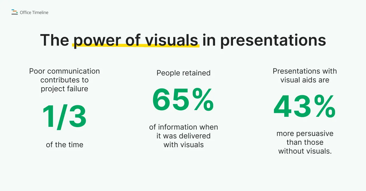
How do we know that? A quick look at the data reveals plenty of evidence pointing to the power of visuals in presentations – here’s what the data says:
- A Project Management Institute study found that poor communication was the primary contributor to project failure about one-third of the time (and harmed project success over half the time).
- People remember information much better when it’s presented visually. In a classic study quoted by LMC, participants retained 65% of information after three days when it was delivered with visuals, versus only 10% retention from spoken or text-only content.
- Incorporating charts and graphics makes your message more convincing. With roughly 65% of people identified as visual learners, it’s no surprise that a University of Minnesota/3M study found presentations with visual aids to be 43% more persuasive (more likely to spur audience action) than those without visuals.
In fact, as we’ve discussed before in our article on how to simplify data presentations, visuals aren’t just effective – they’re efficient. Our earlier exploration highlighted a Stanford study demonstrating that visual presentations, including timelines, Gantt charts and swimlane diagrams, shortened meeting times by approximately 24%.
Additionally, 64% of participants were able to reach immediate decisions when presented with clear visuals, while teams achieved consensus 21% faster compared to those relying solely on verbal communication.
Clearly, visual storytelling doesn't just enhance clarity; it actively accelerates project decisions and stakeholder alignment.
So how exactly do timelines and Gantt charts work?
By now, it should be obvious that the way you tell a story is just as important as the story itself. However, there is of course an extensive array of graphics, charts and diagrams you can employ. What makes these ones stand out?
Timelines and Gantt charts are powerful visual tools that can elevate your project presentations because their structure is very similar to the way we organize events in our mind: linearly, on a time scale – over days, months, quarters, or years.
This type of graphics helps project managers and stakeholders quickly grasp critical details, clearly visualize the flow of tasks, and understand overall project progress at a glance. By turning data-heavy information into accessible visuals, Gantt charts and timelines not only enhance audience engagement but also make it easier to communicate project goals, track milestones, and foster alignment among stakeholders.
How to get started with Gantt charts and timelines
In all fairness, choosing a Gantt chart or timeline maker can feel like a mini research project all on its own. Some are refreshingly simple, while others come loaded with enough features to make your head spin – which makes it tricky to figure out which type truly suits your needs. Ideally, you want something that strikes a balance between user-friendliness and the power to handle real-world projects.
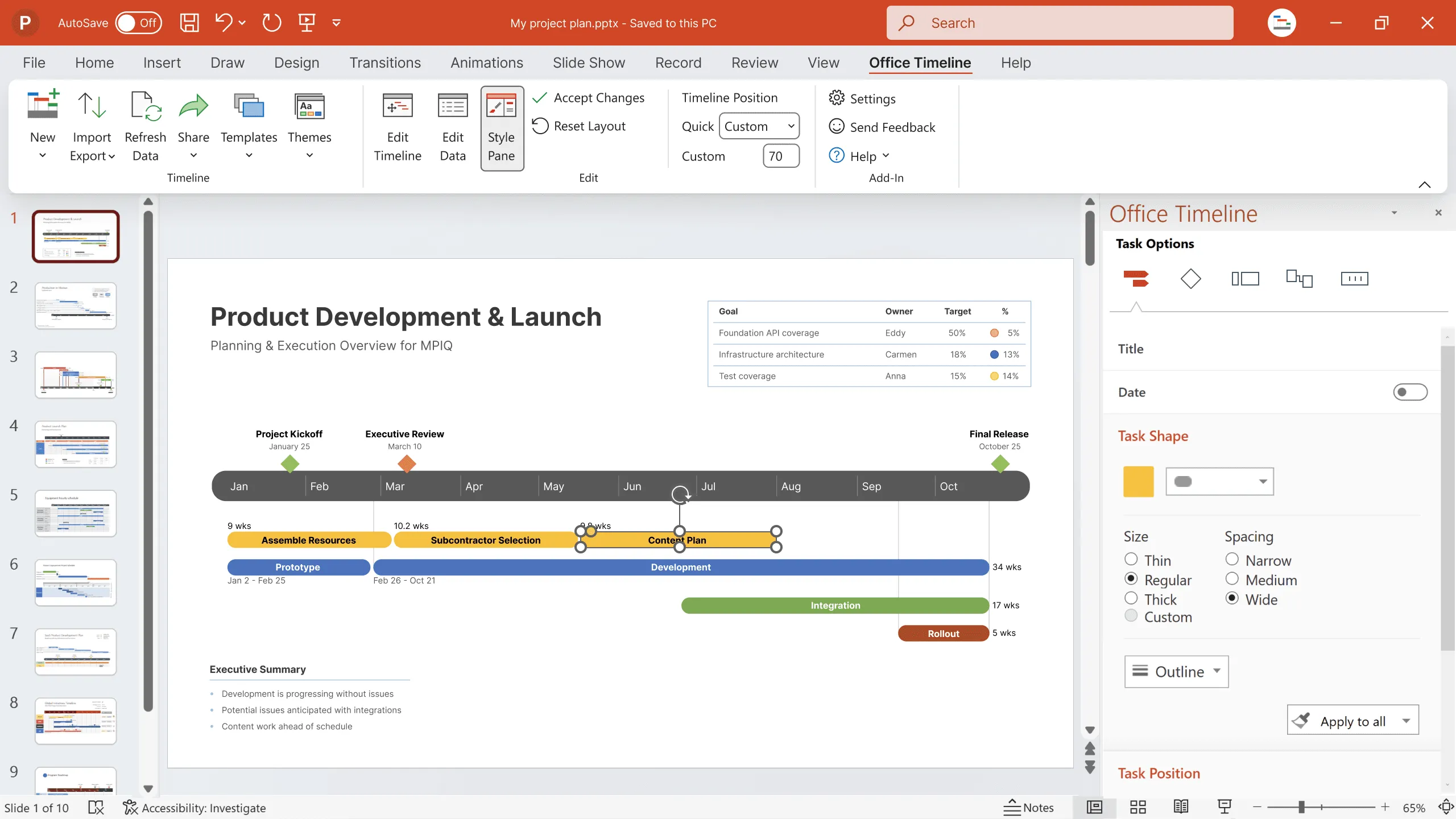
One option worth exploring is Office Timeline: it’s a software that runs right inside PowerPoint (or in your browser, if you prefer the online version), helping you to transform milestones and tasks into polished visuals without any superfluous bells and whistles.
But first let’s discuss what timelines and Gantt charts are and review the differences and similarities between these two types of graphics.
2. Understanding timelines and Gantt charts
It’s entirely too easy to mistake timelines and Gantt charts for the same concept wrapped in different packaging – after all, they both visually map out your project’s journey. But while they may look alike at a glance, there’s more to the story once you go below the surface.
Understanding what sets them apart can make all the difference in how effectively you communicate your project plan.
What is a timeline?
At their core, timelines represent a straightforward way to illustrate the progression of key events or milestones in chronological order. They’re typically used when you want a broad, digestible overview.
You can think of them as a linear roadmap that keeps your audience focused on the high-level sequence of events rather than addressing every tiny detail. This simplicity makes timelines great for setting the stage and clarifying the general flow of a project without overwhelming your audience with specifics.

What is a Gantt chart?
Gantt charts go a step further than the chronological overview by mapping out each task’s start date, end date, and its relationship to other tasks. They’re often used when you need a detailed breakdown of who’s doing what, and when each stage of the project needs to happen.
This makes Gantt charts especially valuable for managing more complex projects where tracking dependencies and resource allocation is as crucial as outlining milestones.

Differences and similarities between timelines and Gantt charts
While both timelines and Gantt charts map out a project visually, each of them shines in different scenarios. Timelines are ideal for broad overviews, highlighting major checkpoints from kickoff to delivery in a straightforward, linear format that keeps your audience engaged with the ‘bigger picture.’
Gantt charts, meanwhile, delve deeper: they break tasks into detailed segments, show how those tasks depend on one another, and underline overlapping or concurrent activities. This makes Gantt charts especially useful for teams that need to coordinate multiple moving parts and spot conflicts early.
In practice, timelines and Gantt charts can complement each other – one keeps everyone aligned on overarching goals, while the other ensures every step is meticulously tracked and managed. Next, we’ll look at why they can be the ace up your sleeve.
3. Benefits of using timelines and Gantt charts in project presentations
Let’s take a moment to highlight why timelines and Gantt charts consistently outperform text-heavy reports in terms of bringing clarity to (and maximizing the impact of) your project presentations.
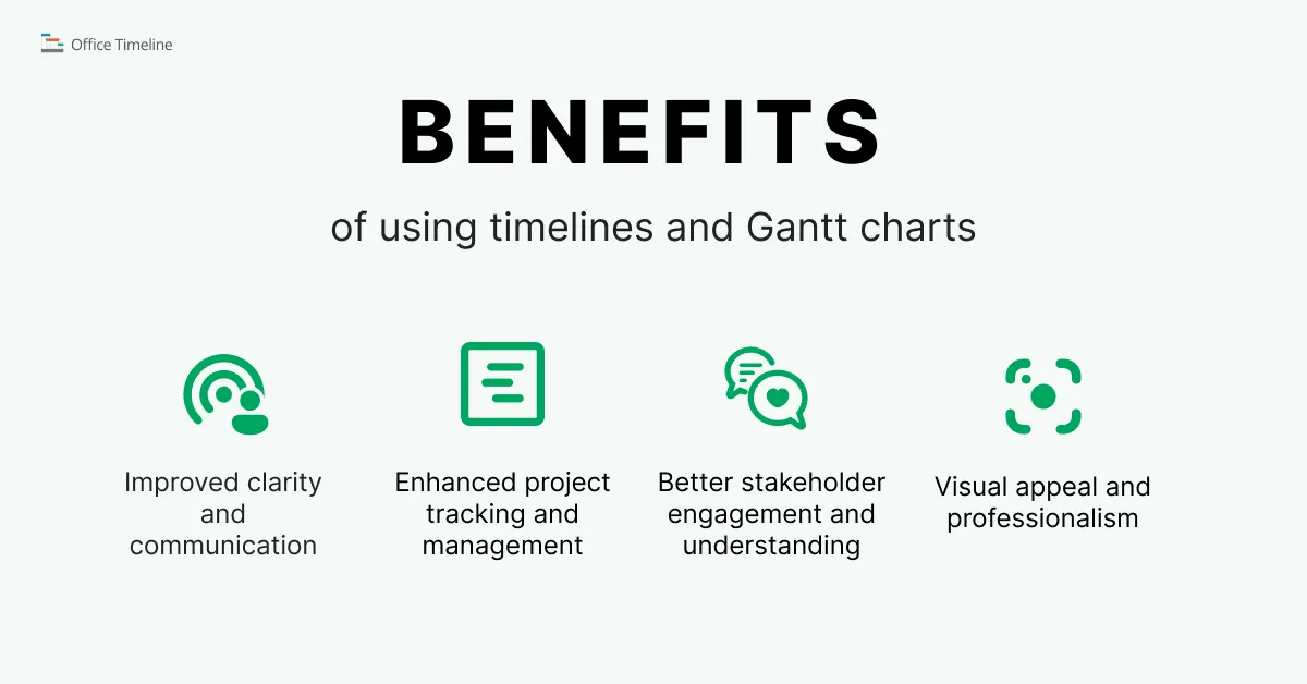
Improved clarity and communication
One of the biggest perks of using timelines and Gantt charts is that they cut through the clutter. Instead of burying your audience under walls of text or endless spreadsheets, these visuals show exactly how a project is progressing and where it’s headed. This clarity leaves no room for misinterpretation, ensuring everyone on the team – or in the audience – has the same understanding of what’s happening and why.
Enhanced project tracking and management
Ever juggle multiple tasks and deadlines at once? Timelines and Gantt charts help you keep all those allegorical balls in the air. By laying out tasks, durations, and dependencies, they make it easier to spot potential bottlenecks and give you the heads-up you need to adjust resources or timelines. Essentially, they’re a manager’s best friend – offering visibility into the moving pieces of even the most complex projects.
Better stakeholder engagement and understanding
We’ve talked a bit earlier about the way people respond to visuals. Show someone a detailed chart, and it’s often much clearer than a five-minute explanation. Timelines and Gantt charts get your stakeholders involved by making the project’s progress and needs instantly obvious. Because these tools tell a story your audience can follow at a glance, you’re more likely to get buy-in, feedback, and overall support throughout the project lifecycle.
Visual appeal and professionalism
Without a doubt, polished visuals stand out in a sea of boring presentations. When you can display a project’s path, deadlines, and key milestones in an attractive, coherent and well-organized format, it not only looks professional, but also inspires and reinforces confidence in your message. Presentations that lean on crisp timelines or Gantt charts show you’ve done the groundwork and are serious about keeping everyone informed, making a strong impression on clients, colleagues, and executives alike.
4. Steps to integrate timelines and Gantt charts into your presentations
Hopefully, by now we’ve managed to persuade you that timelines and Gantt charts can truly be game changers. Now comes the fun part. Ready to turn your raw project data into show-stopping visuals?
Below, we’ll cover how to zero in on what’s important, pick the best format, and create visuals in Office Timeline that fit neatly into your PowerPoint presentation.
Note: We’ve addressed these hot-button PM issues before in greater detail, which is why this section will be more of a quick summary. Check out these links for a deeper dive:
- Identifying key project milestones and tasks (and the Work Breakdown Structure)
- Choosing the right type of visuals and embedding them in your PowerPoint presentation
- Step-by-step guide on creating a timeline
- Step-by-step guide on creating a Gantt chart
Let’s begin.
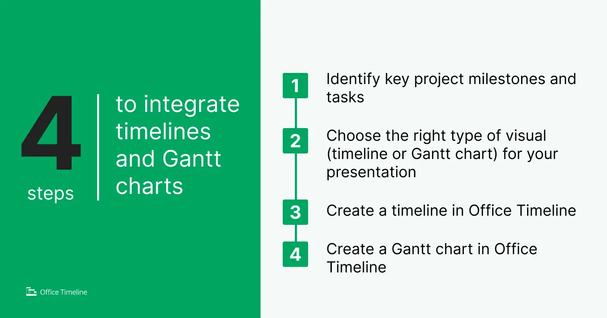
1. Identifying key project milestones and tasks
Before you sit down to create a timeline or a Gantt chart, you need to figure out exactly which milestones and tasks matter. These are your project’s big-picture checkpoints – deliverables, deadlines, or events that signal real progress. Focusing on the essentials keeps your visuals clean and your audience from getting lost in too much detail. It also helps you pinpoint what truly drives the project forward, so you can allocate resources and attention where they’ll have the biggest impact.
2. Choosing the right type of visual (timeline or Gantt chart) for your presentation
With a clear set of milestones in mind, it’s time to decide which visual format tells your story best. If you’re aiming for a high-level overview that highlights key dates in a linear flow, a timeline might be your go-to. But if you need to chart overlapping tasks, deadlines, and dependencies – maybe to show exactly who’s responsible for what – a Gantt chart offers a deeper, more structured breakdown. Ultimately, the choice depends on the level of detail your audience needs and how you want to guide their understanding.
3. Creating a timeline in Office Timeline
Among the perks of working with Office Timeline is that the process is refreshingly straightforward. Once you install the PowerPoint add-in, you can either enter your milestone data manually or import them from Excel, Project, Jira and a couple of other tools.
Choose a timeline template that fits your layout needs, apply a theme to match your presentation’s style, or manually customize the look – tweak colors, adjust shapes, and fine-tune the texts until everything lines up just right. Both are fast ways to turn a sequence of events into a deck that looks clean, focused, and presentation-ready.
4. Creating a Gantt chart in Office Timeline
Building a Gantt chart follows a similar rhythm but with a few extra nuts and bolts under the hood. After installing the add-in, you can input or import your milestones and tasks along with start and end dates, in a similar fashion to timelines.
Selecting an appropriate Gantt chart template from the get-go gives you a head start on the layout, particularly if you need to show task durations, overlaps, or dependencies. Once your data is in, you can easily apply a theme and start customizing – adjusting bar styles, colors, and time scales to highlight what matters most.
5. Tips for seamlessly embedding visuals into your PowerPoint presentation
Inserting visuals like timelines and Gantt charts into your PowerPoint slides isn’t just a final formatting step – it’s where your project starts to speak for itself. To make sure your graphics don’t just look good, but actually land with your audience, here are 3 tips worth following:
- Stick to consistent formatting: Using a PowerPoint timeline template or chart style that matches your overall design helps your visuals feel polished and purposeful – not like an afterthought.
- Let your visuals breathe: Whitespace isn’t wasted space. Whether you’re embedding a simple Gantt chart or a full-blown project timeline template, avoid cramming too much into a single slide. Give your visuals room to stand out.
- Make it part of the story: These visuals are more than ornamental – they’re the narrative backbone of your presentation. In visual project management, timelines and Gantt charts help guide your audience through what has happened, what is happening, and what’s coming next.
When integrated thoughtfully, these visuals dial up your presentation from informative to unforgettable. Next, let’s explore some ways to keep any presentation from looking like a tax return document, because nothing kills momentum faster than a slide that screams Schedule C.
6. Best practices for effective project presentations
Before your timeline or Gantt chart takes center stage, here are a few simple habits worth locking in:
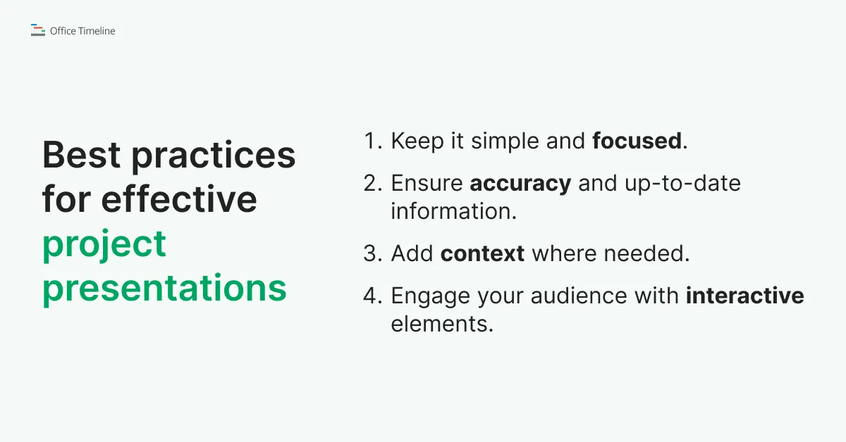
1. Keeping it simple and focused
Not every audience needs the same level of detail – and trying to cram everything into one Gantt chart or timeline template is a fast track to confusion. Your team might need task-level breakdowns, while execs are only interested in major milestones.
The trick? Show just enough. Highlight the most relevant data points for the people in the room and leave the rest behind. Tools like Office Timeline help streamline this by letting you customize what gets displayed, so your timeline or simple Gantt chart stays clean, clear, and laser-focused on what actually matters.
2. Ensuring accuracy and up-to-date information
In visual project management, accuracy isn’t just about looking nice – it’s about building trust. A great-looking Gantt chart or timeline means very little if the dates are off or the data is misleading. Even small visual choices – like uneven spacing or out-of-scale task bars – can skew how your project is perceived.
To keep things clear and credible, consistency is key. Make sure your timeline chart or Gantt chart template uses evenly spaced intervals so the project’s pace and scope aren’t distorted. Avoid cherry-picking only the “good” data – transparency matters, especially when decisions are riding on your presentation. If there’s a tough-to-reach milestone or delayed task, show it. It builds confidence that what you’re presenting reflects reality, not just wishful thinking.
3. Adding context where needed
Annotations and data sources can clarify key dates or shifts in the schedule, especially in a project timeline template where space is tight but the details matter. And don’t overlook the layout: overlapping tasks or crowded milestones can make your slide feel more like a puzzle than a plan.
If you’re using a tool like Office Timeline, good news! A lot of these pitfalls are easy to avoid – intervals stay consistent, proportions stay true, and your data always maps directly to your inputs. That way, your visuals stay honest, sharp, and up to date – just like your project should be.
4. Engaging your audience with interactive elements
A project presentation shouldn't feel like a monologue with slides – especially when you’ve got a timeline or Gantt chart that practically invites questions. Once your visual is up on the screen, use it to spark a conversation. Pause, ask what stands out, and get people talking about what’s going well – or what might go sideways if no one’s paying attention.
A little back-and-forth goes a long way. It keeps your audience tuned in, makes them feel part of the process, and prevents the meeting from feeling like a long-winded email moonlighting as a presentation.
7. Real-world examples and case studies
It’s one thing to talk about the benefits of timelines and Gantt charts – but seeing them in action? That’s where things can get interesting. Below we compiled a few real-world case studies that show just how much impact these visual project management can have, in the wild.
Office Timeline case studies on successful Gantt chart and timeline implementation
Here are three case studies that show how project professionals discovered Office Timeline and what they accomplished by incorporating it into their work habits.
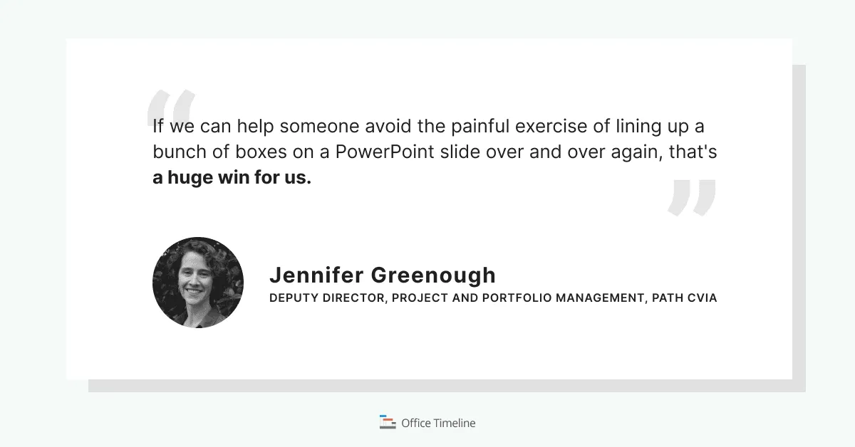
1. Streamlining vaccine development projects
PATH's Center for Vaccine Innovation and Access (CVIA) managed complex, multi-year vaccine development projects involving numerous functional areas. To effectively communicate progress and plans to stakeholders, they adopted Office Timeline. This tool enabled them to create clear, high-level timelines that distilled intricate project details into accessible visuals.
The integration with their existing work management systems allowed for easy updates, enhancing efficiency and consistency in reporting. The result was improved stakeholder understanding and a more unified approach to project communication.
Key findings:
- Reduced complexity: Transformed intricate, multi-year vaccine project details into clear, high-level timeline visuals.
- Improved communication: Enhanced stakeholder understanding through accessible, visual project plans.
- Efficiency boost: Seamless integration with existing systems made it easier to update timelines and maintain consistent reporting.
- Unified direction: Fostered alignment across multiple functional teams by presenting a shared, visual roadmap.
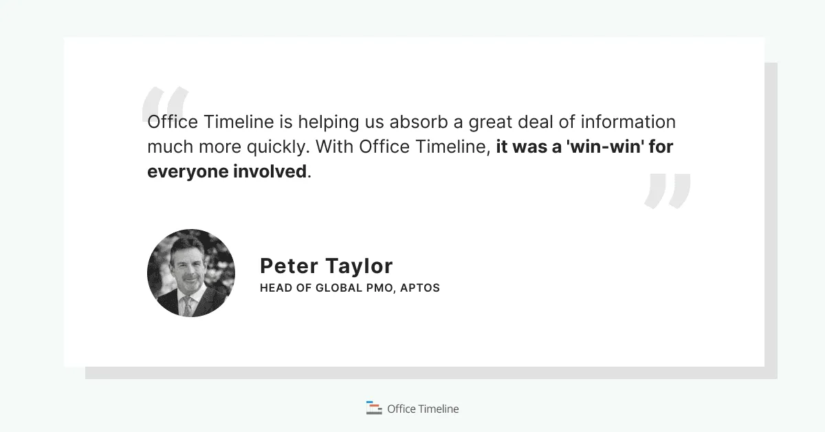
2. Enhancing project reporting in retail technology
Aptos, a retail technology company, faced challenges with inconsistent project reporting formats that hindered executive reviews. By incorporating Office Timeline into their project management toolkit, they standardized reporting templates across teams.
This standardization led to a significant reduction in the time executives spent reviewing projects – by approximately 50%. The visual clarity and ease of updating timelines improved overall productivity and facilitated better decision-making processes.
Key findings:
- Standardized reporting: Unified project visuals across teams using a consistent timeline template.
- Time savings: Cut executive project review time by approximately 50%.
- Better decision-making: Clearer visuals lead to faster, more confident leadership decisions.
- Higher productivity: Reduced reporting friction freed up time and resources across the organization.
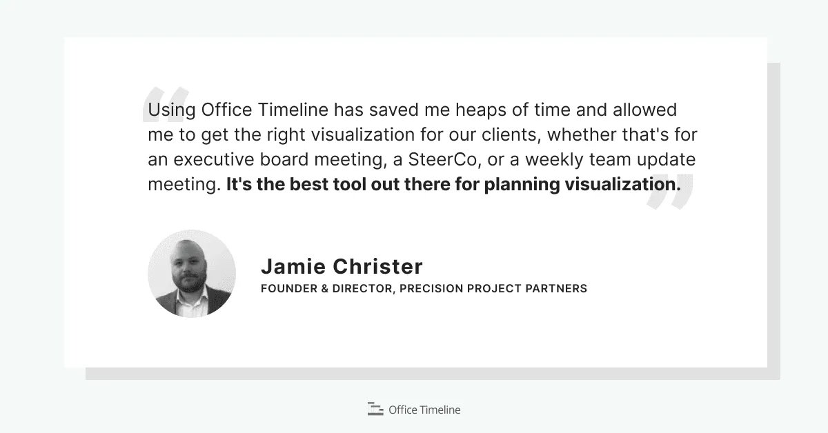
3. Making the right first impression in consulting
Precision Project Partners, a UK-based program and project delivery consulting firm, faced the ongoing challenge of building a strong reputation by consistently delivering value to clients. To address this, they adopted Office Timeline to create high-quality planning visualizations. These visualizations helped establish credibility early on and significantly improved project communication.
Key findings:
- Enhanced credibility: High-quality planning visuals helped establish early trust with clients.
- Improved communication: Clear, visual project plans facilitated better understanding and alignment.
- Consistent delivery: The use of Office Timeline supported the consistent delivery of value to clients.
Gantt chart and timeline case studies from around the web
Now let's take a look outside and see what other examples of case studies on using visuals in your project presentations.
1. The Gantt Chart in Modern Project Management: An Empirical Analysis from Developing Countries
In a study titled “The Gantt Chart in Modern Project Management: An Empirical Analysis from Developing Countries,” researchers explored the real-world impact of using Gantt charts across various projects in developing nations. The case study focused on both public and private sector projects where traditional planning methods lacked visual clarity, causing coordination challenges and delays.
After implementing Gantt charts, project teams reported notable improvements in how tasks were organized and communicated. Managers found that timelines helped align teams around deadlines and deliverables, while stakeholders were better able to understand project progress without needing deep technical knowledge. The study highlights that even in resource-constrained environments, a well-structured Gantt chart can offer significant project management benefits.
Key findings:
- Improved task coordination: Teams better understood task sequences, dependencies, and hand-offs.
- Enhanced communication: Stakeholders found it easier to follow project progress and expectations.
- Timely project completion: Projects using Gantt charts were more likely to stay on schedule.
2. The Role of Gantt Chart in the Project Management
In the thesis “The Role of Gantt Chart in the Project Management”, researcher Kanika Wadhwa examined how Gantt charts support planning, execution, and control in modern projects. Drawing from both academic theory and practical application, the study explores how these visual tools help project teams better structure workflows, monitor timelines, and manage resources.
The case study section of the thesis outlines how Gantt charts were used to map out project phases, reveal interdependencies between tasks, and give stakeholders a clearer understanding of the project’s overall trajectory. Notably, the study emphasizes the Gantt chart’s role in increasing visibility across teams and enabling more proactive project oversight.
Key findings:
- Improved visualization: Timelines made it easier to grasp task flow and project duration at a glance.
- Enhanced coordination: Dependencies and sequencing helped synchronize cross-functional activities.
- Effective resource allocation: Teams used Gantt chart and timeline visuals to forecast and distribute workload more accurately.
- Progress monitoring: Managers could track actual versus planned progress in real time, making it easier to adjust schedules when needed.
8. Conclusions
Timelines and Gantt charts don’t just make your slides look better, they make your message land. They turn scattered details into a clear story, helping your audience instantly understand what’s happening, what’s next, and why it matters. Stakeholders get aligned faster, decisions are reached easier, and projects stay on track with fewer surprises.
Gantt charts bring structure to complex workflows, while timelines give your big-picture goals the spotlight. Together, they boost productivity, reduce misunderstandings, and add a layer of professional polish that sets your presentation apart. In short? They make it look like you’ve got it all under control – even when your project’s on fire behind the scenes.
You've now got the knowledge (and some very compelling proof) that timelines and Gantt charts can do a lot of the heavy lifting in your presentations. If you’re ready to turn your project data into visuals that actually work, Office Timeline makes it easy. It’s built for professionals who want clean, clear timelines and Gantt charts – without the usual design headaches.
Additional resources
Office Timeline Guides
- Gantt chart 101: Everything you should know about Gantt charts
- How to make a project plan presentation for clients and stakeholders
- From data to decisions: visualization strategies for Project Managers
- How to create effective executive reports: a comprehensive guide
- Maximizing team efficiency: Using Office Timeline collaboratively
Tools and templates
Project management tips and tricks
Turn project data into professional timelines
Get the advanced features of Office Timeline free for 14 days.