Mac users wanting to visually present plans or schedules in Pages can tweak a default 2D Stacked Bar chart to build a basic Gantt chart. Because formatting the graphic in Pages can become time-consuming, those who need to regularly create and update such visuals may find it simpler to use a dedicated Gantt chart maker instead.
This page will show you two ways to make a Gantt chart: either by building it manually in Pages, or automatically by using the web-based Gantt chart maker called Office Timeline Online, which generates a professional visual instantly and lets you download it as a PowerPoint slide for easy sharing.
Which tutorial would you like to see?
How to manually make a Gantt chart in Pages
1. Enter your project data into a table in Pages.
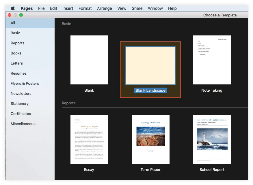
a) Open Pages and double-click on Blank Landscape under the Basic category of the template gallery. This is recommended for an optimized layout of your presentation.
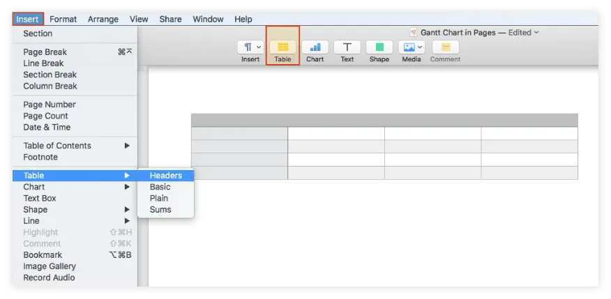
b) Add a table to your document by going to Insert → Table on the Pages ribbon or by clicking on the Table button on the taskbar above your page.
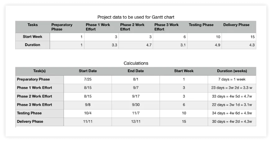
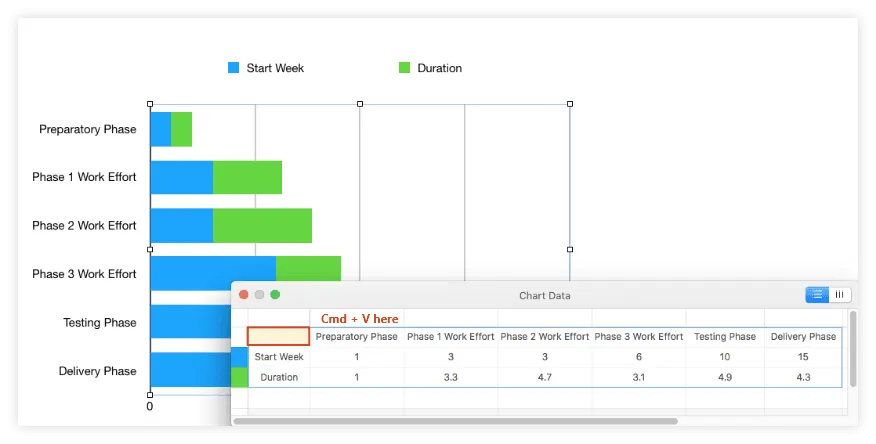
c) List the main phases or tasks of your project in the first row of the newly inserted table, as shown in the picture below. You should keep them as concise as possible to make sure they'll fit well on the graphic.
d) Use the second row to enter the start week for each of your project phases, setting the first task (which begins in week 1) as the reference point in determining the beginning of the remaining ones. See the following image for a better illustration of how we set the start time series for our chart.
e) In the third row of the table, add each task’s duration (amount of time required to complete that task) in weeks. Here are the calculations for our duration series:
2. Add a 2D Stacked Bar Chart to your Pages document.
Now that you have sorted out your data, you can start building your graphic.
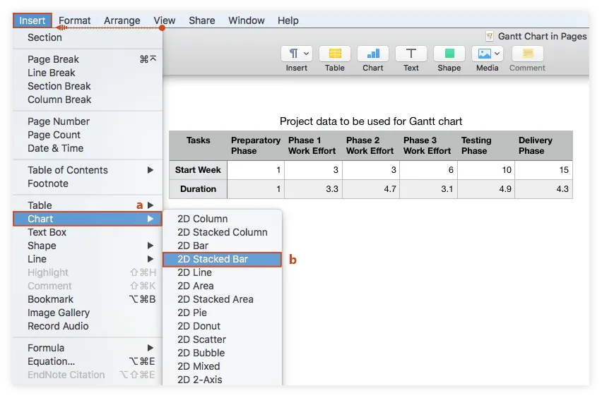
a) Go to Insert → Chart on the Pages ribbon.
b) Click on 2D Stacked Bar from the menu that appears.
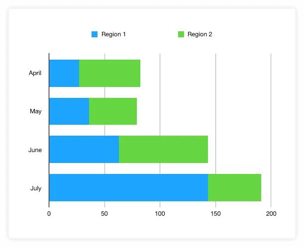
Pages will automatically generate a basic stacked bar chart that looks like this:
3. Input your project data into the chart.
a) Select and copy (Cmd + C) all the rows of your project data table.
b) Click on the Edit Chart Data button that appears after selecting the chart area.
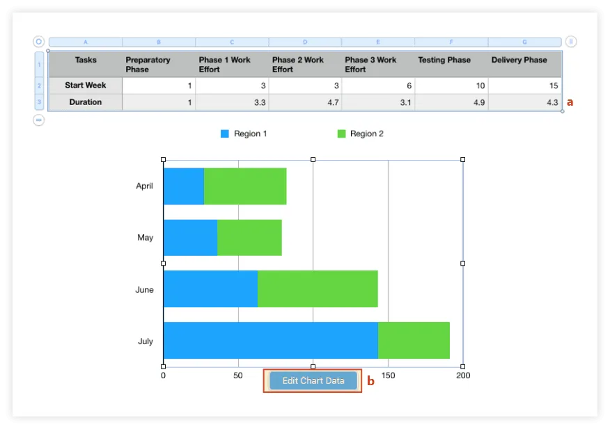
c) Select the first cell in the top-left corner of the Edit Chart window that shows up and paste the copied items. Pages will replace the placeholder data with your own and the graphic will be instantly updated to display the new details.
4. Turn your graphic into a Gantt chart.
Now that that your chart has the right data in, you need to format it to make it look more like a Gantt. This means making the blue bars transparent so that only the green ones remain visible (these will represent the tasks of your project schedule). To do so, you need to select the chart area and:
a) Double-click on any of the blue bars of the graphic, which will select the whole series.
b) Go to the Style tab of the Format pane on the right side of the Pages document.
c) Click on the color indicator next to Fill and select No Fill.
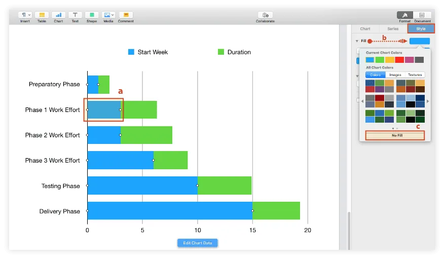
The resulting graphic will look like the one below:

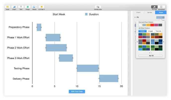
With your Gantt chart properly set up, you can now make further customizations to add meaning and help it stand out better.
5. Customize the tasks bars of your Gantt chart.
a) If you want to recolor your tasks simultaneously, click on the chart area and then on any of the bars to select all of them at once. Then go to the Style tab of the Format pane and use the color indicator next to Fill to choose a new hue. In our example, we picked a pale blue.
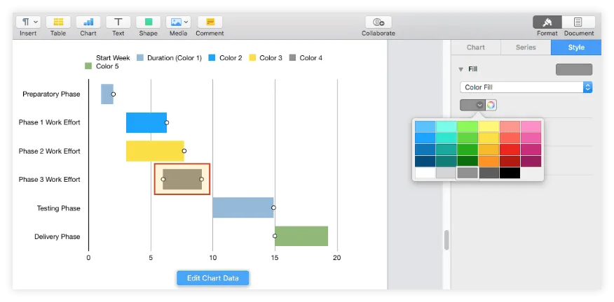
b) Currently, your tasks are seen as a single series, and that's why you can edit them only all at once. To recolor your chart bars individually, your tasks need to be distributed in separate series, which will require you to:
i. Insert a few extra rows beneath Duration, which you can name Color 2, Color 3, Color 4 and so on. As you can see in the image below, the newly added lines will generate different hues for your graphic that you can further customize afterwards.
ii. Now, to move a task into a separate series or color category, cut its Duration value from its original row and paste it into one of the new lines, keeping the same column (the same goes for the rest of the tasks). Here is how we set up the new color palette for our graphic:

Note: As the image above shows, the tasks that have their Duration values on the same row are considered as a single series with the same color (e.g. Preparatory Phase and Testing Phase), which means they'll all be customized at once. The tasks with their duration values distributed on different rows are considered distinct series that can be customized separately - as shown in the following step.
iii. To further customize any of your task bars’ colors, double-click on the desired element and use the color indicator next to Fill on the Style tab to choose whichever new nuance you prefer. This is how we changed our Gantt chart’s default colors:
c) While in the Style section, you may also want to apply a few effects such as strokes and shadows. Because we felt shadows were a little distracting and made the graphic more difficult to follow, we chose to add only a simple black outline to our task bars using the Stroke feature.
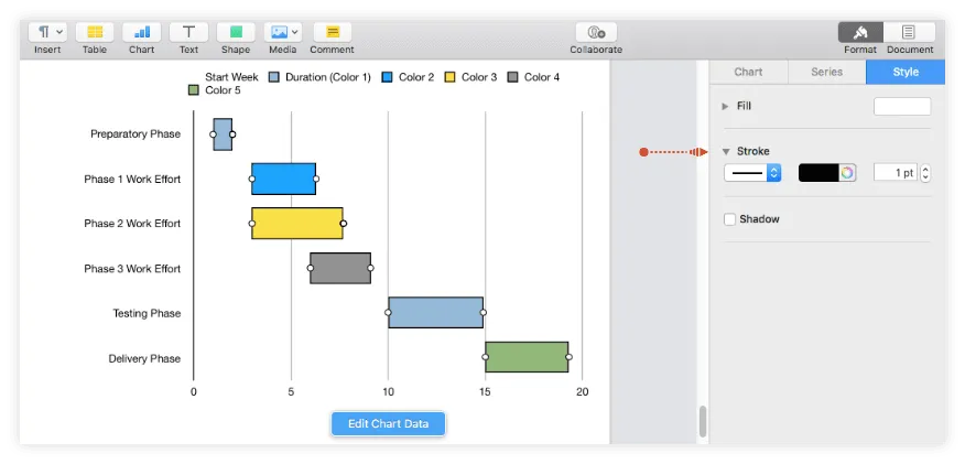
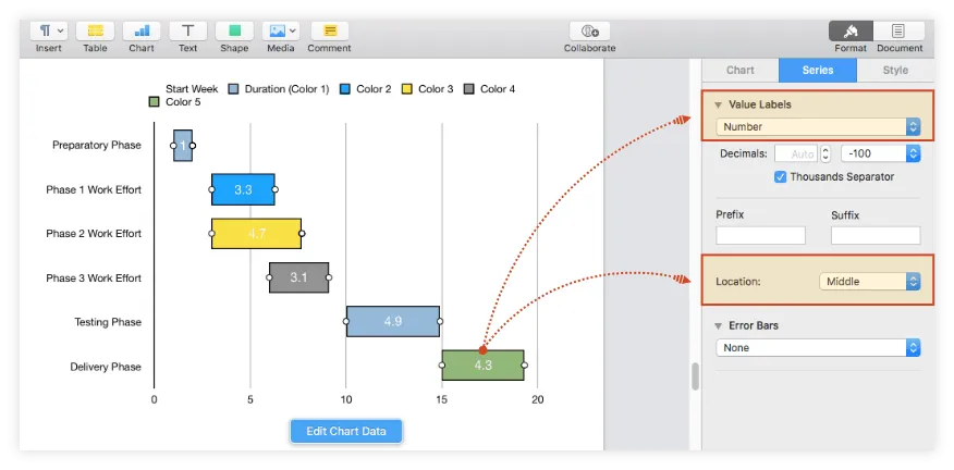
d) To display your tasks’ duration on the Gantt chart, select all the bars (Shift + Click), go to the Series tab, and choose Number from the dropdown menu under Value Labels. To change the placement of the value labels on the task bars, use the Location feature. In our example, we chose to have the labels displayed in the middle.
6. Customize the chart area.
Once you’ve finished customizing the task bars, you can also make changes to the chart area of your graphic. Select it and use the features within the Chart and Axis tabs of the Format pane as follows:
a) Add titles and borders: Tick the boxes for Title and Border under Chart Options. While here, we also unchecked Legend as we considered it redundant in our case.
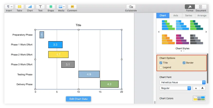
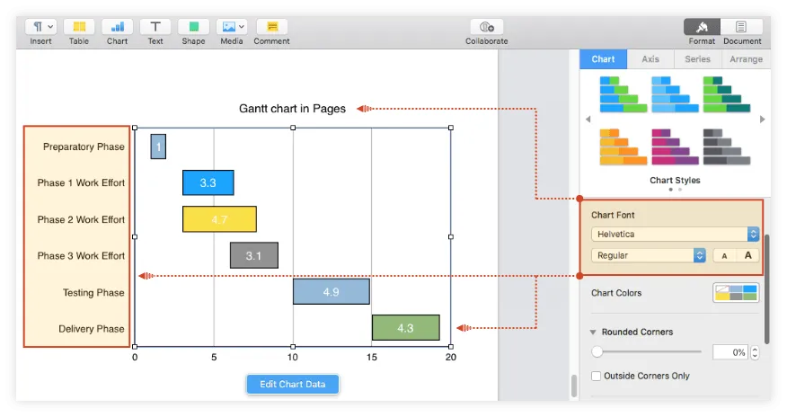
b) Customize fonts: Use the options under Chart Font to modify the font type and size for the entire graphic. In our example, we changed the font from Helvetica Neue to Helvetica and increased it a bit.
Note: You can customize the task descriptions or title independently by double-clicking on them and making the desired changes from the pane on the right.
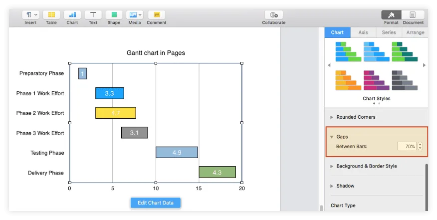
c) Adjust the gap between the task bars: Use the up-down controls under Gaps to increase or decrease the space between chart bars. We increased it from 40% to 70% for our graphic.
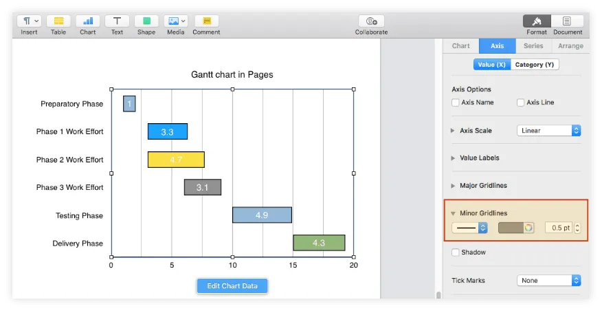
d) Add more vertical lines to the chart: Click on the Axis tab of the Format pane, go to Minor Gridlines, and select the type of gridline you want to use. For our graphic, we used a straight grey line.
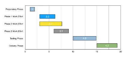
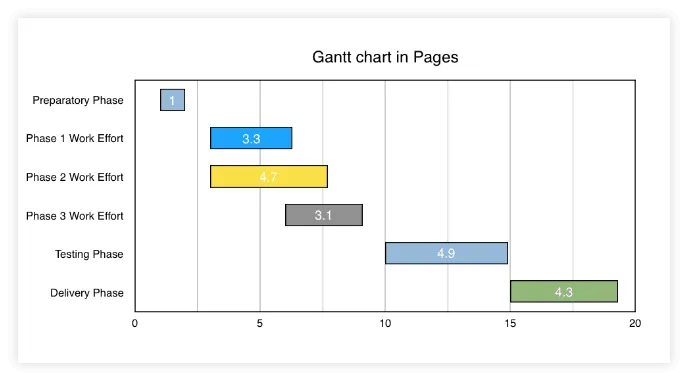
After carrying out all the steps above, trying out several font sizes, and increasing the size of the chart area, our Gantt chart looks like this:
Download Gantt chart template for Pages
If you’d like to use the Gantt chart created in this guide as a template to help you move faster, you can download the file below, free of charge.
Get this free Gantt chart template
How to make a Gantt chart online automatically
Apple's Pages does let you build a Gantt chart, but the formatting process can become cumbersome, especially if you need to regularly create and edit such visuals for recurrent communications. Below we'll demonstrate how to make professional-looking Gantt charts more easily using Office Timeline Online.
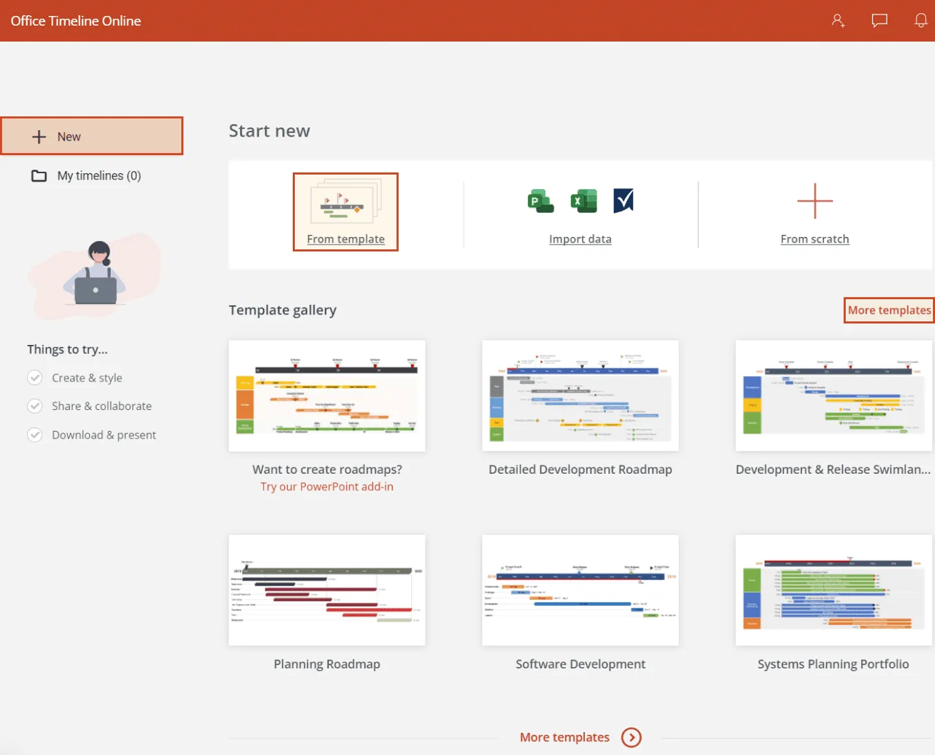
To get things started, access the free online tool and carry out the following steps. For advanced features like downloading or exporting your timeline, you will need the premium version of Office Timeline Online.
1. Add your project’s details in Office Timeline Online.
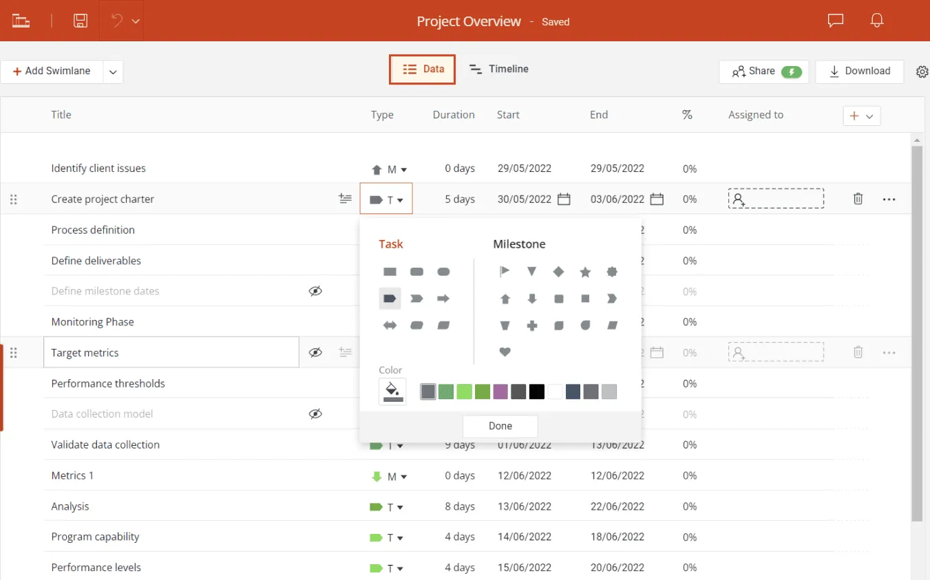
a) To start building your Gantt chart, click on Timeline from scratch from the web tool's New tab or choose one of the templates available. In our case, we went for the first option, so you can see how to make a Gantt from top to bottom.
Selecting the Timeline from scratch option will open the Data View, where you can add and edit data.
b) Use the Data View tab to list your project’s tasks and their due dates and make a few styling choices such as choosing the shapes and colors of your items. Office Timeline Online will automatically transform this data into a Gantt chart. When you’re ready, select the Timeline tab above your data list to see your graphic and start customizing it.
2. Customize and update your Gantt chart with ease.
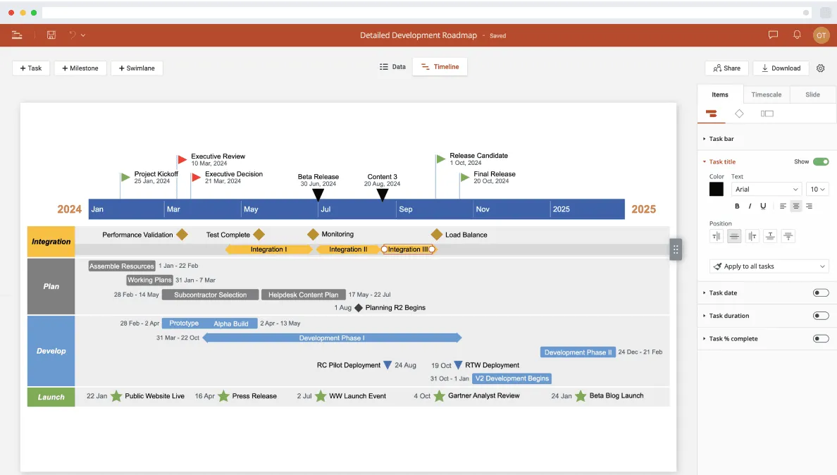
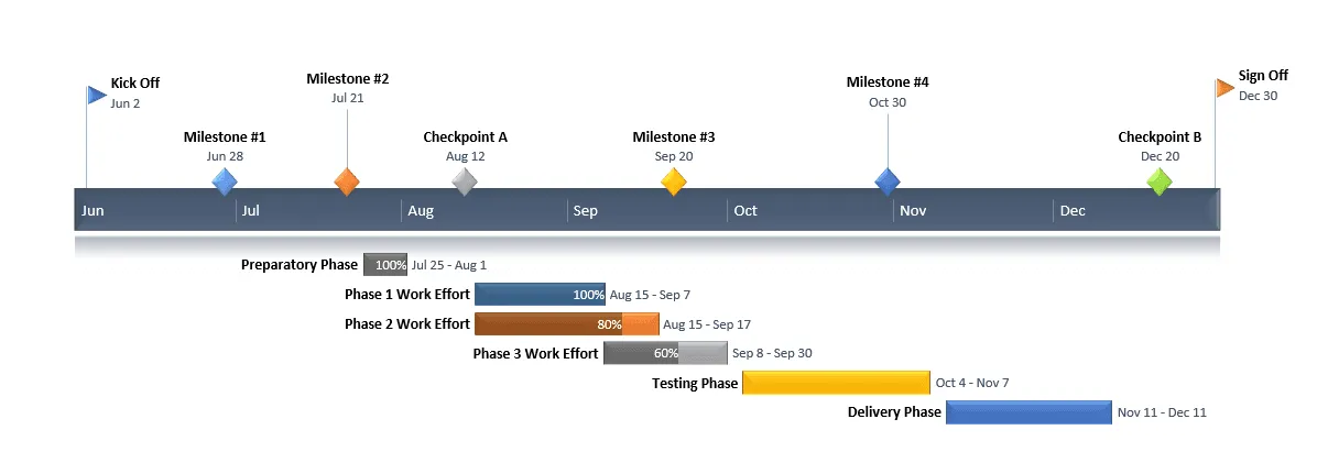
a) At this point, you can customize any detail on your newly created Gantt chart with just a few clicks. From the Timeline tab, you can change any color, shape, and font, adjust the tasks' position and spacing, or choose to show details such as Task Duration or Percentage Complete. Whenever you want to add more tasks, you can instantly switch back to the Data View and enter their details. You can see on our final Gantt chart below that we have included some milestones too, which will help in tracking our project.
b) If you have a free Office Timeline Online account, the Gantt charts you make will be instantly saved in the cloud, which means you can return to them at any time and adjust them as plans change. The Timeline View lets you update task and milestone dates right on the graphic with a simple drag & drop, while the Data tab makes adding and editing items fast and easy. Once finished, if you have the premium version, turn your Gantt chart into an editable PowerPoint slide so you can easily include it in presentations.
FAQs about making Gantt charts in Pages for Mac
Below, we’ve answered the most frequently asked questions about making a Gantt chart in Pages for Mac.
Yes, you can make a Gantt chart in Pages by manually tweaking a default 2D Stacked Bar Chart to reflect your project data. Here are the main steps you need to follow to create a basic Pages Gantt chart:
- Open Pages and select the Basics Landscape template from the app’s gallery.
- Add a 3-row table to your Pages document by clicking the Table icon on the menu bar.
- List your project data into the table.
- Add a 2D Stacked Bar Chart to your document by selecting this option from the menu that shows up after you click on Insert → Chart on the Pages ribbon.
- Copy the data from the table, select the chart area, and then click the Edit Chart Data button that appears. Then, paste the copied items into the newly opened Chart Data window.
- Copy the data from the table, select the chart area, and then click the Edit Chart Data button that appears. Then, paste the copied items into the newly opened Chart Data window.
If you want to create a Gantt chart on MacOS-running devices, you can do so using any of the three applications within Apple’s iWork office suite, namely Keynote, Numbers or Pages. None of them offers pre-built Gantt chart templates but they do let you build a basic Gantt starting from various types of bar charts which then need to be manually formatted.
As explained above, MacOS devices feature a limited series of native applications that allow you to create Gantt visuals by manually formatting a default stacked bar chart. Not only is this process time-consuming, but it also yields a rather schematic and basic Gantt sample in the end.
Mac users who need more complex and professionally-looking project schedules may find a dedicated Gantt chart maker such as Office Timeline Online to be a more suitable solution. This web-based tool comes with dozens of stylish templates and helps you easily generate, update, and share a Gantt chart in the cloud right from your browser.