Why use project management visuals
A Gantt chart is a critical project management tool for anyone working on a project. Gantt charts help visualize the project schedule and status, which makes them useful particularly when communicating with project stakeholders.
There is a lot of Gantt chart software available to manage projects, but these tools create complex schedules that are often too confusing for executive reporting or client reviews.
Google spreadsheets are easily editable and accessible from the cloud, which makes them useful for collaborating on projects. Although there is no native Google apps solution for project management, Google Sheets is perfectly suitable for tracking project schedules. When it comes to presenting those schedules to customers or management, you will need to learn how to create a Gantt chart.
Below we will demonstrate how to manually create a simple Gantt chart in Google Sheets. If you wish to create more professional visuals for high-level presentations, we will show you how to instantly turn your data into a beautiful Gantt chart using a free online Gantt chart tool called Office Timeline Online.
Which tutorial would you like to see?
How to manually make a Gantt chart in Google Sheets
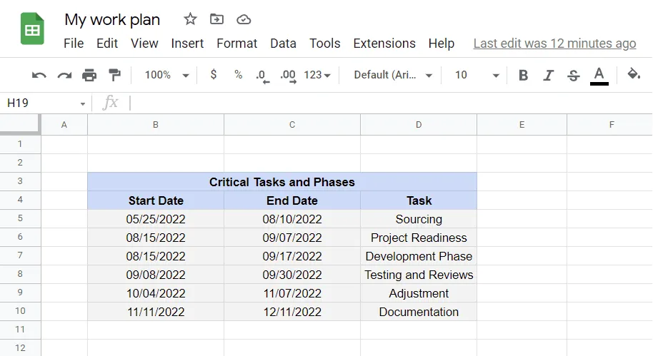
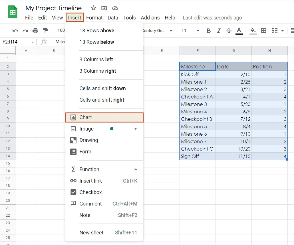
1. Organize schedule data in a table.
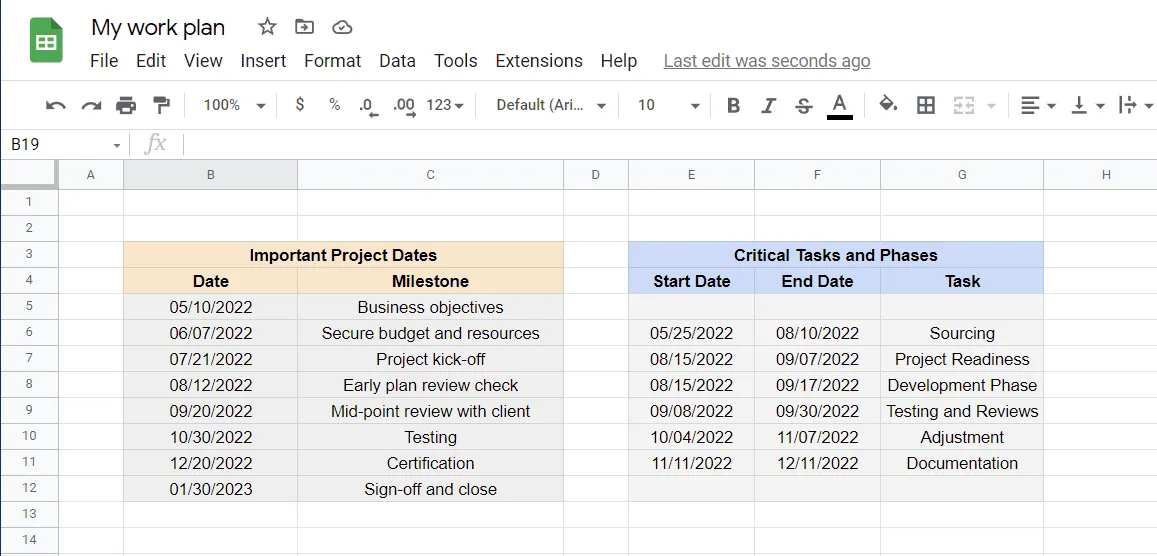
Set up your Google project management spreadsheet by building a table for your project schedule. As shown below, it should include the description of your tasks or phases and the start and finish date for each of them.
2. Add task duration table.
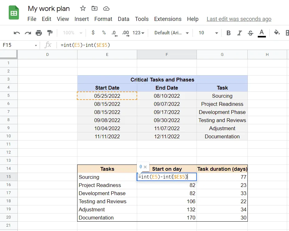
Add a second table underneath. The purpose of this table will be to calculate the intervals in days (duration) between the start date and the finish date. These intervals will be used to build your Gantt chart. The 3 columns in this table will reflect the 3 columns in your original table. Set it up like this:
a) The first column will be your task descriptions copied exactly from your original table. In our new table, we called them “Tasks”. To copy them from your original project schedule with a formula, in the first cell of your new table type “=” and then click on the cell with the title of your project description in the original table. You can repeat or simply drag the corner of this cell downward and your formula will be copied for each of your task descriptions.
b) We called our second column “Start on day.” Basically, this column figures out the day into the project each of your tasks will begin on. So, the first/earliest task will obviously start on day 0. To calculate this column, use the following Google spreadsheet formula as shown below: =int(E5)-int($E$5) and in the cell beneath =int(E6)-int($E$5). This formula translates into: This Task's Start Date – The First Task's Start Date (in our example, cell B5). See more Google Sheets formulas to choose the one that best suits your project data.
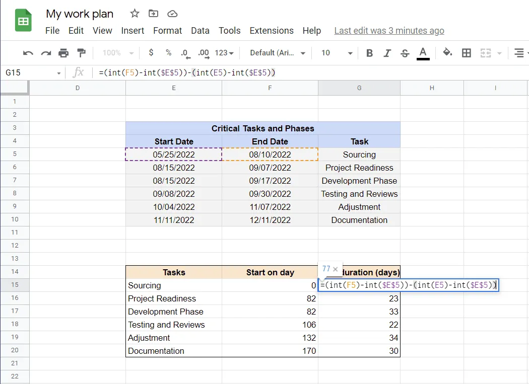
c) We called our third column “Task duration (days)”. In this column, Google Sheets figures out how many days each of your project's tasks will go on for. In our example, the first task, Sourcing, will last for 77 days. Calculate this for each of your tasks using this Google spreadsheet formula as shown below: =(int(F5)-int($E$5))-(int(E5)-int($E$5)) and in the cell beneath =(int(F6)-int($E$5))-(int(E6)-int($E$5)). This formula translates into: (This task’s End Date – The first task’s Start Date) – (This task’s Start Date – The first task’s Start Date) = Task duration.
3. Insert a Stacked bar chart.
Click in the corner of your new table and select all the data in it. Navigate to Insert on the Google Sheets ribbon and select Chart from the drop-down menu. Google Sheets automatically inserts the Stacked bar chart type of chart, which is exactly what we need here.
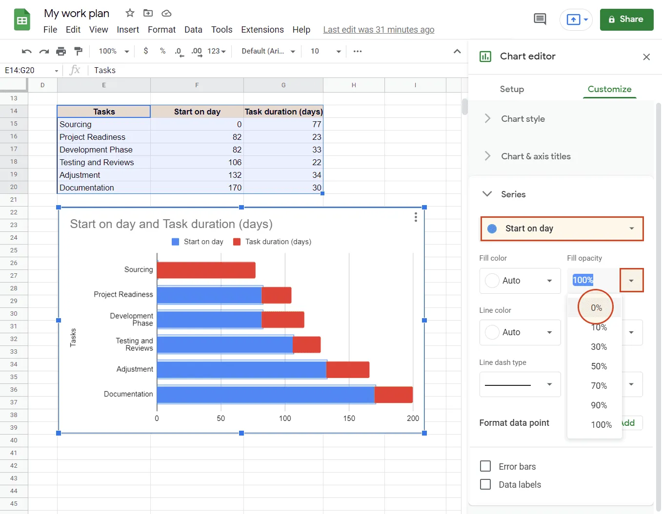
4. Change chart bar appearance.
Now, double-click on any of the "Start on day" bars on your chart (the blue ones, in our case). This will open the Series section in the Chart editor menu. Open the drop-down under Fill opacity by clicking the arrow next to “100%” and select “0%”.
5. Customize your Gantt chart.
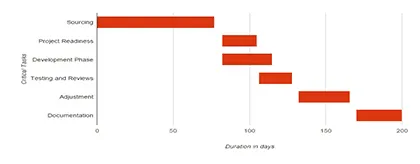
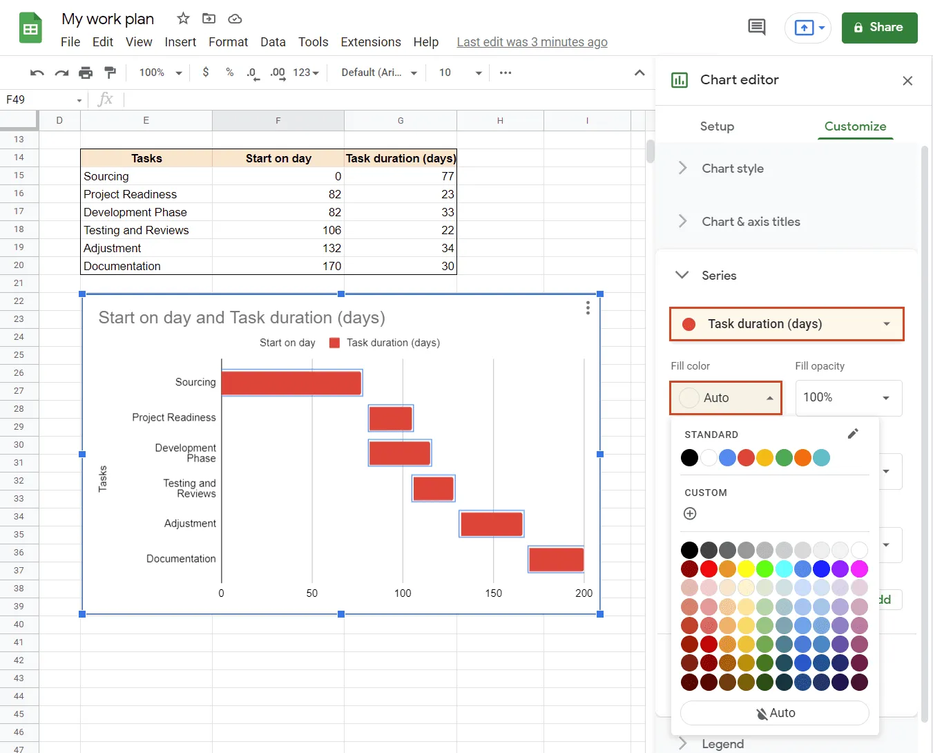
Once you have created your chart, you can customize any items as you like. For instance, you can rename the chart, change or add horizontal and vertical axis titles, and make other customizations by right-clicking anywhere on the graphic and accessing Chart editor. To change the bar color, double-click on any of the "Task duration (days)" bars (the red ones, in our case). This will open the Series section in the Chart editor menu. Open the drop-down under Fill color by clicking the arrow next to “Auto” and select the color you want to use.
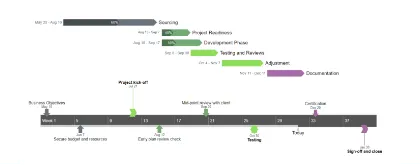
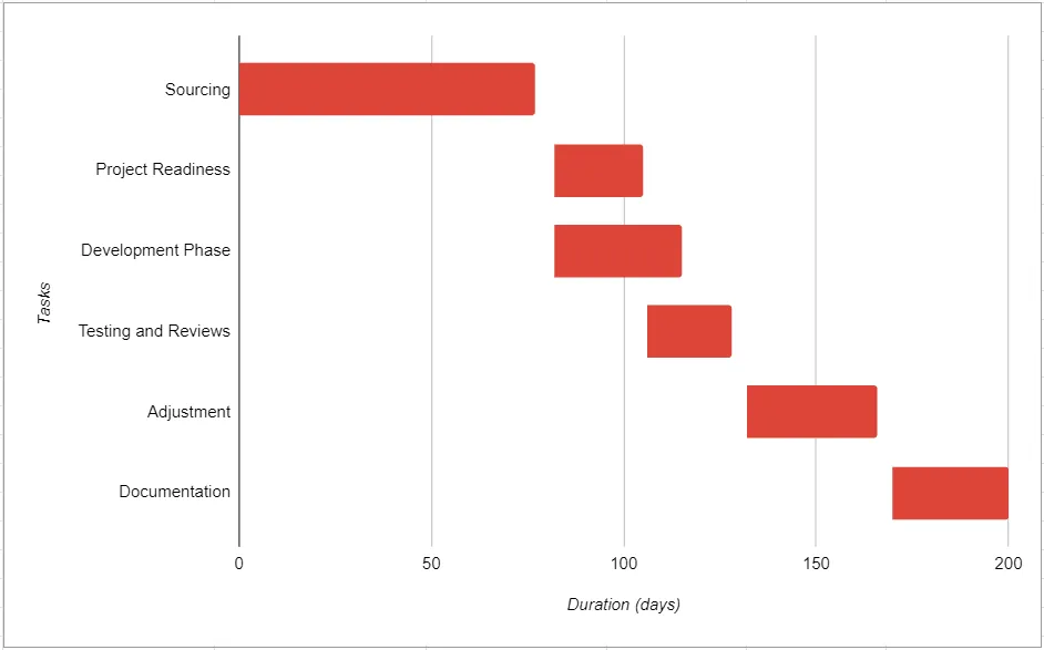
And here’s how our Google Sheets Gantt chart looks like after some customization (removed the chart title, added a title to the horizontal axis and changed the vertical axis title):
Make a Gantt chart automatically with Office Timeline Online
With an online Gantt chart creator like Office Timeline Online, you can instantly convert your project data into an impressive visual that can be used for project management purposes, such as client meetings or stakeholder reviews. With this tool, you can easily update or restyle your Gantt chart for your project presentations.
To begin, open the free Gantt chart maker in your browser and follow the steps below. For advanced features like downloading or exporting your timeline, you will need the premium version of Office Timeline Online.
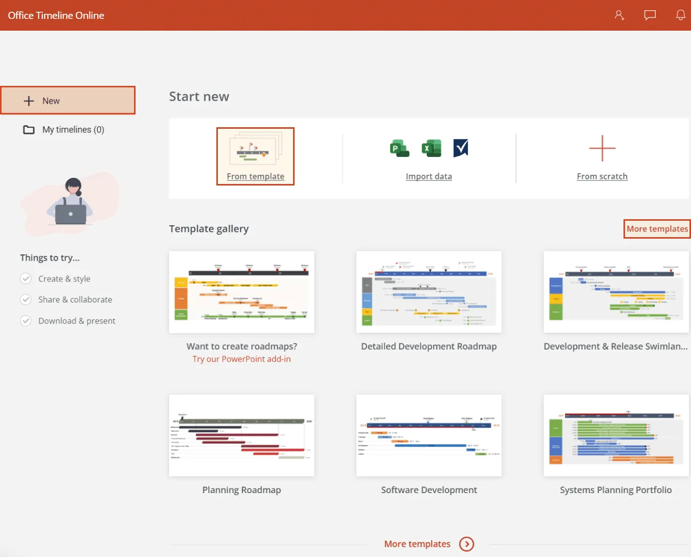
1. Create a new file.
From the New section in Office timeline Online select one of the various templates provided or click on Timeline from scratch to start your Gantt chart. For this example, we will be using the "Project Overview" template.
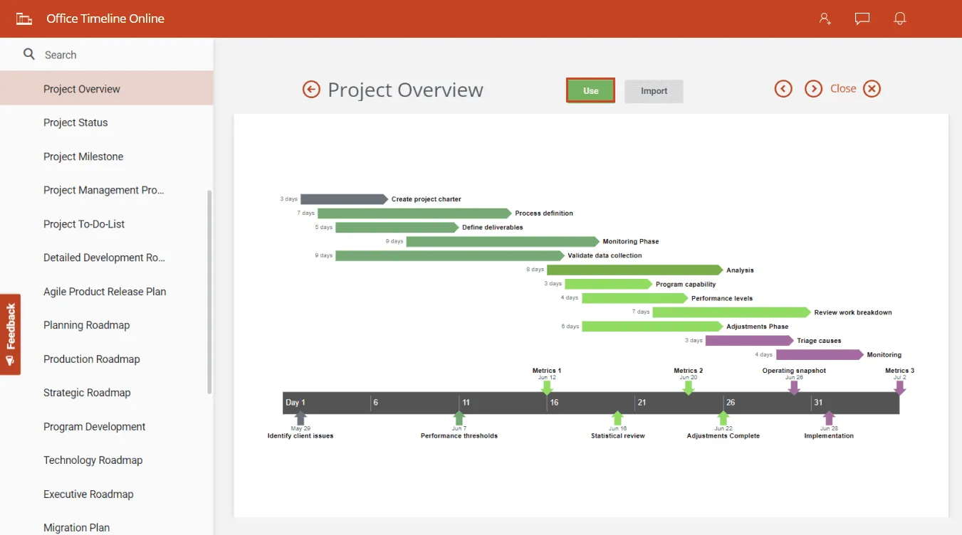
2. Select a template.
Once you click on a template, the web app will open a large preview of it with a menu that lets you browse through all the other designs. If you're happy with the template chosen, click on the Use button to go to the Data View, where you can add or edit data.
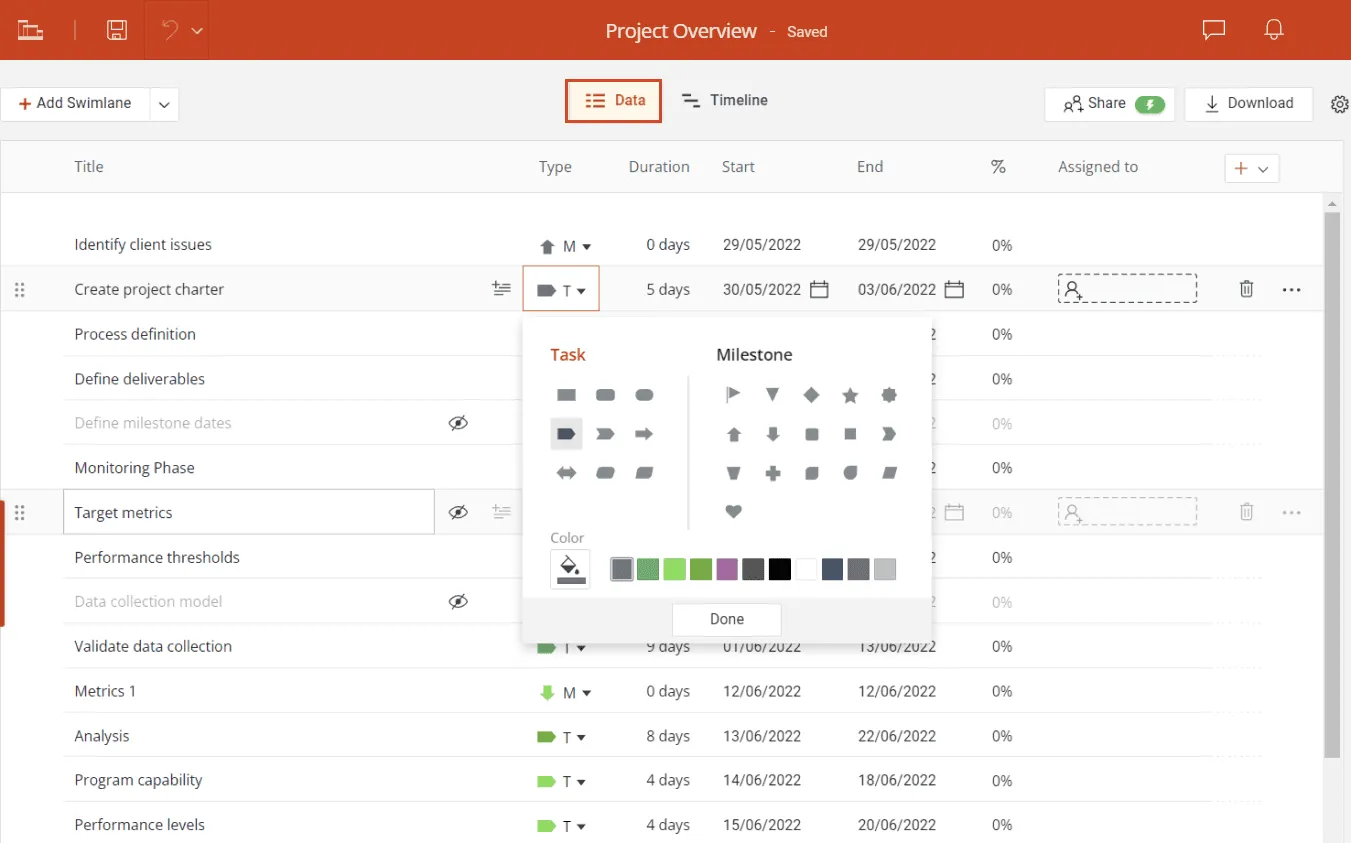
3. Replace data.
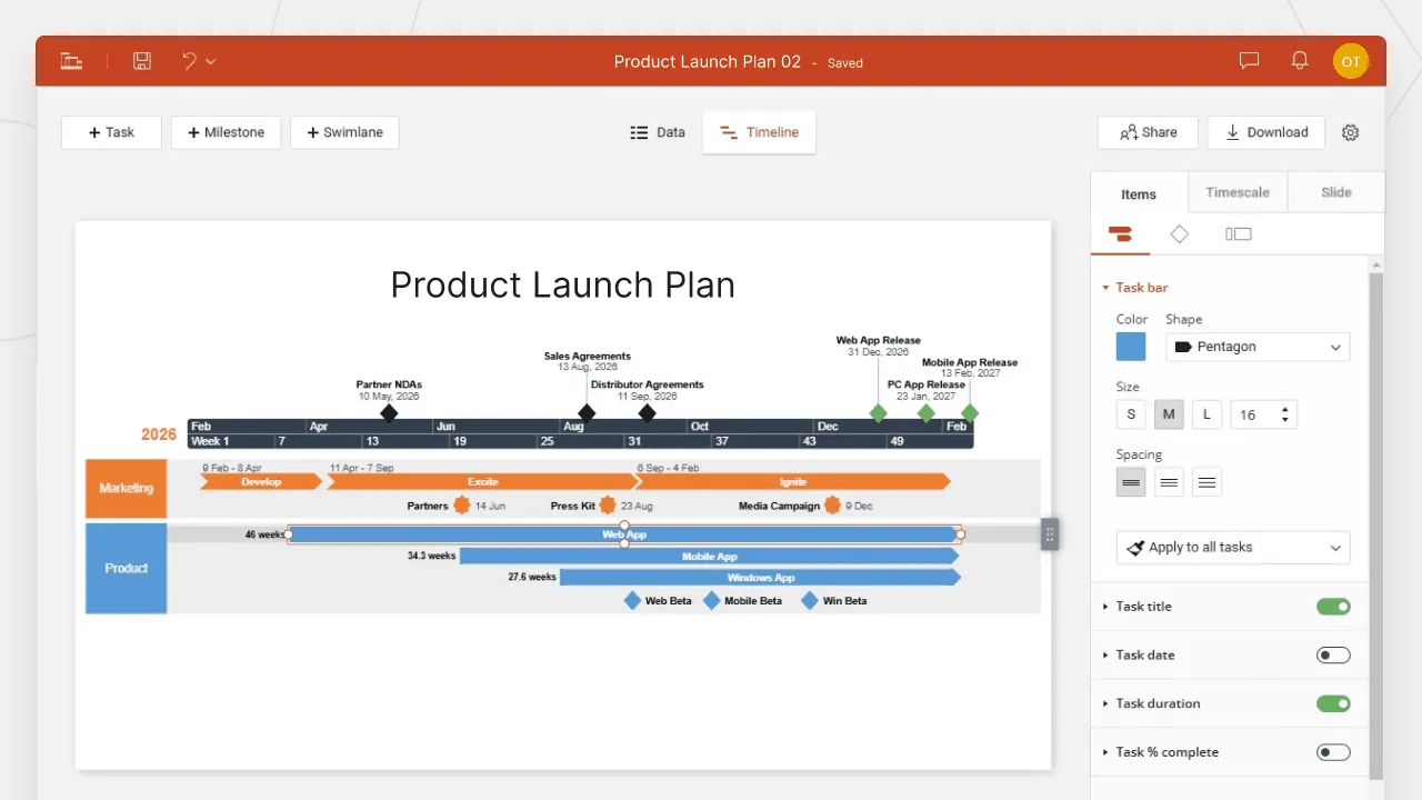
In the Data tab, replace the template's data with your own tasks (T) and dates. You can add milestones (M) too or make some quick styling choices here, such changing task shapes and colors. As you edit items, you'll notice that Office Timeline updates your Gantt chart in real time and displays a live preview of it on the right. When ready, click on that preview or on the Timeline tab to go to the Timeline View, where you can customize every detail on your Gantt chart.
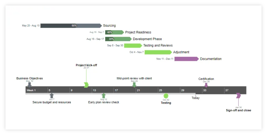
4. Customize your Gantt chart.
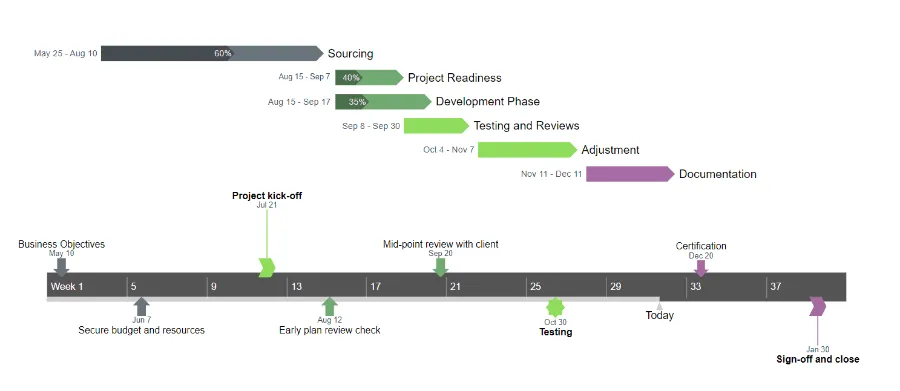
The Timeline View is where the real magic happens. Here you can personalize everything with a few clicks – you can instantly change any font, color, shape, position or date format, or add extra details such as Today's Date or Elapsed Time. In our final Gantt chart below, you can see we've played with different milestone sizes and shapes, formatted fonts, and switched on the Percent Complete indicator for tasks.
With a free Office Timeline Online account, your Gantt chart will be automatically saved in the cloud, so you can access and update it easily whenever needed. Drag & drop tasks and milestones in Timeline View to adjust their dates on the fly, or use the Data View to edit, add or remove items effortlessly.
When ready to present your Gantt chart, if you have the premium version, you can download it as a .png image or as a native PowerPoint slide with all objects fully editable.
FAQ about making Gantt charts in Google Sheets
This section provides answers to the most frequently asked questions on making a Gantt chart in Google Sheets.
Although there are no purpose-built Gantt chart makers from Google, here are a few alternatives to Gantt chart creation using Google:
- DIY Gantt charts in Google Sheets (see steps above);
- third-party apps or add-ins in Google Workspace Marketplace – but these will incur some expenses, although some of them offer free trials;
- code that offers you a solution to make Gantt charts; if you have coding skills, check this out to learn more.
For easier, automated Gantt chart solutions that help you create professional level visuals, you can check also the free online Gantt chart maker from Office Timeline.
Google Sheets is a great tool for simple spreadsheets or charts that do not require automation or flexible adjustments and views. We have found a very basic, manual Gantt chart template in Google Sheets. It can be used for simple Gantt charts, but you’ll need to do a lot of manual customization. If you’re looking for more sophisticated, easily adjustable, automated Gantt chart solutions, that are more suitable for professional use, try Office Timeline Online, the free online Gantt chart generator.
You can find a Gantt chart template in Google Sheets if you follow these steps:
- Access Google Sheets at docs.google.com/spreadsheets;
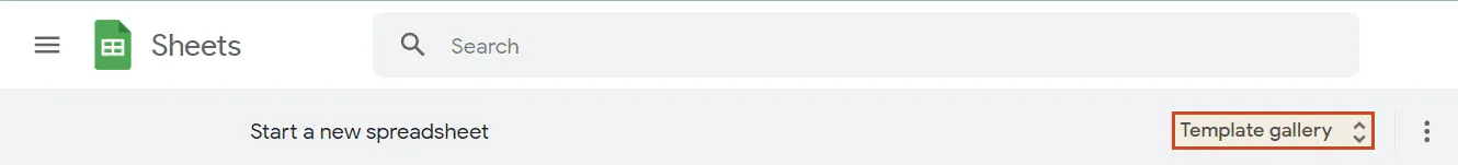
- Click on Template gallery on the right to search for the template you need;
- Scroll down to the Project management section and click on Gantt chart.
OR
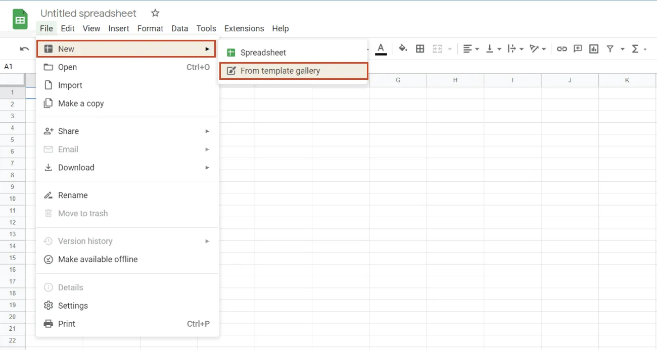
- Access Google Sheets at docs.google.com/spreadsheets and start a new spreadsheet (click on the “+” sign above “Blank”);
- Go to File > New > From template gallery;
- Scroll down to the Project management section and click on Gantt chart.
Google Sheets offers a great, free alternative to creating Gantt charts in Excel or project management software.
Here are the basic steps to follow to manually make a Gantt chart in Google Sheets:
- Organize schedule data in a table.
- Add a second table that calculates start day and duration from the first set of data.
- Insert a Stacked bar chart based on the second table.
- Change chart bar appearance and turn it into a Gantt chart.
- Customize your Gantt chart - rename, change chart bar colors, etc.
See the detailed steps above.
However, Google Sheets is not that great with complex projects and you have to manually update your sheet to show progress. These are downsides that could make you look for a better solution for your needs. You can automate your work and jump-start productivity with Office Timeline Online, the free free online Gantt chart tool that helps you achieve more and raise the bar from confusing, hard-to-follow charts to clear, professional visuals.