The psychology of presentations: getting your point across
Creating effective presentations can be difficult. Use these tips to grab attention and ensure the audience will easily grasp and recall essential data.


Have you ever attended a bad presentation? I have, and they seem to be endless and boring regardless of how interesting the subject may have been. I can think of several meetings where I was presented with eye-straining slides, or slides created from blocks of pasted text.
In these types of presentations, I find it hard to stay focused on what the host is saying and, unfortunately, struggle to retain the information they were trying to communicate.
Any presenter’s primary goal is for their audience to pay attention, easily understand the data being communicated, and leave the room remembering the main points. Thanks to the extensive research available on human psychology, memory and attention, presenters can take advantage of scientifically based techniques to create more compelling and effective presentations.
Tips to help beginner product managers ace their presentations
From capturing the audience’s attention to raising retention levels, the following research-backed tips will help professionals deliver more effective presentations:
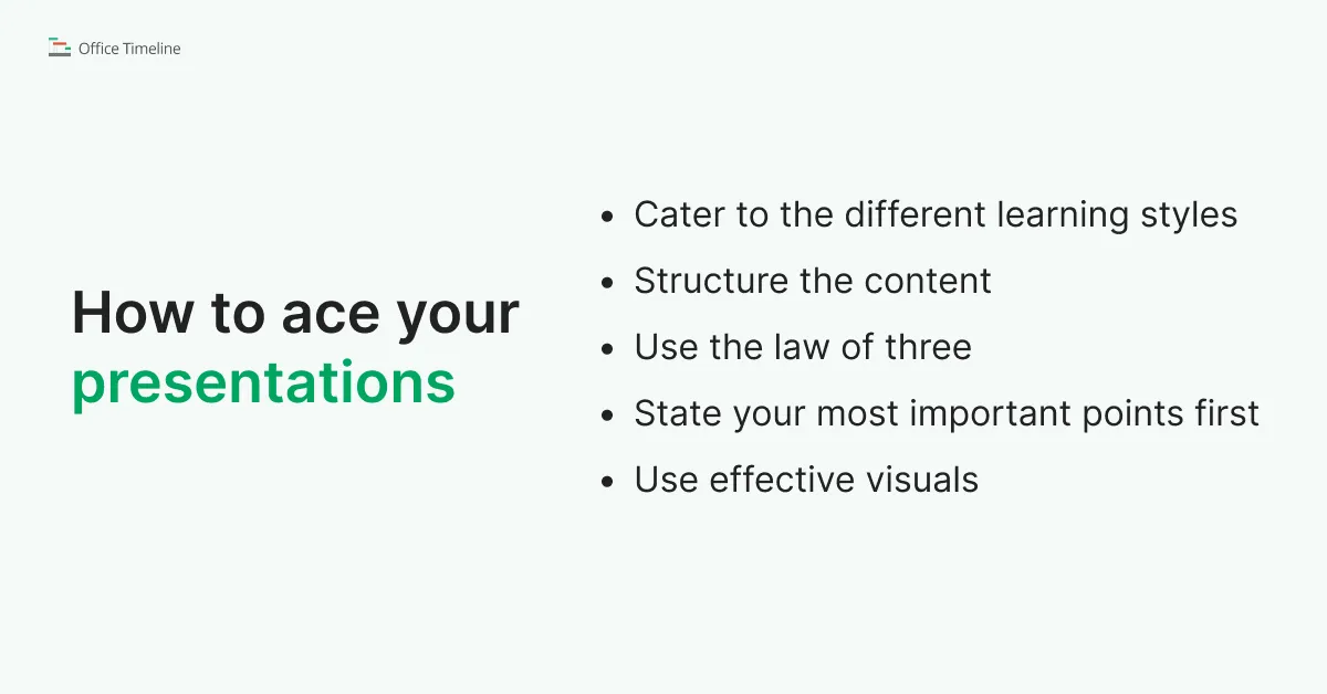
Cater to the different learning styles
Psychologists, teachers, trainers and leaders often use a theory of learning called the VAK model to help people concentrate on and process information more effectively. According to the VAK theory, an individual’s dominant learning style can be either visual, auditory or kinesthetic.
- Auditory learners absorb information best through words and sounds. Varying vocal pitch, tone, volume and pace to avoid monotony or emphasize important ideas can be an effective approach when addressing this type of audiences. In addition, well-placed pauses can add tension, spark curiosity, or give the participants time to process new concepts.
- Visual learners respond best to graphs, mind maps, charts, pictures and any other illustrations. Using facial expressions, gestures and other visual cues while speaking can also be effective.
- Kinesthetic learners retain new concepts most effectively through experience – moving, doing, touching, sharing. Inviting them to share their opinions or integrating various activities into the presentation will help keep kinesthetic audiences focused and improve retention levels.
Since an audience usually comprises a mix of the different types of learners, the safest approach when planning a presentation is to cater to all learning styles. However, in some instances, it can be a good idea to favor one sensory channel over the others. For example, when presenting to a team of illustrators or designers, emphasizing visual communication will ensure a better response from the audience.
Structure the content
Research shows that structured information is 40% easier to retain than data conveyed in a freeform manner. To ensure clarity and higher retention levels, professionals can rely on a variety of effective presentation structures, including:
- Problem – Solution – Benefit: good for motivating or persuading the audience
- Cause – Effect: recommended for helping the audience understand the logic behind the presenter’s position
- Comparison (differences and similarities): effective in highlighting the relative advantages of a specific approach to a problem
- Chronological: best for reporting or stepping the audience through a process.
Use the law of three
What do the Three Little Pigs, the slogan of the French Republic, and the famous Latin phrase “Veni, vidi, vici” have in common? It’s that they all come in threes – and there may be a reason behind it.
The law of three is one of the oldest writing and rhetoric principles, dating back to Aristotle. It suggests that groups or lists of three items are more effective, more “satisfying”, and easier to remember than any other numbers. The rule is used extensively in literature (particularly fairytales), public speaking, marketing, music, theater, the movie industry, and even religion – it is all around us. But why is the number 3 so powerful?
The answer may lie in the way our brains are wired. Humans’ pattern recognition capability is superior to any other species’ and it is one of the most important features supporting information processing, language and imagination. The human brain loves patterns – the simpler they are, the easier they’ll be to process and remember.
Three is the smallest number required to make a pattern, and this is why triads are so effective when it comes to data retention. Therefore, reducing a presentation to three main points or structuring ideas as triads will make it easier for the audience to focus and remember the information presented.
State your most important points first
According to research, people tend to remember the first and last items in a series considerably better than those in the middle of the sequence. This cognitive bias is called “serial position effect” and can have quite an impact on the effectiveness of a presentation. Therefore, a good approach to ensure higher data retention is to:
- Present the most important points first
- Use the middle of the presentation to expand them
- Restate the key points in the conclusion.
Use effective visuals
Numerous studies have demonstrated that images, graphs and pictures are more likely to grab attention and be remembered than words. Adding visuals to a presentation can, therefore, be one of the most valuable ways for professionals to ensure they get their point across – as long as they are used wisely.
Here are a few tips on how to use visuals for more impactful presentations:
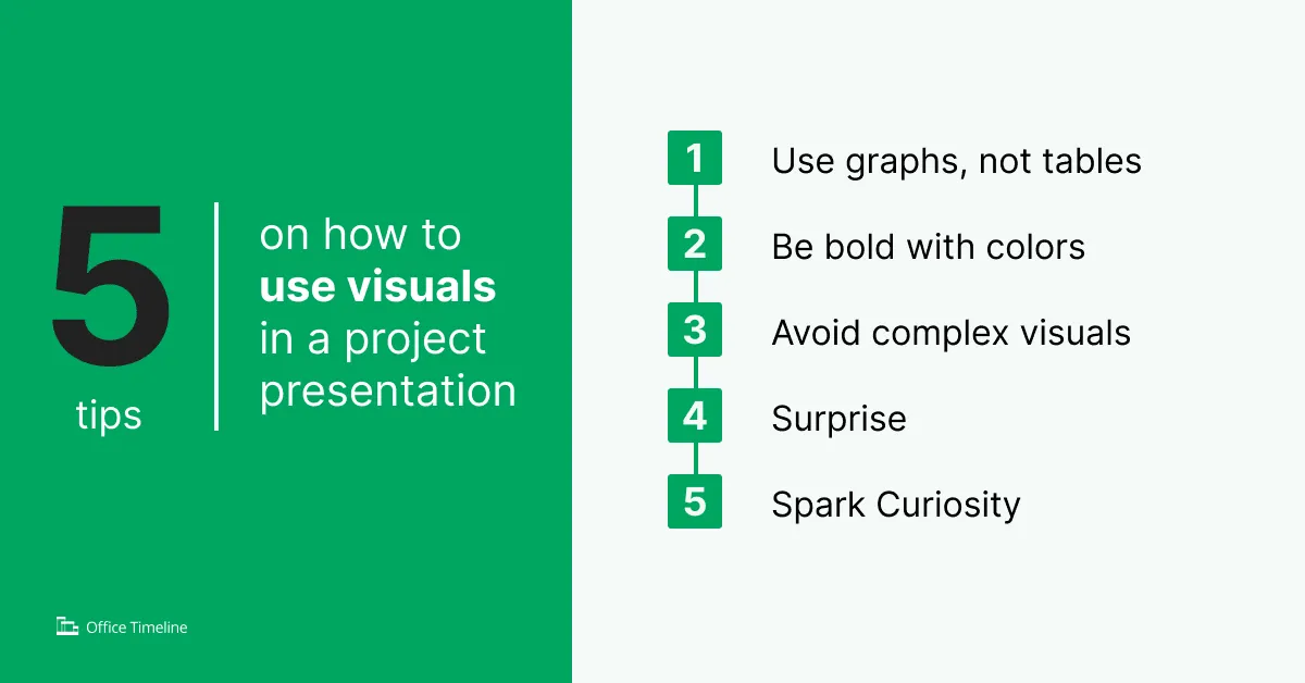
1. Use graphs, not tables
Moin Syed, PhD, psychology professor at the University of Minnesota, recommends converting words and numbers into graphs and diagrams rather than tables. Tables require detailed reading and focus, so they are not ideal for extracting essential data quickly. A well designed chart, on the other hand, can help the audience get the big picture much faster.
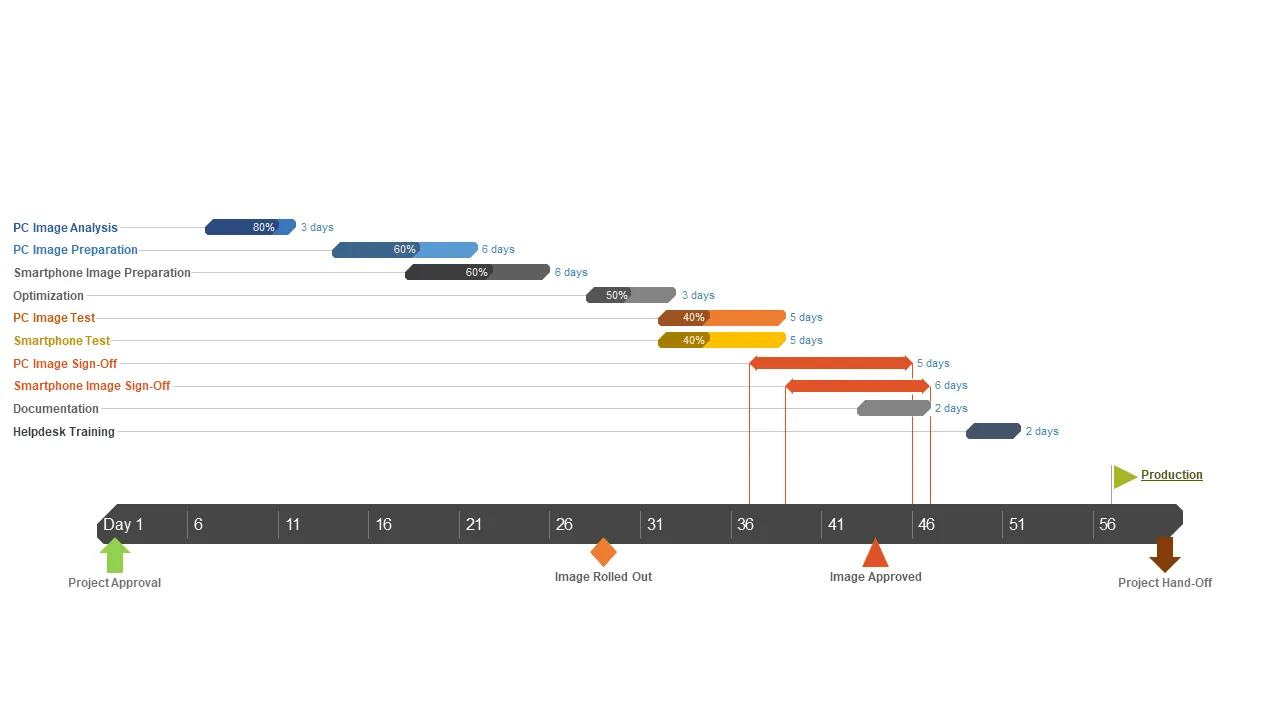
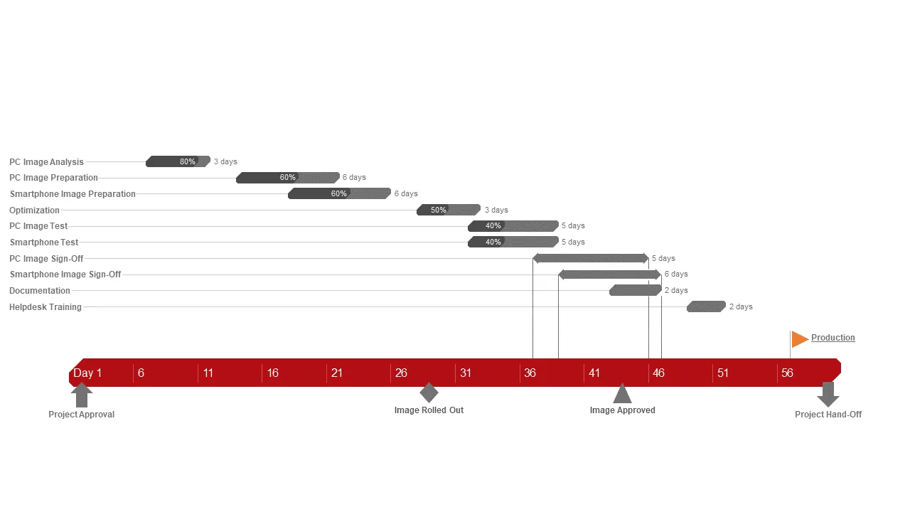
2. Be bold with colors
A recent IEEE study has shown that images comprising 7 or more colors are more memorable than visuals with 2 to 6 colors. As a result, a colorful project plan such as the one below, for instance, can ensure the project team or stakeholders will find the information presented easy to grasp and remember.
On the other hand, the second image may seem more businesslike, but will most likely not have the same impact on the audience.
3. Avoid complex visuals
Research published in the Journal of Neuroscience has revealed that visual and auditory senses share a limited neural resource. This means that focusing on complex images can reduce the brain’s capacity to process sounds.
Consequently, when a presentation includes particularly demanding visuals, the audience will not merely ignore the presenter’s voice – they will actually fail to hear it in the first place. Practicing simple designs in presentations will reduce the cognitive load on the audience and ensure both the visual data and the speaker’s voice can get through to the participants.
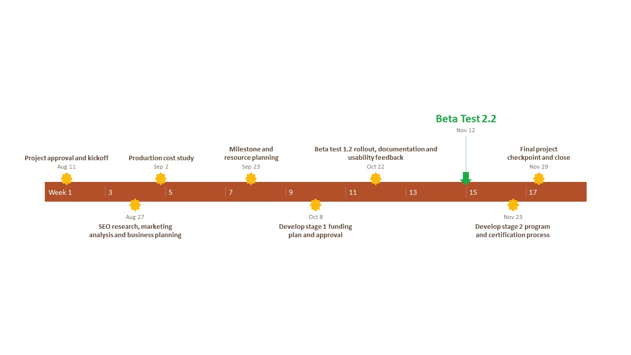
4. Surprise
Psychological studies on human memory have shown that a notably different item in a series of otherwise similar items will be more easily recalled than the others. This cognitive bias is known as the von Restorff effect and can be used to deliver more effective presentations. When creating graphs, charts and other visuals, professionals can tweak colors, sizes and shapes to add an element of surprise and steer the audience’s focus to the most important details.
For instance, in the image below, “Beta Test 2.2” clearly stands out and will most likely be recalled better than the other milestones on the timeline.
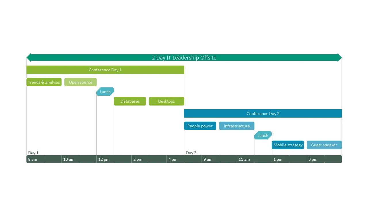
5. Spark curiosity
There is a psychological phenomenon called the curiosity gap that has been used extensively in online marketing (e.g. clickbait titles) and can be very effective in PowerPoint presentations as well. According to research, people learn better when they are curious about an answer.
In addition, the increased dopamine activity while in a state of curiosity also improves their long-term memory. Presenting seemingly incomplete visuals and revealing the missing data gradually will make the audience curious about the omitted details and, therefore, ensure a higher retention level.
For example, in the schedule presented below, viewers can see that there are two events programmed after lunch, but, initially, there is no data about what they entail. When the information is revealed in the second image, due to the curiosity gap created, the audience will be more likely to remember the Mobile strategy meeting and the guest speaker programmed in the afternoon.

Conclusion
The tips above are just some of the many techniques experienced presenters use to get their point across successfully. Understanding the way the human mind works, what grabs attention and what supports learning and memory can help professionals create more powerful presentations, regardless of topic or purpose.
Key points to remember
- Adapting a presentation to the audience’s dominant learning style can considerably improve information processing.
- Structure, patterns, and the order in which ideas are presented play a big role in data retention.
- Well thought-out visuals will make important data easily distinguishable and more memorable
Tim is Co-Founder & CEO of Office Timeline, a Seattle-based start-up that aims to rid the world of boring, uninspiring meetings.
Turn project data into professional timelines
Get the advanced features of Office Timeline free for 14 days.