How to use colors to create more powerful Gantt Charts
Use colors to add impact and highlight meaning in your Gantt charts. Learn practical tips with examples.

Last updated on March 6, 2024
Are you paying enough attention to the colors you’re using in your Gantt charts? Project managers often work hours on end to build accurate, thorough Gantt charts, only to notice that stakeholders have difficulties digesting this level of detail or that the team members are unclear about their roles and responsibilities.
The problem in such situations may not necessarily be the message, but the way it is presented. Gantt charts are useful tools for project planning, tracking and reporting, but they can often be overly complex, making them difficult for audiences to understand.
This is why, when putting together Gantt chart presentations, paying attention to design and colors is equally important as ensuring data accuracy. A simple, well-designed layout can help project managers successfully communicate essential information to teams, clients and execs.
Add meaning to project visuals using color semantics
Marketing and graphic design professionals rely massively on aesthetics to influence brand perception and consumer behavior. Similarly, project managers can use color semantics to add further meaning to Gantt chart data, inspire desired reactions, and transmit important messages instantly, without overcrowding the visual. Although color perception largely depends on personal experience, there are certain hues that have a universal significance.
The RAG (Red, Amber Green) color scheme has been widely used in various industries and contexts to indicate different levels of status or priority.
What is the RAG (Red, Amber Green) color scheme
The RAG color scheme originates from the traffic light system, where red signifies critical issues, amber indicates caution or attention required, and green represents satisfactory progress or completion. Because of its simplicity and effectiveness at conveying information, this approach has been applied to a range of sectors including project management, risk assessment and performance reporting.
Variations of the RAG (Red, Amber, Green) include:
- RAGS (Red, Amber, Green, Silver): Adds a “silver” or gray category to indicate tasks that are on hold or pending further action.
- RAGB (Red, Amber, Green, Blue): Incorporates blue alongside the traditional RAG colors, often used to represent additional information or milestones.
- RAGC (Red, Amber, Green, Cyan): Replaces blue with cyan for a slightly different visual distinction for task statuses.
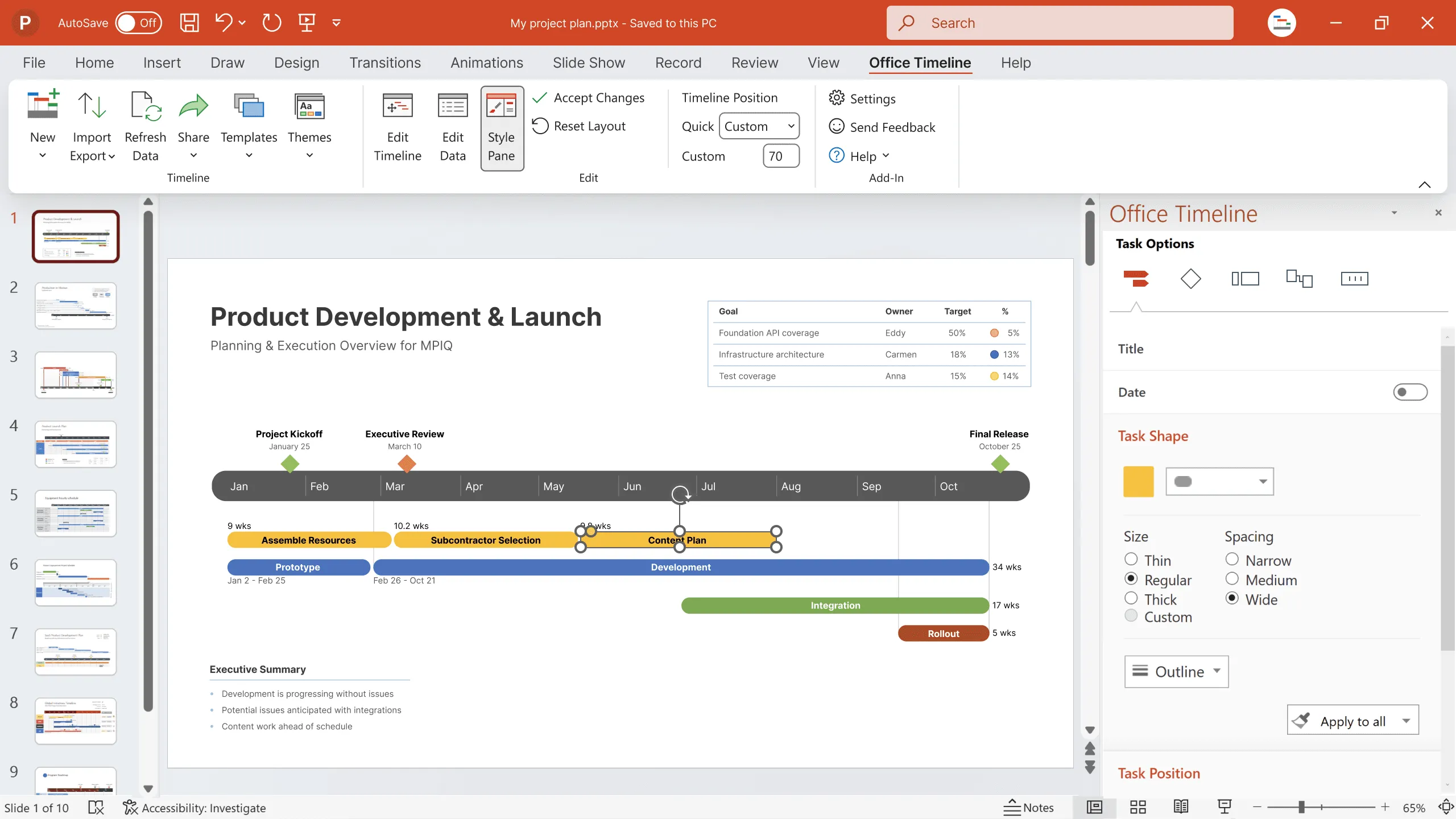
Here is an example of color-coding tasks in a Gantt chart:
- Red: attention-grabbing color that indicates alert, urgency or danger, stop; can be used to flag urgent, high-priority or problematic tasks.
- Green: inspires optimism and typically suggests the idea of “Safe”, “OK” or “Go ahead”. For example, tasks that are on track, tasks that have been completed successfully or planned activities approved by upper management could be marked with this color.
- Amber or Yellow: stands for caution or warning and can be used to illustrate potential challenges or medium-priority tasks.
Other colors commonly used in task coding are:
- Blue: may denote supplementary information or milestones. At the same time, it is a calming color and can also be used for tasks that are completed or very close to completion.
- Black: is often used to outline and label tasks, but it also suggests mystery and could make a good choice for tasks that require further clarification. It can also be a controversial choice, as many interpret it as having a negative connotation, signaling that the items marked black need rescuing or are lost/”dead”.
The following image illustrates just one of the ways the above color semantics can be used to make Gantt charts more meaningful:

While this example is a good starting point, as project managers you can create your own systems of color meanings, as long as they are applied consistently throughout project visuals and are easily recognizable by all stakeholders.
Use colors to depict hierarchies and correspondences
An effective Gantt chart should enable audiences to understand any data dependencies or correspondences at a glance. One of the best ways to achieve this is using colors to group objects. For instance, color-coding team members who have similar responsibilities will allow viewers to instantly see the connection between them.

Similarly, PMs can use colors to group together related tasks, for a faster comprehension of project processes and dependencies:

Aesthetics also play an important role in highlighting data priority. A color ranking that doesn’t represent the information hierarchy may steer the audience’s attention to less important project details. To avoid this, PMs can accentuate priority data – such as main project tasks – using bold hues, while secondary details, such as subtasks, can be marked with lighter, more subtle shades of the same color.

Add contrast to enhance visibility
Of course, we are all trying to create elegant Gantt charts, but these efforts may prove pointless if data is not presented clearly, in an easy-to-understand way. Good color contrast will help audiences to discern important texts or visual elements.
For instance, adding a standard black text over a dark blue task bar will most likely make the writing barely legible. Changing the text to white, on the other hand, will make the data easily stand out – as seen in the image below.

Last but not least, context and communication channels are also important aspects PMs should keep in mind when creating Gantt charts and other project visuals. For instance, while certain color combinations may seem just right on a certain computer screen, they may not look the same on others, on projectors or in print.
Also, some viewers may suffer from vision impairments, and bad lighting and glare can make a chart’s details even more difficult to read. A high color contrast within project visuals will prevent these issues and ensure important data can be easily seen by the audience, regardless of circumstances.
Conclusion
Seemingly minor details can play a major role in ensuring effective project communication. Using colors to define semantics, highlight information hierarchy or dependencies, and improve visibility can help PMs build more powerful Gantt charts and present important data in a convincing, straightforward manner.
One useful tool that helps project managers build easy-to-understand, beautiful project visuals is Office Timeline, an add-in for PowerPoint that comes with impressive customization options and professionally designed templates. To see what Office Timeline can do for your Gantt chart presentations, download and install the free 14-day trial and take it for a spin.
Frequently asked questions about using colors in Gantt charts:
Ready to find out more? Read the answers to questions that people frequently ask about using colors in Gantt charts:
When selecting colors for a Gantt diagram, use a distinct color scheme to provide clear visual clues for task status and importance, and to help quickly understand what is being done or has been completed previously. Emphasize important tasks, markers, or deadlines with more vivid or bold tones to focus notice. The colors that work best for a Gantt chart are those that are easily distinguishable from each other and have a universal significance. A good example is using the classic RAG color scheme (Red, Amber, Green):
• Red usually represents critical deadlines to consider and yellow for milestones.
• Amber usually signifies caution or that a task is approaching a critical status. It serves as an intermediary between red and green, indicating that a task may require attention or is in a transitional state.
• Green denotes tasks that are in progress, on track.
A Gantt chart “looks better” when it effectively communicates information such as the schedule of a project plan and presents it in a clear yet compelling manner. There are some simple things that you can do to make a Gantt chart look better:
1. Start with a clean design and avoid clutter and confusion. This will allow viewers to effortlessly navigate the chart.
2. Select fonts that are legible and consistent throughout, ensuring readability across different devices and printouts.
3. When opting for a color scheme, aim for a balanced palette where distinctions between tasks and categories are perceptible even for those with visual impairments.
4. Make use of visual cues such as bold colors or different shapes to highlight important tasks, milestones, or deadlines, guiding stakeholders’ focus to key aspects of the project schedule.
Using different colors in a Gantt chart helps to show the different parts of a project in a clear and simple way. Each color corresponds to a different task or category, which means that you can quickly look and see what is going on at a glance. By using different colors, the chart also reveals the state of tasks, such as whether they are complete or still ongoing.
In a Gantt chart, color coding helps show important details about tasks, like their status or priority. For example, red might mean a task is overdue, amber could show it’s at risk of delay, and green could mean it’s on track. This makes it easy for everyone to understand how the project is going without reading lots of details. Here’s how you do it:
1. Identify categories: Determine which aspects of tasks you want to represent with color, such as status (e.g., complete, in progress, not started), priority, or task type.
2. Choose colors: Select visually distinct colors that will effectively represent each category. Ensure the colors are visually appealing and easy to differentiate.
3. Assign meanings: Match each category with a corresponding color. For example, you might use green for completed tasks, yellow for in-progress tasks, and red for overdue tasks.
4. Ensure consistency: Keep colors consistent throughout the chart.
Yes, in a Gantt chart colors matter. They are visual indicators to help you make out each element of the project and synthesize it at a glance. With different colors representing different functions, categories, statuses or importance levels, it is easier for stakeholders to understand the chart quickly and correctly. Effective use of colors enhances the clarity and readability of the chart.
The colors that you choose in a Gantt chart are important as well, as there are colors with specific meanings that everyone understands. For instance, green often signifies tasks that are complete or on track, while red typically indicates tasks that are overdue or critical.
Generally, it’s best to use ten colors or fewer to avoid confusion. If you use too many colors, it becomes hard to tell them apart. Make sure the colors for each group are different. Also, think about colorblindness and make sure the colors are clear for viewers who are colorblind.
Tim is Co-Founder & CEO of Office Timeline, a Seattle-based start-up that aims to rid the world of boring, uninspiring meetings.
Turn project data into professional timelines
Get the advanced features of Office Timeline free for 14 days.