Best examples of timelines, Gantt charts, and roadmaps for the Healthcare sector
Engage stakeholders and drive change in the healthcare sector with powerful Gantt charts, timelines, and roadmaps made with Office Timeline.

As a result of the pandemic bringing the complexity of the global medical systems under a bright spotlight, the healthcare industry is currently undergoing an accelerated digital transformation meant to build resilience and provide more accurate, affordable, and personalized patient care.
Apart from designing and implementing innovative technologies to optimize patient diagnosis and treatment, projects in the healthcare industry range from setting up new medical facilities to conducting research studies and creating comprehensive recovery plans. All these initiatives combined aim to drive better patient outcomes at a local and national level.
Nevertheless, project plans in the healthcare sector have a habit of becoming complex quite easily. When this happens, tracking progress and communicating it to stakeholders becomes a matter of untangling bits of information coming from multiple people and different platforms.
Fortunately, there’s a better way to make sense of that data and get a bird’s eye view of your projects — enter the well-crafted, clear, convincing project timelines or roadmaps.
Who said that presenting information visually enhances clarity and engagement and speeds us comprehension wasn’t lying. To show you the benefits of project visuals in action, we’ve prepared 3 examples of Gantt charts, timelines, and roadmaps designed to help you manage your projects efficiently and deliver high-quality healthcare services.
Plus, you can download any of these PowerPoint slides whenever you have an important project coming up and customize them using the Office Timeline free trial.
Best examples of project visuals for the Healthcare sector
1. Hospital construction Gantt chart
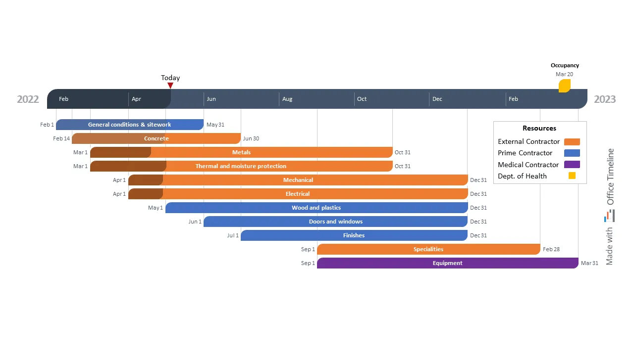
Gabriel is a Clinical Facilities Planning manager at a regional hospital in Canada, where he oversees projects concerning the design, construction, installation, and renovation of all the hospital facilities and systems on campus.
As the hospital management decided on building a new hospital wing to provide additional capacity for better and faster patient care, Gabriel was asked to create a high-level Gantt chart that summarized the duration of the project and the resources required to complete it.
He tested plenty of tools that were difficult to use or produced visuals that lacked the simple yet professional look and feel he was going for. However, in his search, Gabriel stumbled upon a tutorial from Office Timeline that caught his attention.
His previous experiences made him skeptical — could this add-in be as simple and elegant as advertized? So he put this tool to the test as well. By the time Gabriel finished the Gantt chart, he was already thinking about how much the stakeholders would appreciate the easy-to-read, uncluttered layout of the hospital construction plan.
It took him less than 10 minutes to add the major tasks on the visual and assign colors to mark which resources were necessary. Even displaying dates and connectors was a task he settled in a matter of seconds thanks to a simple switch of a button.
The Style Pane, which was intuitive to use, was Gabriel’s favorite since it did all the heavy lifting when it came to design. He customized the Gantt chart by adding a key milestone — the date when the new hospital wing is expected to receive its first patients — directly on the timeband.
Moreover, Gabriel used the elapsed time feature in combination with the “Today” marker and the percent complete option to visually track the project’s progress status up until the moment of the meeting. He finished off by adding a legend with the help of the in-built PowerPoint controls.
It’s been almost four months since Gabriel started managing this construction project and the chart has proven to be a key element in coordinating his efforts with architects and engineers and updating the board of directors on the completion timeframe.
2. Knee surgery recovery plan
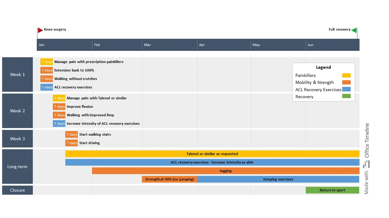
As the Head of the Physical Therapy department at a healthcare center, Beatrice has years of experience helping patients recover after medical interventions.
An important part of her job is creating and managing recovery plans for common surgical procedures, yet she’s been struggling for a long time with finding the right way to present this information in an easily digestible format.
Like many professionals out there, Beatrice went on LinkedIn and asked her network for advice and tool recommendations. While some of the comments on her post mentioned tools she’d already tried and found a bit too much to handle, there were a few people who had only good things to say about a PowerPoint add-in she hadn’t heard about.
Office Timeline seemed like the perfect tool since it integrated with the presentation app that everyone knows. But did it have the functionality she needed to put together beautiful one-slide roadmaps that guided her patients on their journey to regaining full mobility?
So Beatrice set out to create a 6-month recovery roadmap for a routine knee surgery, from the day of the operation until full recovery, using the new tool. It didn’t take much for her to fall in love with the add-in’s ease of use and highly customizable visuals.
She first added the major steps so that patients know what to expect and when, then she grouped these steps into swimlanes to divide the recovery schedule into phases. To help patients distinguish between different types of tasks more quickly, Beatrice color-coded each activity type and included a legend on the top right corner.
After she added the last finishing touches, she saved this roadmap as a custom template to use later on for her other patients and share it with her colleagues. This way, both she and the other physical therapists in the department can save time by customizing the roadmap she made with Office Timeline to match each patient’s recovery journey and keep them motivated as they slowly get back to their normal life.
3. Healthcare study project timeline
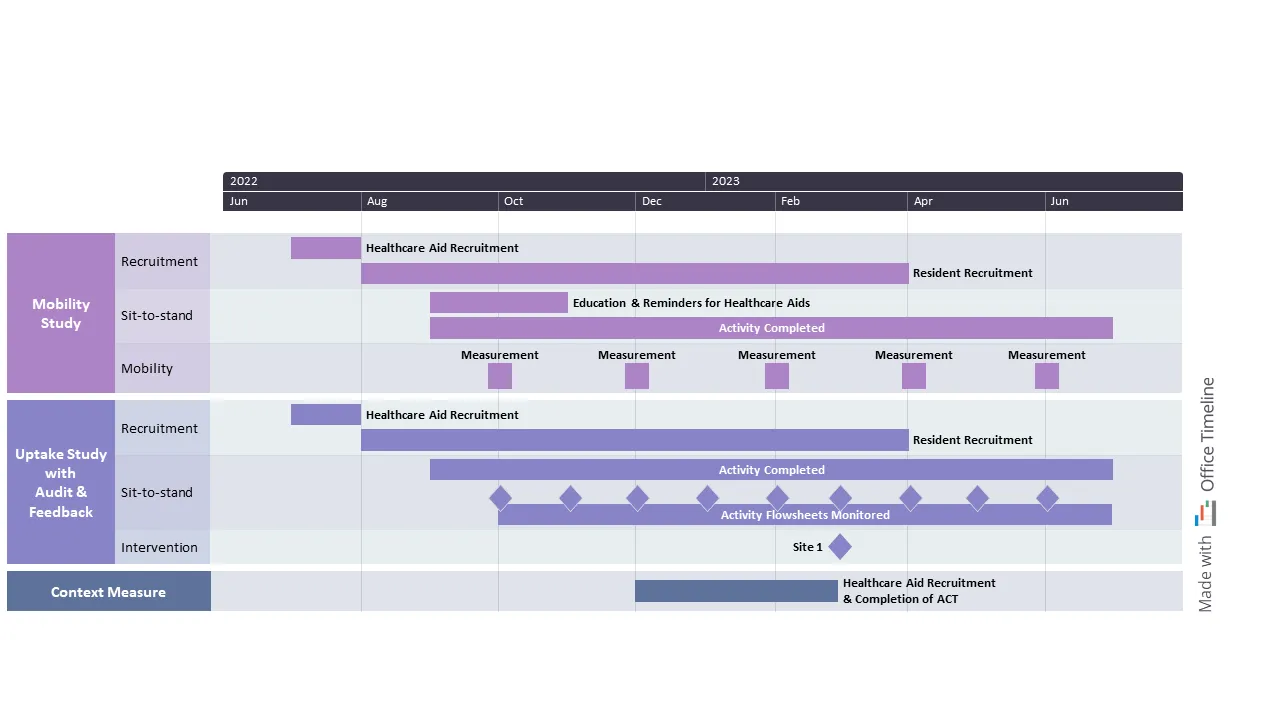
Carolina is a senior researcher at the Faculty of Nursing and leads a program on improving the quality of geriatric care and ensuring healthy aging for patients over 65 years old. As part of this program, she’s doing a pilot study on optimizing the mobility of nursing home residents in her area.
As she was organizing the data in her reports, she couldn’t help but feel that something was missing. That’s when she realized that including a clear visual illustrating the project timeline and work plan for each study component would be a great way to offer anyone reading her study an easy-to-follow (and nice to look at) overview of the entire research process.
Not in the mood to try a new app, Carolina tried to create the timeline in Excel. After all, she’d used this tool throughout her years as a student to build different types of diagrams. However, when she looked at that first boring version of the visual, she knew it was far from what she had in mind.
Thinking that her Excel skills just needed an upgrade, Carolina did a quick search on Google for “how to make a timeline in Excel”. That’s when she found the Office Timeline add-in for PowerPoint and learned that this was a better option than Excel for creating the impactful project timeline she needed.
Excited by the idea, she started creating the timeline in PowerPoint with the help of the newly discovered tool. Surprisingly, it went down way more smoothly than Carolina had expected. The video tutorials helped, surely, but the Office Timeline add-in had to be among the most user-friendly apps she’d ever tried.
After she built a timeband to illustrate the study’s duration in years and months, she added swimlanes for each component and sub-swimlanes for each sub-component. With a couple of clicks, every key task and milestone had their own place on the visual. To make sure each element on the slide was exactly as she wanted it to be, she kept experimenting with a variety of shapes and colors until she was happy with how everything looked.
Carolina included the finished project timeline in her regular reports to sponsoring institutions and in the articles she published in scientific journals. Since the visual’s layout looked more professional than the standard diagrams other researchers included in their work, Carolina’s research caught the attention of influential people in her community.
Turn complex data into powerful project visuals with Office Timeline
Whether you are a medical practitinioner, researcher, or contractor working on projects in the healthcare industry, the Office Timeline tool can help you transform project plans into engaging presentations that enhance collaboration and communication with relevant stakeholders.
Already have an Office Timeline Pro+ subscription? Check out our extensive collection of timeline templates, roadmap templates, and Gantt chart templates and find the inspiration you need for your project visuals. If you’re not sure yet if our tool is the best choice for you, you can install the Office Timeline free trial on your device and have a look around.
Project management tips and tricks
Tagged With:
Examples by industryTurn project data into professional timelines
Get the advanced features of Office Timeline free for 14 days.