Top timelines, Gantt charts, and roadmaps examples for the Finance industry
Learn how to turn financial information into beautiful, clutter-free project visuals that engage executives, clients, and investors with Office Timeline.

People in the finance industry deal with numbers on a daily basis. However, when it comes to meetings and presentations, a spreadsheet full of numbers on a slide is not so easy on the eyes.
If politely stifled yawns, glazed over eyes, and a swarm of questions that go off the track sounds familiar to you, your project or program report presentations are missing something.
Whether you’re a manager, consultant, or c-suite executive, making financial information easy to understand and act on should be a top priority. Especially if you want to hold your stakeholders’ attention and streamline the decision-making process.
The easiest way to do this is by turning data into attractive, digestible visuals that help you get the point across. Enter Gantt charts, timelines, and roadmaps, the unsung heroes of project management that fight against information overload.
Take a look at the 4 examples of project visuals and use cases we’ve put together below and learn more about the power of data visualization in finance. Want to include a visual in your next project meeting and see for yourself what it can do? Download the PowerPoint slides for free and use the Office Timeline 14-day trial to customize them based on your project needs.
Top project visuals examples for the Finance industry
1. Investment organization build-out plan
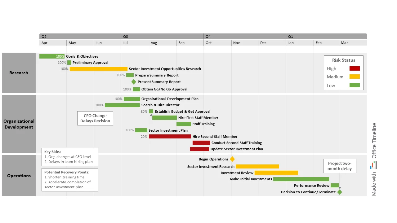
What Selena enjoys most about her job as a financial consultant is guiding clients on their journey from drafting the action plan to completing the final stage and reviewing the results. Right now, she’s helping a client build a new financial services organization of highly-skilled professionals meant to serve a new investor market.
After hearing about Office Timeline from a colleague, Selena decides to put the tool to the test by creating a visual plan for her new project. Half an hour later, all the required steps, including background market research, hiring procedures, and training, stand neatly displayed on just one slide.
Selena reviews the plan together with executives and HR managers from the client side in weekly meetings, highlighting which deliverables are ahead of schedule or behind. After each such session, she can’t help but feel genuinely grateful for having this roadmap to help her keep stakeholders updated on progress.
While the swimlanes allow everyone to visualize the major project phases, the color-coding of tasks by risk level (red, amber, green) helps them identify and mitigate risks before they become roadblocks.
Moreover, the percent complete function enables Selena to show how close a task is to completion. This way, managers and executives can quickly see if things go as planned or if there are any delays they need to handle. She also leverages the rest of the PowerPoint slide to add text boxes with notes on key risks and potential solutions and mark critical issues.
Above all, the visual helped her visualize how the change of the CFO would impact the rest of the tasks and come up with a viable solution to make up for lost time, which in this case was to shorten the training period.
After the project ended, Selena realized that if it hadn’t been for the visual plan she created with the Office Timeline tool, she wouldn’t have succeeded in keeping the work on track.
2. Initial Public Offering (IPO) schedule
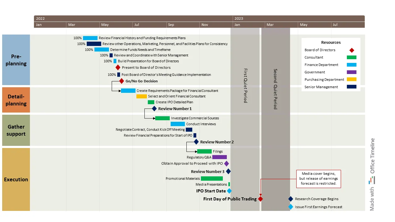
Patrick is the CFO of a tech company from New York that is planning to evaluate and complete an initial public offering on the US stock exchange in the next year. The IPO is a significant milestone for the organization, so if they want to raise enough capital to achieve their goals, they will need a clear schedule that organizes all their efforts.
With so many tools for project management visuals available online but little time to learn the ins and outs, Patrick decides to go with the one he feels most familiar with, Microsoft’s popular presentation software PowerPoint. So he starts building the IPO timeline with Office Timeline, a tool that not only integrates with his trusty PowerPoint but also comes with an intuitive drag & drop editor.
First, Patrick groups the IPO tasks into four main phases illustrated through swimlanes. He then color-codes the tasks, making it easier to identify deliverables by the responsible team. Also, he adds percent complete to keep an eye on progress and spot any delays.
The rest of the PowerPoint controls allow him to add the finishing touches to his slide: a comment box with useful notes, two blocks marking the regulatory quiet periods that restrict information flow to analysts and investors, and a couple of connectors linking key decision points in the IPO to subsequent phases.
The IPO process can make or break a business but having the schedule on hand puts Patrick’s mind at ease and allows him and the other executive-level board members to prioritize resources and meet SEC requirements.
3. Venture Capital (VC) portfolio timeline
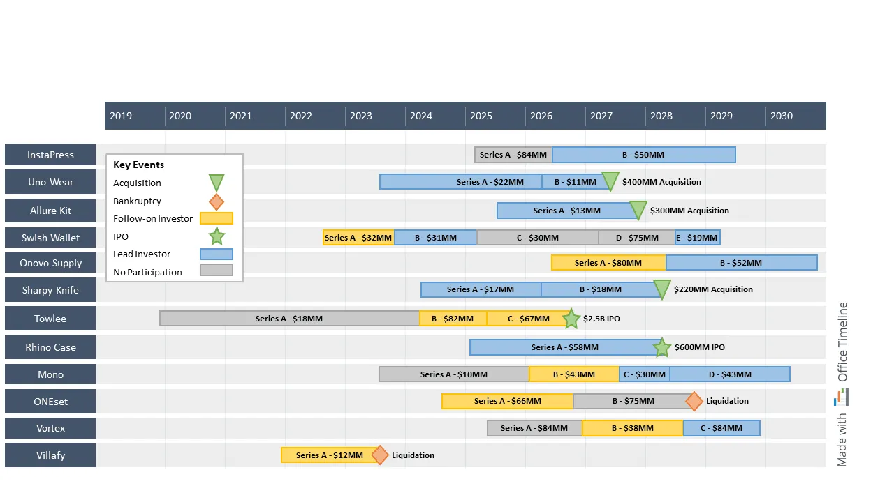
As the investment manager of a US venture capital firm, Nicolas is responsible for the firm’s investment portfolio performance. Lately, he’s noticed that his regular meetings with the board where they discuss their investments have been dragging. In other words, they seem to lose themselves in extra clarifications.
Convinced that visuals could bring much-needed clarity to their discussions, Nicolas used the Office Timeline tool to put together a timeline. The visual underlined the capital raise rounds for each company, the degree of VC involvement, and the liquidity event for each portfolio firm.
He first created swimlanes for each company, grouping related investment events into a single row on the timeline. Then he used the task titles to add details like the investment round (Series A, B, C) and the amount of capital raised.
By color-coding the investment events, Nicolas showed whether the VC fund was a lead investor, a follower, or did not participate. Also, the milestones he added displayed whether a liquidity event came in the form of an acquisition, IPO, or bankruptcy filing/asset sale.
The flexible timescale, which could be customized to span across many years, helped Nicolas put the investments into perspective. Plus, he could effortlessly update the timeline to match the evolution of the portfolio companies when necessary.
In the following months, Nicolas’ portfolio timeline shifted the pace of the board meetings and provided investors with an easy-to-follow history of capital infusion across portfolio companies. As a result, they were able to make better decisions that ultimately contributed to an increase in the value of their investments.
4. Bank branch expansion program schedule
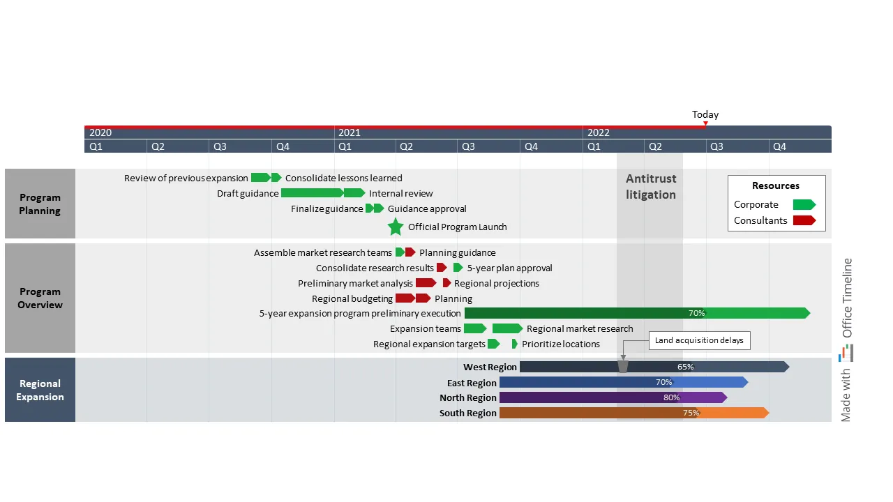
Laura is an operations manager at a national bank. She’s currently in charge of the expansion of the retail banking division into new regions, which means that preparing a program summary over a three-year fiscal period for her busy bank executives is at the top of her To-Do list.
Fortunately, Laura has just the tool for this mighty task. Life as a manager has long taught her never to underestimate the power of a high-level Gantt chart when it comes to beautifully summarizing data. So it’s not the first time Office Timeline has come in handy.
Laura sets the timescale in fiscal years to align with the institution’s financial reporting requirements with a few clicks. She then adds three swimlanes that organize program deliverables by implementation phases and uses color codes to mark which team is responsible for each task.
Extras like percent complete and the Today marker make it easy for her to report on the progress made across tasks up until the moment of the meeting. Plus, the PowerPoint shapes built manually by Laura show the antitrust lawsuit that temporarily delayed regional land acquisition.
Naturally, Laura’s program schedule made a good impression. It also enabled executives to get a quick overview of the program timeline, assess potential risks, and track progress from one stage to the next.
Visualize financial data effortlessly with Office Timeline
Having access to valuable financial information and communicating it are two different things. Nevertheless, both are equally important in helping leaders make informed decisions.
If you enjoyed the examples in this article, we invite you to download them for free and have a look at our collection of professional-looking roadmap templates, timeline templates, and Gantt chart templates. Start customizing your favorite template or create a new one from scratch by downloading the Office Timeline free trial.
Project management tips and tricks
Tagged With:
Examples by industryTurn project data into professional timelines
Get the advanced features of Office Timeline free for 14 days.