Gantt chart 101 – Part 5: What makes the Gantt chart different from other project management charts?
Discover the differences between Gantt charts and other popular project diagrams. Create amazing project presentations with our easy-to-use Gantt chart software.

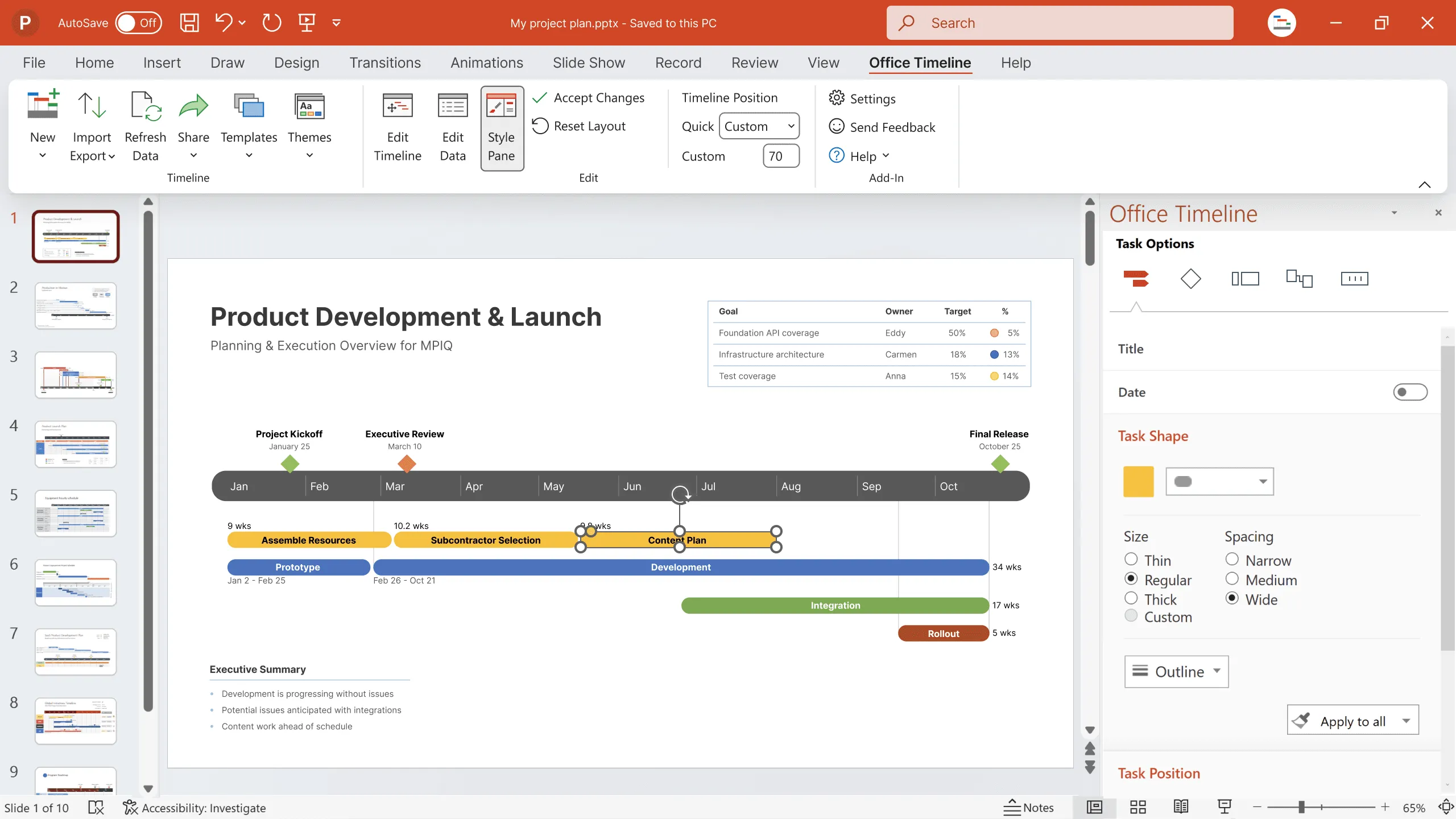
A must-have in the project management essentials toolkit, the Gantt chart is a bar chart that allows you to organize and keep track of project phases, tasks, and milestones and get a complete overview of your project’s schedule at a glance.
What we love most about Gantt charts is their easy-to-follow format, which makes it a breeze to present regular progress updates to executives and clients and turn project data into valuable insights for review meetings.
Pair that with modern Gantt chart software that offers pre-designed professional Gantt chart templates you can quickly customize to fit your project needs and you’ve got yourself the golden ticket to first-class PowerPoint presentations.
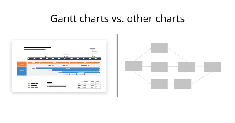
But how do you know a Gantt chart is what you need in the first place? Why not choose a PERT chart or a network diagram instead? When it comes to Gantt chart alternatives, there are many other powerful visual tools you can use to plan, manage, and monitor projects. Each type of diagram comes with its advantages and limitations and, most importantly, a different way of presenting project data.
To help you make the right choice, we’ve dedicated this section of our Gantt chart 101 series to highlighting the key differences between Gantt charts and three popular project tools—PERT charts, CPM charts, and network diagrams.
Top 3 alternatives to Gantt charts: Main differences and when to use them
While all these visual tools help managers stay on time and on budget in terms of project delivery, each one has a distinct purpose and unique way of visually organizing project tasks.
1. Gantt chart vs. PERT chart
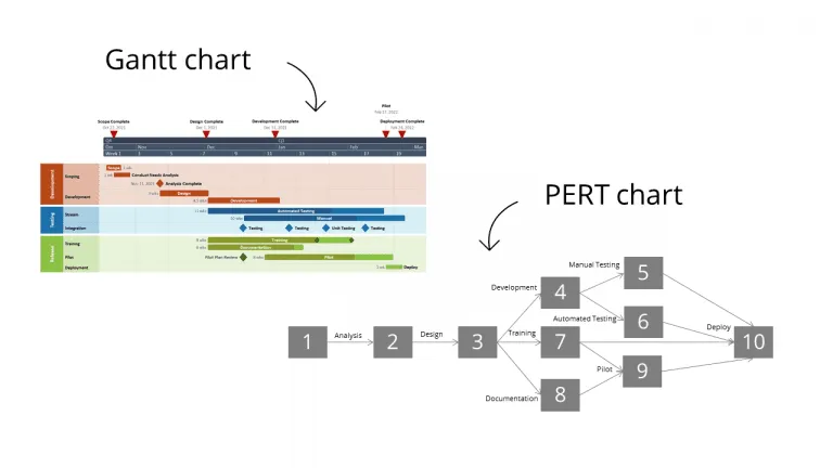
The Program Evaluation Review Technique or PERT provides a high-level visual representation of a project’s timeline while identifying dependencies between tasks.
Unlike the Gantt chart that has a horizontal axis representing the project’s timeframe and a vertical axis where tasks and their durations are illustrated with colorful bars, the PERT chart uses a network diagram with numbered circles or boxes for project events/milestones (nodes), directional arrows for task dependencies, and divergent arrows for concurrent tasks.
Due to their format that’s hard to keep updated and difficult to interpret, PERT charts are best used in the planning phase to determine the tasks, activities, and resources required for project completion, uncover the critical path, and estimate both task duration and the overall duration of a project.
Meanwhile, the Gantt chart is crucial when creating the project schedule, tracking how work progresses throughout the project lifecycle, and generating easy-to-read visuals for the executive team.
2. Gantt chart vs. CPM chart
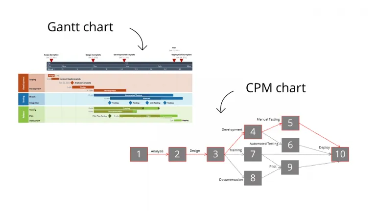
The critical path method (CPM) allows you to map out those key tasks necessary to complete a project successfully. The critical path is the longest sequence of project activities that have to be finished to meet your final deadline. Any delay for the tasks on the critical path will push back the delivery date.
Compared to the Gantt chart, which displays a project’s schedule using task bars against a timeline, the CPM chart uses a network diagram with linked task boxes to represent the critical and non-critical paths.
Also, while the Gantt chart provides you with an overview of how a project progresses and highlights milestones and important deadlines, the CPM chart helps you calculate project duration based on time estimates for each individual task and prioritize crucial activities to keep work on the right track.
In short, as opposed to the CPM that can help you uncover crucial task dependencies and make accurate time estimations, the Gantt chart is an excellent tool for scheduling tasks, managing projects, and tracking progress from one stage of the project to another.
3. Gantt chart vs. Network diagram
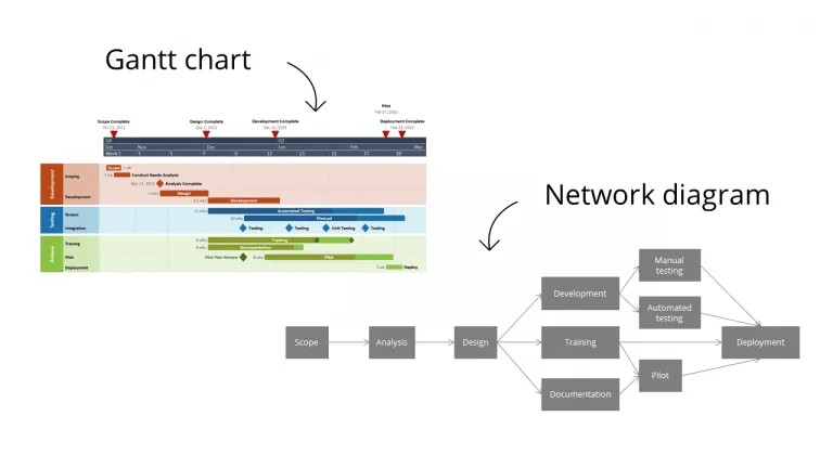
Network diagrams are similar to PERT charts in that they too illustrate a project’s sequential workflow with the help of nodes and arrows. Their structure is more simplistic than a Gantt chart, which uses timescales, task bars, milestones, and swimlanes to visually represent a project’s schedule.
Managers will often use a network diagram in the initial planning phase to get a high-level overview of project tasks and dependencies, determine the critical path, and estimate a project’s duration. Moreover, network diagrams are a great tool for determining the order in which tasks should be performed and if they can be completed simultaneously.
Nevertheless, network diagrams can’t capture progress the way Gantt charts do and they can be challenging to understand when used for more complex projects. That’s why a Gantt chart is option number one when it comes to scheduling tasks, marking essential milestones, assigning resources, and keeping an eye on how things are going from the start of the project until the end.
Create dynamic project visuals with our Gantt chart maker
While each project diagram has its own strengths and purpose, the Gantt chart remains the best choice in terms of ease of use, ability to turn complex project data into engaging visuals, and time required to update. And that’s mostly thanks to Gantt chart makers such as the Office Timeline Add-in.
Here’s what you can expect from using our Gantt chart tool:
- Turn even the most complex projects into easy-to-follow project visuals with the user-friendly drag & drop interface
- Save time by customizing ready-made Gantt chart templates covering a variety of popular business scenarios
- Visualize multi-project portfolios and balance long-term and short-term organizational goals in one PowerPoint slide with sub-swimlanes and multiple timescales
- Impress clients, executives, and other stakeholders with five-start presentations built in just a couple of minutes
Ready to Gantt chart your way to project success? Simply go and install the Office Timeline free trial version on your computer.
Project management tips and tricks
Tagged With:
Gantt chart 101Turn project data into professional timelines
Get the advanced features of Office Timeline free for 14 days.