Timelines show events in chronological order so you can see when things happened and how they connect. In this article, we'll look at horizontal timelines, the most common type where events flow from left to right across the page.
You'll learn what makes them work, when to use them, and how to create one that tells your story clearly. This article is part of our collection on types of timelines, which explores different ways to visualize your history, projects, and important moments.
What is a horizontal timeline?
A horizontal timeline is a visual representation of events arranged along a horizontal axis, typically from left to right, showing how things progress over time. Earlier events appear on the left, with later events positioned toward the right. This layout follows the natural reading direction in many languages, making it intuitive for most viewers.
Think of a horizontal timeline as a straight path where each step represents a moment in time. For example:
- A horizontal timeline could show the steps involved in baking a cake, from gathering ingredients to the finished dessert.
- A timeline horizontal format might display major battles during World War II, arranged from 1939 to 1945.
The simplicity of the horizontal format makes these timelines accessible and easy to understand at a glance.
Horizontal timelines work best when you need to display a clear sequence of events, track company growth, or show project phases. They're especially effective for presentations, reports, and visual storytelling where you want viewers to quickly grasp the flow of history or development.
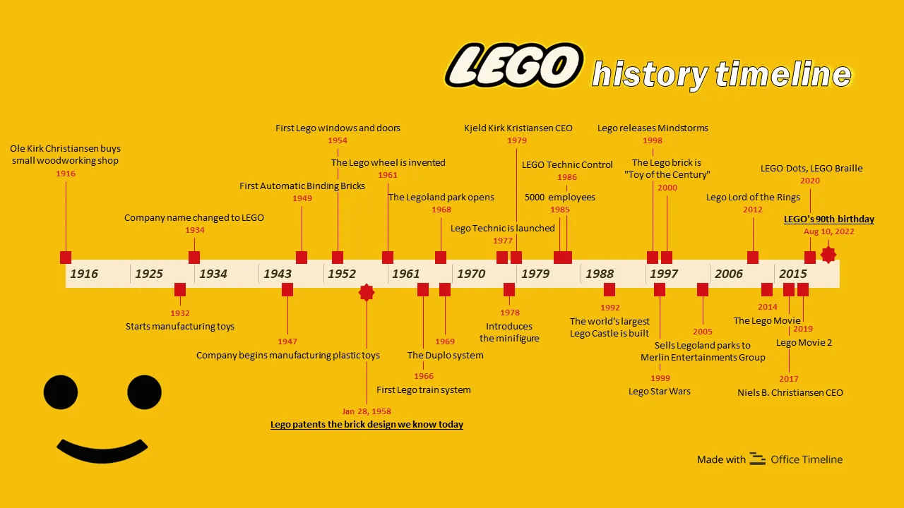
The LEGO history timeline below is a good example, showing key company milestones from 1916 to 2022 in chronological order, easy to read and understand at a glance.
Common uses of horizontal timelines
Horizontal timelines work well for many purposes, from documenting historical events to planning future activities. Their intuitive left-to-right layout makes them a good choice for situations where you need to show clear progression or make connections between events.
Here are some of the most practical ways people use horizontal timelines in their work and personal projects:
Project planning
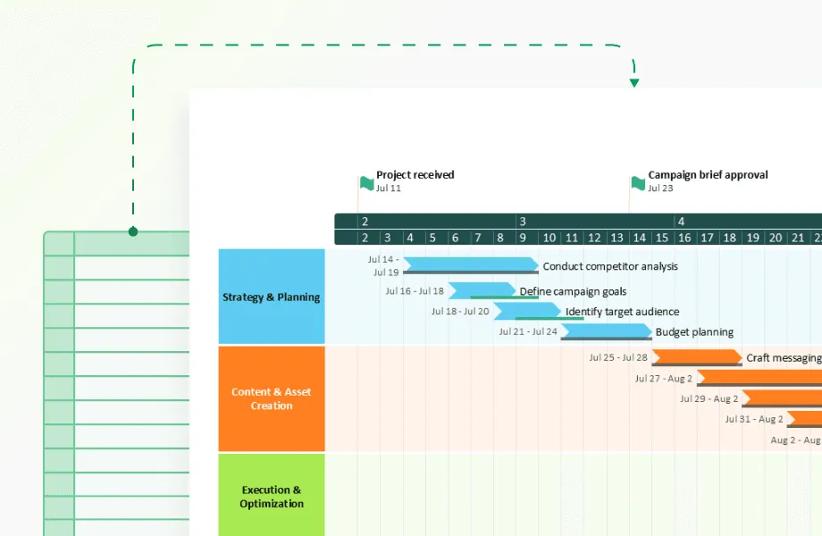
Project managers use horizontal timelines to visualize project phases, deadlines, and dependencies. These visuals help teams see the full sequence of tasks and understand how each activity contributes to the overall plan. A well-structured timeline provides clarity, aligns teams around key goals, and makes progress easier to track.
Effective project schedules and product roadmaps share several key traits:
- Group related features or tasks together to make the structure easy to follow.
- Mark important milestones to highlight major achievements or delivery points.
- Show dependencies between workstreams so teams can see how tasks influence one another.
- Use consistent time scales to ensure that all activities align clearly along the same timeline.
- Keep labels concise and descriptive so viewers can quickly grasp what each element represents.
- Maintain visual balance by spacing events proportionally and avoiding unnecessary clutter.
These specialized visuals need to balance specificity and flexibility, especially for work planned further into the future, where exact dates may shift.
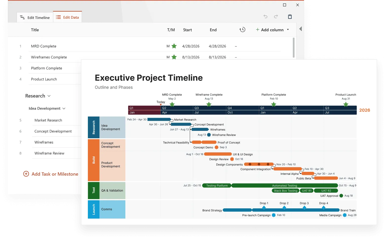
Example: A software development timeline might show the main project phases, such as requirements, design, development, testing, and deployment, mapped along a time axis, with tasks and milestones, giving teams a clear view of progress.

Historical events
Historians and educators frequently use horizontal timelines to illustrate sequences of historical events. These timelines help viewers grasp the relationships between different occurrences over time.
When designed thoughtfully, educational timelines can deepen understanding and spark curiosity. The best ones tend to:
- show cause-and-effect clearly;
- include memorable images or icons;
- provide context around major events;
- let students interact with the information when possible.
For students, seeing events in sequence often creates "aha moments" where historical connections suddenly make sense.
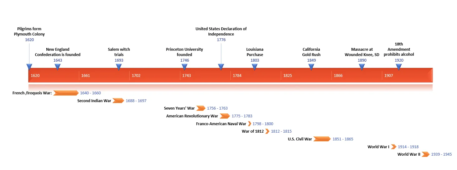
Example: This horizontal timeline demonstrates how major American events from 1620-1945 connect across time. Seeing wars, political shifts, and social changes arranged in sequence reveals how early events influenced later developments.
Process visualization
In business settings, horizontal timelines are valuable tools for visualizing procedural or workflow sequences. They clarify how individual tasks connect within a larger process, helping employees follow each stage with accuracy and consistency.
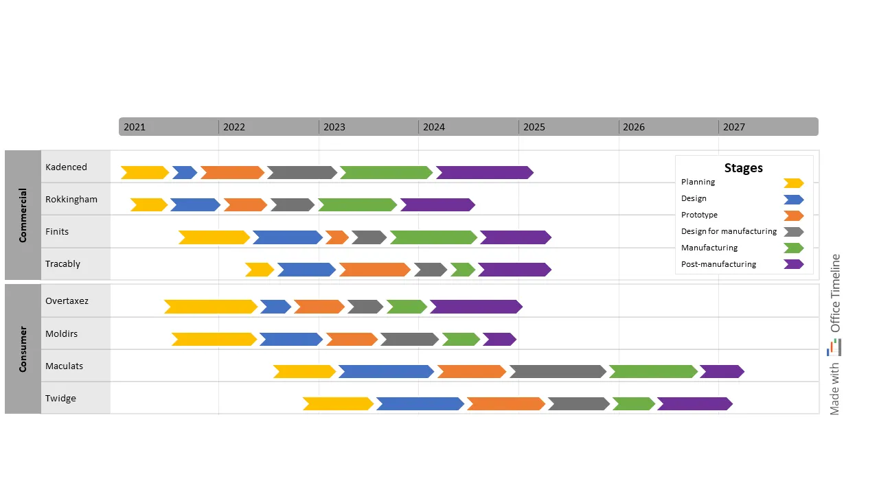
Example: In manufacturing, a horizontal timeline can illustrate the entire production flow, from planning and design through manufacturing and post-manufacturing, helping teams coordinate tasks.
Personal planning
Horizontal timelines can be powerful tools for organizing and visualizing personal goals, life events, or long-term plans. By laying out key milestones in sequence, they help individuals see progress over time and stay focused on what’s ahead.
Planning timelines usually include:
- planning phases and key deadlines;
- decision points and booking cutoffs;
- vendor schedules and delivery dates;
- detailed, hour-by-hour plans for the event day itself.
Event timelines tend to become more detailed as the big day approaches. Early versions may outline monthly tasks, while final versions often break activities down by the hour.
Example: Someone might create a horizontal timeline to plan an important life event, such as a wedding or an academic journey. It’s a simple way to map out milestones, goals, and achievements along the way.

Benefits of using horizontal timelines
The many advantages of horizontal timelines make them one of the most popular ways to visualize time-based information. Their simple structure and familiar format help people quickly understand complex sequences of events.
Here's why you might choose them for your next project:
Clarity
Horizontal timelines present information in a straightforward, sequential format. The left-to-right arrangement makes the order of events immediately apparent.
Simplicity
Creating a horizontal timeline requires minimal design skills. Even simple horizontal timelines effectively communicate chronological information.
Visual representation
Complex sequences become more digestible when presented visually. Horizontal timelines transform abstract chronologies into concrete visual references.
Progress tracking
Teams and individuals can use horizontal timelines to monitor advancement toward goals. Completed items provide a visual record of progress, while upcoming items show what remains to be done.
Creating effective horizontal timelines
Building a timeline that’s both informative and visually appealing takes some planning. Whether you’re documenting company history, mapping out a project, or presenting research findings, following a structured process helps you create a timeline that achieves your goals. Here are the steps to create a horizontal timeline that communicates clearly and looks professional.
Planning your timeline
Before you start designing your horizontal timeline, consider these key elements:
Identify key events
Focus on the most significant milestones to keep your timeline clean and readable. Too many minor details can make it look cluttered.
Determine the time scale
Decide how you’ll represent time—hours, days, months, years, or centuries. The scale determines spacing between events and how your audience perceives time progression.
Consider your audience
Tailor the content to who will be viewing it. A timeline for executives may emphasize key outcomes, while one for technical teams might show dependencies or detailed phases.
Templates for quick and painless timeline creation
Building a timeline from scratch can be time-consuming. Templates save effort by giving you a ready-made structure that you can easily customize. With a good template, you can input your data and produce a professional-looking result in minutes instead of hours.
Word timeline templates – simple but limited
Microsoft Word provides basic timeline templates that are useful for simple projects.
To use a Word timeline template:
- Open Word and search for “horizontal timeline” in the template search box.
- Browse the available options and choose one that fits your needs.
- Replace the sample text with your own events and dates.
- Adjust colors and fonts to match your style or company branding.
Pros:
- Quick and simple to set up.
- Ideal for straightforward timelines.
Cons:
- Manually repositioning elements when adding events can be tedious.
- Dates and layouts don’t adjust automatically.
Spreadsheet templates – more powerful but less visual
Tools like Excel and Google Sheets handle data more efficiently and give you flexibility with updates. However, they typically produce less visually engaging timelines.
Advantages:
- Dates can calculate automatically (e.g., number of days between events).
- Updating a single date automatically shifts related events.
- Sorting and filtering options help organize information.
- You can link your timeline to other project data.
Typical setup:
- Create columns for event names, start dates, end dates, and categories.
- Enter all timeline data.
- Use built-in chart tools (like Gantt chart options) to visualize events.
- Format the chart for readability and presentation.
While spreadsheets provide strong functionality, they often look technical rather than polished, and sharing them with non-technical stakeholders can be challenging.
Office Timeline bridges this gap by combining spreadsheet-level data handling with presentation-quality visuals. You can:
- Import data directly from Excel or Microsoft Project.
- Create professional-looking timelines with just a few clicks.
- Instantly update visuals when dates change.
This approach saves time and ensures your audience sees a clear, accurate, and visually appealing timeline every time.
Presentation software templates
Tools like PowerPoint are designed for visually appealing timelines that fit naturally into presentations, reports, or handouts.
Benefits:
- Visually engaging layouts using colors, icons, and images.
- Easy drag-and-drop functionality for arranging events.
- Professional appearance suitable for meetings and reports.
How most people create PowerPoint timelines:
- Choose a wide slide layout (landscape orientation works best).
- Draw your main horizontal line across the slide.
- Add dots or markers where important events occur.
- Create text boxes above or below the line for event descriptions.
- Apply company colors and add simple visuals for a polished look.
This manual method works for small timelines but quickly becomes cumbersome. Moving one event usually means repositioning everything else manually.
The Office Timeline PowerPoint add-in simplifies the process:
- It integrates directly into PowerPoint.
- You just enter your dates and events, and it automatically builds a perfectly spaced timeline.
- When dates change, updates happen instantlyp; no manual adjustments needed.
- You can import data from Excel or Microsoft Project for full accuracy.
- Built-in professional templates ensure consistent, high-quality results.
Customers report saving hours each week by avoiding the need to constantly realign and redesign timelines when plans shift.
Create accurate timelines instantly
Try Office Timeline for free. Import dates, update events, and generate perfectly spaced timelines without tedious adjustments.
Online timeline makers save you headaches
Online tools make timeline creation even faster and more collaborative. These platforms are built specifically for working with timelines and offer flexibility that desktop tools can’t always match.
Common advantages of online timeline makers:
- Multiple users can work on the same timeline simultaneously.
- Interactive features make timelines more engaging to view online.
- Finished timelines can be downloaded in multiple formats.
Office Timeline Online combines all these advantages with the design quality of PowerPoint. You can:
- Log in from any browser; no software installation required.
- Create professional, presentation-ready timelines in minutes.
- Share with teammates for real-time collaboration and feedback.
- Update or adjust data from anywhere.
Its browser-based design means you can stay productive even when you don’t have PowerPoint installed, while still maintaining the same high-quality visuals.
Make your timeline easy to understand
After you’ve built your timeline, take a step back and look at it with fresh eyes. Would someone unfamiliar with your project understand it? Many timelines make perfect sense to their creators but confuse everyone else. The goal is clarity—your audience should grasp the message instantly, without needing additional explanation.
A plain timeline with just dates and text won’t grab attention or communicate effectively. The best ones balance information with visual appeal. When done right, your timeline becomes more than just a list of events—it becomes a visual story that’s easy to follow, memorable, and persuasive.
Clear labels make all the difference
The text you include on your timeline is just as important as its design. Based on insights from thousands of project managers and presenters, these best practices consistently lead to better understanding:
- Use specific event titles that tell the full story at a glance. “Website Launch” communicates more than “Phase 3 Completion” or “Milestone 7.”
- Include exact dates (for example, March 15 rather than mid-March).
- Add short descriptions—around 5–7 words—if the title isn’t self-explanatory.
- Group related events consistently (for example, by “Marketing,” “Development,” or “Milestones”).
- Use consistent color-coding to distinguish between different workstreams or event types.
Our analysis of over 10,000 timelines created with our software shows a clear pattern: less text leads to better understanding. The most effective timelines use fewer than 10 words per event. It might feel minimal at first, but it forces clarity and prevents the “wall of text” effect that causes audiences to tune out.
Think of your timeline like a highway sign - viewers should be able to read and understand it quickly. Save detailed explanations for your speaking notes or supplementary materials. In our customer satisfaction surveys, executives consistently rank “scannable at a glance” as the most valuable quality in presentation timelines.
One marketing director shared how this approach transformed her presentations: “My old timeline had all the information, but nobody could absorb it. My new one tells the same story in a way people can actually follow.”
Using visual elements effectively
The right visual touches make your timeline easier to understand and remember. Even small design decisions can have a big impact:
- Color coding works wonders. Using different colors for different event types helps people grasp structure at a glance. For example, use blue for planning phases, green for approvals, and orange for external deadlines.
- Small icons tell big stories. Simple icons help people process information faster. A calendar icon for deadlines, a dollar sign for budget milestones, or a checkmark for completed tasks creates instant visual cues.
- Space events proportionally. One of the most common timeline mistakes is inconsistent spacing. If one month occupies half your timeline and five years fill the other half, it distorts the story. Keep distances roughly proportional to time intervals.
- Show connections when they matter. When one event leads to or influences another, use arrows or connecting lines to visualize those relationships.
These elements make your timeline more intuitive and allow your audience to understand patterns and dependencies at a glance.
Making your timeline accessible
Accessibility is often overlooked, but it’s essential for effective communication. A timeline that’s easy for everyone to read and understand benefits all audiences, not just those with specific accessibility needs.
Here are some practical checkpoints to ensure accessibility:
- Check color contrast to ensure all text remains legible, even if printed in black and white.
- Add alt text for digital timelines, describing key events and patterns for screen readers.
- Use large, readable text—at least 18 pt for presentations—to make sure details can be seen from a distance.
- Test with a screen reader to confirm that your timeline still makes sense without visuals.
Improving accessibility doesn’t require major changes; small adjustments in contrast, text size, or labeling can dramatically improve clarity for all audiences. Organizations that prioritize accessible design consistently report improved clarity and engagement for all users.
The same principles that make a timeline accessible (good contrast, clear organization, and thoughtful labeling) also make it more effective as a visual communication tool.
Design principles for effective horizontal timelines
Creating a timeline that's both informative and easy to understand takes some careful thought. The best timelines balance visual appeal with clear information.
Here are some design principles that will help your timeline communicate better.
Balance between detail and clarity
Most timeline creators struggle with how much information to include. Add too much, and your timeline becomes a confusing mess. Include too little, and it doesn't tell the full story.
Here's how to find the right balance:
- Create a hierarchy by making major events more prominent than minor ones.
- For digital timelines, use hover or click interactions to reveal details only when someone wants them.
- Consider creating a series of connected timelines that progressively zoom in on specific time periods.
One approach that works well is the "headline and details" method. Give each event a brief, informative headline that stands alone, with optional details available for those who want to dig deeper.
Proportional time representation
The physical spacing between events should match the actual time between them. When March and April take up the same space as the entire 1990s, you're distorting reality.
This seems obvious, but I see this mistake all the time. People tend to squish older events together and spread-out recent ones. While sometimes you'll need to compromise, try to keep your timeline's spacing reasonably proportional to actual time.
Consistency in visual elements
Consistent design helps people make sense of your timeline at a glance:
- Use the same icon or symbol for similar types of events.
- Keep text formatting consistent (same font and size for all event titles).
- Stick with a cohesive color scheme throughout.
- Place labels in the same position relative to your timeline bar.
Visual consistency creates patterns that help viewers process information more quickly. When everything follows predictable rules, people spend less time figuring out how to read your timeline and more time understanding its content.
Common challenges and solutions
Every timeline creator faces some common obstacles, no matter what tool or approach they use. These challenges can make the difference between an efficient timeline and one that confuses the audience.
Let's look at the most frequent problems and practical ways to solve them.
Limited space
Running out of room is probably the most common timeline problem. This happens especially when you have many events or need to fit your timeline into a presentation slide.
Here's how to handle space limitations:
- For digital formats, make your timeline scrollable horizontally.
- Use a two-tier layout with some events above the line and others below.
- Add zoom capability to digital timelines.
- Split your timeline into logical segments.
The multi-tier approach is particularly effective. By placing different types of events above and below the main timeline, you can include twice as many items without making the timeline twice as long.
Complex event relationships
Some timelines need to show how events connect or influence each other. This gets tricky when events overlap or have cause-effect relationships.
Try these solutions:
- Draw simple connecting lines or arrows between related events.
- Use consistent colors to link related items across your timeline.
- Add small symbols that mark dependencies.
- Include brief notes explaining connections.
The key is to make relationships visible without overcomplicating your design. Simple visual cues often work better than lengthy explanations.
Keeping timelines updated
Timelines rarely stay static. New events happen, dates change, and plans evolve. If your timeline is hard to update, you'll eventually abandon it.
To make maintenance easier:
- Build your timeline in software that allows simple editing or automatic updates.
- Write down your design decisions so future updates stay consistent.
- Use data-driven tools where changing the underlying dates automatically updates the visualization.
- Think about the update process when choosing a tool to create your timeline.
Office Timeline syncs updates automatically and refreshes the visualization, making it one of the best tools for easy updates and ongoing maintenance. No need to stress, this is particularly important. A beautiful but hard-to-update timeline quickly becomes obsolete.
An easily maintained timeline is a smarter, longer-lasting choice. With Office Timeline, you get the best of both worlds.
Conclusion
Horizontal timelines give you a straightforward way to show when things happened. People intuitively understand the left-to-right format, making these timelines accessible to almost anyone.
Whether you build your timeline in Word, PowerPoint, or specialized software like Office Timeline, the same principles apply: keep it clear, make the spacing match the actual time periods, and use visual elements consistently.
The guidelines in this article will help you create timelines that communicate effectively. As you get more comfortable with timeline creation, try different approaches to see what works best for your specific situation.
Horizontal timelines are just one of many timeline types you can use to present information visually. Explore other timeline , each with its own strengths and ideal uses, that can give you a complete toolkit for visualizing time-based information.
Frequently asked questions about horizontal timelines
This section covers practical tips and answers to common questions about creating and customizing horizontal timelines so they’re clear, engaging, and easy to follow.
For most presentations and reports, aim for 5-15 events. This keeps your timeline readable while showing enough information to tell a complete story. If you need to show more events, consider creating multiple timelines focused on different time periods or aspects of your subject.
Yes, but be clear about which is which. You can combine specific dates (June 15, 2023) with relative timeframes (3 months after launch) if you visually distinguish between them. Just make sure your audience understands which events have fixed dates and which ones are relative.
For events with uncertain dates, use approximations and indicate the uncertainty. You might add "circa," "approximately," or "~" before estimated dates. For planning timelines, you can use date ranges (Q3-Q4 2023) or add visual indicators showing flexibility around specific milestones.