What is a PERT chart anyway? A PERT chart is a visual project management timeline tool used to map out tasks and their dependencies.
In this article, you’ll learn about PERT charts, how they function, and their benefits in managing complex projects. We also provide a PERT chart template to illustrate the process of creating a PERT diagram and its application in project timelines.
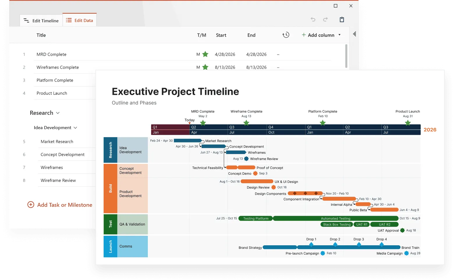
This free downloadable PERT chart template, created with Office Timeline, demonstrates how to visualize a complex software development project. The chart shows tasks organized by categories (Requirements, Validation, Database, etc.) with clear timelines.
Tasks are color coded and key milestones like "Kick-Off," "Validation," and "Project Submission" are marked with diamond shapes. You can customize this template for your own projects with the help of Office Timeline and make your own easy professional PERT charts that clearly communicate project timelines, milestones and tasks.
Managing complex projects with PERT charts
Complex projects fail more often because of poor task sequencing than budget overruns or resource shortages. PERT charts solve this exact problem by showing you what tasks need to be done, how they connect, and which ones are most important for keeping your project on schedule.
Unlike simple task lists or basic timelines, PERT charts use a flowchart format to show the relationships between different activities and help you identify the critical path - the sequence of tasks that determines your project's minimum completion time. They show tasks, dependencies, and timelines visually, making them perfect for complex projects.
Creating a PERT chart means identifying project tasks, defining their dependencies, estimating durations, and mapping the project visually for effective management. PERT charts improve communication, encourage teamwork, and allow for what-if scenarios, which help with proactive risk management and better project outcomes. We'll walk through practical examples to show you exactly how to create and use these diagrams in real project situations.
Understanding project management fundamentals
Project management is about planning, organizing, and controlling resources to reach specific goals. It involves coordinating tasks, activities, and resources so projects get delivered on time, within budget, and meet quality standards. Without proper project management, projects often run over budget, miss deadlines, or fail to meet expectations.
Effective project management includes several important elements: project planning, task management, resource allocation, risk management, and communication. Using various project management tools and techniques helps project managers complete projects successfully and meet required standards.
What is a PERT chart?
A PERT chart stands for Program Evaluation and Review Technique - a visualization tool used in project management to show task sequences, dependencies, and timeframes. This system was created by the United States Navy during the 1950s for managing the complex Polaris submarine project. The special projects office played an important role in developing PERT charts for this initiative, which has since been widely adopted across various industries.
PERT charts are different because they provide a complete view of how tasks follow one another and depend on each other's completion. Unlike other tools that focus mainly on timelines, PERT charts present a clear way to understand how different activities connect - a feature that's extremely helpful for complex projects where understanding these relationships is important for timely and efficient execution.
How PERT charts work
In project management, a PERT chart organizes and visualizes the sequence of project tasks alongside their timelines. This diagram uses numbered nodes to represent important events or milestones within the project, with connecting lines showing the various tasks that bridge these points. Each task is typically shown as boxes or circles, linked by arrows that indicate the necessary order and show how one stage leads into another.
The arrows in a PERT chart do more than just connect elements. They represent tasks within the network and show both task sequencing and dependency relationships among activities. When arrows branch out from a single node, it means multiple tasks can happen at the same time, adding flexibility to the overall schedule.
Dotted lines indicate dummy activities within the PERT diagram - these are dependencies that don't require actual time or resources but are important for maintaining logical flow throughout complex projects. By mapping out these elements effectively, project managers gain better oversight over complex projects.
Why PERT charts matter in project management
PERT charts help identify potential problems early, greatly improving the efficiency of task scheduling. This technique helps project managers distribute resources wisely, making sure that important tasks get appropriate attention.
For projects with strict deadlines, PERT charts provide huge value through their clear visual display of activities and their relationships. These diagrams make complex projects easier to handle by improving communication about roles and expected timeframes, promoting better collaboration and teamwork. PERT charts also help project managers identify the resources needed for each task, helping with budget development and providing a clearer overview of the project's timeline and critical path.
PERT charts allow managers to test different scenarios, which can speed up updates while also improving overall time management - a particularly useful function when preparing for multiple possible outcomes. By providing more precise planning coupled with better coordination between team assignments, PERT charts prove valuable for achieving success within projected timelines.
Steps to create a PERT chart
Learning how to make a PERT chart is important for effective project management, as it helps visualize project tasks and dependencies to manage timelines efficiently.
Creating a PERT chart requires systematic steps to map out every task and dependency within a project. This process begins by identifying each task that must be completed, establishing the connections among these tasks, and estimating how long each will take.
Once you have this information, you can use the PERT chart as a visual tool to display your project plan, outline the timeline of events, and show the work breakdown structure. This makes accurate forecasting possible and allows for necessary adjustments throughout the project. Here are the specific steps:
Step 1: Identify tasks
To start creating a PERT chart, you need to list every single task that will be part of the project. Making sure nothing is missed is important for accurate project planning. Start by asking questions about how the project will begin and end to compile a complete inventory of all necessary tasks. This initial list of all individual tasks provides the foundation for your PERT chart.
Next, it's important to figure out both the sequence in which tasks should happen and their dependencies. Understanding these relationships between tasks helps you prioritize them effectively and arrange them into a logical execution order, with special attention given to identifying the longest sequence of tasks - known as the critical path - that determines the minimum time required for completion. By carefully mapping out these connections, you can avoid potential delays caused by overlooked dependencies and optimize collaboration among team members.
Step 2: Define task dependencies
Once tasks have been identified, you need to determine their dependencies. These are the tasks or milestones that depend on others being finished first - predecessors that must be completed before moving on to subsequent work. Understanding these dependent relationships is important for figuring out the order in which tasks should happen.
Finding these task dependencies reveals important sequences that can affect the project schedule. By carefully outlining these connections, you make sure that all necessary conditions are met before starting subsequent tasks. This insight helps create an accurate timeline for the project and prevents unexpected delays.
Step 3: Estimate task durations
When building a PERT chart, you need to carefully evaluate how long each task will take. This is done using three-point estimates which account for varying degrees of uncertainty. These estimates include an optimistic timeframe, a pessimistic time, and the most likely time for each activity. These calculations help create a realistic project schedule that allows for variations in how long tasks may actually take to complete.
Once you've gathered your duration estimates, incorporate them into your PERT diagram. This step gives you an overall view of the entire project's timeline and helps identify the critical path - a sequence representing dependent activities that defines the minimum completion time necessary for achieving project objectives.
Step 4: Draw the PERT chart
The final stage is creating the actual PERT chart, where tasks are shown as nodes and connected with arrows indicating their dependencies. In the PERT chart, nodes represent significant parts of a project, such as events and milestones, creating an organized display of tasks and their relationships throughout the project timeline. Use the PERT diagram to arrange these tasks and include their estimated durations.
This visual tool helps forecast realistic schedules, improving project management by establishing a clear timeframe for planning and execution.
Make your workflows presentation-ready
Try Office Timeline for free. Build clean, professional visuals that clearly communicate critical paths, milestones, and schedules.
PERT chart components
Understanding the key elements of a PERT chart helps you read and create these diagrams more effectively. Each component serves a specific purpose in showing how your project flows from start to finish.
Nodes (events and milestones)
Nodes appear as circles or boxes and represent important events or milestones in your project. These are points in time when something significant happens - like the completion of a major phase or the start of a new activity. Each node is numbered to help you track the sequence of events. For example, Node 1 might represent "Project Start," while Node 5 could represent "Design Phase Complete."
Arrows (tasks and activities)
Arrows connect the nodes and represent the actual work or tasks that need to be done. The direction of the arrow shows the sequence - work flows from one node to the next. The length of the arrow doesn't indicate duration; instead, you'll typically see time estimates written along or near the arrows. Multiple arrows can originate from a single node, indicating that several tasks can begin simultaneously once that milestone is reached.
Dummy activities
Dummy activities appear as dotted lines and represent dependencies that don't require time or resources but are necessary to maintain the logical flow of the project. These help show relationships between tasks that might not be immediately obvious. For example, you might need approval from one department before another department can start their work, even though the approval itself doesn't take project time.
Time estimates and duration
PERT charts typically use three time estimates for each task: optimistic (best case), pessimistic (worst case), and most likely (realistic estimate). These estimates help account for uncertainty and create more accurate project timelines. The estimates are often combined using a weighted formula to calculate expected duration.
Reading the flow
Following the arrows from start to finish shows you the complete project sequence. When multiple paths exist through the network, the longest path becomes your critical path - the sequence that determines your minimum project completion time.
Critical path method
The Critical Path Method (CPM) is a project management technique used to identify the longest sequence of dependent tasks that determines the minimum time required to complete a project. This sequence, known as the critical path, matters because any delay in these tasks will directly impact the project's end date.
CPM involves several steps, starting with listing all project tasks and their dependencies. Each task gets assigned a duration, and a network diagram is created to show the sequence of tasks. By analyzing this diagram, project managers can identify the critical path and focus their efforts on making sure these tasks are completed on time.
How CPM works with PERT charts
The Critical Path Method works well with PERT charts by providing a clear view of the project's timeline and highlighting the tasks that require the most attention. While PERT charts offer a probabilistic approach to estimating task durations using three-point estimates, CPM provides a more straightforward view, making it easier to identify potential bottlenecks and allocate resources in a more efficient way.
When you combine CPM with PERT charts, you get a strong project schedule that accounts for both task dependencies and potential uncertainties. PERT charts help you understand the range of possible completion times, while CPM shows you exactly which tasks will delay your project if they run late. This combined approach makes time estimates more accurate and improves the overall efficiency of project planning and execution.
For example, your PERT chart might show that a software development task could take anywhere from 5 to 15 days depending on various factors, while CPM analysis reveals that this task sits on the critical path. This combination tells you that you need to pay special attention to this task and possibly allocate additional resources to make sure it stays on schedule.
To learn more about mastering the Critical Path Method and how it can transform your project management approach, check out our comprehensive guide on Critical Path Method (CPM) – how to use it in project management.
Real-world applications of PERT charts
From software launches to construction projects, PERT charts help teams across different industries tackle complex projects with confidence. These visual tools translate complicated project timelines into clear, manageable roadmaps that keep everyone on track.
Content marketing projects
In content marketing, PERT charts serve as a roadmap from idea conception to blog post publication, making sure deadlines are met and resources are used efficiently. Marketing teams can map out tasks like research, writing, editing, design, and approval processes, showing how each step depends on the previous one and identifying where bottlenecks might occur.
Construction management
Construction project managers use PERT charts to monitor important tasks and milestones, creating transparent communication about progress with all involved parties. These charts help coordinate activities like permits, site preparation, foundation work, framing, and finishing, ensuring that delays in one area don't unnecessarily impact the entire project timeline.
Software development
Software development teams use PERT charts to map out user interactions while identifying potential bottlenecks or issues in their systems. They can visualize how requirements gathering, design, coding, testing, and deployment phases connect, helping them spot where problems might arise and plan accordingly.
Home renovation projects
PERT charts prove helpful for home renovation projects by outlining task sequences, which helps homeowners and contractors organize schedules efficiently. From permits and demolition to electrical work, plumbing, and final finishes, these charts show which tasks can happen simultaneously and which must wait for others to complete.

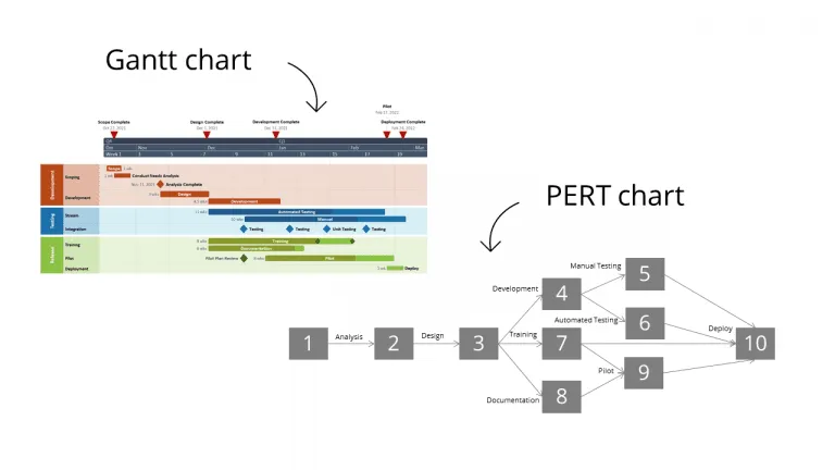
Comparing CPM/PERT charts with Gantt charts
In project management, Gantt and PERT charts are often compared because they serve different but complementary purposes. PERT charts excel at showing task dependencies and identifying the critical path, which helps determine the shortest possible completion time for complex projects.
Gantt charts, created by Henry Gantt, provide a more straightforward view of schedules that makes monitoring task durations simpler. Unlike PERT charts that focus on relationships between tasks, Gantt charts prioritize showing tasks along a timeline. This makes them more accessible and user-friendly for basic scheduling needs.
Tips for effective PERT charts
Even the most beautifully designed PERT chart is useless if your team can't understand it or your estimates are wildly off target. Creating successful PERT charts requires attention to detail and ongoing collaboration.
Here are the most important practices to follow:
- Involve your team in planning - Engage team members for their insights on task duration and dependencies. Your team's input contributes to a PERT chart that is both accurate and realistic, since they understand the actual work involved better than anyone else.
- Keep it simple and clear - Use consistent symbols and formatting throughout your PERT chart to make reading and sharing information easier among all parties involved. Avoid cluttering the diagram with unnecessary details that might confuse stakeholders.
- Update regularly - As the project progresses, incorporate ongoing feedback to adjust and improve the PERT chart. Keeping it updated makes sure accuracy stays high and project monitoring remains effective.
- Focus on critical dependencies - Pay special attention to tasks that have the most impact on your project timeline. These relationships between tasks are what make PERT charts valuable for coordination.
- Use realistic time estimates - Apply the three-point estimation technique (optimistic, pessimistic, and most likely) rather than single-point estimates to account for uncertainty and create more reliable schedules.
- Make it accessible - Share your PERT chart in formats that all stakeholders can easily view and understand, whether that's printed copies for meetings or digital versions for remote team members.
Following these practices consistently can make your PERT charts reliable tools that your team actually uses to stay on track.
Common mistakes to avoid
PERT charts can make or break your project timeline, but most teams sabotage their own success with these predictable mistakes:
- Inaccurate time estimates - One of the most frequent errors is underestimating or overestimating task durations. To avoid this, use the three-point estimation technique (optimistic, pessimistic, and most likely time) to get more realistic estimates.
- Ignoring task dependencies - Failing to account for task dependencies can lead to scheduling conflicts and delays. Make sure all dependencies are clearly defined and represented in your PERT chart to maintain a logical project timeline.
- Overlooking the critical path - Not identifying the critical path can result in missed deadlines and project overruns. Regularly review and update the critical path to make sure important tasks are prioritized and completed on time.
- Lack of communication - Poor communication among team members can lead to misunderstandings and errors. Use your PERT chart as a communication tool to keep everyone informed about task progress and dependencies.
- Not updating the chart - A PERT chart is a dynamic tool that should be updated regularly to reflect changes in the project. Failing to update the chart can result in outdated information and poor decision-making.
These mistakes are entirely preventable, but they still cause unnecessary delays and budget overruns. Stay aware of these common pitfalls, and your PERT charts will actually help you manage your projects better instead of adding to your problems.
Conclusion: mastering your project's timeline with PERT charts
PERT charts help you handle complex project timelines without getting overwhelmed. They work especially well for projects where you can't nail down exact dates from the start, giving you better ways to estimate how long work will actually take. When you use PERT charts, you can see different scenarios coming and deal with problems before they blow up your schedule.
Getting PERT to work for you means breaking big tasks into smaller pieces and figuring out which work depends on what. The visual diagram shows you how everything connects and what happens if something runs late.
When you track how long tasks actually take compared to your PERT estimates, you can adjust things as you go. This keeps your project moving forward instead of getting stuck when reality doesn't match your original plan.
PERT charts make your planning more accurate and help your team understand what they need to do and when. Get your team involved in building the chart, keep it updated as things change, and use symbols everyone can understand. Do this right, and you'll have a tool that actually helps instead of just looking impressive in meetings.
Frequently asked questions
Here are the most common questions people ask about PERT charts and how they work in project management. Whether you're new to PERT methodology or looking to improve your current approach, these answers will help you understand when and how to use these powerful planning tools.
A PERT chart is a visual way to map out your project tasks and see how they depend on each other. PERT stands for Program Evaluation and Review Technique, but don't let the fancy name scare you - it's basically a flowchart that shows what needs to happen when. Think of it as a roadmap for your project that highlights not just the tasks, but how they all connect and which ones are most important for staying on schedule.
PERT charts work by using:
- circles or boxes for important milestones and events;
- arrows to connect tasks that depend on each other;
- numbers to show estimated durations;
- a network structure that reveals your critical path.
The arrows show you which work has to be done before other work can start, helping you find the critical path - the chain of tasks that will determine how long your project takes.
PERT charts help you spot problems before they happen and figure out better ways to schedule your work. They're really useful when you have complicated projects where lots of tasks depend on each other, and they help you plan for things that might go wrong. Unlike simple task lists, PERT charts show you the ripple effects of delays and help you understand which tasks deserve your most careful attention. This visibility becomes invaluable when you're trying to explain project timelines to stakeholders or when you need to make quick decisions about resource allocation.
Creating a PERT chart might seem complicated, but it's actually a straightforward process when you break it down. Here are the steps to create a PERT chart:
- List out all your project tasks.
- Figure out which tasks depend on others.
- Estimate how long each task will take (using three estimates: best case, worst case, most realistic).
- Draw it out with circles and arrows to show connections.
- Identify your critical path.
- Review and adjust as needed.
Take your time with each step, especially the dependency mapping - that's where most people make mistakes that come back to haunt them later in the project.
PERT charts are great for showing how tasks connect and finding your critical path, while Gantt charts are better for tracking progress over time. Think of PERT as your planning tool and Gantt as your tracking tool. PERT excels during the planning phase when you need to understand dependencies and estimate timelines, while Gantt charts shine during execution when you want to see progress against deadlines and communicate status to your team.
Use PERT charts when you have:
- messy, complicated projects with many dependencies;
- uncertain time estimates;
- one-time projects without historical data;
- stakeholders who need to understand project complexity;
- projects where delays in one area could mess up everything else.
PERT handles uncertainty by using three time estimates for each task, while CPM uses just one estimate. If you're dealing with a lot of unknowns, go with PERT. If you have solid data from similar past projects, CPM might be simpler.