Imagine you have a collection of puzzle pieces, each representing an event. A timeline acts as the table where you lay them out, showing how they fit together over time. It gives context to individual pieces, revealing the bigger picture. By arranging events in time order, you can spot patterns, like how certain things happen in cycles or during particular seasons.
Timelines make complicated stories easier to understand by breaking them into clear steps. Most importantly, they help you see how one event leads to another, showing the connections that explain why things happened the way they did. To explore these ideas further and see how timelines are used in history, projects, and everyday life, check out our introduction to timelines.
1. Timelines and graphical timelines
A timeline is any chronological sequence of events, often presented as text, while a graphical timeline transforms this information into a visual format, displaying events along a linear axis with dates and descriptions. Time becomes something we can actually see and explore. When we see time represented visually, relationships between events that happened years or even centuries apart begin to make sense, and abstract chronology becomes a clear, accessible story.
This visual format makes it easier to understand cause and effect relationships across history. Each point on the line represents a moment worth remembering, and together these points tell a story. The beauty of these visual sequences is how they compress years of information into a format your brain can process in
1.1. Components
Timelines are built from a few key elements that work together to create a clear picture of how events unfold.
- Dates: These form the backbone of the timeline, establishing the chronological order. They act as anchors, showing exactly when each event occurred.
- Descriptions: Brief explanations or labels that provide context for each event. They tell the "what" and sometimes the "why" of each point on the timeline.
- Visuals: Images, icons, or other graphics that enhance understanding and engagement. They help to illustrate events and make the timeline more visually appealing.
1.2. Layouts
The way a timeline is arranged on a page or screen affects how easily we can understand the information. There are a few common layouts, each with its own strengths:
- Horizontal: The most common layout, offering a straightforward left-to-right progression. This is how we naturally read, making it easy to follow the flow of time.
- Vertical: Useful for timelines with many events or when scrolling is necessary. When you have a long list of events, a vertical layout can make it easier to see them all without making the timeline too wide.
- Snake: A winding layout that allows for more creative storytelling and complex narratives. This layout is less about strict chronology and more about showing connections between events, even if they're not in a simple order.
2. Types of graphical timelines
Timelines offer a structured way to visualize sequences of events, each format revealing different connections between events. The most effective timelines match their design to the story they need to tell, emphasizing what matters most in your data.
From simple chronologies to complex multi-threaded visualizations, the format you choose shapes how your audience understands time-based information. Here's a breakdown of common timeline types:
2.1. Chronological timelines
Chronological timelines present events in strict sequential order, mirroring the passage of time. These straightforward timelines arrange events from earliest to latest. This format emphasizes the progression of events, making it easy to follow a narrative.
They work particularly well when showing progression or evolution of ideas, developments in a field, or historical narratives where the sequence itself tells an important story. The linear structure clarifies cause-and-effect relationships and shows how one event leads to another.
Applications
Chronological timelines are widely used to:
- document historical events;
- chart personal biographies;
- depict the progression of long-term processes.
Example
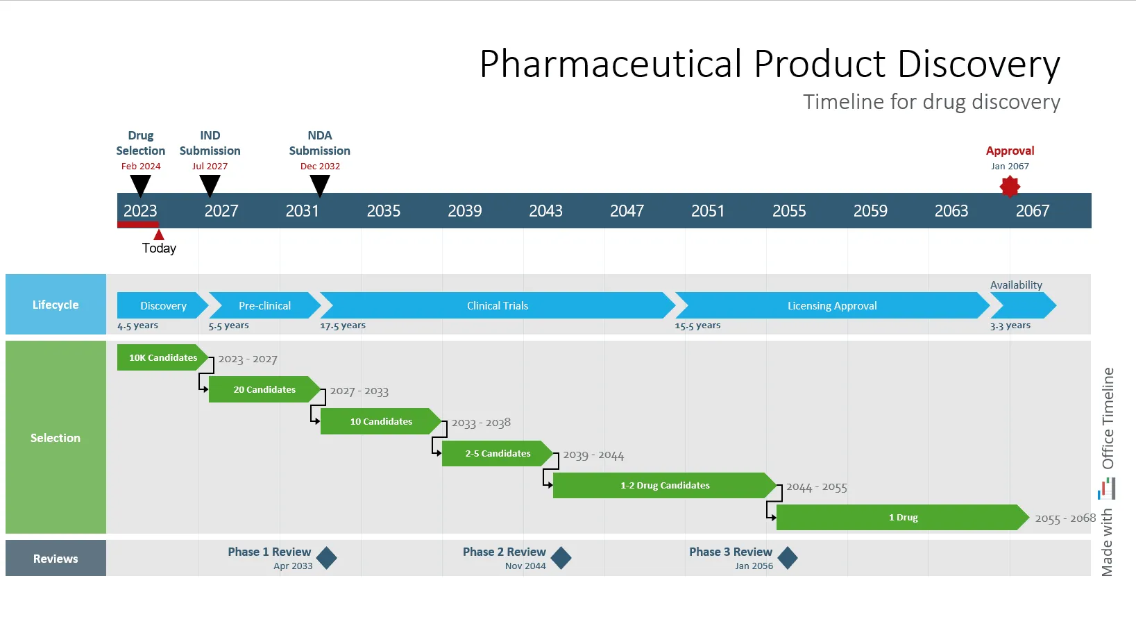
This is an example of a chronological timeline that illustrates the sequential stages of pharmaceutical product discovery, from initial drug selection to final approval. The events are arranged in time order along a horizontal axis, making it easier to see how the process unfolds step by step over more than four decades. The timeline was created with the Office Timeline add-in, a professional timeline maker for PowerPoint, designed to build presentation-ready visuals that simplify time-based data.
2.2. Comparative timelines
Comparative timelines present two or more sets of events or processes side-by-side. This allows for direct comparison, highlighting similarities, differences, and trends. The format helps to visualize how different entities or processes evolve relative to each other over the same period.
Applications
Comparative timelines can be successfully used to:
- compare the development timelines of competing products;
- analyze the effects of different strategies or interventions;
- contrast historical developments in different regions or sectors;
- identify overlapping periods of innovation across different fields;
- assess the relative pace of change in different industries or markets;
- visualize how similar milestones were achieved at different speeds.
Example
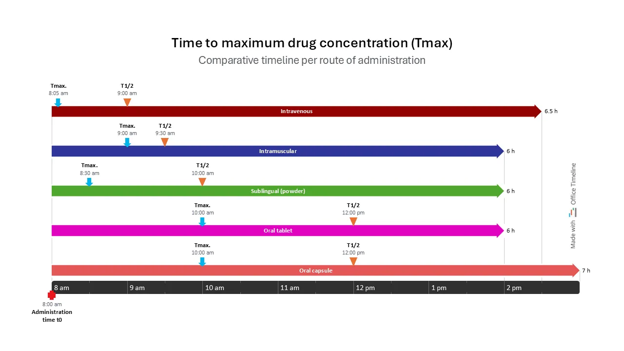
This is a clear example of a comparative timeline, used to visually compare time to maximum drug concentration (Tmax) across different routes of administration. This format is ideal for side-by-side comparison, making it easy to assess how route selection impacts pharmacokinetics.
2.3. Interactive timelines
Interactive timelines are digital tools that allow users to actively explore data through features like zooming, clickable details, and multimedia integration. This format enhances engagement and allows for a deeper understanding of complex information.
Applications
Interactive timelines are used in:
- educational platforms for interactive learning;
- websites for presenting complex historical or scientific data;
- software applications for project visualization and data exploration;
- research presentations where users need to examine specific time periods in detail;
- data visualization tools that enable filtering and zooming of temporal information;
- family history and genealogy platforms to map generational relationships;
- scientific platforms mapping the progression of experiments or studies.
Example
Office Timeline Online is an excellent example of an interactive timeline because it combines intuitive design with powerful customization and collaboration features. Unlike static visuals, it allows users to build, edit, and share timelines directly in their browser, updating project milestones and tasks with just a few clicks. The tool’s drag-and-drop interface, interactive data fields, and real-time editing make it easy for teams to adjust plans dynamically and visualize project progress instantly.
2.4. Gantt charts
Gantt charts are horizontal bar charts used for project management. They visually represent tasks, durations, and dependencies, providing a clear overview of project timelines and progress.
Applications
Gantt charts are used in:
- project management across various industries, including construction, software development, and pharmaceuticals;
- planning and tracking complex projects with multiple tasks and dependencies;
- resource allocation and scheduling;
- coordinating work between different teams or departments;
- tracking milestone achievements against projected deadlines;
- forecasting potential bottlenecks or scheduling conflicts.
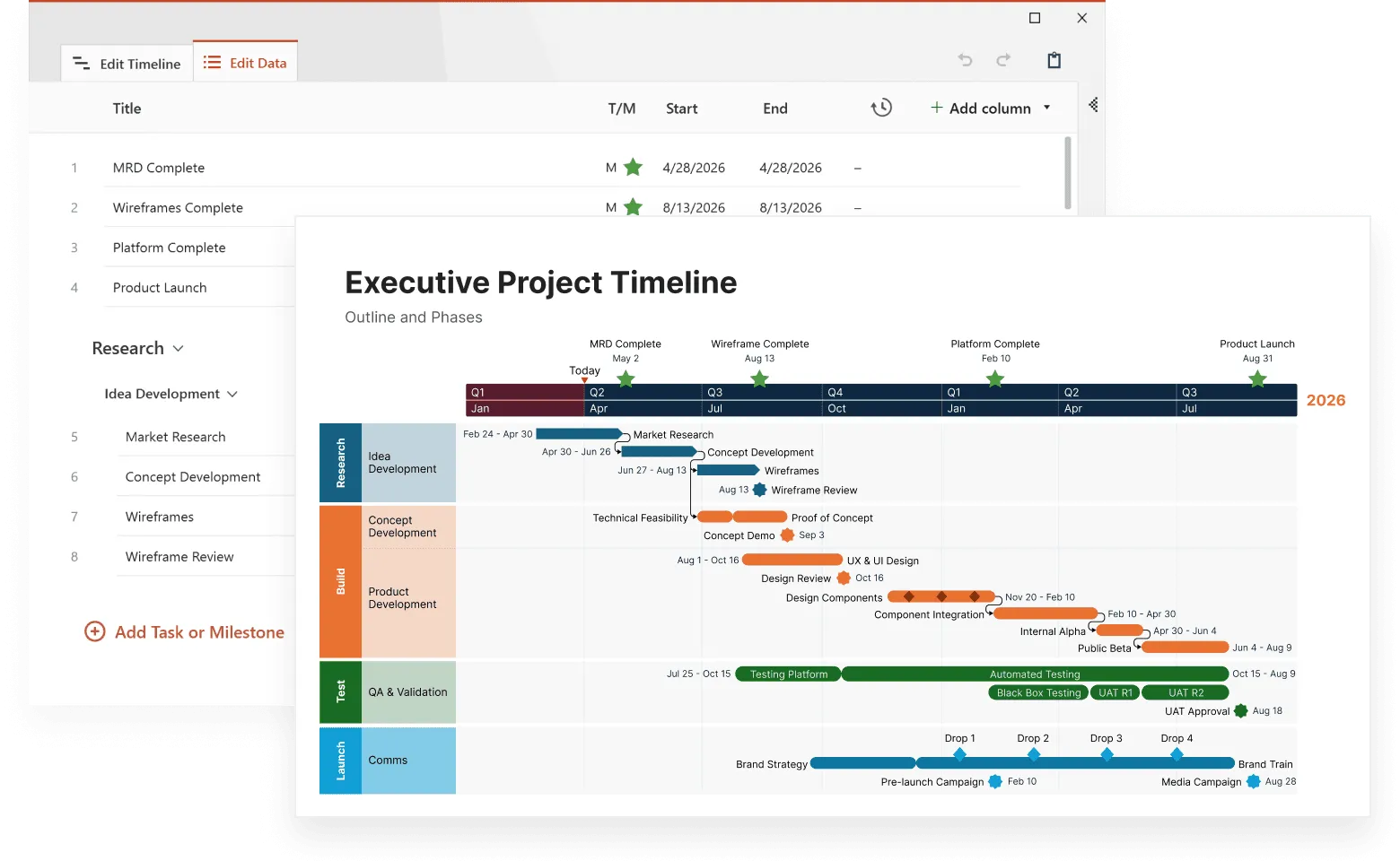
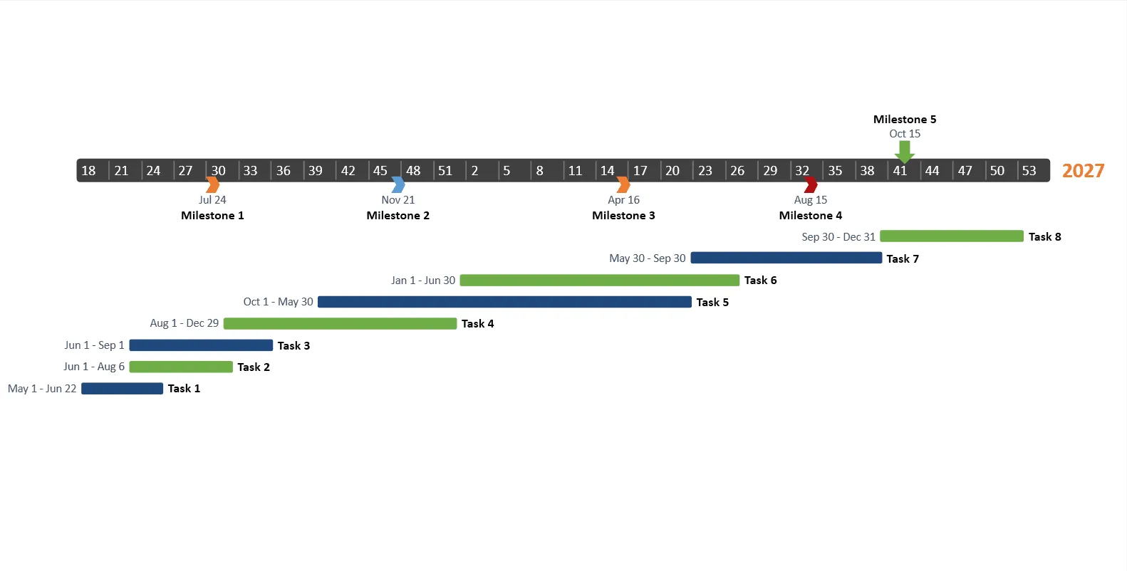
Example
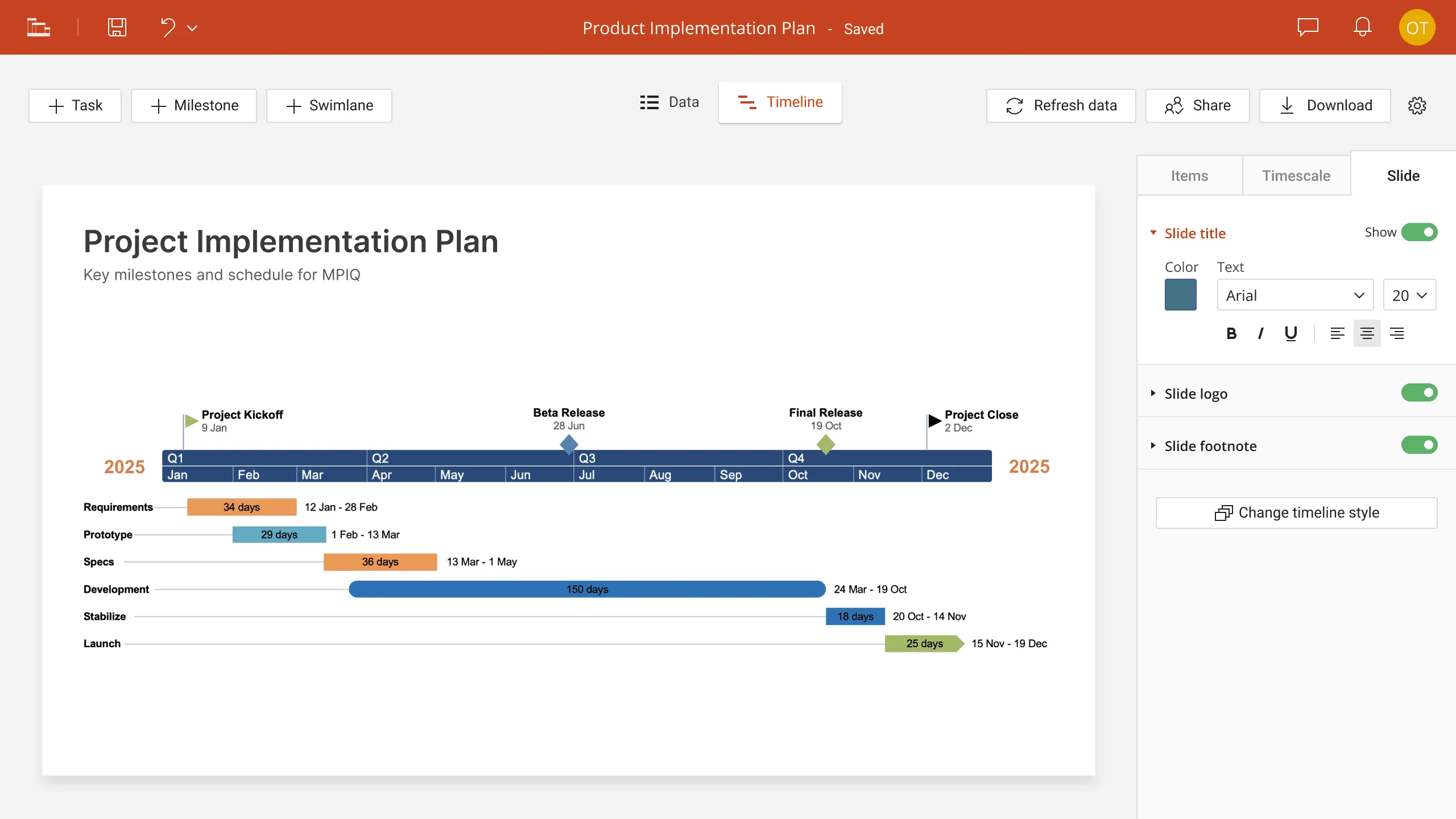
This image is an example of Gantt chart, used to visualize project schedules by showing tasks and milestones along a time axis. Horizontal bars represent tasks with their start and end dates, while color-coding helps distinguish overlapping and sequential activities. Milestones are marked with symbols and dates to highlight key checkpoints. It's ideal for tracking progress and managing timelines efficiently.
2.5. Biographical timelines
Biographical timelines focus on the life events of an individual, highlighting key achievements, milestones, and contributions. This format provides a chronological overview of a person's life and career.
Applications
Biographical timelines are used to:
- document the lives of historical figures, scientists, and industry leaders;
- showcase the career progression of individuals in specific fields;
- create educational materials about influential people;
- trace the evolution of an individual's ideas or contributions over time;
- map relationships and collaborations with contemporaries;
- illustrate how personal circumstances influenced professional decisions;
- demonstrate the lasting impact of someone's work beyond their lifetime.
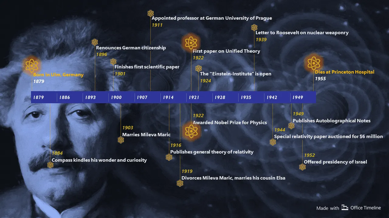
Example
This is an example of a biographical timeline for Albert Einstein, displaying key milestones in his life. The timeline combines chronological precision with visual appeal, arranging events from his birth in 1879 through his death in 1955. Notable moments are highlighted with atom icons, representing his scientific contributions, while a horizontal time scale at the bottom provides temporal context. This format effectively illustrates Einstein's personal journey, academic achievements, and historical impact in a single, integrated visual narrative, demonstrating how biographical timelines can condense a lifetime of significant events into an accessible, engaging format.
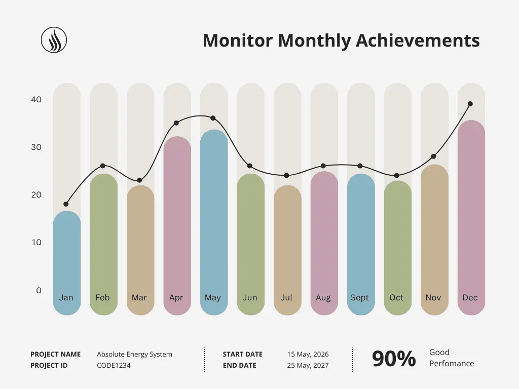
2.6. Vertical bar chart timelines
Vertical bar chart timelines combine chronological progression with quantitative data, such as revenue growth or sales figures. This format allows for the visualization of trends and growth over time.
Applications
Vertical bar chart timelines are used in:
- business analysis and financial reporting;
- data visualization for performance tracking;
- economic trend analysis across multiple time periods;
- comparing quarterly or annual performance metrics;
- tracking budget allocation and utilization over time.
2.7. Living graphs and logarithmic timelines
Living graphs show relationships between variables over time, such as population growth versus resource availability. Logarithmic timelines represent events spanning vastly different timescales, such as geological eras versus human history.
Applications
Living graphs are used in scientific research and data analysis to visualize dynamic relationships, while logarithmic timelines are used in geology, astronomy, and history to represent events across vast timescales.
For example, a living graph can be used to show the correlation between antibiotic usage and the emergence of antibiotic resistance. A logarithmic timeline can be used to represent the geological history of Earth, showing the major eras and events.
3. Choosing the right timeline type
The timeline format you select shapes how effectively your audience will grasp time-based relationships in your data. Different designs highlight different aspects of chronological information, making some formats better suited for certain stories than others. This section outlines practical considerations to help you match timeline types to your specific content and communication objectives.
3.1. Factors to consider
When selecting a timeline format, consider these practical factors to match your data with your audience's needs:
- Purpose of the visualization: What is the timeline's main goal? Is it to show event sequences, compare processes, or analyze trends? The purpose affects the format and detail level. A project schedule looks different from a historical overview.
- Target audience: Who will use this timeline? Specialists might need technical details, while general audiences need clear, straightforward presentations with minimal complexity.
- Data complexity: How complex is the data? Simple linear data works with basic timelines. Complex data with multiple variables needs interactive or comparative formats.
- Display platform: Where will the timeline show? Platform affects design and format. Website timelines can be interactive; printed ones are static.
- Data type: Is the data numbers or descriptions? Numerical data often works best with bar or line formats, while descriptive information fits better with milestone markers.
- Level of detail: How much detail is needed? Consider whether your timeline needs to highlight main events or include smaller developments too.
Build the timeline format you need
Try Office Timeline for free. Use intuitive templates to create timelines tailored to your project, history, or data narrative.
3.2. Layout selection
The way you arrange your timeline shapes how people understand your information. Picking the right layout helps your audience quickly grasp what matters most in your time-based story. Here's what to think about when choosing between different timeline arrangements.
Horizontal timelines:
These timelines present information along a left-to-right axis. They are well-suited for showing events that follow a clear progression, such as:
- the stages of a research project;
- the chronological development of a product;
- historical sequences of events.
The linear format allows for ample space to include detailed descriptions and supporting visuals below or above the timeline. Horizontal timelines are generally easy to follow, as people are accustomed to reading from left to right.
Vertical timelines:
These timelines display information along a top-to-bottom axis. They are useful when:
- the timeline contains a large number of events;
- the data includes hierarchical information, such as organizational structures or family trees;
- the timeline is intended for a digital format where scrolling is natural.
Vertical timelines can accommodate more data points within a limited horizontal space. They are good for showing the progression of something that builds from the top down.
Snake layout:
This layout presents information in a winding or zig-zag pattern. It is used for:
- complex narratives that do not follow a strict chronological order;
- stories with multiple interconnected threads;
- creative presentations where a non-linear approach is desired.
The snake layout allows for visual interest and can guide the viewer's eye through a complex story. This type of layout can be used to show events that loop back on themselves, or events that are connected in non-linear ways.
4. Applications across industries
Graphical timelines are used in many different sectors to put complex information in a clear and organized way. People in different jobs use these visual tools to make sense of time-based information in ways that fit their specific needs. Whether tracking a company's growth story, mapping out a construction schedule, or showing a patient's medical history, timelines help turn confusing sequences into clear visual stories.
Let's look at how different professions put timelines to work in their daily challenges.
4.1. Education: understanding the past and processes
Chronological timelines are a staple in education, providing students with a structured framework to grasp historical events and scientific processes. They simplify intricate information, making it easier for students to see how events are connected and understand cause-and-effect relationships.
Applications in education:
- Curriculum planning: Organizing educational content in a logical sequence.
- Illustrating scientific processes: Visualizing the steps of a scientific experiment or natural phenomenon.
- Biographical studies: Showing the life and achievements of important figures.
- Literature analysis: Plotting the sequence of events in a novel or play.
- Environmental studies: Tracking changes in ecosystems over time.
- Teaching historical events: Timelines provide context and order to historical stories.
This Independence Day timeline exemplifies effective educational design by organizing Revolutionary War events into distinct military and diplomatic categories.
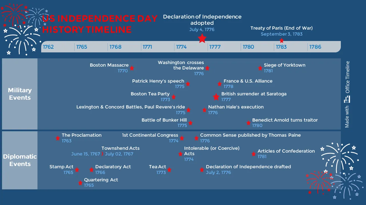
Its clear structure helps students understand how political decisions and battlefield events influenced each other during the same time periods. The consistent formatting, color-coding, and highlighted key moments like the Declaration of Independence support multiple teaching approaches. The timeline helps make abstract historical relationships more accessible in the classroom.
Find more examples and free timeline templates for teachers, perfect for any school project or lesson plan, made with Office Timeline.
4.2. Business and marketing: planning and analysis
In business, timelines are important for managing projects and analyzing markets. Gantt charts help track project timelines, while comparative timelines aid in analyzing market trends and competitors.
Applications in business and marketing
- Project management: Gantt charts track tasks, deadlines, and dependencies.
- Market analysis: Comparative timelines analyze market trends and competitor activities.
- Product launch planning: Timelines coordinate marketing, sales, and distribution activities.
- Financial reporting: Vertical bar chart timelines visualize revenue growth and financial performance.
- Supply chain management: Visualizing the flow of goods and services.
- Strategic planning: Setting long-term goals and milestones.
- Tracking sales and marketing campaigns: Monitoring the effectiveness of campaigns over time.
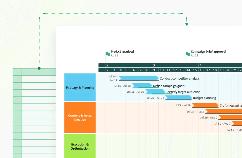
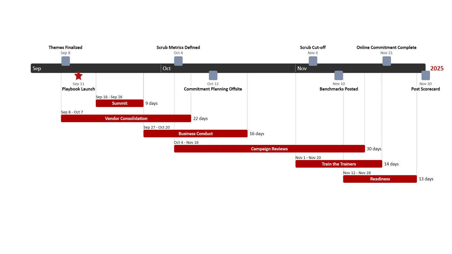
This marketing timeline excels by combining strategic milestones with tactical execution details in a single view. The clear sequence, marked duration of each marketing activity, and visual indication of overlapping workstreams gives marketing teams exactly what they need: both campaign strategy and practical resource planning. The design efficiently communicates timing relationships and dependencies across a complex multi-month campaign in a format that's immediately useful for marketing planning and coordination.
Discover more of our professionally designed business templates, like the marketing plan timeline template and the swimlanes roadmap template, created specifically to help teams visualize campaign strategies, track progress, and coordinate cross-functional execution.
4.3. Media and storytelling: engaging stories
Interactive timelines make stories more engaging in media and storytelling. News sites covering complex topics like political developments or tech innovations use these visual tools to help readers see how events connect over time. Rather than overwhelming audiences with walls of text, interactive timelines let people explore at their own pace - clicking through key moments, seeing patterns emerge, and understanding how one event led to another. This visual approach transforms complicated narratives into clear storylines, helping readers grasp the bigger picture while still accessing the specific details that interest them most.
Applications in media and storytelling
- Documentaries and news reports: Interactive timelines provide context and background information.
- Video games: Timelines display character progression and world history.
- Museum exhibits: Interactive timelines engage visitors with historical artifacts and events.
- Digital storytelling: Presenting complex storylines in a clear format.
- Visualizing media technologies: Tracking the development of media technologies over time.
- Film and theater productions: Plotting the sequence of scenes and events.
- Historical dramas: Providing historical context to fictional narratives.
4.4. Healthcare and pharmaceutical: managing processes
In healthcare and pharmaceuticals, timelines bring clarity to complex processes that often span months or years. Doctors and nurses use patient treatment timelines to track progress and ensure important steps aren't missed between shifts.
Drug development teams rely on visual schedules that map out the path from early research through clinical trials to market approval, helping them manage the countless tasks and checkpoints along the way. During vaccine rollouts, timelines help coordinate manufacturing, shipping, and distribution across regions. These practical tools convert complicated medical protocols and development cycles into straightforward visual guides that teams can follow while managing daily responsibilities.
Applications in healthcare and pharmaceutical
- Medical research and drug development: Visualizing the progression of medical research and drug development.
- Medical research funding: Tracking grants and funding over time.
- Drug development: Chronological timelines show the stages of drug development.
- Patient history: Timelines document patient medical history.
- Regulatory submissions: Timelines track the preparation and submission of regulatory documents.
- Visualizing disease spread: Understanding how diseases spread to inform public health strategies.
- Healthcare policy development: Visualizing the evolution of healthcare policies.
- Clinical trial tracking: Gantt charts monitor the progress of clinical trials.
This clinical trial roadmap shows why healthcare timelines work well by organizing complex drug development into color-coded phases. It highlights both the practical aspects (patient recruitment, enrollment dates) and regulatory checkpoints that matter to pharmaceutical teams. By displaying clear durations and phase transitions, it helps researchers track progress across a lengthy development cycle while managing expectations about when key milestones will occur. The straightforward visual format makes it easier for teams to coordinate activities and for stakeholders to understand the path from initial trials to potential drug approval.

4.5. Technology and IT: development and maintenance
In the tech industry, timelines are critical tools for managing software development cycles and IT projects. They help track milestones and deadlines, ensuring projects are completed on time.
Applications in technology and IT
- Software development: Timelines track development stages from design to launch.
- IT Project management: Gantt charts manage tasks and dependencies for IT projects.
- Network maintenance: Scheduling maintenance and upgrades to minimize downtime.
- Cybersecurity planning: Timelines for implementing security measures and responding to threats.
- Data analytics: Visualizing data trends over time to inform business decisions.
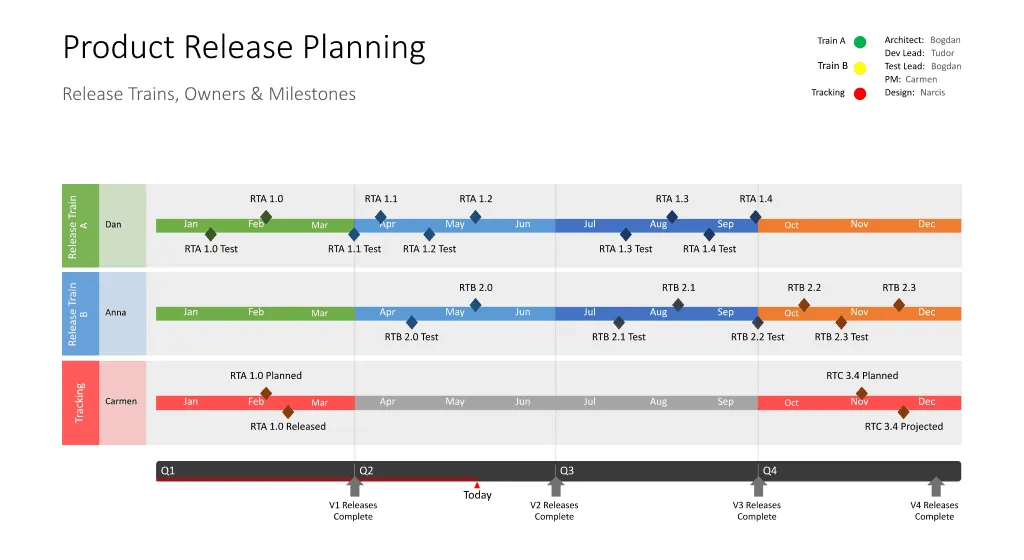
This technology roadmap demonstrates effective IT timeline design by using parallel swimlanes to track software development across planning, testing, and deployment phases.
The color-coded visualization shows how different team members' work intersects across multiple releases, with diamond markers indicating test cycles and completion points. By aligning releases with quarterly business periods and clearly displaying version dependencies, the timeline provides both technical teams and stakeholders with the precise visibility needed to coordinate complex software delivery schedules while tracking progress toward complete version deployments throughout the year.
4.6. Government and public sector: policy and planning
In government and public sectors, timelines are used for policy planning, public service delivery, and infrastructure projects. They help track progress and ensure accountability.
Applications in government and public sector
- Policy development: Timelines track the development and implementation of policies.
- Infrastructure projects: Managing construction timelines for public works.
- Public service delivery: Coordinating service delivery schedules and milestones.
- Emergency response planning: Timelines for emergency response and disaster recovery.
- Budget planning: Visualizing budget allocations and expenditures over time.
Graphical timelines transform how we understand and navigate time-based information across every sector. By using graphical timelines, industries can communicate more clearly and effectively, making complex information easier to understand and manage.
Conclusion
Graphical timelines provide distinct formats for showing time-based data. Each format serves a particular function. Recognizing the differences between these formats improves communication. Choosing a timeline that aligns with the data and the intended audience simplifies information comprehension.
For example, a chronological timeline effectively displays the steps of a research study, showing the order of each phase. Conversely, a Gantt chart allows for the tracking of individual tasks and their deadlines within the same study. The correct timeline choice presents data accurately and makes it easy for viewers to grasp the information.
Where spreadsheets and text documents bury key connections in data, well-designed timelines reveal the hidden patterns and relationships that drive decisions. These visual tools organize events into meaningful narratives, highlight critical turning points, and bridge the gap between raw chronology and meaningful insights.
Whether mapping a patient's medical journey, coordinating a product launch, or bringing historical events to life for students, thoughtfully crafted timelines cut through complexity and create "aha moments" when patterns suddenly become clear. In our data-rich world, they serve as navigational tools that help us record what happened when, and also understand why it matters.
Frequently asked questions
If you still have questions about timeline types, this section gives simple answers and shows how different formats can be used in practice.
There isn't a fixed, universally agreed-upon number of "types" of timelines. Timelines can be categorized in various ways, and the specific categories depend on the criteria used for classification. Here's a breakdown of common categories:
By sequence:
If you need to show events in the order they occurred, you'll use a chronological timeline. This type of timeline is what most people think of when they picture a history of something, clearly showing what happened first, second, and so on.
By comparison:
When you want to highlight the differences or similarities between two or more things happening over time, you'll use a comparative timeline. Imagine wanting to see how two different medications progressed through their development phases; a comparative timeline would show them side-by-side.
By interactivity:
Timelines can be either static or interactive. A static timeline is a fixed image or printed document, like a poster. An interactive timeline, on the other hand, is usually digital, allowing you to click on events, zoom in for more detail, or explore different aspects of the timeline.
By purpose:
Timelines are used for various specific purposes. For project management, you'd use a Gantt chart, which tracks tasks and deadlines. If you're documenting the life of a person, you'd use a biographical timeline. And if you want to show how data changes over time, you'd use a data visualization timeline, which might incorporate graphs or charts.
By scale:
Timelines can also differ in their scale. A linear timeline uses consistent time intervals, showing equal amounts of time between each point. However, if you need to show events that happened over vastly different time scales, you'd use a logarithmic timeline, which compresses or expands the time scale as needed.
Timelines come in different forms, each designed to highlight specific aspects of how events unfold. The most popular 3 timeline types are the chronological, comparative, and Gantt chart. They address fundamental needs in how we understand and manage information.
Chronological timelines present events in the order they occurred. Imagine a straight line showing the rise and fall of empires, or the step-by-step progress of a scientific discovery. This type is straightforward and helps to build a basic understanding of sequences.
Comparative timelines place two or more sets of events side-by-side. This allows you to see how different things evolved over the same period. For example, you might compare the development of medical treatments in two different centuries, or the evolution of two competing companies.
Gantt charts, mostly used in project management, display tasks along a horizontal timeline, showing when they start, how long they last, and how they relate to each other. Think of it as a visual to-do list for complex projects, ensuring everything stays on schedule.
Horizontal timelines progress left to right, suitable for linear sequences. Vertical timelines progress top to bottom, useful for dense information or scrolling formats.
Gantt charts focus on project tasks and deadlines. They use horizontal bars to show task durations and dependencies. Other timelines may not include task duration information.
Dynamic timelines are used for complex data exploration, educational simulations, and website content. They allow users to interact with the data and retrieve more detailed information. For example, a historical website can allow a user to click on a date to see images and text of that time period.
Logarithmic timelines compress large timescales. They show events across orders of magnitude. This is useful when showing events that happened over very long or very short time frames.
They can display character progression, world history, or plot development. For example, a game might show the player's progression through levels on a timeline.
Chronological timelines are best for presenting historical events. They show events in the order they occurred.
Vertical bar chart timelines show growth metrics alongside chronological progression. The vertical bars can represent revenue or other growth metrics.
Horizontal timelines show task durations and dependencies. This helps project managers to track progress and identify potential delays.
Yes. For example, a project timeline might show a vertical timeline with the overall project duration, and horizontal Gantt charts for the individual tasks.
Interactive timelines allow users to engage with data. Static timelines display fixed information. Users can zoom in, click on items, or watch animations within an interactive timeline.