Project managers dealing with complex datasets know the frustration of basic timeline tools that show events but miss the story behind them. Advanced timeline software changes this by turning scattered data points into clear patterns that reveal what's really happening in your projects.
This article breaks down how professional timeline analysis software works, what specific features make it worth the investment, and practical steps for getting real value from these tools in your organization, building on principles found in expert-level timeline analysis.
What makes timeline software advanced
The difference between basic and advanced timeline software comes down to analytical depth. While simple tools plot events on a calendar, professional systems dig into the data to find connections, predict outcomes, and spot problems before they happen.
Advanced timeline software processes multiple data streams simultaneously. Instead of manually entering project updates, these systems pull information directly from your existing tools - project management platforms, databases, API feeds, and real-time monitoring systems. The software then applies statistical analysis to identify patterns that human reviewers typically miss.
For example, a basic timeline maker would show each task as separate bars without revealing the underlying relationships.
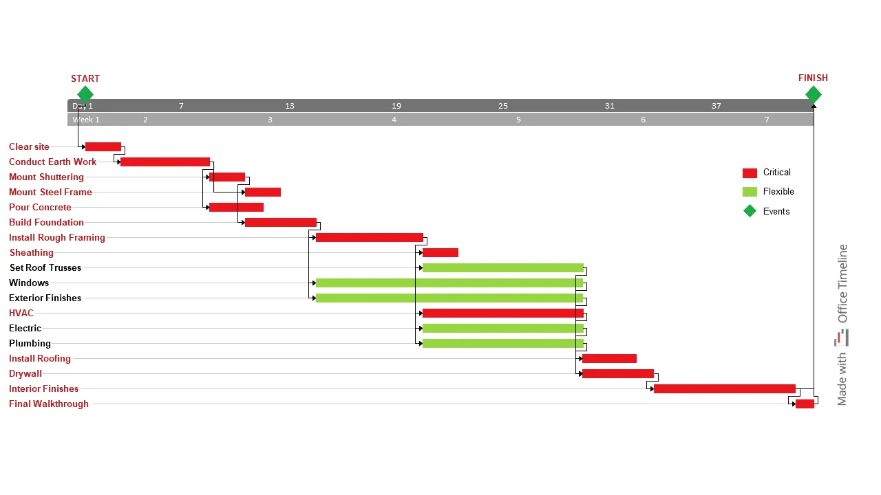
The construction timeline above, created with Office Timeline, demonstrates how professional presentation tools transform complex project data into clear visual communication. Notice how critical path tasks (red bars) are immediately distinguishable from flexible tasks (green bars), making dependency relationships obvious to stakeholders.
This visual clarity helps project managers communicate risk scenarios, showing that delays in early foundation work like "Clear site" or "Conduct Earth Work" will cascade through the critical path, affecting "Install Rough Framing" and ultimately pushing back "Interior Finishes" by weeks.
Professional systems also handle much larger datasets. While basic tools slow down with hundreds of events, advanced software processes thousands of data points across multiple projects without performance issues. This scale matters when analyzing enterprise-level operations or historical data spanning several years.
For presentation-focused needs, Office Timeline excels at creating executive-ready visuals from Microsoft Project data, while analytical platforms like Smartsheet and enterprise solutions handle the heavy computational lifting.
The analytical capabilities separate professional tools from consumer options:
- Correlation detection finds relationships between events across different project areas.
- Trend forecasting uses historical data to predict future timeline risks.
- Resource optimization identifies when teams are overloaded before delays occur.
- Impact modeling shows how changes in one area affect the entire project.
- Automated reporting generates insights without manual data crunching.
These capabilities transform timeline software from a display tool into an analytical engine that guides decision-making.
Data integration that actually works
Real timeline analysis starts with getting data from all your existing systems into one place. Professional timeline software connects to the tools you already use without requiring manual exports or format conversions.
Modern platforms integrate with project management systems like Asana, Monday.com, and Jira through direct API connections. They also pull data from financial systems, HR platforms, and custom databases. The software handles different date formats, time zones, and data structures automatically.
Some tools specialize in specific integrations. Office Timeline works seamlessly with Microsoft Project and Excel, making it ideal for organizations already using Microsoft's project management ecosystem.
Import project data effortlessly
Try Office Timeline for free. Turn your Microsoft Project and Excel data into polished, presentation-ready timeline slides in minutes.
Automated data processing
Once connected, the system cleans and standardizes your data without human intervention. This includes:
- Duplicate removal - identifies and merges identical events from different sources.
- Date standardization - converts various date formats into a consistent timeline.
- Missing data detection - flags gaps and suggests where to find missing information.
- Quality validation - spots inconsistent entries that could skew analysis.
A marketing agency using timeline analysis software found that their campaign data from three different platforms contained 40% duplicate entries. The software automatically identified and removed these duplicates, revealing the actual campaign timeline and budget allocation.
Real-time data updates
Professional systems update automatically as new information becomes available. When a project deadline changes in your project management tool, the timeline analysis updates immediately. This real-time capability means your analysis always reflects current conditions rather than outdated snapshots.
Data integration done right eliminates the manual work that makes timeline analysis too time-consuming for regular use.
Visualization that reveals insights
Interactive timeline visualization goes beyond pretty charts to reveal relationships and patterns that drive better decisions. Professional software creates multi-layered displays where you can zoom from high-level overviews to detailed event sequences without losing context.
The visualization engine handles complex data relationships through:
- Layered timelines showing different organizational levels simultaneously.
- Dynamic filtering to focus on specific time periods, teams, or event types.
- Comparison overlays that display multiple projects or historical periods side by side.
- Drill-down capabilities moving from summary views to detailed event data.
- Custom color coding based on project status, priority, or resource allocation.
A software development team discovered through timeline visualization that their bug fix cycles consistently extended when certain team members worked on specific types of issues. The visual pattern revealed training gaps that weren't obvious in traditional project reports.
Advanced systems also support different viewing modes for different users. Executives see high-level milestone progress while project managers access detailed task dependencies and resource allocation views.
Presentation-focused tools like Office Timeline bridge this gap by transforming complex project data into polished executive summaries and stakeholder reports that communicate key insights without overwhelming detail.
Professional timeline analysis identifies recurring patterns using machine learning algorithms that process far more data than human analysts can handle. These systems group similar events, detect seasonal variations, and flag unusual sequences that might indicate emerging problems.
Pattern recognition analyzes event sequences to understand typical project workflows. For example, the software might discover that projects starting with incomplete requirements documents take 30% longer to complete. This insight helps teams focus on better upfront planning.
The system also performs frequency analysis, measuring how often specific events occur and identifying optimal timing for different activities. A manufacturing company found that equipment maintenance scheduled on Tuesdays resulted in 25% fewer production delays compared to other weekdays.
Duration pattern analysis reveals how long different types of activities typically take, helping with more accurate future planning. The software builds these patterns from historical data, continuously refining predictions as new projects complete.
Dependency mapping for complex projects
Understanding how project elements connect helps predict the impact of changes before they cause delays. Professional timeline software maps these dependencies automatically by analyzing historical data and current project structures.
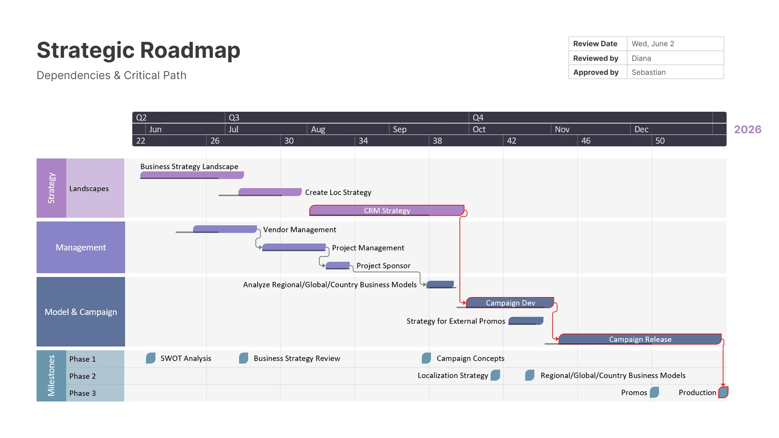
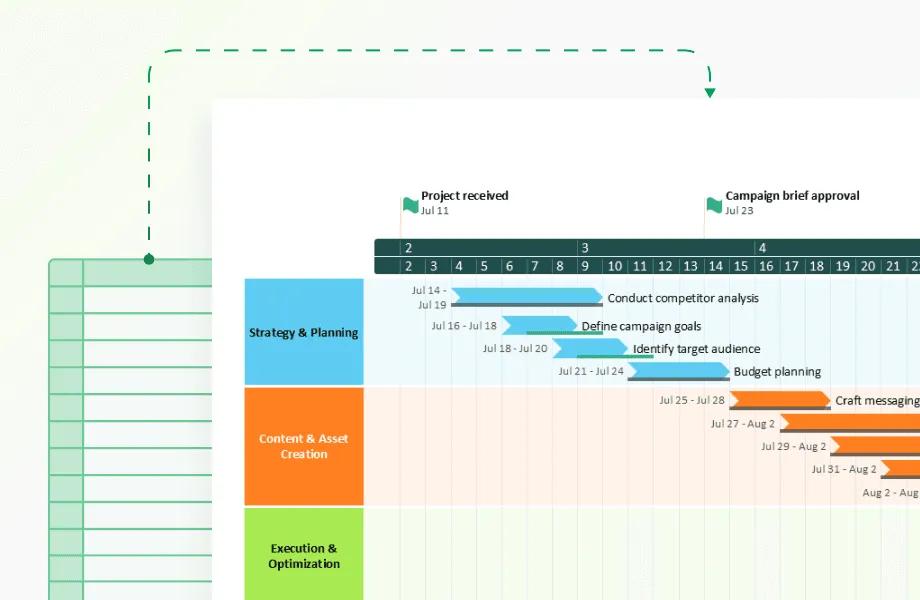
The strategic business timeline above, created with Office Timeline, demonstrates how complex multi-departmental projects benefit from clear dependency visualization.
This example shows a comprehensive business strategy rollout organized into distinct swim lanes - Strategy, Management, Model & Campaign, and Key Milestones - each with color-coded tasks that reveal both sequential dependencies and parallel workstreams.
The system identifies several types of dependencies:
- Sequential dependencies where one task must complete before another starts.
- Resource dependencies where multiple tasks compete for the same people or equipment.
- External dependencies involving vendors, approvals, or outside factors.
- Soft dependencies where tasks benefit from coordination but don't require strict sequencing.
Impact analysis quantifies how changes propagate through the project. When a key milestone shifts, the software calculates which other elements will be affected and by how much. This capability helps project managers make informed decisions about trade-offs and resource allocation.
Once dependencies are mapped, presenting these complex relationships clearly becomes important for stakeholder communication. Office Timeline excels at transforming dependency data into visual formats that executives and clients can easily understand, while platforms like Microsoft Project and Smartsheet focus more on the technical calculation aspects.
Critical path analysis goes beyond traditional project management by considering resource constraints and historical performance data. The software identifies not just the longest sequence of tasks, but the most vulnerable points where delays are likely to occur based on past experience.
A construction firm using dependency mapping discovered that permit delays had three times more impact on overall project completion than originally estimated because of cascading effects on subcontractor scheduling.
Predictive capabilities that work
Forecasting based on timeline data helps organizations plan proactively rather than react to problems after they occur. Professional software uses statistical models trained on historical data to generate realistic predictions about future events.
Predictive models consider multiple factors simultaneously:
- historical performance patterns from similar projects;
- current resource availability and utilization rates;
- external factors like seasonal variations or market conditions;
- risk indicators based on early warning signals in the data.
Scenario analysis explores different potential outcomes based on various assumptions. Project managers can test "what if" questions like the impact of adding resources, changing deadlines, or shifting priorities before making actual decisions.
Risk assessment identifies events or conditions that could negatively impact timelines. The software assigns probability scores based on historical data and current project conditions. A technology company found that projects with more than 15% staff turnover in the first month had an 80% chance of missing their delivery dates.
Resource planning predictions help organizations anticipate future capacity needs based on projected activity levels. Instead of reacting to resource crunches, teams can plan hiring, training, or equipment purchases in advance.
Getting started with professional timeline analysis
Successful implementation requires matching software capabilities to your specific analytical needs rather than choosing based on feature lists. Start by identifying the key questions you need timeline analysis to answer.
Planning your data architecture
Before selecting software, map your current data sources and quality levels. Professional timeline analysis requires consistent, reliable data feeds. Identify which systems contain timeline-relevant information and assess their data quality.
Consider storage requirements for historical data. Timeline analysis becomes more valuable over time as the system builds a larger database of patterns and relationships. Plan for data retention periods that support meaningful trend analysis.
Security and access controls matter for professional implementations. Different users need different levels of access to timeline data and analysis results. Establish clear policies about who can view, modify, or export timeline information.
Training for real adoption
Professional timeline software requires investment in user training that goes beyond basic software operation. Users need to understand analytical concepts, data interpretation, and reporting techniques to extract real value.
Training should cover:
- Software mechanics - navigation, feature usage, and customization options.
- Analysis methodology - how to interpret results and identify meaningful patterns.
- Data quality - recognizing and addressing data issues that affect analysis.
- Reporting skills - creating presentations that communicate insights effectively.
Start with a pilot group of power users who can become internal experts and train others. This approach builds organizational capability while reducing external training costs.
Integration planning
Timeline analysis delivers maximum value when embedded in existing workflows rather than operating as a separate system. Map your current decision-making processes and identify specific points where timeline insights would improve outcomes.
Automated reporting reduces the manual effort required to maintain timeline analysis. Set up regular reports for different stakeholder groups, customized to their specific information needs and decision-making responsibilities.
API connections allow other systems to access timeline analysis results, enabling automation of routine decisions based on timeline insights.
Measuring real business impact
Professional timeline analysis should produce measurable improvements in project outcomes and organizational efficiency. Track specific metrics that matter to your business rather than generic software usage statistics.
Performance indicators that matter
Focus on metrics that directly relate to your business objectives:
- Decision speed - time from problem identification to action taken.
- Prediction accuracy - percentage of forecasts that prove correct within acceptable ranges.
- Cost avoidance - value of problems prevented through early identification.
- Resource utilization - improvement in capacity planning and allocation efficiency.
A logistics company measured success by tracking the percentage of delivery delays prevented through timeline analysis. They achieved a 60% reduction in late deliveries within six months of implementation.
Long-term value tracking
Advanced timeline software creates value that compounds over time:
- process improvement based on pattern identification and optimization opportunities;
- institutional knowledge captured in timeline databases and analysis models;
- competitive advantage through superior planning and risk management capabilities;
- scalability handling growth without proportional increases in analytical overhead.
Track these longer-term benefits through annual reviews that assess organizational capability improvements rather than just software functionality.
Conclusion
Advanced timeline software transforms how organizations understand and respond to temporal patterns in their operations. The key to success lies in choosing tools that match your analytical needs, implementing them systematically, and measuring results that matter to your business.
Professional timeline analysis pays for itself through improved decision-making, reduced risk exposure, and better resource utilization. Organizations that invest in proper implementation and user training gain competitive advantages in increasingly complex business environments.
The difference between basic timeline tools and professional analytical platforms comes down to depth of insight and actionable intelligence. While simple tools display information, advanced systems generate understanding that drives better business outcomes.
Frequently asked questions
Here are our answers to some questions coming from project managers and analysts evaluating timeline analysis software for their organizations. The answers provide practical guidance based on real implementation experiences. Hope they help!
Gantt charts display schedules while timeline software analyzes performance patterns. The key difference lies in purpose and capability.
Gantt charts excel at showing planned project schedules and task relationships. They help you organize work and communicate timelines to stakeholders. However, they don't learn from what actually happens during project execution or identify why some projects succeed while others struggle.
Advanced timeline software goes deeper by:
- analyzing actual performance data from completed projects;
- identifying patterns that predict future problems;
- processing data from multiple sources beyond project management tools;
- using statistical analysis to quantify relationships between events;
- generating forecasts based on historical performance.
Think of Gantt charts as planning tools while timeline software functions as a performance intelligence platform that gets smarter over time.
Yes, most professional platforms connect directly to Asana, Monday.com, Jira, Microsoft Project, and other major PM tools through APIs. Integration quality varies significantly between vendors.
Modern timeline analysis software offers pre-built connectors that sync task data, team assignments, milestone dates, and resource allocation automatically. The best integrations update in real-time as your project data changes, while basic connectors may sync daily or require manual updates.
Different tools excel in different integration scenarios. Office Timeline provides seamless Microsoft Project and PowerPoint integration, while platforms like Smartsheet offer broader third-party connectivity, and enterprise solutions like Clarity PPM handle complex multi-system environments.
It is a good idea to request a technical demonstration using your actual data before making a purchase decision. This reveals integration limitations that aren't obvious in standard demos.
The best choice depends on your presentation needs and existing tools. Software varies significantly in visual capabilities.
Office Timeline excels for Microsoft environments with polished PowerPoint integration. Smartsheet offers good collaboration with decent visuals, while Lucidchart provides excellent diagramming for complex timelines. Enterprise tools like Microsoft Project focus on data depth over visual polish.
You should match your presentation requirements to software strengths. Many teams use specialized presentation tools alongside their primary analysis platform.
Basic functions require minimal technical skills, but advanced features need analytical background. Most professionals master essentials within weeks.
Modern software prioritizes user-friendly interfaces without requiring coding knowledge. Creating timelines, generating reports, and interpreting patterns falls within typical project manager capabilities.
Advanced features like custom statistical modeling, complex integrations, and predictive algorithms benefit from analytical backgrounds. Many organizations succeed by having 1-2 power users handle advanced setup while others focus on daily analysis. Start with user-friendly tools and expand complexity as skills develop.