Graphics turn flat, text-heavy timelines into compelling visual stories that grab attention and communicate information faster than words alone. When you add icons, images, and visual markers to your timeline, you create a document that people actually want to read and can understand at a glance.
The difference between a basic timeline and one enriched with visual elements is like comparing a grocery list to an infographic. Both contain information, but only one makes you stop and look.
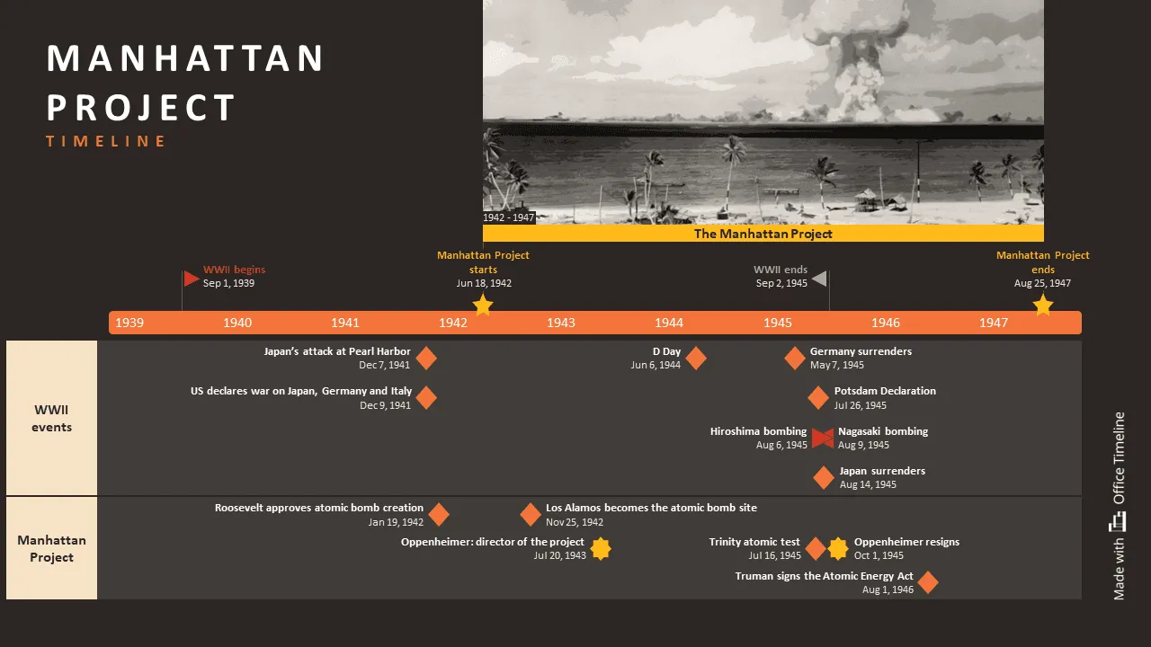
This article explores how to incorporate visual elements into your timelines, from choosing the right icons to implementing proper color strategies. You’ll learn which graphics work best for different timeline types, how to maintain visual consistency, and practical techniques for creating timelines that communicate more clearly through strategic use of images, symbols, and design elements, drawing inspiration from methods used in advanced timeline visualization.
Why graphics make timelines more powerful
Visual elements serve specific cognitive functions in timeline design. Your brain processes images 60,000 times faster than text, which means a well-placed icon can convey meaning before someone even reads the accompanying text.
Graphics also create visual hierarchy. When you scan a timeline filled with text, everything looks equally important. Add a bright red warning icon next to a critical deadline, and that milestone immediately stands out from the rest.
Color coding through graphics provides another layer of organization. You might use blue icons for planning phases, green for execution, and orange for review periods. This system lets readers quickly identify different types of activities without reading detailed descriptions.
Visual elements also improve memory retention. The picture superiority effect shows that people remember information better when it's paired with relevant images. A timeline documenting a product launch becomes more memorable when each phase includes appropriate visual markers.
Types of graphics that work in timelines
Each type of visual element serves a specific purpose in timeline design. You have three main options for timeline graphics: icons for quick recognition, photos for authenticity, and charts for data display. Knowing when to use each helps you pick the right graphic for a specific situation.
Icons and symbols
Icons work best when they directly relate to the content they represent. A calendar icon for scheduling milestones makes immediate sense. A gear icon for development phases creates clear association. A checkmark for completed tasks provides instant status updates.
The most useful timeline icons follow these principles:
- simple designs that remain clear at small sizes,
- consistent style throughout the timeline,
- universal symbols that don't require explanation,
- high contrast colors that stand out against backgrounds.
Photographs and illustrations
Real photos add authenticity to personal or historical timelines. A company anniversary timeline gains emotional impact when you include actual photos from each year. Project timelines become more engaging with screenshots of work in progress.
Illustrations work well for abstract concepts or future events. If you're creating a timeline for a marketing campaign that hasn't launched yet, custom illustrations can represent planned activities without using stock photos that don't match your brand.
Charts and data visualizations
Small charts embedded in timeline entries can show progress or results without cluttering the main flow. A mini bar chart showing monthly sales figures tells a more complete story than just listing revenue numbers.
Progress bars work particularly well for project timelines. Instead of writing "Phase 1: 75% complete," a visual progress bar communicates the same information instantly.

Choosing the right graphics for your timeline
Your timeline's purpose should drive your graphic choices, not personal preferences or what looks attractive. Match your visual strategy to how people will actually use your timeline.
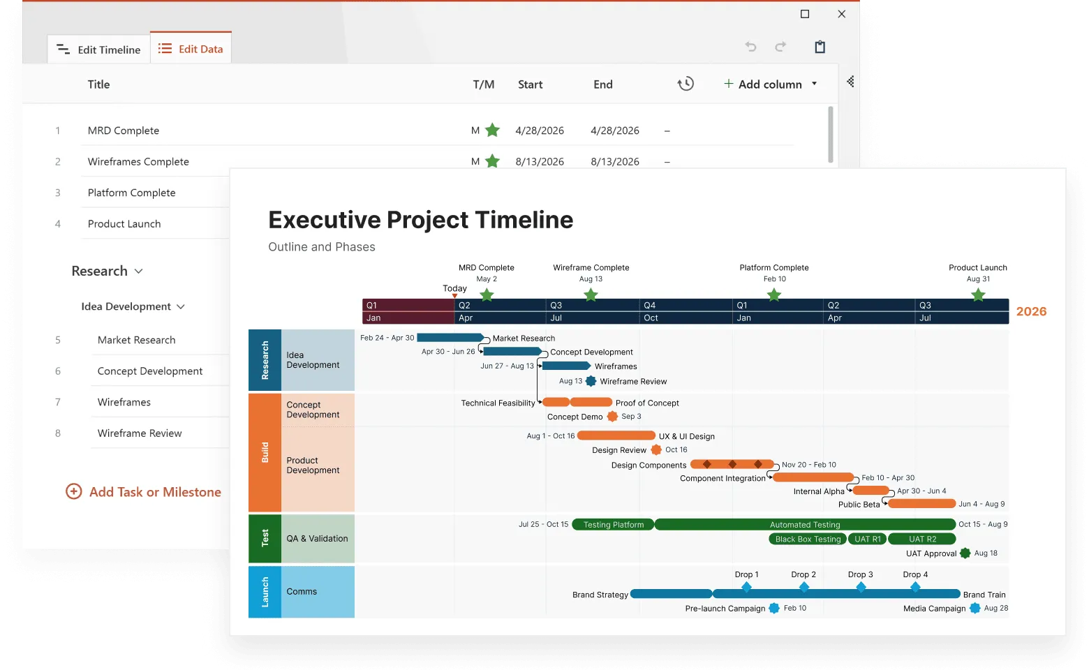
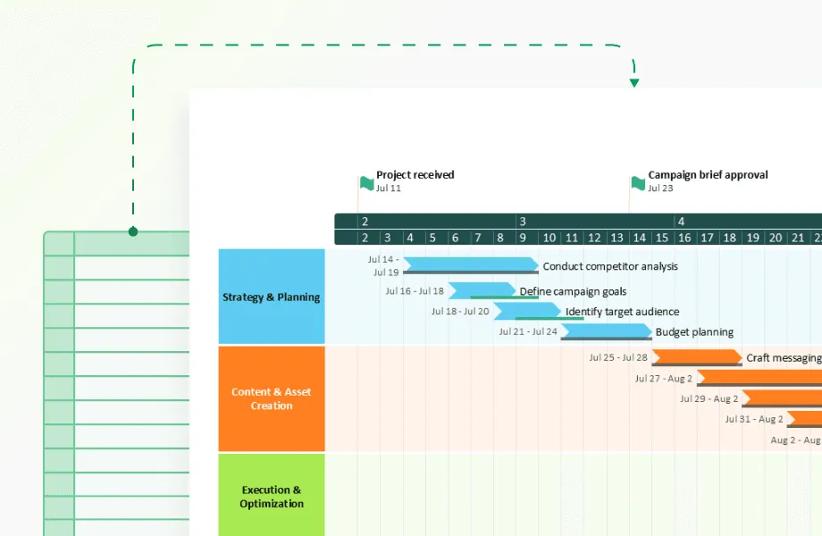
Business and project timelines need action-oriented graphics that communicate status and progress at a glance. Use meeting icons for collaborative phases, gear symbols for development work, document icons for deliverables, and checkmarks for completed milestones. Progress bars work particularly well here because stakeholders can instantly see how much work remains. Avoid decorative elements that don't convey specific information about project status or next steps.
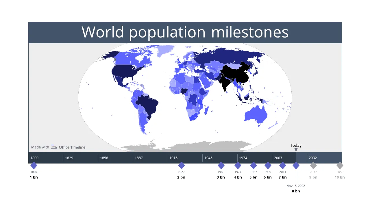
Historical timelines gain credibility from period-appropriate imagery. Actual photographs from the time period create authenticity that illustrations can't match. Maps help readers understand geographical context, while portraits of key figures personalize historical events. When historical photos aren't available, use simple icons that won't compete with the educational content.
Personal timelines benefit from mixing emotional photos with recognizable milestone symbols. Include actual photos from important events, supplemented by universal icons like graduation caps, wedding rings, or house symbols for life transitions. This combination creates emotional connection while maintaining visual organization.
Educational timelines should prioritize comprehension over visual appeal. Students need to focus on learning content, not deciphering complex graphics. Use simple, widely recognized symbols that support the educational material without creating additional cognitive load.
Your graphic choices should solve specific communication problems in your timeline. Icons provide quick status recognition, photos add credibility and emotion, and charts display quantitative information clearly. The most effective timelines use one primary graphic type consistently, then add other types sparingly where they serve a specific purpose.
Before adding any graphic, ask yourself: does this help readers understand the timeline better, or does it just fill space? Graphics that don't improve comprehension waste attention and make timelines harder to follow.
Tech tips for graphics in timelines
Graphics must work across different devices and viewing contexts. An icon that looks perfect on your computer screen might become unreadable on a mobile phone.
File formats and sizes
Vector graphics (SVG format) scale cleanly to any size without losing quality. This makes them ideal for timelines that might be viewed on different devices or printed at various sizes. Raster images (PNG, JPG) work fine for photographs but can become pixelated when scaled up.
Keep image file sizes reasonable, especially if your timeline will be shared online. Large image files slow down loading times and create poor user experiences.
Consistency in style
Mixing different graphic styles creates visual confusion. If you start with flat, minimalist icons, maintain that style throughout the timeline. Don't combine cartoon-style illustrations with photorealistic images unless you have a specific design reason.
Line weights, corner radii, and color saturation should remain consistent across all graphic elements. This creates visual harmony and makes your timeline look professionally designed.
Accessibility requirements
Graphics should support, not replace, text information. Screen readers can't interpret images, so include alt text for important graphics. Color alone shouldn't convey critical information - use shapes or patterns as backup communication methods.
Make sure you have sufficient color contrast between graphics and backgrounds. This helps users with visual impairments and makes timelines readable in various lighting conditions.
Color strategy
Color choices in timeline graphics serve both aesthetic and functional purposes. A well-planned color scheme improves readability and creates visual organization.
Start with a base color palette of three to five colors maximum. Too many colors create visual chaos and make timelines harder to follow. Choose colors that provide sufficient contrast against your background - light icons disappear on white backgrounds, while dark graphics become invisible on black backgrounds.
Consider color psychology when making choices. Red naturally draws attention and works well for deadlines or important events. Green suggests completion or positive outcomes. Blue conveys reliability and works well for planning phases. Yellow grabs attention but can be hard to read, so use it sparingly.
Color coding can organize information by category, priority, or status. You might use:
- different colors for different team members or departments,
- progression from light to dark to show increasing importance,
- warm colors for active phases and cool colors for planning periods,
- consistent colors for similar types of events across the timeline.
Your color choices will affect how people navigate and understand your timeline. Test your color scheme by showing it to others before finalizing - what seems obvious to you might confuse someone seeing it for the first time.
For a deeper dive into effective color usage, check out this article: How to use colors to create more powerful Gantt charts.

Common issues with timeline graphics
Bad graphic choices can make timelines harder to read and less professional. Adding too many colors, mixing different graphic styles, or using poor-quality images creates visual confusion. These mistakes happen frequently, especially when people rush to add graphics without planning.
Here are the three most common problems and how to avoid them:
Overloading with decorative elements
The biggest mistake in timeline graphics is using too many visual elements. Every graphic should serve a purpose: either communicating information or improving navigation. Decorative flourishes that don't add meaning distract from your content.
Inconsistent sizing and spacing
Graphics of different sizes create visual imbalance. Establish standard sizes for different types of graphics and stick to them. A timeline with randomly sized icons looks unprofessional and becomes harder to follow.
Inconsistent spacing between graphics and text also disrupts visual flow. Create spacing rules and apply them consistently throughout your timeline.
Using low-quality or irrelevant images
Poor image quality and irrelevant graphics hurt your timeline's credibility. Blurry photos or pixelated icons immediately signal poor quality. If you can't find high-quality graphics that fit your needs, it's better to use simple shapes or text formatting instead.
Graphics that don't relate to their content confuse readers. A random stock photo of people in a meeting doesn't add value to a timeline entry about budget planning. Use graphics that actually represent the events or concepts they accompany.
Knowing what makes graphics work is only half the battle, you also need to know where to get them.
Tools and resources for timeline graphics
Finding the right graphics doesn't require expensive software or design skills. Free icon libraries offer thousands of professional symbols, while stock photo sites provide business-appropriate images at no cost. These resources provide quality icons, photos, and design tools that work well for timeline projects.
Free icon libraries
Free icon libraries solve the biggest challenge in timeline graphics: finding professional-looking symbols that maintain visual consistency. When you download icons from different sources, they rarely match in style, line weight, or proportions. Using a single library keeps your timeline looking cohesive.
Several websites offer high-quality icons for timeline use:
- Noun Project provides thousands of icons in consistent styles, with collections curated by individual designers.
- Flaticon offers collections organized by theme, making it easy to find related icons for project phases.
- Font Awesome includes icons that work well in web-based timelines and load quickly as vector fonts.
The advantage of these libraries is standardization. Instead of mixing a thick-lined calendar from one source with a thin-lined checkmark from another, you get symbols designed to work together. Most also offer multiple file formats, so you can use the same icon set whether you're creating a printed timeline or a web-based project tracker
Professional design tools
The right design tool can save hours of formatting work and prevent common graphic mistakes. Timeline-specific templates include proper spacing, consistent icon sizing, and coordinated color schemes that would take significant time to create from scratch.
- Canva includes timeline templates with coordinated graphics that you can customize, plus drag-and-drop functionality that prevents sizing inconsistencies
- Adobe Creative Suite offers more advanced options for custom graphics creation, with precise control over colors, typography, and vector editing
- Figma provides collaborative design features that work well for team projects, allowing multiple people to comment on and edit timeline graphics without version control problems
- Sketch offers powerful vector editing capabilities specifically designed for interface and graphic design, with symbols and libraries that maintain consistency across timeline projects.
The main advantage of specialized design tools is built-in consistency for timeline graphics. These platforms automatically maintain proper spacing between timeline elements, ensure icons scale proportionally along the timeline, and provide color palettes that work well together. They also include export options optimized for different uses - web display, print, or mobile viewing.
PowerPoint remains a solid choice for simple timeline graphics, especially when you need to present the timeline directly or when your team already knows how to use it. PowerPoint's SmartArt timeline features and graphic formatting tools can create professional-looking timeline visuals without learning new software. For more advanced timeline creation in PowerPoint, the professional timeline maker from Office Timeline provides specialized templates and automated formatting that turns PowerPoint into a powerful timeline design tool while keeping the familiar interface.
Improve timeline design
Try Office Timeline for free. Create polished, professional timeline graphics directly in PowerPoint with automated templates and clean formatting.
Stock photography services
Stock photos can add authenticity to timelines, but only when they genuinely represent your content. The wrong photo choice makes timelines look generic and undermines credibility.
- Unsplash and Pexels offer free photos that work well in timelines, with business-appropriate images that don't require licensing fees
- Shutterstock provides more comprehensive collections with advanced search features, including filters for image orientation, color scheme, and specific industries
- Getty Images offers the highest quality options for professional projects, with exclusive photos that won't appear in competitors' materials
When using stock photos, choose images that genuinely relate to your timeline content. A photo of an actual product launch event beats a generic handshake photo for a business timeline. Generic business photos rarely improve communication and often make timelines look templated. The best approach is using real photos when possible, supplemented by carefully chosen stock images that directly represent your timeline events.
Measuring the impact of visual elements
Once you've built your timeline with carefully chosen graphics, how do you know if they're actually working? Adding graphics to your timeline should improve timeline performance, not just appearance. You can test whether your visual elements help by tracking how people use your timeline and asking them what works.
There are several methods for this:
- User engagement metrics
If your timeline is digital, track how long people spend viewing it. Graphics that improve engagement should increase viewing time and reduce bounce rates. - Comprehension testing
Ask users to extract specific information from your timeline. Compare how quickly and accurately they can do this with and without graphics. Useful visuals should improve both speed and accuracy. - Feedback collection
Direct feedback from timeline users reveals whether graphics help or hinder understanding. Ask specific questions about which visual elements were most helpful and which seemed unnecessary.
The goal is creating timelines that communicate more clearly, not just look more attractive. Graphics that don't improve communication waste time and resources.
Conclusion
Graphics can make the difference between a timeline that gets ignored and one that actually gets used. When you add the right visual elements, people can scan your timeline quickly, understand the key points, and remember the information later. The visual hierarchy you create helps readers focus on what matters most.
Start with one type of graphic and use it consistently throughout your timeline. Choose icons that immediately relate to your content - a calendar for deadlines, a checkmark for completions, actual photos for events rather than generic stock images. Keep your color palette simple and make sure everything remains readable on different devices.
Most importantly, test your timeline with real people before finalizing it. Show it to someone who wasn't involved in creating it and ask them to find specific information. If they struggle or get confused, simplify your graphics rather than adding more. The goal is communication, not decoration. A timeline with fewer, well-chosen graphics will always work better than one packed with visual noise.
Frequently asked questions
These are the most common questions people ask when adding graphics to their timelines. Whether you're creating your first visual timeline or looking to improve an existing one, these answers will help you make better design decisions.
Focus on action-oriented icons that immediately communicate what's happening. Calendar or clock icons work for deadlines, gear symbols for development work, checkmarks for completed tasks, and document icons for deliverables.
Avoid abstract or decorative icons that require explanation; if someone needs to think about what your icon means, choose a simpler alternative.
Stick to 3-4 colors maximum. Start with one dominant color for your timeline structure, add one accent color for important milestones, and include one additional color for categories if needed. Too many colors make timelines look chaotic and harder to follow.
No. Mixing different visual styles makes your timeline look unprofessional and confusing. Choose one graphic style from these options and use it consistently throughout your entire timeline:
- flat design icons (simple, solid-colored shapes),
- line art symbols (outlined drawings with no color fill),
- real photographs,
- hand-drawn illustrations.
For example, don't combine a flat blue calendar icon with a sketchy hand-drawn checkmark. Pick either flat icons for everything or hand-drawn style for everything. The exception is combining simple icons with photos, which works well if all your icons follow the same style.
Several reliable sources offer quality graphics. For icons, try the Noun Project for massive collections with consistent styles, Flaticon for category-organized options, or Font Awesome for web-friendly symbols. For photos, Unsplash provides high-quality business-appropriate images while Pexels offers good variety with easy search. Always check licensing requirements and choose images that actually relate to your content.
Only add graphics that serve a specific purpose. Not every entry needs visual elements. Use them to highlight critical milestones, show different activity types, indicate status, or break up text-heavy sections. A timeline with too many graphics becomes cluttered and loses impact.
SVG files work best for icons and simple graphics because they scale perfectly at any size. Use PNG for complex images with transparency and JPG for photographs. Avoid large, high-resolution files that slow loading times, especially for web-based timelines.
Accessibility improves usability. Add descriptive alt text to important images, don't rely only on color to convey information, and make sure you have sufficient contrast between graphics and backgrounds. Use shapes, patterns, or text labels as backup communication methods. Test your timeline in grayscale to verify that important information remains clear without color.
Keep graphics proportional and consistent throughout your timeline. Icons should typically measure 16-32 pixels for web timelines, while photos can be larger but should maintain uniform dimensions. Graphics should support your text content, not overpower it - create a style guide with specific dimensions and follow it for a professional appearance.