[Guest post] How to save time when putting together project reports
Find out how to save precious time when you're working on reports in this guest post by PM expert Peter Taylor.
Find out how to create powerful visual project updates for your stakeholders in this guest post by PM expert Peter Taylor.
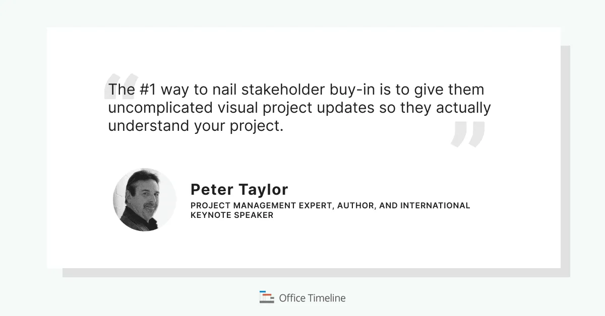
The #1 way to improve the success probability of your project is to nail stakeholder buy-in – but how do you do that? The #1 way to nail stakeholder buy-in is to give them uncomplicated visual project updates so they actually understand your project – but how do you do that?
To effectively communicate something requires all four of the following to be correct, providing the right information, providing it to the right person, delivering it in the right way, and delivering it at the right time.
Get any of these wrong, and you will fail to effectively communicate. For example, deliver the right information to the right person, in the right way but at the wrong time, then you have failed to effectively communicate. Or deliver the right information in the right way, and at the right time but to the wrong person, then once again you will have failed to effectively communicate.
I was taught a truth in my early project management days – reporting is not communicating! The fact that the critical facts and important truths are buried somewhere in a report that the right people may be in possession of does not, in any way, mean that they have received the message.
This is a harsh reality all of your busy, busy project managers out there. The fact you can produce the most wonderful 16-page report with graphs and diagrams and every single data point included, designed with beautiful font layouts, a rainbow of colours, and high-definition images, and you email it every single stakeholder (and their best friend) actually means you have probably effectively communicated to absolutely nobody!
Why? Because you have failed to deliver the right information, to the right person, in the right way, and at the right time.
When I was leading some very substantial PMOs, global in nature, hundreds of project managers around the world, leading thousands of projects on an annual basis, we had this fundamental issue of effectively communicating to a whole range of stakeholders but particularly to the executives inside the organisation.
All of my project managers were incredibly busy and yet they all had the challenge of how to represent the key aspects of their projects to the business executives, who in turn were busy people who did not have a lot of time and who were overseeing many, many projects at any given time.
Every project manager was being asked to share information with people internally, people externally, clients, sponsors, internal executives, and, of course, the PMO on a regular basis. The risk was that the project managers could so easily have been consumed by regular and disparate reporting demands and had no time to actually manage their projects.
The key here was to both make sure that the project manager did not waste their time and the executives (and other report consumers) received accurate, up-to-date information that they could act on.
We learned that this could be achieved by visually representing the information in the simplest way possible, and in a consistent format for easy reference and understanding. Most often this format was PowerPoint. Our stakeholders were familiar with PowerPoint, comfortable receiving reports this way and very often they wanted to roll-up our project slides into the information they presented to their executives.
Now, on a day-to-day basis, the project managers were typically working with something like Microsoft Project, so they had a detailed project plan but the executives neither had the time nor the inclination (or often the understanding) to look at such a plan, such detail. The reports were complicated, did not get read, or worse led conversations down a rabbit hole.
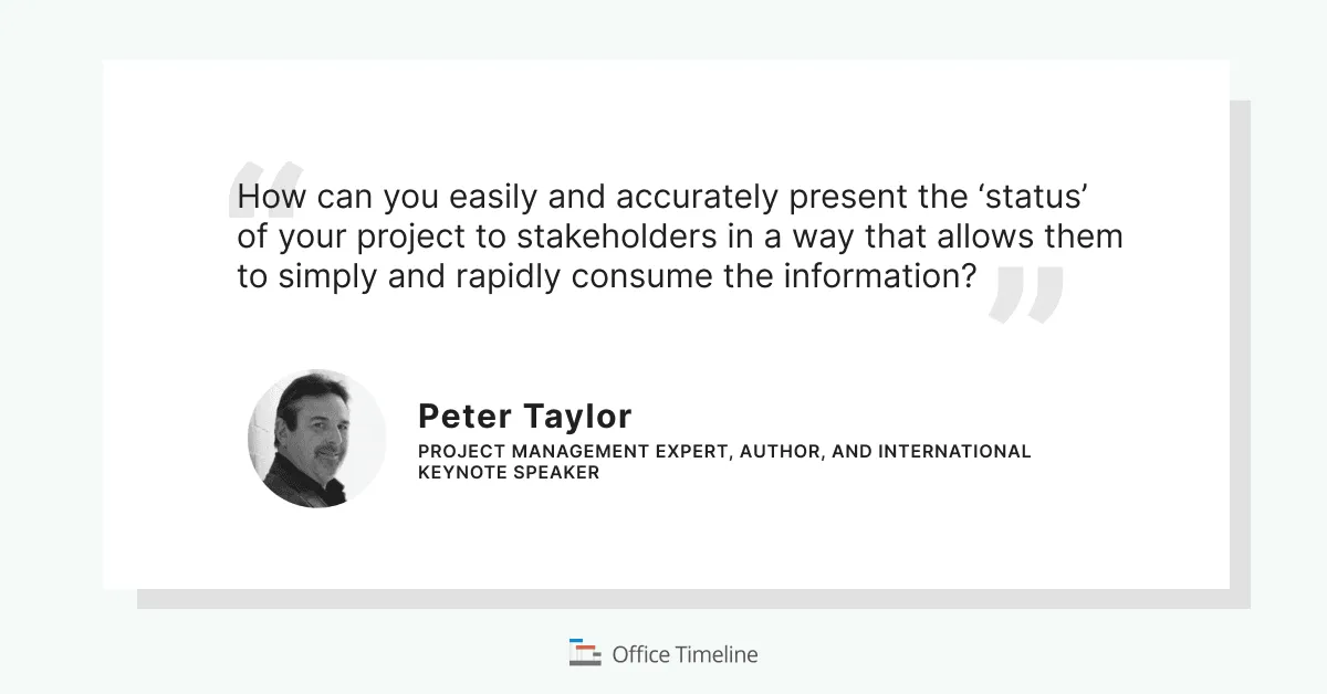
What we needed was a more simplified timeline and a much-simplified visualisation of where the project was, what was the progress, what were the challenges, what were the issues, what were the constraints, and therefore, what were the decisions that these executives had to make to support the project managers in being successful. And we needed it in PowerPoint.
There is a thing called the ‘Picture Superiority Effect’, something that I use regularly in my own lectures and keynotes. Simply put, picture superiority refers to the phenomenon where people remember pictures better than they remember the corresponding words. Put in another way, pictures are superior to words when it comes to recalling and recognising information… they get more attention than text or lists.
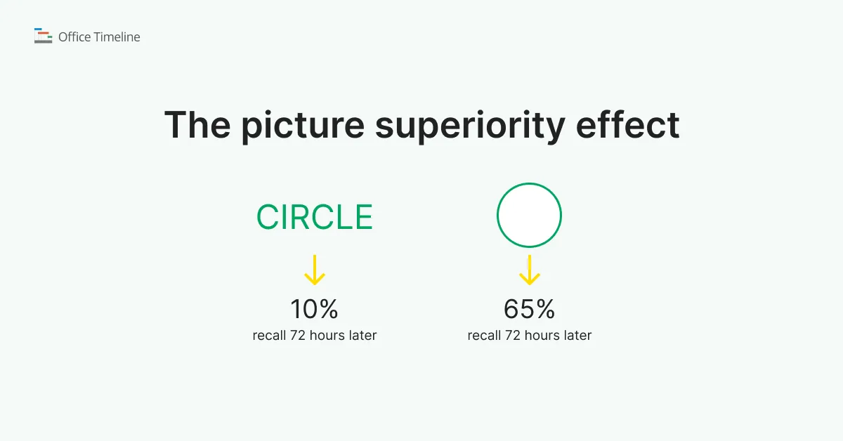
Taking this knowledge and acting on the principle in regard to project reporting means that you need to represent your project timeline in a clear, simple, and compelling visual in order to get the attention and understanding of your executives, and other stakeholders.
We learned that it is all about delivering the right information, at the right time, to the right person and in the right way. In this case, the right way is a visual way.
Which brings us back to my opening arguments: It is all about improving the success probability of your project by nailing that stakeholder buy-in, and my advice is to give them uncomplicated visual project updates, so they actually understand your project.
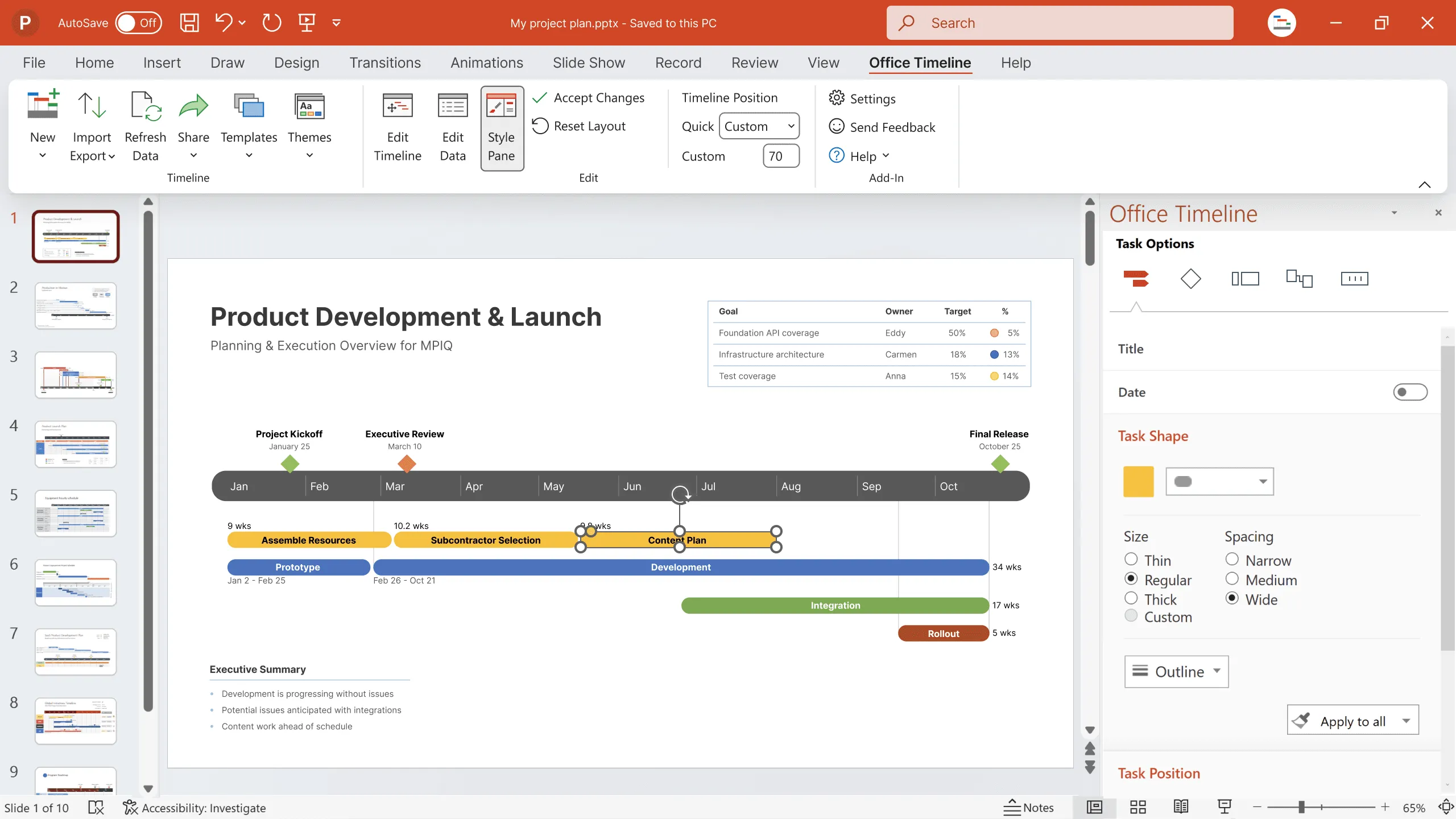
One solution my team found useful is the Office Timeline add-in for PowerPoint. My project managers found it valuable for quickly creating project slides that our VPs and executives loved. The visuals were uncomplicated and impressive and the automation saved our PM’s lots of time.
In fact, originally it was one of my project managers who started using the tool and shared their positives experiences with the rest of their colleagues, and myself, to the point that we standardised on it for executive reporting.
Try out Office Timeline to improve project planning and communication with clear, convincing timelines, Gantt charts and swimlane diagrams that are easy to follow, but hard to forget.
Project Management expert, author, and international keynote speaker
Tagged With:
Guest postGet the advanced features of Office Timeline free for 14 days.
Find out how to save precious time when you're working on reports in this guest post by PM expert Peter Taylor.
Explore the top five reasons why report standardization is key to productivity in this guest post by PM expert Peter Taylor.