How to plan team workloads using a Gantt chart in Excel
Learn to use Excel Gantt charts for resource planning. Identify overallocation, balance workloads, and optimize team capacity visually.

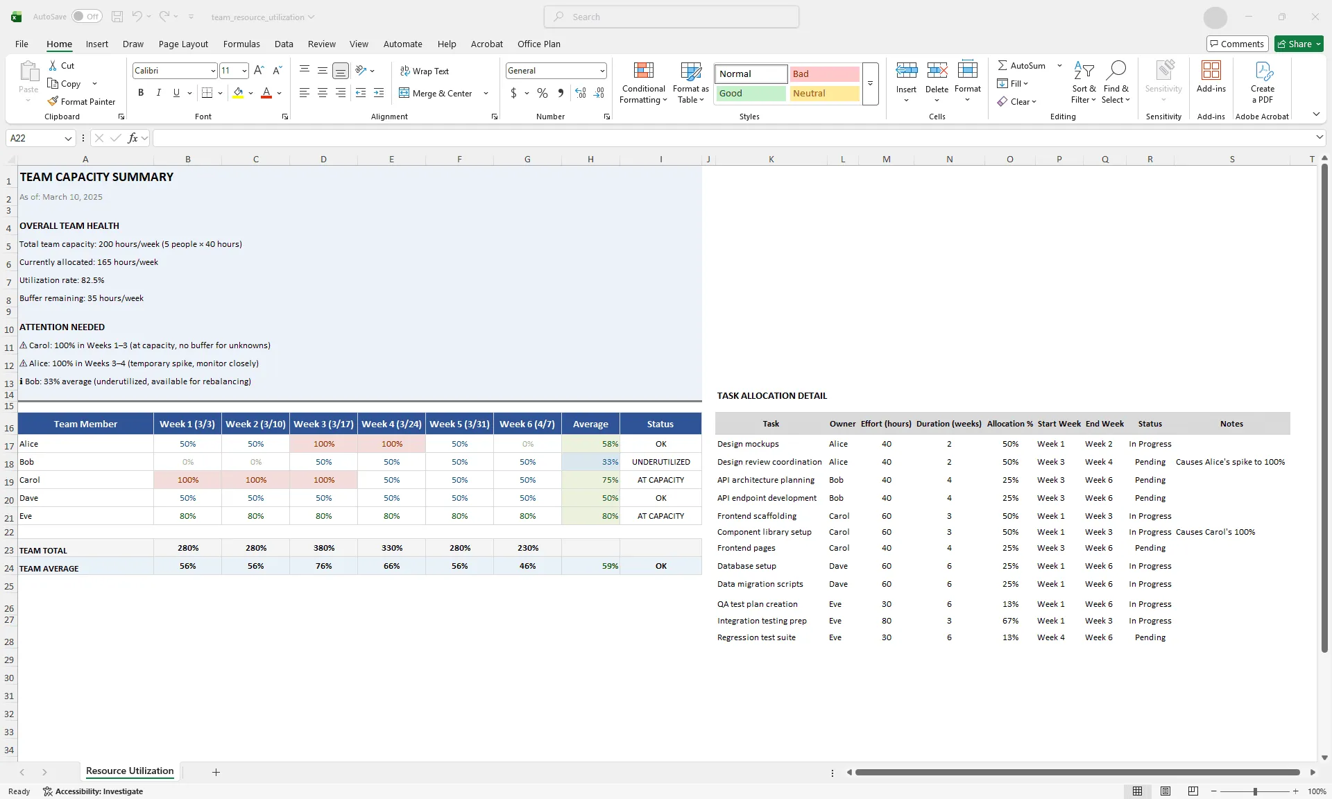
Excel resource utilization table showing team workload allocation per week with conditional formatting: red for overallocated, yellow for at capacity, green for sustainable, and blue for underutilized
Quick answer
Use a Gantt chart for resource planning by assigning owners to tasks, adding an allocation percentage per task, and visualizing total capacity per person using a resource utilization table. Identify overallocation (anyone assigned above 100%) and rebalance by shifting tasks, extending duration, or adjusting scope. A resource-aware Gantt gives you visibility into whether your timeline is actually achievable.
Introduction
You're managing a team of five people. You have 30 tasks across two concurrent projects. On your task-focused Gantt chart, everything looks fine. Tasks have owners, dates are reasonable, nothing is overdue.
But in reality, your team is drowning. Two people are allocated to 150% capacity. Three others are underutilized. Work quality is suffering, people are burning out, and you're missing deadlines despite what the Gantt chart says.
The problem: task-focused Gantt charts don't show workload. They show timeline and task assignment, but not whether those assignments are realistic given team capacity. Your Gantt looks healthy while your team is stretched thin.
You need resource planning layered onto timeline planning. A resource-aware Gantt shows not just who owns what task, but whether each person can realistically deliver it.
This guide walks through how to layer resource planning onto your Gantt chart, identify overallocation before it becomes burnout, and rebalance workloads so your timeline reflects reality.
What workload planning means in the context of a Gantt chart
Workload planning answers a simple question: "Given this timeline and these tasks, can my team actually execute without overallocating individuals?"
Key concepts:
Allocation %. The percentage of a person's time dedicated to a task. Task A (40 hours over a 4-week task) = 50% allocation. Task B (20 hours over the same 4 weeks) = 25% allocation. Total: 75%, which is sustainable with 25% buffer for overhead, meetings, and breaks.
Overallocation. When one person is assigned above 100% across overlapping tasks. Person X: Task A (50%) + Task B (40%) + Task C (30%) = 120%. Result: quality suffers, timelines slip, burnout increases.
Capacity. Total available hours per person per week. A typical full-time employee has 40 hours/week total. Subtract meetings and overhead: roughly 30 billable hours/week. Factor in vacation and training: roughly 25 billable hours/week on average.
Sustainable allocation. 80–90% of capacity. The remaining 10–20% is buffer for unknowns, meetings, and overhead. Planning beyond this consistently leads to burnout.
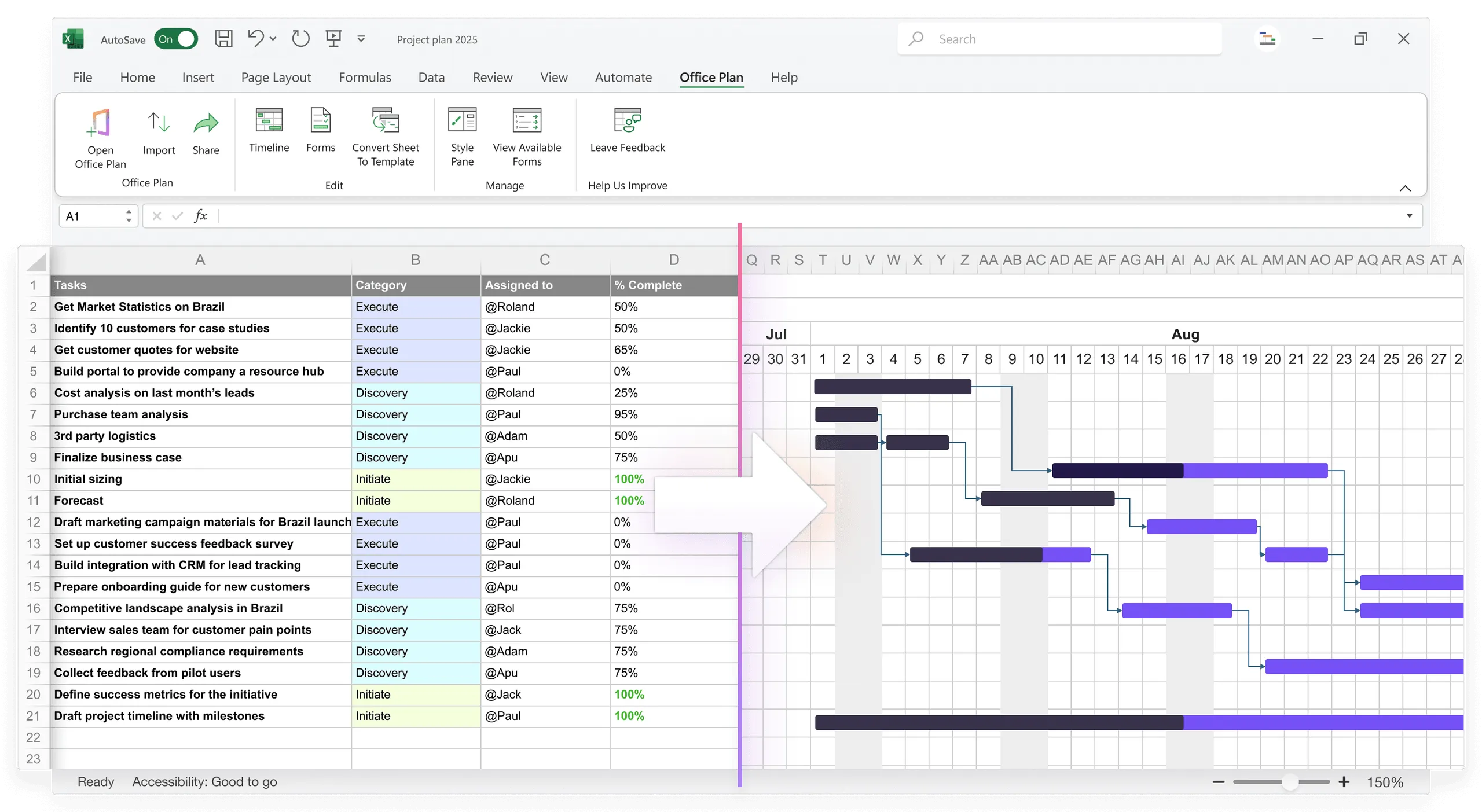
Setting up resource columns in your Excel Gantt
Add these columns to your existing Gantt to track allocation:
| Task | Owner | Effort (hours) | Duration (weeks) | Allocation % | Status |
|---|---|---|---|---|---|
| Design mockups | Alice | 40 | 2 | 50% | In Progress |
| API development | Bob | 80 | 4 | 50% | Pending |
| QA testing | Carol | 60 | 3 | 50% | Pending |
Calculation:
| Allocation % = (Effort hours / (Available hours per week × Duration weeks)) × 100 Example: Alice designing mockups: (40 hours / (40 hours/week × 2 weeks)) × 100 = 50% |
Now you can see each task's impact on the person assigned to it. The allocation percentage turns an abstract timeline into a realistic picture of what your team can actually handle.
Calculating and visualizing resource utilization
Create a resource utilization table showing total allocation per person per week:
| RESOURCE UTILIZATION TABLE | Person | Week 1 | Week 2 | Week 3 | Week 4 | Week 5 | Week 6 | Average | Status | |--------|--------|--------|--------|--------|--------|--------|---------|--------| | Alice | 50% | 50% | 100% | 100% | 50% | 0% | 58% | OK | | Bob | 0% | 0% | 50% | 50% | 50% | 50% | 33% | UNDERUTILIZED | | Carol | 100% | 100% | 100% | 50% | 50% | 50% | 75% | AT CAPACITY | | Dave | 50% | 50% | 50% | 50% | 50% | 50% | 50% | OK | | Eve | 80% | 80% | 80% | 80% | 80% | 80% | 80% | AT CAPACITY | |
This table gives you immediate visibility into capacity across the team. You can see at a glance who's overallocated (above 100%), who's at capacity (80–100%), who has buffer (50–80%), and who's underutilized (below 50%).
Building the utilization table with formulas
For each person and week, use a formula to sum their allocations:
| Alice Week 1 allocation: =SUMIFS(Gantt!$F:$F, Gantt!$B:$B, "Alice", Gantt!$D:$D, "<=Week 1 end", Gantt!$E:$E, ">=Week 1 start") [Sums all of Alice's tasks that overlap with Week 1] |
Or use a simpler approach: manually fill in allocation percentage for each task, then add them per person per week.
Identifying overallocation with conditional formatting
Use conditional formatting to make overallocation visible instantly:
- Select your Resource Utilization table
- Go to Home > Conditional Formatting > New Rule
- Create rules:
- Value >= 100%: Red fill
- Value 85–99%: Yellow fill
- Value 50–84%: Green fill
- Value < 50%: Light blue fill
Now overallocation jumps out visually. Red means someone is stretched beyond capacity. Yellow means they're approaching the limit. You can scan the entire team's workload in seconds and know exactly where the pressure points are.
Balancing workloads across the team
Once you've identified overallocation, rebalance using one or more of these tactics:
Tactic 1: Shift tasks to underutilized team members.
If Alice is at 120% and Bob is at 30%, move some of Alice's tasks to Bob. Change the task owner in your Gantt, verify Bob has the skills, recalculate allocations, and confirm Bob doesn't become overallocated.
Tactic 2: Spread tasks over longer duration.
If a task is overallocating one person, extend the duration to reduce weekly intensity:
| Original: 40 hours over 2 weeks = 50% (of 40 hours/week) Extended: 40 hours over 4 weeks = 25% (of 40 hours/week) |
This reduces immediate overallocation but extends the timeline slightly.
Tactic 3: Reduce task scope. If a task can't be moved or extended, reduce what's included:
| Original: 40 hours (full design) Reduced: 30 hours (core design, defer nice-to-haves) Result: 37.5% allocation instead of 50% |
Tactic 4: Add resources temporarily. Hire a contractor or borrow a resource from another team for the overallocated period. This is expensive but sometimes necessary.
Tactic 5: De-prioritize non-critical work. Identify low-priority tasks and defer them:
| Current (overallocated): - Task A (critical) 50% - Task B (critical) 40% - Task C (nice-to-have) 30% = 120% Rebalanced (defer Task C): - Task A (critical) 50% - Task B (critical) 40% = 90% |
Building a capacity dashboard
Create a resource dashboard above your detailed Gantt that tells the team capacity story at a glance:
| TEAM CAPACITY SUMMARY Total Team Capacity: 200 hours/week (5 people × 40 hours) Currently Allocated: 165 hours/week Utilization Rate: 82.5% Buffer Remaining: 35 hours/week PEOPLE AT CAPACITY OR OVERALLOCATED: - Carol: 80% (monitor, approaching limit) - Eve: 80% (monitor, approaching limit) PEOPLE WITH BUFFER: - Alice: 60% (has 20 hours/week available) - Bob: 35% (has 26 hours/week available) - Dave: 50% (has 20 hours/week available) NEXT WEEK'S FORECAST: Utilization: 85% | Risks: None | Buffer: 30 hours available |
This dashboard gives you and your stakeholders full visibility into team health. The team is sustainable overall, but Carol and Eve are at their limits, and you have 30 hours of buffer for unexpected work. That clarity is what prevents burnout before it starts.
Limitations of Excel for resource planning
Excel can track allocation, but it has real limits:
No automatic leveling. Excel doesn't automatically rebalance overallocation. You have to manually identify conflicts and move tasks. Dedicated tools like Microsoft Project can auto-level (automatically shift tasks to balance load).
Weak dependency logic. If you extend a task to reduce allocation, it might push dependent tasks. Excel doesn't auto-adjust downstream dependencies. You have to recalculate manually.
Multi-project blind spots. If your team member is allocated across multiple projects tracked in separate files, Excel doesn't aggregate allocation across them. You might think someone is at 60%, but they're actually at 100% when you add another project.
Manual scenario planning. "What if we add a person? What if we defer this task?" requires manually recalculating allocations for each scenario. Dedicated tools support multiple scenarios side-by-side.
No skill matching. Excel doesn't flag when you assign a task to someone without the required skills. You have to track that manually.
For simple projects with one team (5–10 people) and clear skills, Excel is a practical choice. For complex multi-project, multi-skill portfolios, dedicated resource management tools are worth the investment.
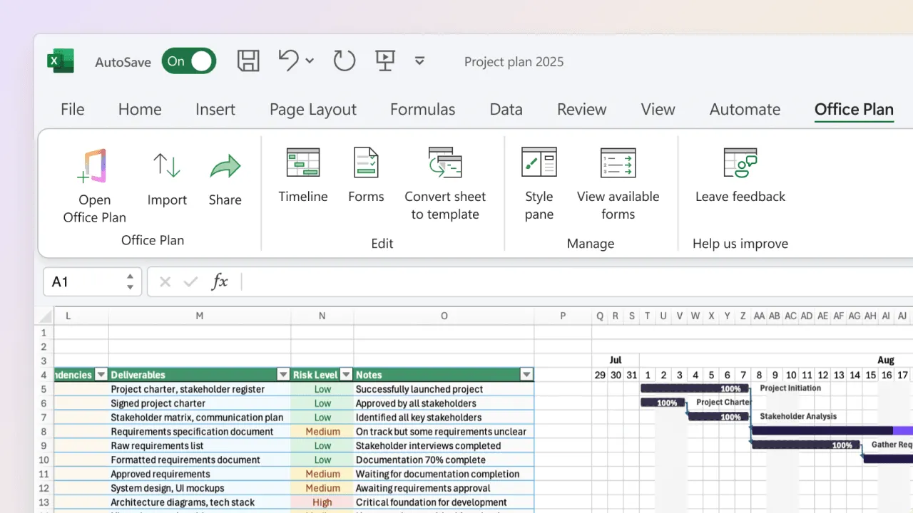
For teams that stay in Excel, Office Plan can help with the visual side. It reads your Gantt data and generates a professional timeline visual directly inside your spreadsheet. When you rebalance workloads and shift task dates, the visual updates automatically. Your resource planning data and your project visual stay connected in one place.
Common workload planning mistakes
Ignoring overhead. You assume people have 40 billable hours per week, but factor in: meetings (5 hours), email (5 hours), training (2 hours), breaks (3 hours). Realistic capacity is closer to 25 billable hours per week. Planning to 40 leads to burnout.
Not accounting for ramp-up. New team members or new tasks require ramp-up time (learning, setup, mentoring). Allocating a junior developer to 80% on their first week sets everyone up for disappointment. Realistic first-week allocation: 40–50%.
Setting allocation targets too high. Sustainable allocation is 80–90%. Targeting 95%+ regularly leaves no buffer for unknowns, blockers, or quality. People burn out.
Ignoring skill mismatches. A skilled senior engineer is scarce. A junior is more available. Allocating 50% of the senior's time to junior-level work is wasteful. Use senior people on hard problems, junior on routine work.
Not communicating allocation. Team members need to know their allocation. If you tell someone they're at 70% and they're actually managing 100%, they'll be resentful. Be transparent about workload.
Frequently asked questions
80–90% is sustainable long-term. This leaves 10–20% buffer for meetings, unexpected work, and recovery. Allocating people to 100%+ regularly leads to burnout and mistakes.
If a person has 40 hours per week total, subtract overhead: meetings (5 hours), email (5 hours), breaks (5 hours) = 25 billable hours per week. Use 25 as your capacity denominator when calculating allocation, not 40.
Create a master Resource Utilization table that aggregates allocation across all projects. Example: Person X is 40% on Project A and 50% on Project B = 90% total. If this happens regularly, you have a resource conflict that needs escalation.
Adjust capacity. A contractor working 20 hours per week has 20 billable hours of capacity, not 40. Allocate proportionally.
Yes. If you allocate people to 100% (no buffer), you have zero slack. Any delay cascades. Allocate to 80–90%, leaving 10–20% for the unexpected.
You can't do resource planning without estimates. Use rough estimates (small/medium/large or t-shirt sizing) if exact hours aren't available. Or run a planning spike to estimate before committing to the timeline.
Key takeaways
- A resource-aware Gantt gives you visibility into whether your timeline is actually achievable, not just whether it looks good on paper.
- Add Owner and Allocation % columns to track who's assigned what and at what intensity. This is the foundation of workload planning.
- Build a Resource Utilization table showing total allocation per person per week. This is where overallocation becomes visible.
- Use conditional formatting (red/yellow/green) to flag overallocation instantly. If someone is above 100%, you need to act before quality and timelines suffer.
- Rebalance by shifting tasks, extending duration, reducing scope, or adding resources. The goal is sustainable allocation at 80–90%.
- Build a capacity dashboard that tells the team health story at a glance. Stakeholders need to see not just the timeline, but whether the team can deliver it.
- Account for overhead realistically. 25 billable hours per week is closer to reality than 40. Planning beyond that leads to burnout.
- For teams staying in Excel, tools like Office Plan keep your resource planning data and your project visual connected in one spreadsheet, so rebalancing is reflected in the timeline automatically.
Project management tips and tricks
Make your resource plan visible, not just calculated
You've built allocation percentages and utilization tables. The numbers are solid. But if your stakeholders only see a standard Gantt chart, they miss the resource story behind the timeline. Office Plan reads your Excel Gantt data and generates a professional visual right inside your spreadsheet. When you rebalance workloads, shift tasks, or adjust timelines, the visual stays current. Your team sees the resource reality. Your stakeholders see a clear, trustworthy timeline.