
Visual timelines keep teams aligned and on track when more meetings can’t
Learn how visual project timelines help managers replace confusion with clarity, foster ownership, and build a culture of proactive accountability.
Find out why creating clear project visuals is not just a matter of design, but of communicating project progress.

Creating clear project management visuals
Just how important is it to make your project visuals really stand out? To answer this question, it helps to look at it from two angles: whether it’s worth it for you as a project manager and whether it’s worth it for the people you report to and collaborate with.
Beautiful project visuals aren’t shiny extras or a whim. If they were, we’d all be happy sticking with the standard corporate templates and this blog wouldn’t exist.
Yet expectations have changed as AI technology entered the workplace. Projects move faster, decisions happen under tighter time pressure, and stakeholders expect information they can digest in seconds.
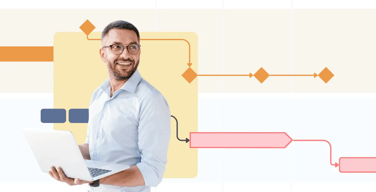
A well-designed timeline or Gantt chart helps stakeholders instantly see how the project is progressing across time, scope, and budget, and which decisions need to be made to keep it on track. It also allows project managers to communicate progress to audiences with different priorities in a format that’s easy to grasp and hard to misinterpret.
Being an excellent communicator is one of the most important skills a project manager can have. Some project managers even argue that up to 90% of their job is communication.
That said, creating professional project visuals is one of the most effective ways to communicate with stakeholders, especially since many are time-constrained and constantly switching contexts.
In my conversations with project managers across industries, I’ve noticed a clear preference for simple, polished PowerPoint timelines and Gantt charts over text-heavy corporate templates. Here’s what these project visuals deliver that makes this choice a no-brainer:
There’s a story I hear all the time. You get into a meeting with that one project manager whose PowerPoint slides always look like a perfectly polished client pitch or keynote deck. Meanwhile, most project managers are stuck with the standard corporate template, adjusting the layout and adding a few icons in the hope the visuals carry the message well enough.
Most project managers would love to be in the first category. The challenge is that (1) you’re not a designer and (2) you rarely have the time to build timelines and Gantt charts from scratch.
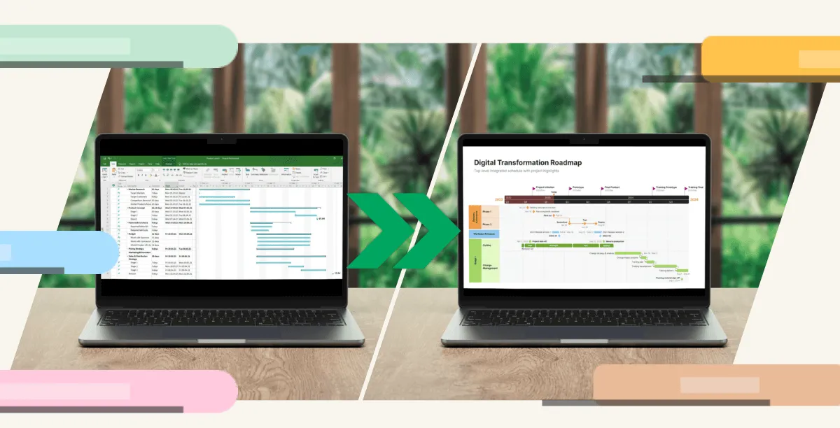
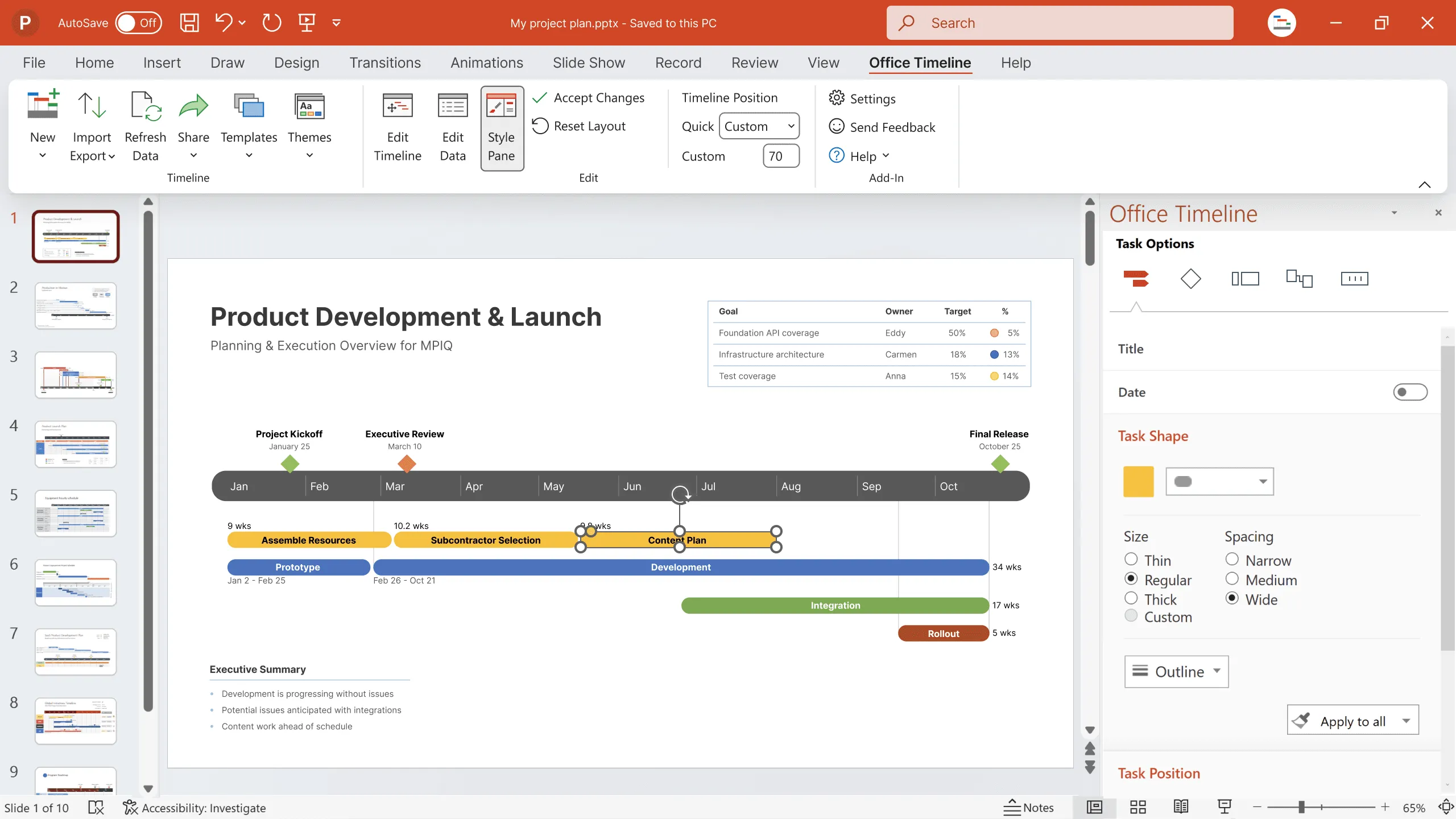
Thankfully, a user-friendly timeline and Gantt chart maker can help you build professional visuals with minimal effort and no need for design skills.
Ready-made templates give you sophisticated designs that can be customized in minutes, while smart integrations with tools like Excel, Jira, and Smartsheet help populate your visuals with real-time project data. And if you want a consistent, branded look across your company’s portfolio, custom themes ensure each slide reflects your organization’s color palette and overall style.
Targeting visuals to specific audiences is just as simple. You can hide items or showcase key elements depending on what matters most to each stakeholder group, keeping everyone engaged and focused throughout the meeting.
No more tired, distracted audiences scrolling on their phones and counting down the minutes until the coffee break.
It’s not just a matter of design. Clear, elegant timelines and Gantt charts, whether for weekly team updates or monthly executive reviews, simplify complex information, highlight priorities, and keep stakeholders aligned without overwhelming them.
When created in a tool that simplifies the process and makes project visuals dynamic by integrating data from the tools you already use, any remaining doubt about whether it’s worth it turns into "Why didn’t we do this sooner?"
If you want to communicate progress visually and effectively, take a look at the results other companies have achieved with beautiful timelines and Gantt charts.
Eddy is Founder & Chief Product Officer for Office Timeline, building a user-friendly but powerful app that makes timelines, Gantt charts and roadmaps directly in PowerPoint.
Tagged With:
Visual accountabilityGet the advanced features of Office Timeline free for 14 days.
Learn how visual project timelines help managers replace confusion with clarity, foster ownership, and build a culture of proactive accountability.
See how visual timelines outperform PM jargon by making progress obvious, reducing confusion, and helping project managers drive real delivery.