With so much data in the world today, making sense of large amounts of information is a needed skill in many fields. Raw data can be hard to understand on its own. When properly displayed, patterns become clear and trends are easier to spot.
Timelines turn time-based data into visual stories that are easier for our brains to process. They connect raw numbers to useful insights by using our natural ability to see progression and patterns across time.
This article explores how timelines work as tools for time series visualization, helping analysts, researchers, businesses, and regular users understand time-based data. We'll look at different timeline types, good practices for creating them, and practical uses in various fields.
For a wider perspective on how timelines are used beyond data visualization (in history, education, projects, and personal planning) explore our introduction to timelines.
Principles of timeline visualization
A timeline is simply a visual display that shows data points placed in order along a time axis. This design makes it one of the most useful ways to show how things change over time. Timelines work because they match how we naturally think about time, that is, as a continuous flow moving in one direction. By placing events in sequence, timelines show when things happened and the relationships between events.
At its most basic, a timeline consists of:
- Time axis - a horizontal or vertical line that represents time.
- Data points or events - marked at specific times.
- Clear labels that explain what each point represents.
With these basic components in mind, let’s examine each, starting with the time axis.
1. Time axis
The time axis is the foundation of any timeline visualization. It defines how time progresses across your visual space. Creating an effective time axis involves several key decisions that impact how viewers interpret the data. These decisions fall into four main categories:
- Scale selection (how time intervals are represented): Choose between linear scales (equal time periods take up equal space) for most standard uses, logarithmic scales (that compress older or less relevant time periods and expand recent events) - useful for showing both historical and recent data, broken scales (that omit inactive periods), ideal for skipping long gaps with no relevant events or cyclical scales, that represent repeating patterns (e.g., annual business cycles or seasonal trends).
- Orientation options (the direction of the timeline): Horizontal timelines (left-to-right) follow Western reading patterns and are most common. Vertical timelines (top-to-bottom) can work well for mobile displays or when comparing multiple parallel sequences.
- Granularity decisions (the level of detail): Match your time divisions (years, months, days, hours) to your data needs. Too detailed, and the timeline becomes cluttered; too broad, and you lose important patterns.
- Visual markers (aid in accurate reading and interpretation): Regular tick marks and grid lines help viewers estimate when events occurred without needing to read every date label.
2. Data points and events
How you represent information on your timeline significantly affects comprehension. Once the time axis is established, the next step involves representing the data points and events themselves. Several visualization techniques can enhance clarity and understanding. These techniques include:
- Visual coding (uses shapes to differentiate event types): Different shapes can represent different types of events. Triangles might show product launches, and diamonds, financial milestones. (like the example below)
- Size and color (mark magnitude and categories): Use size to show magnitude (larger points for more significant events) and color to categorize (blue for technical developments, green for financial milestones).
- Density management (addresses event clustering): When many events cluster in a time period, consider using aggregation techniques, such as combining related events or using summary markers that expand on interaction.
- Connection lines (show relationships between events): Show relationships between events with connecting lines or arrows, helping viewers understand cause and effect or process flows.
3. Clear labels
Even the best visual design fails without proper labeling. Labeling ensures a timeline is easily understood. Effective labeling demands:
- Hierarchy of information - Use text size and weight to create a visual hierarchy - primary dates in bold, secondary information in regular weight, and additional details in smaller text.
- Placement strategy (how labels are positioned relative to data points) - Position labels consistently - either directly on data points, connected by short lines, or in a legend. Avoid text that overlaps or requires awkward reading angles.
- Content brevity - Keep text concise. For complex events, use abbreviated labels with hover/click interactions to reveal more details when needed.
- Typography choices - Prioritize readability, select fonts that remain readable at various sizes. Sans-serif fonts often work best for screen displays, with sufficient contrast against the background.
When these three elements work well together, viewers can quickly extract meaningful information from your timeline without feeling overwhelmed or confused by the presentation.
Designing clear timelines
A good timeline strikes a balance between showing all relevant information and still being easy to read. Effective timelines balance information density with visual clarity.
Here's how to make clear timelines:
Implement thoughtful space management
Use enough white space. White space isn't empty space, it's a design element that helps organize information.
How to manage space efficiently:
Leave margins around the entire timeline.
Ensure data points are spaced far enough apart to prevent visual crowding.
Maintain consistent spacing between similar elements to create a structured, easy-to-follow layout.
For complex timelines, break information into sections with clear visual boundaries to improve comprehension.
Apply smart grouping strategies
Group related events when possible. Organize related information visually to help viewers understand relationships:
Visually group related events:
Create visual lanes or swim lanes for different categories of events or cluster related events using subtle background shading or borders.
Represent hierarchical structures:
Use indentation or branching structures to show hierarchical relationships.
Consider collapsible groups for digital timelines when dealing with many related items.
Design polished, structured timelines
Try Office Timeline for free. Use intuitive templates that automatically apply spacing, grouping, and visual hierarchy for you.
Implement consistent visual coding
Use colors and shapes consistently. Visual elements should follow logical patterns that viewers can quickly learn. Here’s how to do this:
Assign specific colors to distinct categories and use them consistently throughout.
Choose shapes that intuitively connect to the data they represent.
Maintain consistent size relationships - larger for more important items, smaller for less significant ones.
Use a limited palette of visual variables to avoid overwhelming viewers.
Optimize text for viewer comprehension
Avoid too much text that might overwhelm viewers. Text should support, not dominate, the visual experience. Some suggestions:
Use concise labels that put relevant information in a few words. Position text to minimize awkward reading angles or excessive eye movement.
Establish a clear hierarchy with font size, weight, and color to distinguish primary from secondary information.
For digital timelines, consider progressive disclosure - show key details first, with additional information available on demand.
Prioritize accessibility
Make your timeline usable for diverse audiences:
Use clear, legible fonts and avoid overly small text.
Ensure sufficient color contrast for readability.
Don't rely solely on color to convey meaning - use multiple visual cues.
Consider how the timeline will appear to viewers with color vision deficiencies.
Provide alternative ways to access the information for users with different needs.
Ensure keyboard and screen reader compatibility if the timeline is interactive.
When designed well, timelines help viewers quickly grasp changes over time without needing to study complex data tables or read lengthy explanations. When these principles work together, information is absorbed efficiently, and patterns can be identified intuitively.
The best timelines feel almost transparent - the information comes forward while the visualization itself remains subtle.
Techniques for time series data visualization with timelines
We deal with data that changes over time in all areas of activity. From business metrics to scientific observations, historical events to personal milestones, we constantly track how things change across temporal dimensions. The numbers are only useful when we understand their relevance. Raw chronological data remains opaque until properly visualized.
Choosing the right visualization can turn collections of timestamps and values into meaningful narratives that reveal trends, patterns, and insights that might otherwise be missed.
Different timeline visualization techniques serve distinct analytical purposes. The approach you choose should align with your specific goals, whether you need to track performance metrics, identify patterns, or compare multiple datasets.
This chapter explores the most effective timeline visualization methods and how they can transform your temporal data into actionable insights, focusing on three approaches: linear timelines that show progression, comparative timelines that highlight relationships, and interactive timelines that enable deeper exploration.
Linear timelines
The simplest form of timeline shows a single data set plotted against time. Linear timelines provide a straightforward chronological view of events or data points.
Linear timelines work well for:
- Showing clear progressions - like population growth or temperature changes.
- Displaying when specific events occurred along a known chronology.
- Tracking simple metrics that follow a direct path.
Linear timelines excel at showing overall trends and making it easy to identify when significant changes happened. For example, a company might use a linear timeline to track revenue growth, with markers showing when new products launched.
Comparative timelines
When analyzing how multiple, related datasets evolve concurrently, comparative timelines provide valuable insights. These timelines address the need to identify correlations, divergences, and the relative impact of various factors over a shared timeframe.
For example, in market analysis, you might need to compare the sales performance of competing products, or in environmental studies, track changes in temperature and species populations within the same period. To effectively illustrate these relationships, consider the following approaches:
- Parallel timelines: Placing multiple linear timelines above or below each other with aligned time axes. This method is suited for direct comparison of separate but related trends, such as the growth of different market segments or the progress of individual project phases.
- Stacked timelines: Layering data series on top of each other to show both individual patterns and cumulative effects. This technique is useful for illustrating how components contribute to an overall total, like tracking the breakdown of revenue sources or the accumulation of project costs.
- Overlaid timelines: Plotting multiple data series on the same axis using different colors or patterns. This technique is useful for illustrating how components contribute to an overall total, like tracking the breakdown of revenue sources or the accumulation of project costs.
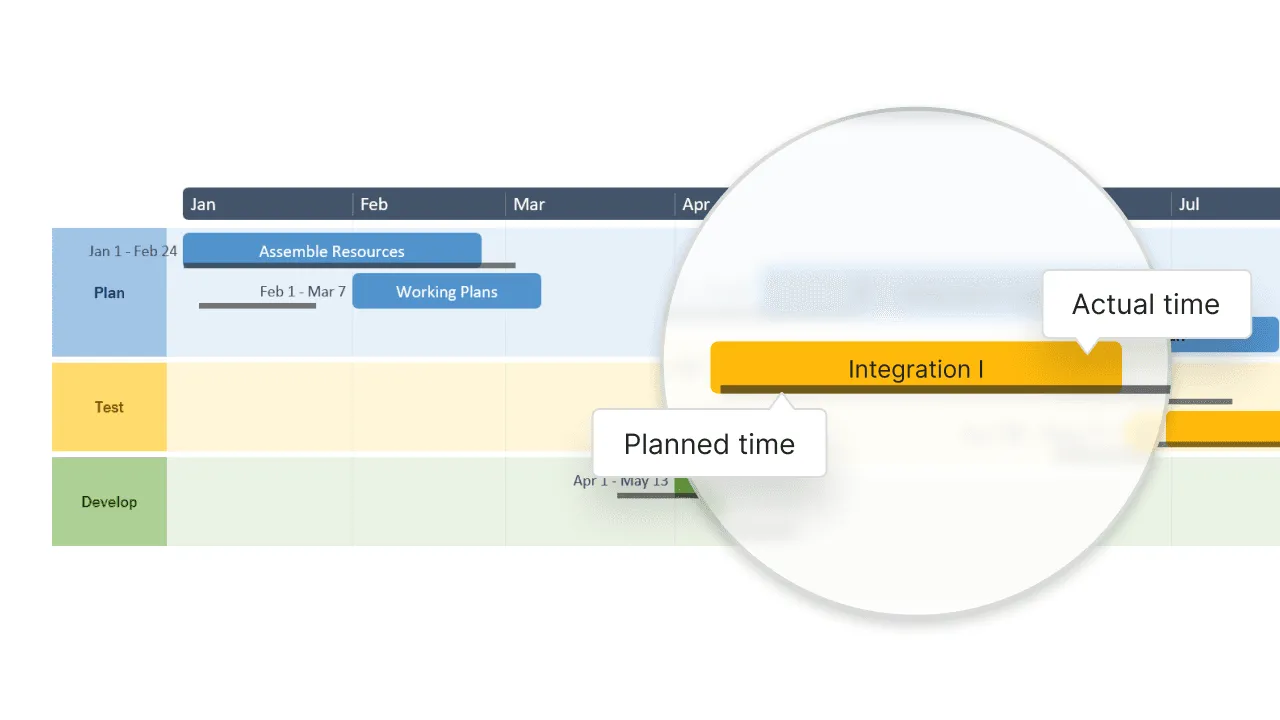
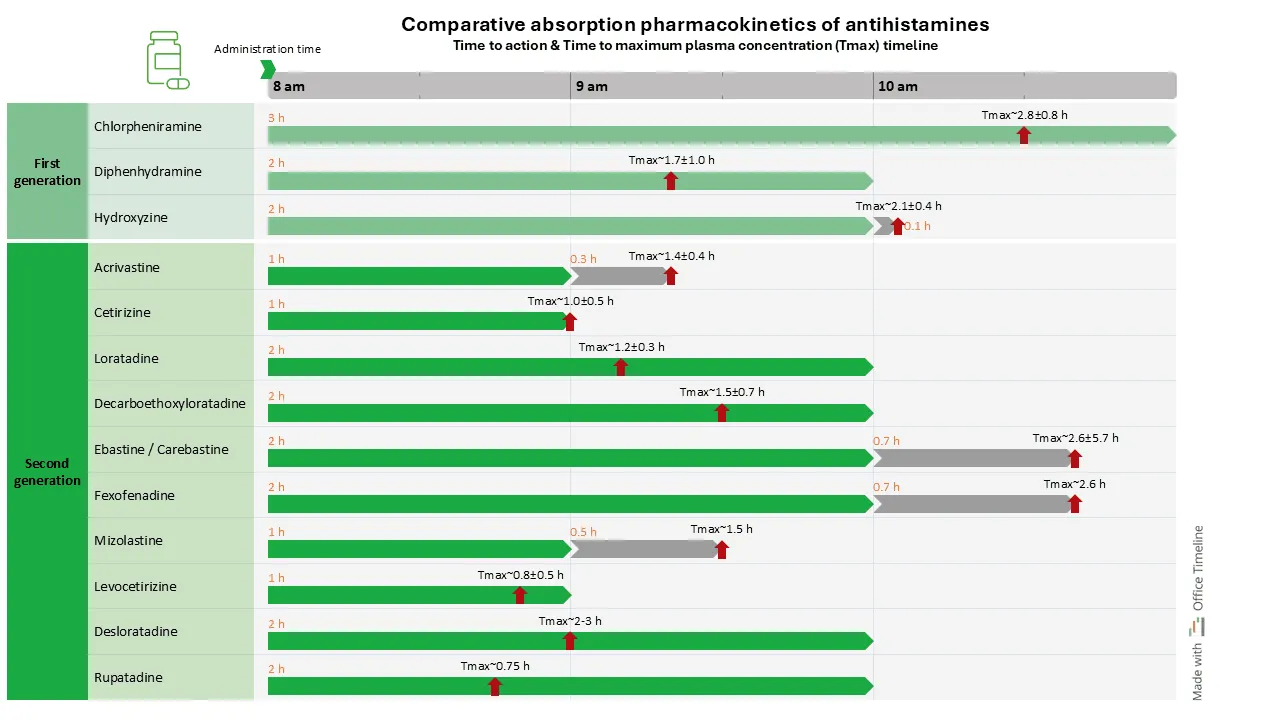
These methods make it possible to see not just how each variable changes individually, but how they relate to each other over time. For instance, comparing the absorption profiles of different antihistamines, showing both their time to action and time to maximum plasma concentration (Tmax) in a single view.
Interactive timelines
Interactive elements transform static timelines into dynamic exploration tools. By incorporating features like zooming, filtering, and drill-down capabilities, users can navigate complex temporal data at different levels of granularity, uncovering insights that might otherwise remain hidden.
Some of the interactive elements that enhance understanding are:
- Zooming: Allowing users to focus on specific time ranges for detailed analysis
- Filtering: Enabling viewers to show or hide specific data categories
- Tooltips: Revealing detailed information when hovering over data points
- Animation: Showing how data changes through automated playback
These features are particularly valuable when working with complex or extensive data sets that would be overwhelming in a static format.
Real-world applications of timeline visualization
Timeline visualizations are used in many industries and fields. The following examples show how different sectors use these techniques to understand data and make decisions. We will look at specific uses of timelines in areas such as financial analysis, project management, and scientific research.
Financial analysis and investment
In financial markets, timeline visualizations transform abstract numbers into practical information that directly impact investment decisions and financial strategies. These visual tools reveal patterns that might go unnoticed in spreadsheets or reports. Timeline visualizations support:
- Stock price analysis. Multi-year stock charts show long-term growth patterns while revealing seasonal fluctuations and reactions to market events.
- Portfolio performance tracking: Comparative timelines display investment performance against relevant benchmarks, allowing investors to identify which assets are outperforming or underperforming. When a mutual fund consistently trails its index over multiple quarters, this visual pattern signals potential problems more effectively than periodic statements alone.
- Economic indicator monitoring: Layered timelines connecting GDP growth, unemployment rates, and inflation create a comprehensive economic picture. These visualizations help analysts spot leading indicators - such as how changes in manufacturing output often precede shifts in employment figures by 3-4 months.
- Trading pattern identification: Day traders rely on minute-by-minute timeline charts to recognize short-term patterns like support and resistance levels. These detailed visualizations show how a stock repeatedly bounces off certain price points, providing strategic entry and exit opportunities.
These applications demonstrate how financial professionals use timeline visualizations not just to understand past performance, but to develop forward-looking strategies.
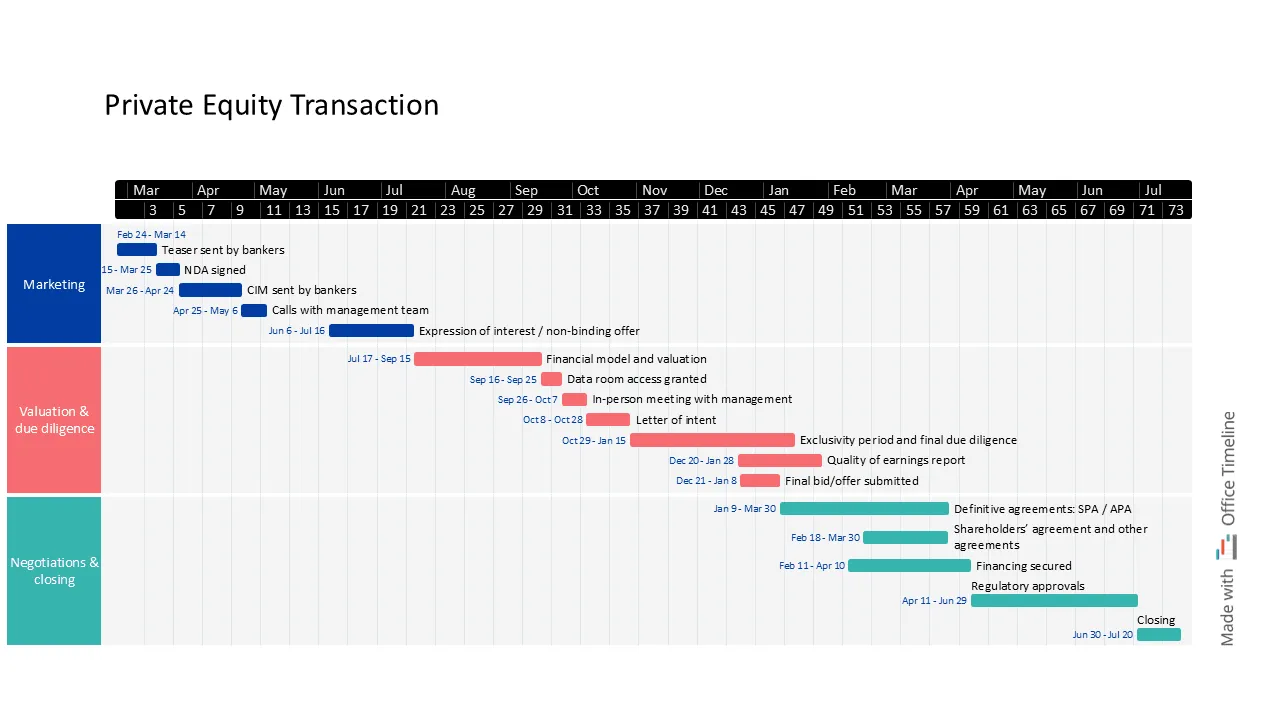
For example, by structuring key stages of a private equity transaction, from initial marketing and due diligence to final negotiations, professionals can track progress, anticipate bottlenecks, and ensure a smooth closing process.
Marketing and consumer behavior
Marketers use timelines to understand audience engagement and campaign effectiveness. Abstract analytics turn into clear patterns that drive strategic decisions. These visualizations provide precise insights into when, how, and why consumers interact with brands. For example:
- Website traffic analysis: Timeline views of site visits reveal specific behavioral patterns—like the 30% traffic surge that occurs every Monday morning for B2B sites, or the evening browsing peaks for consumer retail. These patterns help marketing teams schedule content releases and technical maintenance to maximize visibility and minimize disruption.
- Campaign performance tracking: Multi-channel marketing timelines show how different campaigns affect conversions across platforms. For instance, a timeline might reveal that email campaigns drive immediate spikes in activity, while content marketing creates more gradual but sustained traffic increases over weeks or months.
- Social media engagement: Timeline visualizations pinpoint optimal posting times based on historical performance data. A healthcare brand might discover their educational content performs 40% better when posted Tuesday mornings, while their community-building posts generate more engagement on weekend evenings.
- Customer lifecycle mapping: Timelines tracking customer interactions from first contact to purchase highlight critical conversion points and potential drop-off moments. These visualizations might show that prospects who don't convert within 14 days of initial contact have a 75% lower lifetime value, signaling the need for timely follow-up strategies.
- Seasonal trend forecasting: Year-over-year timeline comparisons help marketers anticipate and prepare for predictable demand fluctuations. These visualizations might reveal that holiday shopping patterns now begin three weeks earlier than five years ago, allowing for more precise campaign timing.
- Competitor launch analysis: Comparative timelines tracking competitor product releases alongside market share changes help brands identify strategic windows for their own launches. These visualizations might show that being first to market provides only temporary advantages in some product categories, while in others it establishes lasting dominance.
Based on these connections, marketing teams can rely less on guesses and single numbers. They can build strategies that use real customer behavior.
These timelines help them decide where to spend resources, when to run campaigns, and how to connect with customers at each step.
Scientific research
Scientists use timelines to understand phenomena that unfold over time. Good timeline visuals turn masses of data points into clear stories that show what's happening beneath the surface. In science, where tracking changes over days, years, or even centuries matters, the right timeline can reveal connections and patterns that numbers alone can't show.
Scientists across many fields need these visual tools to spot trends, test ideas, and share findings with others. Whether studying short-term events or long-term shifts, timelines help researchers organize information in ways that make complex relationships easier to understand.
- Climate data analysis: Timelines showing decades of temperature readings, rainfall amounts, and severe weather events reveal climate change patterns in different regions. These visuals let scientists separate natural weather cycles from human-caused changes and make better predictions.
- Epidemiological studies: Disease outbreak timelines show how sicknesses spread, whether prevention efforts work, and how seasons affect illness rates. By showing case numbers alongside public health actions, researchers can see which strategies control outbreaks best.
- Biodiversity monitoring: Species population timelines show how animals and plants in an ecosystem affect each other and react to environmental changes. These visuals help scientists spot early warning signs of ecosystem problems and track recovery after disturbances.
- Agricultural yield analysis: Year-by-year timelines connecting weather, farming techniques, and harvest results improve growing practices. These visuals show farmers the best planting times and how to prepare for changing weather patterns.
- Geological processes: Timelines covering millions of years show shifting continents, fossil changes, extinction events, and major climate shifts. These help geologists understand Earth's past and possible future.
- Astronomical observations: Timelines tracking celestial objects' brightness, position, and light characteristics help astronomers discover exploding stars, planets around other stars, and other space phenomena that happen over time.
- Ocean science: Marine timelines showing temperature, acidity, currents, and sea life reveal how oceans respond to climate change, pollution, and conservation efforts over different time periods.
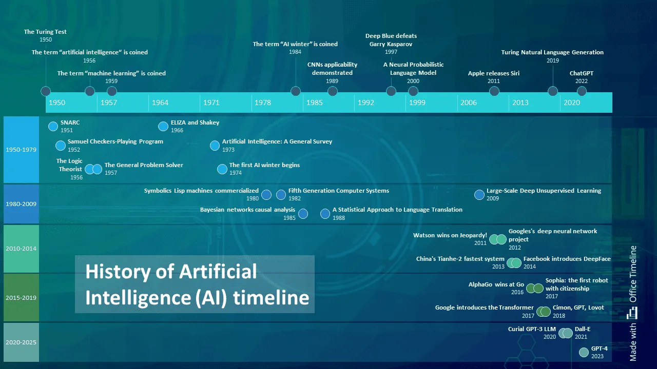
- Artificial intelligence development: Timelines showing key milestones in AI history, from the early theoretical concepts to modern machine learning breakthroughs, help researchers understand the progression of AI and predict future trends. These timelines show the evolution of algorithms, hardware, and data availability that have driven AI advancements.
Healthcare and patient monitoring
Medical professionals use timelines to track health metrics and treatment outcomes, turning scattered medical data into clear health stories. These visual tools give doctors and nurses a quick way to see patterns in patient health that might not be obvious from reading charts or test results alone.
In healthcare settings, timelines help everyone from individual doctors to hospital administrators make better decisions based on what's actually happening over time rather than single snapshots of information.
- Patient health histories: Timelines showing symptoms, treatments, medications, and test results give doctors a complete picture of a patient's medical journey. These visuals make it easier to spot connections between treatments and outcomes or identify recurring health patterns.
- Treatment efficacy tracking: Side-by-side timelines comparing how patients respond to different treatments help doctors see which approaches work better and when improvements typically begin. This helps them adjust care plans based on real evidence.
- Population health management: Timelines showing disease rates across different communities help public health officials spot outbreaks early and direct resources where they're needed most. These visuals reveal which neighborhoods or groups might need extra attention.
- Medical research: Clinical trial timelines track when medications or treatments start showing effects in study participants. Researchers use these to determine optimal dosing schedules and treatment durations.
- Hospital resource planning: Timelines showing patient admissions, length of stays, and readmissions help hospital managers schedule staff and prepare for busy periods, improving care quality while managing costs.
- Chronic disease management: Timelines tracking blood sugar levels, blood pressure readings, or pain scores help patients and doctors see how lifestyle changes and medications affect day-to-day symptoms.
- Medication adherence: Simple timelines showing when patients take their medications help doctors identify missed doses and develop better medication routines that patients can follow.
- Recovery monitoring: Post-surgery timelines showing pain levels, mobility improvements, and healing markers give both patients and healthcare teams realistic expectations about recovery progress.
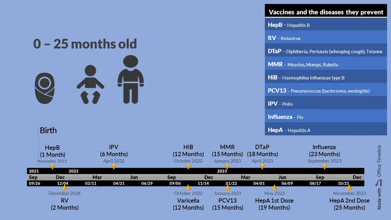
- Vaccination scheduling: Timelines like the one shown help parents and healthcare providers track immunization schedules to ensure children receive proper protection at the right developmental stages. These visuals show the optimal timing for each vaccine dose and highlight when catch-up immunizations might be needed.
The timeline below shows an excellent example of a healthcare timeline visualization for childhood vaccinations from birth to 25 months. This timeline serves multiple purposes: it maps out when each vaccine should be administered, identifies which diseases each vaccine prevents, and creates a clear schedule for parents and healthcare providers to follow.
The visual representation makes a complex immunization schedule much easier to understand than a text-based list would be.
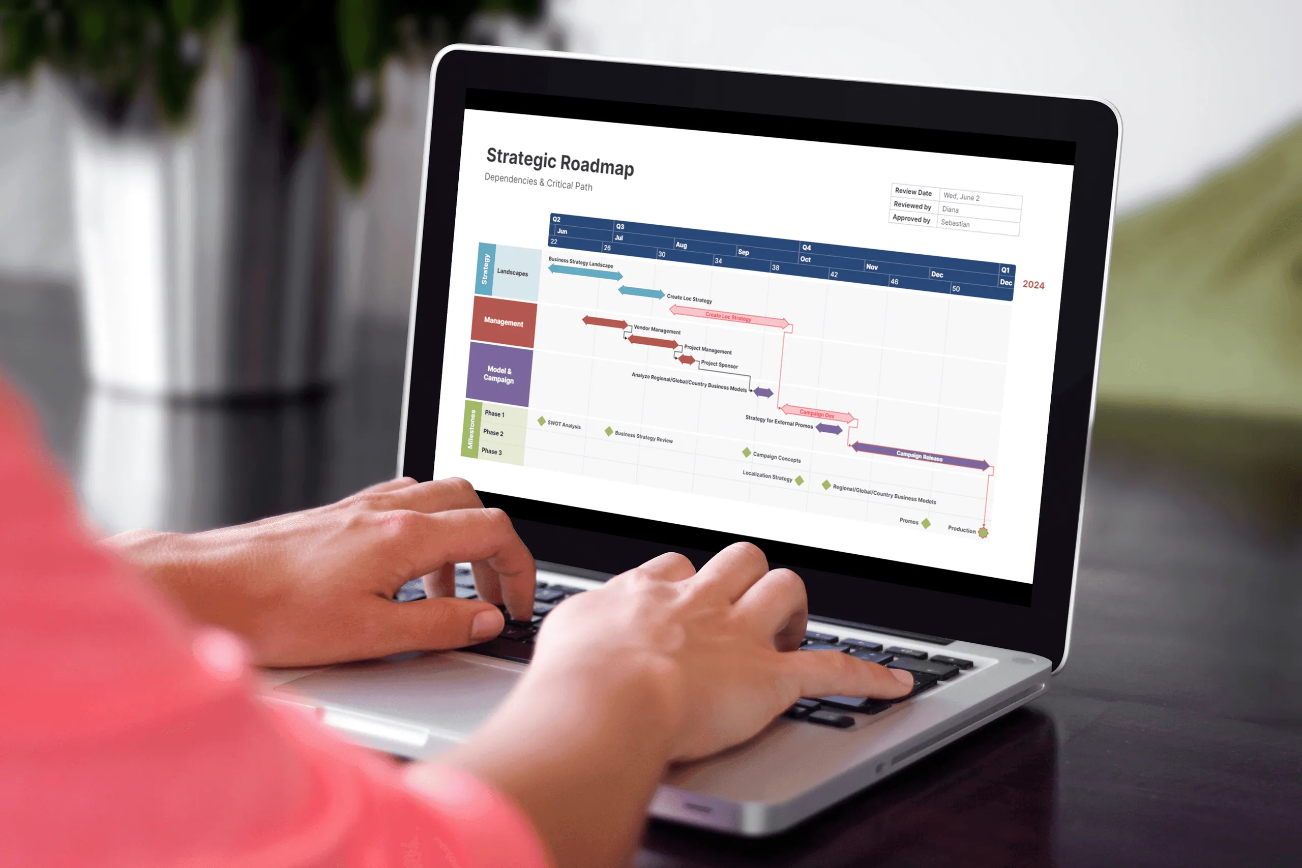
Project management
For project management, timelines turn complex project data into useful tools that affect how teams work and how well projects go. These visuals show task connections and progress that you might miss in regular reports. Timelines are used for:
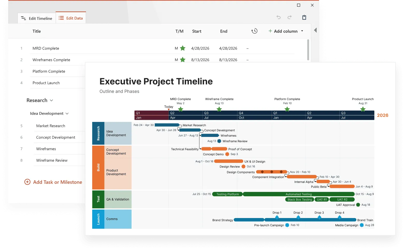
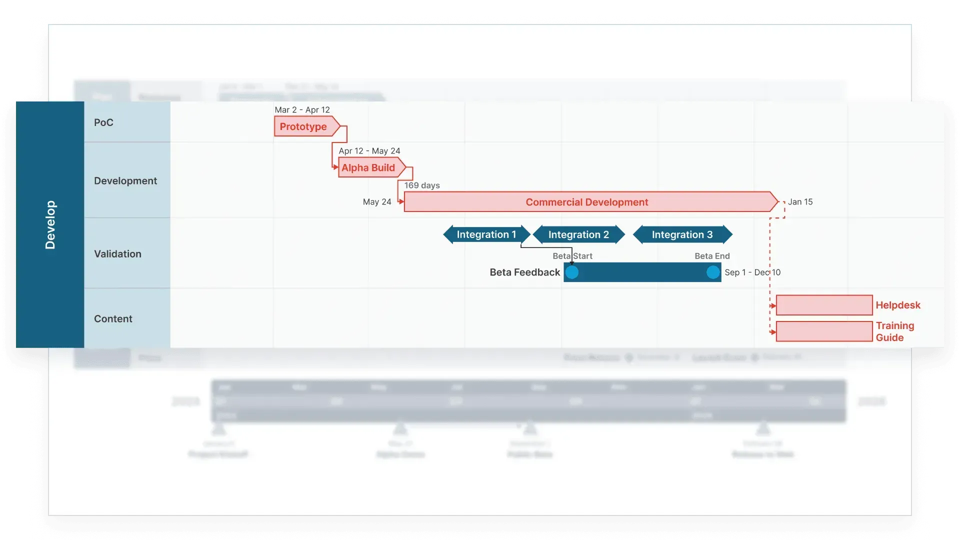
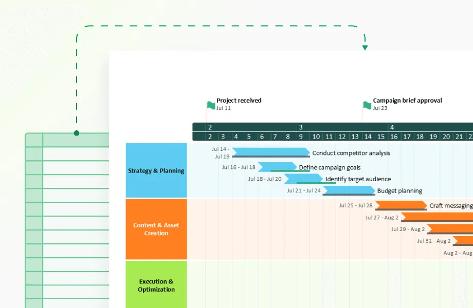
- Gantt charts: These specialized timelines show when tasks start and finish, which ones depend on others, and where work overlaps. They help managers spot bottlenecks and assign people to the right tasks at the right times.
- Milestone tracking: Critical path timelines highlight the make-or-break moments in a project—the decisions and deliverables that will determine whether you finish on time or fall behind. They show which tasks have wiggle room and which don't.
- Resource use: Stacked timelines reveal how team members split their time across different projects and tasks. They help prevent both overwork and downtime by showing who's available when.
- Historical performance analysis: Comparing what you planned versus what actually happened across several projects helps teams get better at estimating how long things will take next time.
- Sprint planning: For agile teams, timeline visuals show work completed in each sprint, helping teams adjust their workload based on their proven capacity rather than optimistic guesses.
- Budget tracking: Timelines that pair spending against project phases help managers spot cost overruns early, before they become major problems.
- Risk management: Timelines with color-coded risk levels throughout a project's lifespan help teams prepare for high-risk periods and allocate extra resources when they're most needed.
- Stakeholder communication: Simplified timeline views give executives and clients the big picture without drowning them in details, making it easier to keep everyone informed without endless meetings.
- Change management: Timelines showing how project scope, requirements, or deadlines have shifted help teams document and understand the impact of changes that happen mid-project.
- Cross-team coordination: Timelines showing how different teams' work intersects help prevent situations where one group is waiting on another or where conflicting work happens simultaneously.

How timelines work for you - from observation to action
Timeline visualizations become most valuable when they transform data observation into concrete action. Rather than passively displaying historical information, they provide tools for active decision-making through these specific applications:
Pattern recognition
Time-based data often contains hidden rhythms and relationships. For example, sales data might reveal weekly peaks every Friday, or quarterly increases following marketing campaigns. By spotting these recurring cycles and connections between variables, you can adjust strategies accordingly - perhaps scheduling promotions during natural lulls or reinforcing successful timing patterns.
Anomaly identification
When you establish baseline patterns in your timelines, deviations become immediately visible. A sudden spike in website traffic might indicate a successful social media mention, while an unexpected drop in production efficiency could signal equipment problems. These anomalies, once identified, often represent your most urgent action items.
Predictive analysis
Historical patterns shown in timelines provide the foundation for forward-looking projections. By extending trend lines from past performance, you can forecast next quarter's sales, estimate future resource needs, or anticipate seasonal fluctuations. These projections, while not perfect, offer much better guidance than guesswork.
Scenario planning
Timelines excel at showing the potential impact of different choices. By creating multiple forward-looking timelines based on various decisions, you can compare possible outcomes—whether testing different project schedules, investment strategies, or resource allocations—before committing to a course of action.
Communication tools
Well-designed timelines convert complex data into clear stories that diverse stakeholders can understand. When showing budget plans to managers or explaining project delays to clients, timelines give visual proof to back up your ideas and help people come to an agreement.
These applications examples show how timelines go beyond being pictures of data; they are tools for planning and action. When designed well and used often, they connect past events to what might happen next. This lets teams in any area see new trends early, find what needs to be changed, and adjust plans based on facts before things become problems.
Conclusion
We see time-based data all around us, from tracking our workouts to watching the stock market. Timelines show this data in a way that other charts can't. They fit how we naturally think about time, so complicated information makes more sense.
Creating timelines that work requires a balance of detail and clarity, focusing on what the audience needs. Include relevant details without overwhelming the viewer, and keep visual elements consistent. The best timelines show not just when things happened, but why they matter and what might happen next.
But making good timelines takes time and design skills. Many professionals struggle with formatting challenges, or maintaining the same look across different versions, or updating the timelines when new data comes in - sometimes, all of these things. These practical issues can limit the use of timeline visualizations in decision-making.
Using a tool like Office Timeline simplifies timeline creation and enables users to implement all the design principles for creating effective timelines, such as clear labeling, smart grouping, and consistent visual coding. It allows for quick generation of consistent timelines, ensuring data accuracy and clarity.
Templates and automated formatting reduce complex layouts, saving time and errors. This lets users focus more on analyzing data and improving how they communicate time-based information. You can try Office Timeline free and turn your data into clear visual stories.
Frequently asked questions
Below you'll find answers to common questions about creating and using timeline visualizations to effectively represent your time-based data.
A timeline visualization is a visual display that shows data points placed in order along a time axis. It's designed to show how things change over time by placing events in sequence, showing when things happened and the relationships between events.
There are some visual encoding techniques that work best for differentiating event types on a timeline:
- Shape coding: Use distinct shapes that intuitively connect to the event type—stars for achievements, circles for recurring events, diamonds for decision points, triangles for milestones, and squares for deliverables
- Position-based encoding: Place different event categories on separate parallel tracks or "swim lanes" while maintaining the same time axis (especially effective for project timelines showing different team activities)
- Visual prominence hierarchy: Combine size, color, and shape to create a multi-level encoding system where critical events stand out through larger, more saturated markers while routine events use smaller, more muted visuals
- Temporal relationship indicators: Use specialized connectors (solid arrows for direct causation, dotted lines for influence relationships, brackets for duration) to show how events relate across time
- Icon integration: For digital timelines, incorporate small domain-specific icons within event markers that instantly communicate event type (e.g., document icon for reports, person icon for personnel changes)
- Pattern/texture differentiation: When color alone isn't sufficient (particularly for print or accessibility), apply distinct patterns to event markers (especially useful for ensuring your timeline works in grayscale)
Dense clusters of events are a common challenge in timeline visualization. When you have numerous data points concentrated in a narrow time period, try these specialized techniques:
- Create event groupings by category (e.g., "4 product launches in May 2023") with the ability to expand for details.
- Implement a "staggered display" where events at the same time are vertically offset rather than overlapping.
- Use size-coding to show a single marker representing multiple events, with the size indicating the number of occurrences.
- For digital timelines, add semantic zooming where the level of detail changes based on zoom level (showing aggregated information when zoomed out and individual events when zoomed in).
- Consider a "timeline break-out" where you create a detailed sub-timeline that expands just the crowded section while maintaining the context of the full timeline.