Complex data overwhelms most people. Spreadsheets with thousands of rows, databases spanning multiple years, interconnected metrics from various departments. These datasets hide valuable insights beneath layers of numbers and timestamps. The right data visualization tools transform this complexity into clear, actionable intelligence.
Timeline-based visualization stands out among visualization approaches because it adds the missing dimension that most complex datasets share: time. When you can see how variables change and interact over time, patterns emerge that static charts cannot reveal. This temporal context turns confusing data into coherent stories about business performance, customer behavior, and operational trends.
Modern organizations generate more complex data than ever before. Understanding this information requires tools that can handle multiple variables, large datasets, and temporal relationships simultaneously. The best data visualization solutions excel at simplifying without oversimplifying. They reveal the signal within the noise.
This article explores how timeline-based visualization transforms complex datasets into clear insights, covering tool selection strategies, design principles, and real-world applications that help organizations make sense of their most challenging data.
If you want to explore how timelines apply to more technical analytical workflows, you can learn more in our guide to timelines in data science. You can also visit our timeline overview for broader context and examples.
Why complex data needs specialized visualization approaches
Complex data differs fundamentally from simple datasets. While basic charts work well for showing quarterly sales figures, they break down when dealing with interconnected variables, multiple time periods, and layered relationships between different data sources.
Consider a typical e-commerce operation. Customer behavior data includes purchase timestamps, product categories, seasonal patterns, marketing touchpoints, and geographic information. Traditional pie charts or bar graphs can show individual aspects, but they cannot reveal how these elements interact over time to influence business outcomes.
Complex datasets typically exhibit several characteristics that make them challenging to visualize:
- multiple variables that influence each other in non-obvious ways;
- temporal dependencies where past events affect future outcomes;
- nested hierarchies of categories, departments, or product lines;
- irregular patterns that don't follow simple seasonal cycles;
- missing or inconsistent data that creates gaps in analysis;
- scale differences where some metrics are measured in thousands while others in millions.
These characteristics require visualization approaches that can handle multidimensional complexity while maintaining visual clarity. Timeline visualization addresses many of these challenges by providing temporal context that helps explain variable relationships and irregular patterns.

Timeline visualization as a complexity-reduction strategy
Timelines excel at reducing complexity because they organize information chronologically. This matches how humans naturally process cause-and-effect relationships. Instead of presenting isolated data points, timelines show progression and evolution, making complex patterns more intuitive.
The human brain processes temporal sequences more easily than abstract relationships. When we see events unfold over time, we can identify patterns, predict outcomes, and understand causation. Timeline visualization leverages this cognitive strength to make complex data more accessible.
Multi-layered timeline analysis represents one powerful approach to complexity reduction. By displaying related variables on synchronized time axes, users can observe correlations and dependencies that separate charts might miss. A marketing team might overlay campaign spending, website traffic, social media engagement, and sales conversions on the same timeline to understand which activities drive results.
Feature requirements for handling complex datasets
Not all data visualization tools can handle truly complex data effectively. The best data visualization platforms include specific features designed for multidimensional temporal analysis and large dataset processing.
Robust data connection capabilities allow tools to pull information from multiple sources simultaneously. Complex datasets rarely exist in single files or databases. Modern organizations store customer data in CRM systems, financial information in ERP platforms, and operational metrics in specialized software. Effective visualization tools must integrate these diverse sources seamlessly.
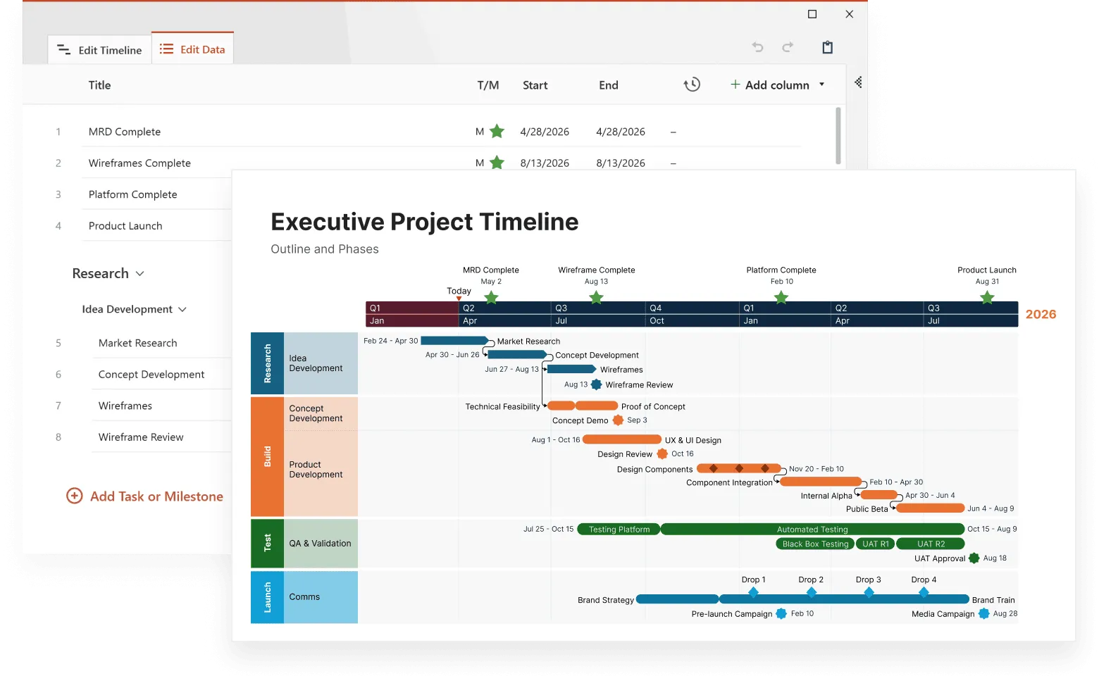
Tools that offer this feature are Tableau and Power BI, that excel at connecting to dozens of data sources, while Office Timeline specifically integrates with Microsoft Project, Excel, Smartsheet, and Jira for project-focused visualizations. Tools like QlikView also provide strong data integration across enterprise systems.
Real-time data processing becomes important when dealing with dynamic complex datasets. Static snapshots cannot capture the evolving nature of business operations. Tools that update visualizations automatically as new data arrives provide more accurate insights for decision-making.
Tableau and Power BI offer real-time dashboard capabilities, while specialized tools like Grafana focus specifically on real-time monitoring visualizations.
Advanced filtering and segmentation options help users focus on specific aspects of complex datasets without losing context. A retail analyst might want to examine seasonal patterns for specific product categories in particular geographic regions. The visualization tool should support this multidimensional filtering while maintaining timeline continuity.
For example, Tableau’s filter actions and Power BI's cross-filtering capabilities support this multidimensional analysis, while Office Timeline allows users to filter specific tasks and milestones when importing from project management tools.
Scalable performance architecture ensures that visualizations remain responsive even with large datasets. Complex data often means big data, and tools must handle millions of data points without compromising user experience. This includes efficient rendering, intelligent data sampling, and optimized query processing.
For example, QlikView's associative engine and Tableau's data extracts provide efficient processing for large datasets, while cloud-based solutions like Power BI Premium offer additional processing power for complex calculations.
Collaborative annotation features support team-based analysis of complex data. Multiple users need to add context, share insights, and build collective understanding of temporal patterns. Tableau's commenting system and Power BI's collaboration workspace enable team discussions around specific data points, while Office Timeline's PowerPoint integration allows teams to collaborate using familiar presentation and review workflows. These collaborative capabilities become particularly important when different departments contribute domain expertise to data interpretation.
See your project data clearly
Try Office Timeline for free. Import tasks and milestones from Excel, Project, Jira, or Smartsheet and instantly generate clean, presentation-ready timelines.
Governance challenges: keeping complex data trustworthy
Here's the uncomfortable truth: as your datasets grow more complex, they become exponentially harder to trust. A single misconnected data source or outdated transformation can turn your beautiful timeline visualization into an expensive mistake.
The data lineage problem hits organizations when executives ask, "Where did this number come from?" and nobody can answer confidently. Complex datasets pull from multiple systems. Your CRM talks to your ERP, which feeds your analytics platform, which connects to your visualization tool. Tools like Informatica and Collibra specialize in mapping these data journeys, while simpler solutions like Office Timeline maintain clear connections to source files in Excel or Project, making lineage transparent for project data.
But governance is not only about tracking, but mostly about prevention. Automated quality monitoring catches problems before they reach decision-makers. Tableau Prep and Microsoft's Data Factory include built-in quality checks, while specialized tools like Great Expectations validate data automatically. The key is setting up alerts that fire when your data behaves unexpectedly, not after someone notices the quarterly report looks wrong.
Version control becomes mission-critical when multiple teams work with the same complex datasets. Without it, you get the classic scenario: marketing's timeline shows one set of launch dates while product development's shows another. Git-based solutions work for technical teams, while business-friendly tools like Office Timeline automatically sync with source files, preventing version conflicts when project schedules change.
Most organizations underestimate access control complexity until they face their first data breach investigation. Complex datasets often contain customer PII mixed with financial projections mixed with competitive intelligence. Enterprise platforms like Tableau Server and Power BI Premium offer granular permissions, while cloud solutions like Looker provide sophisticated role-based access.
The governance lesson? Start simple, automate everything you can, and remember that the best governance tool is often the one your team will actually use consistently.
Making complex data interactive: beyond point-and-click
Static charts are where insights go to die. Complex data demands interaction, but not the kind that overwhelms users with seventeen different filter options and a control panel that looks like a spaceship dashboard.
Smart time navigation separates good timeline tools from great ones. Users need to zoom from decades to days without losing their mental map of the data. Tableau's timeline controls and D3.js implementations handle this elegantly, while Office Timeline's PowerPoint integration allows users to create focused views for different audience needs—executives see quarterly milestones while project teams drill into weekly tasks.
Connected views reveal the stories hiding in your data relationships. When a user clicks on a revenue spike in January, they should instantly see which marketing campaigns were running, which products were launched, and which regions performed best. Power BI's cross-filtering excels here, automatically highlighting related data across multiple visualizations. Programming solutions like Plotly Dash offer even more sophisticated linking capabilities.
Consider this real scenario: A manufacturing company's timeline showed production delays, but static charts couldn't explain why. With conditional formatting, delays longer than two weeks appeared in red, immediately revealing that all major delays coincided with supplier changes. The pattern was invisible in spreadsheets but obvious in the interactive visualization.
Progressive disclosure prevents information overload while preserving analytical depth. Start users with the big picture, then let them drill down through layers of detail. A financial services firm might show quarterly performance trends initially, then allow drilling into monthly figures, weekly metrics, and daily transactions, each level providing context for the next.
The interaction design principle? Every click should answer a question or raise a more interesting one. Complexity should feel like discovery, not confusion.
Common complexity challenges and solutions
Organizations frequently encounter specific types of complexity when working with temporal data. Understanding these common challenges and their solutions helps teams choose appropriate visualization strategies and tools.
Challenge 1: Multiple time zones and irregular intervals
Global organizations often collect data across different time zones, creating confusion about when events actually occurred. Additionally, some data arrives at irregular intervals rather than consistent daily or hourly patterns.
Solution: Normalize all timestamps to a standard time zone for analysis, while preserving original time zone information for context. Use adaptive time scales that accommodate irregular data collection patterns without distorting temporal relationships.
Challenge 2: Seasonal patterns mixed with long-term trends
Many business metrics exhibit both seasonal fluctuations and underlying growth or decline trends. Traditional visualizations often make it difficult to separate these different temporal patterns.
Solution: Implement decomposition techniques that separate seasonal, trend, and residual components. Display these components on synchronized timelines so users can understand how different factors contribute to overall patterns.
Challenge 3: Correlated variables that confuse causation
Complex datasets often contain variables that appear related but may not have causal relationships. Users might misinterpret correlation as causation, leading to incorrect business decisions.
Solution: Provide statistical analysis tools alongside visualization features. Include correlation coefficients, lag analysis, and other statistical measures that help users understand the strength and nature of relationships between variables.
Challenge 4: Data quality issues that distort insights
Complex datasets frequently contain missing values, outliers, and inconsistencies that can skew analysis results. These quality issues often become apparent only after visualization reveals unexpected patterns.
Solution: Implement robust data validation and cleansing processes before visualization. Provide clear indicators when data quality issues exist and offer options for handling missing or anomalous values.
Industry-specific applications of complex data visualization
Different industries face unique challenges when visualizing complex temporal data. Understanding these sector-specific applications demonstrates how timeline-based visualization adapts to diverse analytical requirements.

Healthcare and pharmaceutical research
Medical researchers work with incredibly complex datasets that include patient demographics, treatment histories, drug interactions, and outcome measures. Timeline visualization helps identify treatment effectiveness patterns, adverse reaction timing, and optimal intervention windows.
Clinical trial data presents particular visualization challenges because it combines multiple patient timelines with varying treatment schedules and measurement intervals. Advanced visualization tools can overlay individual patient journeys while revealing population-level trends and statistical significance.
Financial services and risk management
Financial institutions analyze complex datasets that include market data, customer transactions, regulatory requirements, and risk factors. Timeline visualization reveals how market events affect portfolio performance, customer behavior, and regulatory compliance over time.
Risk management requires understanding how different factors interact over time to create potential threats. Timeline-based visualization can show how seemingly unrelated events combine to create risk scenarios, helping institutions prepare for various contingencies.
Manufacturing and supply chain optimization
Manufacturing operations generate complex datasets that include production schedules, quality metrics, supply chain logistics, and equipment performance. Timeline visualization reveals bottlenecks, quality patterns, and optimization opportunities that span multiple operational areas.
Supply chain visualization must account for multiple parallel timelines representing different suppliers, transportation routes, and inventory levels. Advanced tools can show how disruptions in one area affect downstream operations and overall system performance.
Retail and e-commerce analytics
Retail organizations analyze complex customer behavior datasets that include purchase histories, website interactions, marketing touchpoints, and seasonal patterns. Timeline visualization reveals customer journey patterns, campaign effectiveness, and inventory optimization opportunities.
E-commerce platforms face particular challenges because they must integrate online and offline customer interactions across multiple channels. Timeline visualization can show how customer engagement patterns evolve across different touchpoints over time.
Advanced analytical techniques for complex temporal data
Beyond basic timeline visualization, sophisticated analytical techniques can extract deeper insights from complex temporal datasets. These methods require more advanced data visualization tools but provide substantial analytical value for organizations dealing with multifaceted data challenges.
Time series decomposition separates complex temporal patterns into constituent components: trend, seasonality, and residual variation. This technique helps analysts understand which factors drive observed patterns and predict future behavior based on historical components.
Multivariate time series analysis examines relationships between multiple variables as they change over time. This approach reveals lead-lag relationships, where changes in one variable predict changes in another after a specific time delay. Marketing analysts might use this technique to understand how advertising spending affects sales with various time lags.
Anomaly detection in temporal data identifies unusual patterns that deviate from normal behavior. Machine learning algorithms can automatically flag anomalies in complex datasets, helping organizations identify potential problems or opportunities before they become critical.
Predictive modeling with temporal features uses historical patterns to forecast future scenarios. Advanced visualization tools can display both historical data and predictive models on the same timeline, helping users understand confidence intervals and scenario planning.
Cluster analysis for temporal patterns groups similar temporal behaviors to identify distinct pattern types. Customer segmentation based on purchase timing patterns, for example, can reveal different customer lifecycle stages and inform targeted marketing strategies.
Choosing the right tools for complex data visualization
Selecting appropriate data visualization tools for complex datasets requires careful evaluation of organizational needs, technical requirements, and user capabilities. The best data visualization solutions offer different strengths that align with specific use cases and complexity levels.
Enterprise-grade platforms like Tableau, Power BI, and QlikView provide comprehensive features for complex data visualization. These tools excel at connecting to multiple data sources, handling large datasets, and supporting collaborative analysis. They typically require more technical expertise but offer extensive customization options and robust governance features.
Specialized timeline makers focus specifically on temporal data visualization. These platforms often provide intuitive interfaces for non-technical users while offering advanced features for complex timeline analysis. Office Timeline, for example, integrates directly with PowerPoint and can import data from Excel, Microsoft Project, Smartsheet, and Jira, making it particularly effective for organizations already using Microsoft Office workflows. While these tools may lack some general visualization capabilities, they excel at temporal-specific functions and often reduce learning curves for business users.
Programming-based solutions using libraries like D3.js, Python's Plotly, or R's ggplot2 provide maximum flexibility for complex visualization requirements. These approaches require programming skills but enable highly customized solutions that match specific analytical needs. They work particularly well for organizations with development resources who need functionality not available in commercial tools.
Cloud-based visualization services offer scalability and collaboration features that work well for complex datasets. These platforms can handle large data volumes and provide real-time updates, making them suitable for dynamic complex datasets that change frequently.
Factors to consider when choosing tools:
- data source compatibility and integration capabilities,
- performance with large, complex datasets,
- user skill level and training requirements,
- collaboration and sharing features,
- mobile accessibility and responsive design,
- cost structure and licensing models,
- security and compliance requirements.
Organizations often find that workflow integration matters as much as technical capabilities. Tools that work within existing software environments typically see higher adoption rates and better governance outcomes.
Once you've selected appropriate tools, the next challenge lies in designing interactive features that help users navigate complex relationships without becoming overwhelmed by the data's complexity.
Best practices for complex data visualization design
Creating effective visualizations for complex datasets requires balancing information density with user comprehension. These design principles help organizations develop visualizations that clarify rather than complicate complex temporal data.
Start with clear objectives before designing any visualization. Complex datasets can support multiple analytical perspectives, but trying to show everything simultaneously creates confusion. Define specific questions that the visualization should answer and design accordingly.
Use progressive disclosure to manage information complexity. Present high-level patterns first, then provide interactive features that allow users to explore details as needed. This layered approach prevents overwhelming users while preserving access to comprehensive information.
Maintain consistent visual language throughout complex visualizations. Establish color coding, symbol meanings, and interaction patterns early in the design process. Consistency reduces cognitive load and helps users focus on data insights rather than interface learning.
Provide context and annotations that help users interpret complex patterns. Include relevant events, benchmarks, and explanatory notes that explain why certain patterns occur. This context transforms raw data into actionable business intelligence.
Test with actual users who will work with the visualization in real scenarios. Complex data visualization often looks clear to designers but confuses end users. Regular user testing identifies usability issues and improvement opportunities.
Plan for different devices and screen sizes since complex visualizations need to work across various platforms. Mobile users might see simplified versions, while desktop users access full functionality. Consider touch interactions and responsive design principles.
Measuring success in complex data visualization
Evaluating the effectiveness of complex data visualization requires specific metrics that go beyond simple user satisfaction surveys. Success should be measured by improved decision-making speed, analytical accuracy, and insight generation.
Time to insight measures how quickly users can identify patterns and generate actionable conclusions from complex datasets. Effective visualizations should reduce the time required to understand temporal patterns and their business implications.
Decision quality improvements track whether visualizations lead to better business outcomes. This might include more accurate forecasts, better resource allocation, or improved operational efficiency based on insights gained from complex data analysis.
User engagement metrics indicate whether visualizations effectively communicate complex information:
- time spent exploring the visualization,
- number of interactive features used,
- frequency of return visits,
- questions asked about the data.
Analytical accuracy measures whether users correctly interpret complex patterns and relationships. This includes identifying true correlations, understanding temporal dependencies, and avoiding common analytical pitfalls.
Knowledge transfer effectiveness evaluates whether insights gained from complex data visualization spread throughout the organization. Effective visualizations should support knowledge sharing and collaborative decision-making.
Complex data visualization transforms overwhelming information into clear, actionable insights when implemented thoughtfully. Timeline-based approaches excel at revealing temporal patterns and relationships that traditional charts cannot capture. The best data visualization tools combine sophisticated analytical capabilities with intuitive user interfaces, making complex datasets accessible to diverse organizational users.
Organizations that invest in appropriate visualization tools and design practices gain significant competitive advantages through better understanding of their complex data environments. As datasets continue growing in size and complexity, visualization becomes increasingly important for maintaining analytical clarity and supporting informed decision-making.
Conclusion
The difference between drowning in spreadsheets and surfacing actionable insights often comes down to one thing: showing how your data changes over time. While executives debate whether that revenue spike was seasonal or strategic, timeline visualization already has the answer mapped out chronologically.
Complex datasets will only get more complex. Customer journeys now span dozens of touchpoints, manufacturing operations generate sensor readings every millisecond, and financial markets react to global events in real-time.
Organizations that master timeline-based visualization today will identify patterns, predict outcomes, and respond to changes while their competitors are still trying to make sense of yesterday's numbers.
The tools exist. The techniques work. The question isn't whether your data is too complex for effective visualization but whether you're ready to stop treating time as just another column in your database and start using it as the organizing principle that makes everything else make sense.
Frequently asked questions
These questions address real concerns that organizations face when working with complex data visualization. Our answers provide practical guidance based on actual implementation challenges and solutions.
Start by evaluating your data sources and technical requirements. Tools like Tableau and Power BI excel at connecting multiple data sources and handling large datasets, making them suitable for enterprise environments. Programming-based solutions (Python, R, D3.js) offer maximum customization for unique requirements but need technical expertise.
Consider these factors:
- data source compatibility (databases, apis, cloud services);
- team technical skills and training requirements;
- budget for licensing and implementation;
- need for real-time updates versus batch processing;
- mobile accessibility and sharing requirements.
Test tools with actual data samples before committing, as performance can vary significantly with complex datasets.
Complex datasets exhibit multiple challenging characteristics simultaneously. They typically include:
- multiple interconnected variables where changes in one metric affect others;
- temporal dependencies where historical events influence future outcomes;
- irregular patterns that don't follow predictable seasonal cycles;
- mixed data types combining numerical, categorical, and geographic information;
- multiple time scales (hourly operations data mixed with quarterly financial data);
- data quality issues like missing values, outliers, or inconsistent collection methods.
Examples include customer journey data combining purchase history, website behavior, support interactions, and demographic information across different time periods and platforms.
Yes, but with important limitations. Real-time timeline visualization works best for:
Operational monitoring where immediate pattern detection matters more than deep analysis. Financial trading systems, manufacturing quality control, and website performance monitoring benefit from real-time timelines.
However, complex relationship analysis often requires batch processing. Correlation analysis, predictive modeling, and multi-variable pattern detection typically work better with periodic updates (hourly or daily) rather than streaming data.
Success factors include robust data infrastructure, clear aggregation rules, and automated anomaly detection to flag unusual patterns that need human investigation.
Apply progressive disclosure principles:
- Start simple - Show high-level trends first, then provide drill-down capabilities.
- Use effective filtering - Let users focus on specific time periods, categories, or metrics.
- Provide context - Include annotations explaining why certain patterns occur.
- Maintain visual hierarchy - Use size, color, and position to emphasize important information.
- Test with actual users - Complex visualizations often look clear to creators but confuse end users.
Consider creating different views for different user types. Executives might need monthly summaries while operations teams require daily detail.
Complex data visualization focuses on understanding relationships and patterns within multidimensional datasets, regardless of size. A dataset with 15 variables across 6 months could be complex but not particularly large.
Big data visualization primarily addresses volume, velocity, and variety challenges. You might have millions of simple records (like basic website clicks) that require big data tools but don't involve complex relationships.
Many organizations face both challenges simultaneously - large datasets with complex relationships. These situations require tools that can handle scale while preserving analytical depth, often involving data sampling, aggregation strategies, and distributed processing.
You've created a complex visualization, but how do you know it's actually reliable and helpful? You can use these three validation approaches to catch aspects that can become problems:
Technical validation (Is the data correct?):
- Spot-check 5-10 random data points against source data.
- Test with missing data and extreme outliers.
- Calculate key metrics independently using different tools.
- Monitor loading times with your largest datasets.
User validation (Can people actually use it?):
- Time new users answering real business questions (should take under 3 minutes).
- Track whether stakeholders actually change decisions based on your visualization.
- Watch for the "nod and ignore" pattern—polite feedback but continued old workflows.
Business validation (Does it improve outcomes?):
- Test predictions against actual outcomes (did that seasonal pattern hold true?).
- Have domain experts review conclusions for missing context.
- Measure whether visualization-driven decisions improve performance metrics.
Red flag: People praise your visualization but keep making decisions the old way. This means it's not answering questions that actually matter to your business.