Most executives can recite their quarterly revenue figures but ask them why sales dropped exactly 23% in week three of September, and you'll get blank stares. The problem isn't lack of data; it's that traditional reporting strips away the timing that makes data meaningful.
A manufacturing company might track defect rates monthly, missing the fact that quality issues spike every Tuesday when the night shift starts. An e-commerce business could analyze conversion rates by demographic, overlooking that their best customers consistently purchase within 72 hours of receiving marketing emails.
This article explores how businesses can harness timeline visualization to improve their data-driven decision-making processes. We'll examine practical techniques for building effective timelines, analyze real-world applications across different industries, and provide actionable strategies for implementing timeline-based analysis in your organization. For a deeper look at how these methods apply in technical and analytical fields, you can also explore timelines in data science.
Why chronological data visualization matters for business decisions
Most businesses analyze data in chunks: monthly sales reports, quarterly performance reviews, annual budget assessments. This approach misses the sequential relationships that explain why numbers change. A restaurant chain might report that average order value dropped 8% in March without realizing the decline began exactly when they removed combo meal promotions two weeks earlier.
Timeline analysis connects these dots by showing when events happen in relation to each other. Take a SaaS company tracking customer acquisition costs. Monthly reporting showed CAC increased from $120 to $180 between January and April. But plotting the data daily revealed that costs jumped within 48 hours of their main competitor launching a free trial extension, information that completely changed their response strategy from internal optimization to competitive positioning.
The timing advantage matters more than most executives realize. When Zoom's daily active users exploded in March 2020, companies that could quickly correlate this spike with remote work policies gained market share in video conferencing tools. Those relying on monthly user reports missed the three-week window when demand was highest and competition was lowest.
Manufacturing companies see similar patterns. A textile manufacturer noticed quality defects increased 12% year-over-year. Traditional analysis pointed to supplier issues or equipment aging. Timeline visualization showed defects spiked every Monday and Friday, revealing that weekend temperature fluctuations in their facility affected material properties, a $50,000 HVAC adjustment that solved a problem they'd been attributing to much more expensive causes.

The connection between data-driven decision making and time-based analysis
Most business metrics don't change instantly. A marketing campaign launched today might not affect sales for two weeks. A price increase could trigger customer complaints immediately but not impact churn rates until billing cycles complete. Understanding these time delays prevents managers from making premature decisions or missing real opportunities.
Timeline analysis reveals four specific patterns that traditional reporting obscures:
Lag effects show true campaign performance
A B2B software company spent $50,000 on a trade show, then declared it unsuccessful when leads didn't convert within 30 days. Timeline analysis revealed that 67% of trade show leads converted between days 45-90, compared to 23% for online leads. This insight shifted their budget allocation and extended their follow-up sequences.
Seasonal patterns predict resource needs
An accounting firm noticed their client onboarding process slowed during tax season but couldn't quantify the impact. Timeline visualization showed that new client setup took 3.2 days during off-peak months but jumped to 8.7 days between February and April. They now hire temporary staff in January and adjust client expectations accordingly.
Correlation timing prevents false conclusions
A manufacturing company thought employee satisfaction scores predicted productivity until timeline analysis showed the relationship was backwards; productivity improvements preceded satisfaction increases by six weeks. This discovery changed their management approach from focusing on satisfaction surveys to implementing productivity tools that naturally improved morale.
Intervention effects measure real impact
When a retail chain implemented new inventory software, they measured success by comparing before-and-after stockout rates. Timeline visualization revealed that improvements didn't begin until three months post-implementation, when employees completed training. This delayed effect pattern now guides their expectations for technology rollouts.
Recognizing these temporal patterns is only the first step. The real value comes from building timelines that capture the right data at the right granularity to answer specific business questions.
Building effective business timelines for data analysis
Most timeline projects fail because teams start plotting data before defining what decisions the timeline should inform. A successful business timeline answers a specific question that leads to concrete action, not just pretty charts that sit in presentations.
Step 1: Define your decision context
Instead of asking "what data should we timeline?" ask "what decision are we trying to make?" Start with the specific business question you're trying to answer. Are you investigating why customer churn increased? Understanding seasonal demand patterns? Evaluating the impact of a new product launch?
Example: An e-commerce company wanted to reduce cart abandonment. Their first timeline attempt plotted total abandoned carts per day. Interesting but not actionable. Their second attempt plotted the sequence of events leading to abandonment: product page views, time spent on checkout, payment method selection attempts. This revealed that 73% of abandonment happened at the shipping cost calculation step, leading to a specific fix.
Step 2: Select relevant data streams
Choose metrics that directly connect to actions you can take. Map your data to decision points rather than just available information. For customer churn analysis, plotting contract renewal dates helps more than customer acquisition dates because it shows when intervention opportunities occur.
For churn prediction, you might include:
- login frequency (weekly averages),
- support ticket volume,
- feature usage depth scores,
- billing cycle events,
- competitor promotion periods,
- contract renewal deadlines.
This combination reveals that customers typically reduce login frequency 6-8 weeks before churning, support tickets spike 2-3 weeks before, and churn probability doubles during competitor promotion periods.
Step 3: Establish appropriate time granularity
Match your time scale to your response capability. A customer service team that can adjust staffing daily needs hourly timeline data. A product team planning quarterly releases needs weekly granularity. Don't create daily timelines if you can only act monthly. It generates noise without value.
Daily data works well for operational decisions, while weekly or monthly views suit strategic planning. The key is matching your time scale to your decision timeframe.
Step 4: Add contextual markers
External markers often explain data patterns that seem random. Include external events that might influence your data (product launches, marketing campaigns, regulatory changes, or economic indicators). A food delivery company noticed order spikes every third Tuesday until they marked local sports schedules on their timeline. The spikes coincided with home games. This insight helped them predict demand and adjust driver schedules proactively.
The difference between useful and useless timelines often comes down to specificity. Generic timelines show patterns; specific timelines drive decisions. Once you've defined your data strategy, the next question becomes how to display that information for maximum analytical impact.
Common timeline visualization techniques for business data
The wrong visualization format can hide patterns that the right format reveals instantly. Each timeline technique serves specific analytical purposes, and choosing correctly determines whether your data drives decisions or just fills dashboards.
Sequential bar charts compare performance across periods
These work when you need to spot performance changes between specific time intervals. A manufacturing company tracking defect rates per shift can instantly see that Tuesday night shifts have 40% more quality issues than other periods. Tools like Tableau or Power BI make these comparisons straightforward; you can create interactive bar charts that let managers drill down from monthly to daily to hourly views.
Line graphs reveal trends and correlations
Use line graphs when tracking multiple metrics that might influence each other. A SaaS company plotting monthly recurring revenue alongside customer acquisition cost can see that MRR growth slows when CAC exceeds $150. Excel handles basic line graphs, but tools like Looker Studio allow real-time data connections that update automatically.
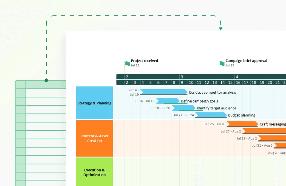
Gantt-style timelines show process dependencies
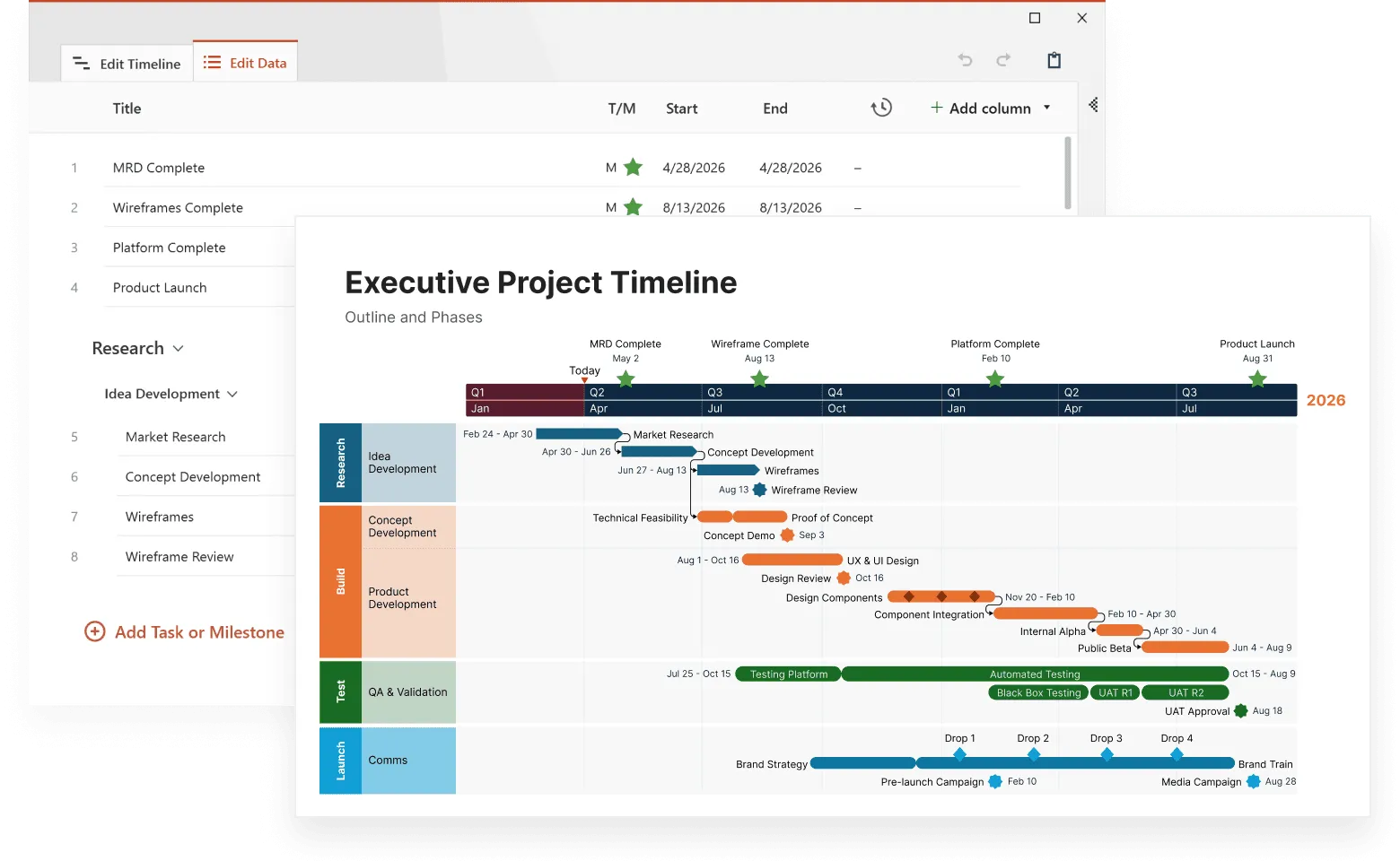
These excel at visualizing overlapping activities and identifying bottlenecks. A construction company can see that electrical work consistently starts late because plumbing runs over schedule. Microsoft Project and Smartsheet specialize in Gantt charts, while Airtable offers simpler timeline views for less complex projects. Office Timeline creates presentation-ready Gantt charts that integrate directly with PowerPoint, making them ideal for executive reporting and client presentations.
Event timelines track specific occurrences
Mark discrete events to understand their impact on other metrics. A retail chain marking store opening dates alongside regional sales data discovered that new stores cannibalize existing location revenue for exactly 6 months before the market expands. Tools like TimelineJS or Preceden focus specifically on event-based timelines.
Milestone timelines connect achievements to outcomes
Plot significant accomplishments against performance metrics to understand what drives success. A startup tracking product launches, funding rounds, and user growth might discover that growth accelerates most after technical hires, not marketing spend. Notion and Airtable both offer milestone tracking with visualization capabilities.
While these visualization techniques help you see patterns in operational data, the most valuable timeline insights often come from understanding how your customers behave over time.

How timelines reveal patterns in customer behavior and market trends
Customer behavior unfolds predictably over time, but only timeline analysis reveals these patterns. Data shows that customers who browse for 5–11 weeks before buying high-value home items spend up to 60% more than impulse buyers, prompting the retailer to extend their sales cycle rather than rush conversions.
E‑commerce report shows that “61% of consumers will spend 5+ days to research and purchase a big-ticket electronic device”. This timing difference completely changes remarketing strategies: electronics companies invest in long-term nurture campaigns, while other retailers focus on immediate conversion tactics.
Subscription firms using Mixpanel and Amplitude detect viewing declines 7–14 days before cancellation. Netflix, which reduced churn to around 2–3 %, uses this insight to time retention outreach.
Investment teams overlay IPO listings with Fed rate news and economic indicators. They consistently observe significantly lower success rates, often a major drop, within 30 days of interest rate announcements, regardless of fundamentals.
Timeline analysis transforms from descriptive reporting to predictive intelligence when businesses understand that timing patterns repeat. The key is moving beyond visualizing what happened to predicting what happens next based on temporal sequences. These same principles apply when managing internal operations and coordinating team resources.
Timeline-based project management and resource allocation examples
Project timelines typically focus on deadlines and deliverables, but the real management value comes from analyzing resource patterns and capacity constraints over time. Smart project managers use timeline data to predict problems before they derail schedules.
Identifying resource bottlenecks before they happen
Organizations frequently discover that projects slip during certain phases, not because of poor planning, but because key roles become overextended. For example, a team might notice that mid-project phases consistently run over budget. A timeline review may show that specialized contributors are overloaded across multiple projects during the same window. Adjusting start dates or redistributing work can prevent the bottleneck and reduce unsustainable workloads.
Similarly, companies with seasonal operations may spot predictable timing issues. A contractor, for instance, might observe that material deliveries tend to lag during periods of high supplier demand. By ordering materials earlier during those months, they can reduce delays and stabilize project timelines.
Understanding team velocity patterns
Timeline analysis also helps teams understand how productivity fluctuates around recurring events. A software team might find that velocity drops briefly after major releases because developers shift attention to customer support. Recognizing this pattern allows managers to plan lighter sprints, allocate time for documentation, or prepare support teams in advance.
Marketing and creative teams often see parallel trends. Campaign timelines may consistently stretch during periods when client approvals take longer, such as end-of-quarter review cycles. Adjusting workflows to account for predictable slowdowns leads to smoother delivery and more realistic expectations.
Optimizing resource allocation timing
Visualizing resource allocation on a timeline highlights when teams are under pressure versus when they have capacity. A design or consulting team might notice recurring slow periods, such as late summer or holiday weeks, where client activity dips. Instead of leaving that time underutilized, they can schedule training, internal initiatives, or strategic planning during those windows.
Over time, repeated patterns across multiple projects provide managers with a forecasting advantage. Timeline-based insights help shape more accurate schedules, strengthen resource planning, and improve long-term operational efficiency. These same principles can be applied beyond projects, including financial planning, budget cycles, and organizational capacity management.

Financial planning and timeline analysis
Most CFOs can recite their quarterly burn rate, but far fewer can pinpoint which specific weeks will tighten cash flow or when seasonal fluctuations will affect working capital. Timeline analysis shifts financial planning from backward-looking reports to forward-focused cash management.
Cash flow prediction through seasonal pattern recognition
Many businesses experience recurring dips in cash flow but struggle to anticipate their exact timing. For example, a consumer-focused company might know that early-year revenue trends soften, yet only a timeline analysis of daily cash flows reveals the precise weeks when spending slows or deferred purchases catch up. With this insight, they can prepare short-term financing, adjust operational pacing, or refine promotional calendars to stabilize cash flow during predictable lulls.
Working capital optimization through timing analysis
Plotting accounts receivable, inventory cycles, and payables on a timeline often exposes cash conversion patterns hidden in monthly summaries. A manufacturer, for instance, may discover that bulk order shipments cluster at certain points in the month, creating periodic cash crunches when receivables lag. By spreading shipments more evenly or adjusting payment terms, they can smooth working capital needs and reduce reliance on short-term borrowing.
Budget variance analysis with temporal context
Traditional variance reports show where spending deviated from plan but rarely explain when or why. Timeline visualization reveals the specific weeks when a variance emerged and the events that triggered it. A tech company might see a quarterly overspend in marketing, but mapping spend chronologically uncovers that the spike occurred during a concentrated response to market activity. This temporal insight shifts the discussion from cost cutting to strategic budgeting for rapid-response moments.
Investment timing through multiple timeline analysis
Strategic investment decisions often depend on aligning multiple timelines: market conditions, competitive shifts, operational milestones, and internal performance metrics. An investment team layering these timelines might notice that strong exit opportunities consistently align with certain stages in leadership transitions or product cycles. Recognizing these patterns helps them time acquisitions, divestitures, or restructurings more deliberately.
Once finance teams start to see these temporal dynamics clearly, the practical question remains: Which tools make this type of timeline analysis accessible without requiring advanced analytics expertise?
Technology platforms and tools for timeline-based analysis
The software you choose for timeline analysis can make the difference between insights that drive decisions and charts that collect digital dust. The wrong tool creates beautiful visualizations that nobody uses; the right tool gets embedded into daily decision-making processes.
Business intelligence platforms for data-heavy organizations
Tableau excels when you need complex timeline analysis with multiple data sources. It is a powerful analytics platform with interactive filtering and drill-down capabilities, making it useful for exploring patterns across time at both high and granular levels.
A logistics company can use Tableau to layer delivery times, traffic patterns, and weather data on a single timeline, revealing that x% of late deliveries happen during the y minutes after school dismissal when traffic spikes. The interactive filtering lets dispatchers drill down from monthly patterns to specific route problems in real-time.
Microsoft Power BI works best for organizations already using the Microsoft ecosystem. It supports automated timeline reporting through direct integrations with Office 365 tools and offers seamless sharing and collaboration through platforms like SharePoint and Teams.
A consulting firm that connects Power BI directly to their project management system can automatically generate timeline reports that show resource allocation conflicts weeks in advance. The SharePoint integration means project managers see timeline alerts without switching applications.
Google's Looker Studio provides the simplest entry point for timeline analysis. It is a user-friendly option for creating straightforward timeline dashboards. Its native integrations with Google Analytics, Google Ads, and other Google services make it effective for quick setup, automated reporting, and real-time data updates.
An e-commerce business can connect it directly to Google Analytics and Google Ads, creating automated timeline dashboards that show how marketing spend correlates with sales spikes. The real-time updates help them adjust ad budgets within hours instead of weeks.
Specialized timeline tools for focused analysis
Preceden
A timeline creator suited for project-focused or multi-phase planning, offering structured views that help teams organize events, dependencies, and milestones.
Office Timeline
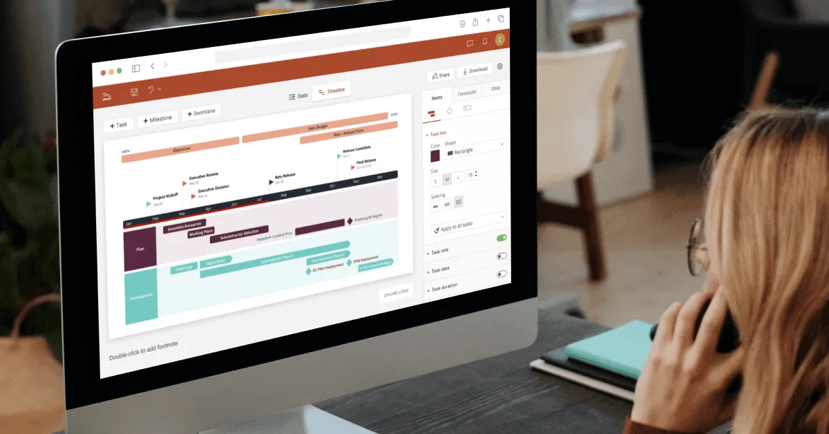
A PowerPoint-integrated tool designed for professionals who need polished, presentation-ready timelines for reporting, executive communication, and stakeholder updates.
Timeline Maker Pro
A timeline software built for handling detailed or historically rich datasets, with features that support organizing, analyzing, and visualizing long chronological sequences.
Aeon Timeline
A tool tailored for narrative, relationship, and sequence mapping, ideal for workflows that require seeing how events, people, and timelines interact over time.
The best tool depends less on features and more on adoption. A sophisticated platform that requires training won't beat a simple tool that managers actually use daily. Start with the simplest option that answers your most important timeline questions, then upgrade when complexity demands it.
Building timeline analysis capability is just the beginning; the real question becomes whether these tools actually improve business outcomes enough to justify the investment.
Make data stories decision-ready
Try Office Timeline for free. Present multi-phase plans and milestone sequences in clear, persuasive timeline slides.
Measuring success and ROI of timeline-based decision making
Organizations often adopt timeline analysis but find it difficult to demonstrate its impact when they focus on surface metrics like tool adoption or chart output. More meaningful measurement comes from looking at how timeline insights influence decisions and operational outcomes.
Decision speed improvements
Timeline analysis can help reveal where delays tend to occur in approval processes or project handoffs. When these patterns become clearer, teams are often able to act more quickly and reduce lag in decision-making. A practical metric is time from insight to action, which commonly shortens once timing-related issues are made visible.
Forecast accuracy gains
Incorporating temporal patterns into forecasting models can lead to more reliable predictions. This may reduce inventory issues, staffing mismatches, or budgeting surprises. Many organizations track this through forecast error rates, which can improve as timeline-based insights are integrated into planning.
Process cycle time reductions
Timeline views often highlight recurring bottlenecks, such as review delays or uneven resource availability, that aren’t obvious in standard reports. Addressing these patterns can shorten cycle times for key processes. Useful measures include average phase duration or overall process cycle time, which may improve when timing issues are resolved.
Early warning system effectiveness
Visualizing trends over time can help teams spot signals of potential problems earlier than they would through traditional reporting. As a result, the percentage of issues identified before they escalate often increases. Organizations may track this through early risk detection rates or similar indicators.
Competitive response speed
Teams that visualize competitive or market-related timelines often become more aware of when external changes occur and how quickly they respond. A helpful KPI is time from external event to response, which may show improvement once timeline tracking is in place.
Proving ROI with decision-level tracking
Demonstrating ROI is easier when teams document the decisions that timeline analysis directly supports, such as avoided delays, improved planning, or better allocation of resources. These decision-level connections provide a more grounded and realistic measure of the value timeline analysis contributes.
Conclusion
Timeline analysis succeeds when it moves beyond pretty visualizations to drive specific business decisions. The companies gaining competitive advantages are not those with the most sophisticated timeline software but the ones asking better questions about timing, patterns, and cause-and-effect relationships in their data.
Start simple: pick one business problem where timing matters, plot the relevant data chronologically, and look for patterns that traditional reporting misses. Whether that's understanding why customers churn, predicting cash flow problems, or optimizing resource allocation, timeline analysis works best when it answers questions that lead to immediate action.
The goal is to build a data driven decision making process that recognizes timing as a critical factor in business success. Once your team starts seeing temporal patterns, you'll wonder how you ever made strategic decisions without understanding when things happen, not just what happens.
Frequently asked questions
Here are answers to some questions coming from businesses starting their timeline analysis journey. The answers focus on practical implementation rather than theoretical concepts.
You need at least 3 months of data points with dates attached.
Most timeline patterns become visible with 90 days of daily data or 12 months of weekly data. A restaurant needs 3 months of daily sales to spot weekly patterns, but requires a full year to identify seasonal trends. Start with whatever data you have; even 30 days can reveal daily patterns like peak hours or day-of-week variations that improve operational decisions.
Start with Excel if you have fewer than 10,000 data points and basic visualization needs.
Excel handles simple timeline analysis well: plot dates on the x-axis, metrics on the y-axis, add trend lines. Upgrade to specialized software when you need real-time data updates, multiple data sources, or interactive dashboards. A small business tracking monthly sales can use Excel indefinitely, while a logistics company monitoring thousands of daily shipments needs dedicated timeline software.
Plotting too many metrics on one timeline, making it impossible to see any patterns clearly.
Limit each timeline to 2-3 related metrics maximum. Instead of showing revenue, costs, customer count, and website traffic together, create separate timelines: one for financial metrics (revenue vs costs), another for customer metrics (acquisition vs churn). Each timeline should answer one specific business question.
Most companies identify actionable insights within 2-4 weeks of implementation.
Timeline analysis typically pays for itself through the first major insight. A manufacturing company might discover that quality issues spike every Tuesday, leading to immediate process adjustments. The timeline software costs $200/month; fixing the Tuesday problem saves $5,000/month in rework costs. However, building timeline analysis into regular decision-making processes takes 3-6 months.
Yes, but focus on leading indicators rather than final outcomes.
B2B companies with 6-month sales cycles can't wait for purchase data to identify patterns. Instead, track proposal submissions, demo requests, pricing discussions, and contract negotiations on timelines. A software company discovered that deals taking longer than 45 days from demo to proposal had 67% lower close rates, allowing them to adjust their sales process for better qualification.