Data tells stories, but raw numbers rarely captivate an audience. When you transform those datasets into interactive data timelines, you create visual narratives that people can explore, understand, and remember. This shift from static charts to dynamic, chronological presentations changes how audiences engage with information.
Interactive data timelines combine the analytical power of data visualization with the intuitive appeal of chronological storytelling. Instead of presenting isolated data points, you create connected sequences that reveal patterns, trends, and relationships over time, building on techniques often used in advanced timeline visualization.
This article guides you through the complete process of building interactive data timelines, from planning your data structure to sharing polished visualizations that engage your audience.
What makes interactive data timelines different from regular timelines
Traditional timelines focus on events and milestones. Data timelines go deeper by incorporating quantitative information that changes over time. You might track website traffic growth, sales performance, temperature variations, or population changes; any metric that evolves chronologically.
The interactive element separates these timelines from static versions. Users can hover over data points to see specific values, zoom into particular time periods, filter different data series, or switch between visualization modes. This interactivity transforms passive consumption into active exploration.
Data timelines work particularly well for:
- financial performance tracking across quarters or years;
- scientific measurements over extended periods;
- marketing campaign results and their temporal relationships;
- product development cycles with measurable outcomes;
- historical data analysis with quantifiable elements.
A marketing team tracking campaign performance across six months would benefit more from an interactive data timeline showing click-through rates, conversion metrics, and budget allocation over time rather than a simple list of campaign launch dates. Similarly, a research project measuring temperature variations needs quantitative visualization, not just milestone markers for data collection events.
These examples illustrate when to choose data-driven approaches: whenever your audience needs to understand trends, compare values across time periods, or explore relationships between different metrics. Once you recognize these opportunities, the next step involves planning how to structure your specific dataset for maximum impact.
Planning your data-driven timeline structure
Building on the understanding of what makes data timelines unique, you need to examine your dataset's temporal structure before creating anything. Most data timelines follow one of three patterns: regular intervals (monthly sales figures), irregular events with data (product launches with revenue impact), or continuous measurements (sensor readings).
Start by identifying your primary timeline axis. Will you show daily, weekly, monthly, or yearly progressions? Your data collection frequency should match your timeline granularity. Monthly data works poorly on daily timelines, but daily data can aggregate effectively into monthly views.
Consider secondary data layers. Weather data might include temperature, precipitation, and humidity. Business data could combine revenue, expenses, and profit margins. Multiple data series create richer stories but require careful visual organization to avoid confusion.
Define your interactive elements early in the planning process. Which data points will users want to explore in detail? What filtering options would provide the most value? How will users navigate through different time periods?
Defining interaction patterns
Your audience's needs determine which interactive elements provide the most value. Financial analysts might want to filter specific quarters and compare year-over-year performance. Researchers could need detailed hover information for outlier data points. Project managers often require zoom capabilities to examine both overview trends and daily details.
Map out user scenarios before you make an interactive timeline. What questions will your audience ask? Which comparisons matter most? How will they want to explore different time periods or data categories?
With your structure planned and interaction patterns defined, you can now focus on preparing the raw materials that will power your timeline.
Choosing and preparing your data sources
Moving from planning to execution requires clean, well-structured data. The quality of your source materials directly impacts your timeline's effectiveness and user experience. Inconsistent formats, missing values, or poorly organized information creates frustrating interactions that undermine your story.
Spreadsheet formats work well for most timeline projects. CSV files, Google Sheets, and Excel documents provide structured data that most interactive timeline makers can import directly. JSON formats offer more flexibility for complex datasets with nested information, though they require more technical setup.
Your data should include these essential elements:
- timestamp or date columns in consistent formats;
- numerical values for quantitative measurements;
- category labels for different data series;
- text descriptions for context and explanations;
- media URLs if you plan to include images or videos.
Data cleaning procedures
Import your dataset and examine its structure systematically. Remove duplicate entries that could skew your visualizations. Standardize date formats across all entries - inconsistency here breaks most timeline tools. Fill gaps in your data sequence or decide how to handle missing periods explicitly.
Convert text dates into standard formats (YYYY-MM-DD works universally across platforms). Separate different measurement types into distinct columns for easier processing. If your data includes qualitative descriptions alongside quantitative values, organize them into separate fields that your chosen timeline tool can handle appropriately.
Clean data sets the foundation for smooth timeline creation. With your information properly organized, you can now select the right tools to bring your timeline to life.
Selecting the right interactive timeline builder
Your cleaned dataset is ready, but choosing the wrong tool can derail even the best-prepared project. Different interactive timeline software excels in different areas - some prioritize ease of use, others offer advanced customization, and a few specialize in handling large datasets.
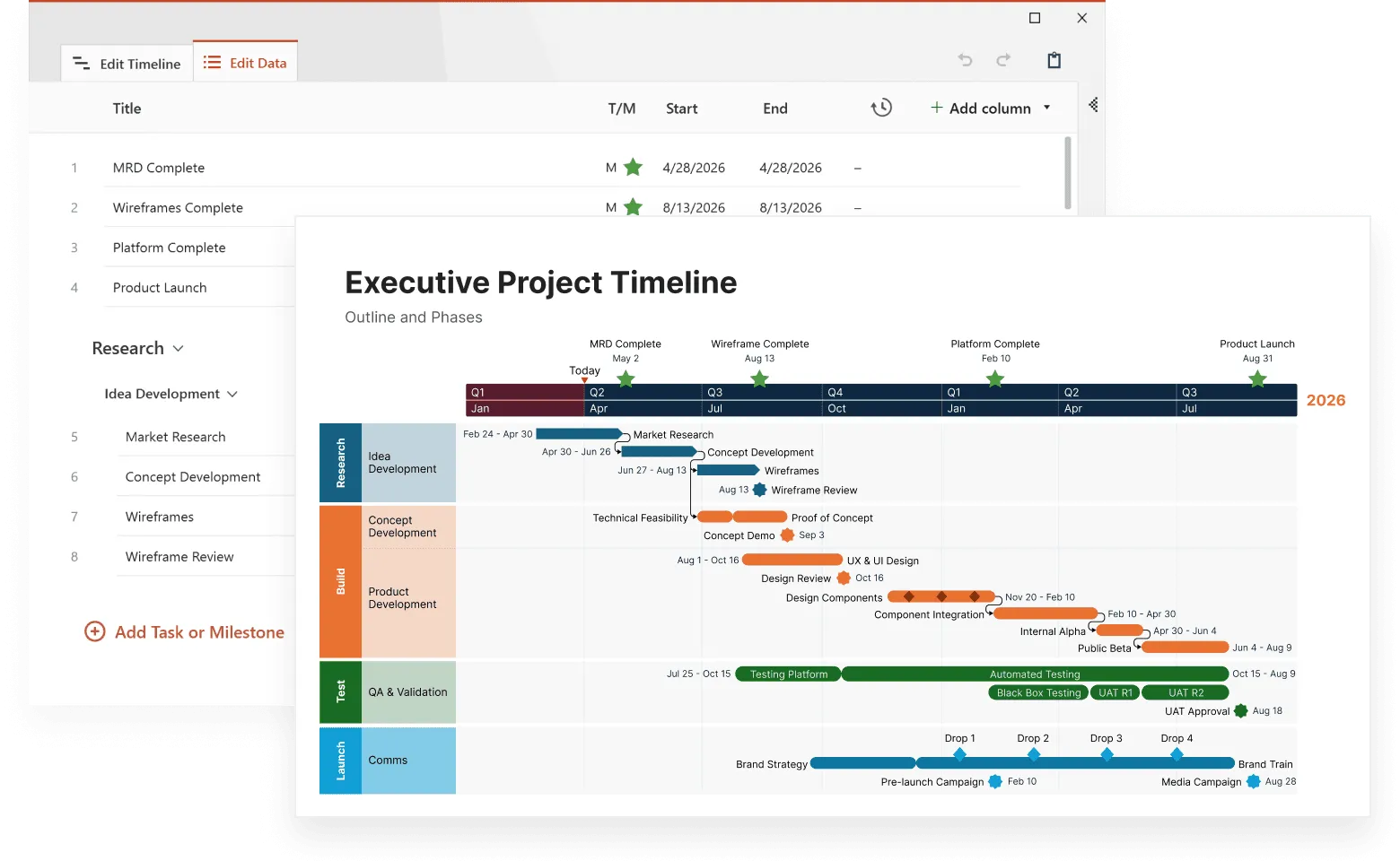
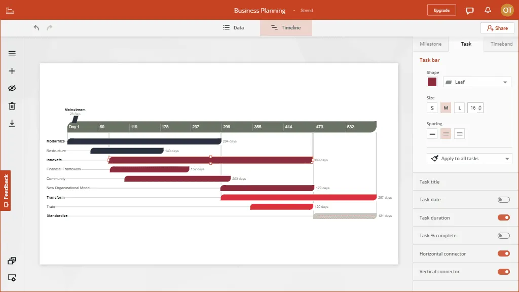
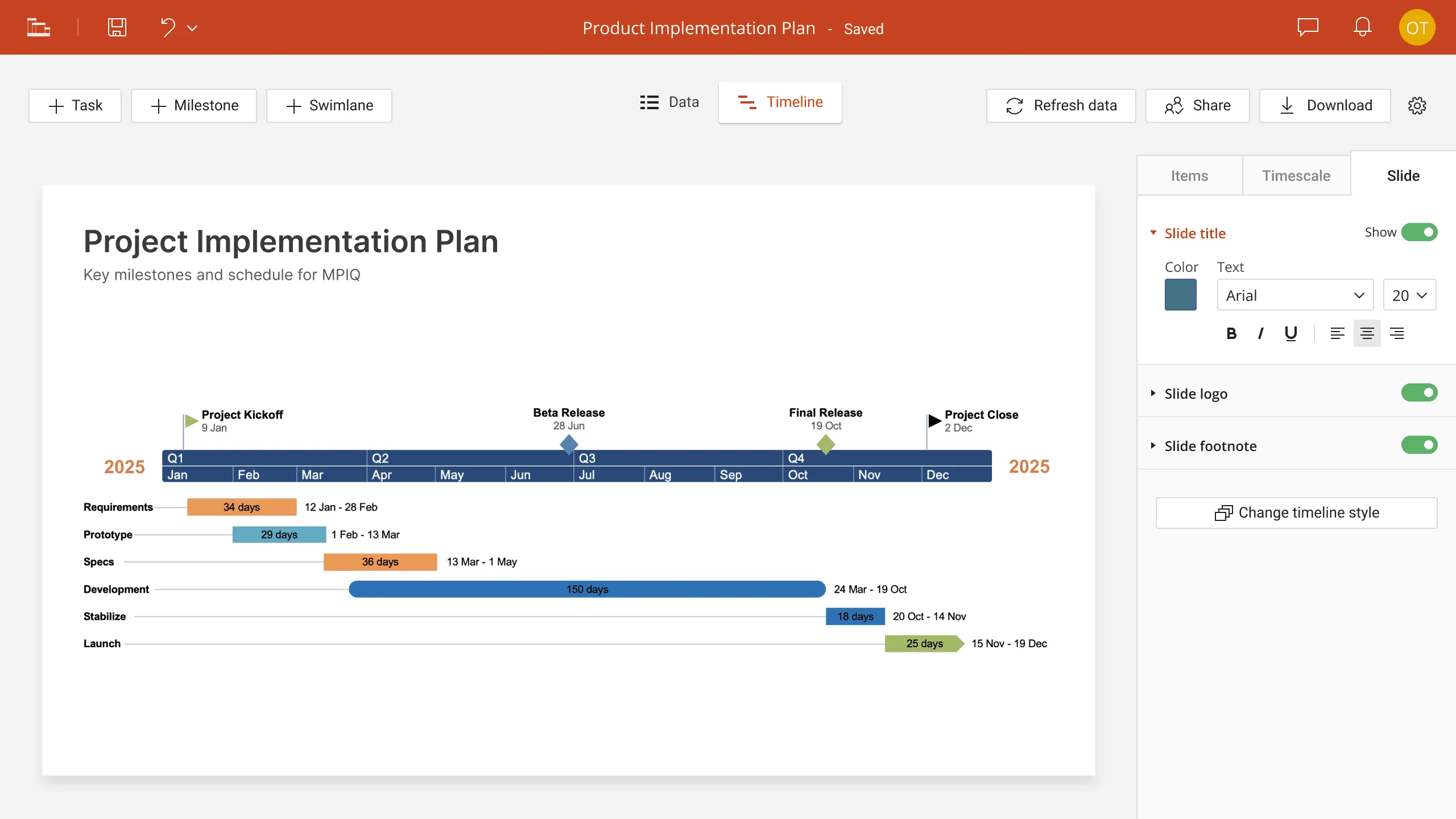
Free interactive timeline makers provide solid starting points for most projects. Timeline JS integrates seamlessly with Google Sheets and supports media embedding without cost barriers while offering data import capabilities and automated responsive designs generation. Tiki-Toki provides more visual customization options with both free and paid tiers available. Office Timeline offers a free plan that includes basic interactive timeline creation capabilities.
Paid interactive timeline software delivers advanced features that justify their cost for complex projects. Preceden offers collaborative editing capabilities that work well for team projects. For example, Office Timeline integrates with Microsoft Office workflows. Office Timeline Online provides web-based interactive timeline creation with professional styling options. Aeon Timeline provides sophisticated data management tools for research applications.
Build clearer timelines online
Create polished, professional timelines directly in your browser for free. No installation needed.
Matching tools to project requirements
Consider your specific needs when evaluating options. Do you need real-time data connections? Will multiple team members contribute content? Are custom styling requirements part of your project? Does your organization require specific security or privacy features? Office Timeline Online, for example, offers enterprise-grade security while maintaining the flexibility to create interactive timeline presentations that work across different devices.
Budget considerations extend beyond subscription costs. Factor in learning time, setup complexity, and ongoing maintenance requirements. A free tool that requires extensive customization might cost more in time than a paid solution that works immediately.
Performance matters for user experience. Test potential tools with representative data samples before committing to full development. Some platforms handle large datasets better than others, and animation performance varies significantly across different solutions.
With your tool selected and tested, you can now move into the hands-on creation process that transforms your prepared data into an engaging interactive experience.
Step-by-step creation process
Now comes the practical work of building your interactive data timeline. This process transforms your cleaned data and selected tool into a working visualization that users can explore and understand.
Setting up your data import
Upload your prepared dataset to your chosen platform, paying attention to file size limits and supported formats. Most tools provide data mapping interfaces where you connect your spreadsheet columns to timeline fields - typically dates, values, categories, and descriptions.
Preview your data mapping before processing the complete dataset. This preview reveals formatting issues or missing information while they're still easy to fix. Many platforms allow you to adjust column mappings without re-uploading entire files, which saves time during the refinement process.
Test with a small data subset first. Import just the first 10-20 rows of your dataset to verify that dates parse correctly, numerical values display properly, and text descriptions appear as expected. This testing approach prevents you from discovering problems after processing thousands of data points.
Configuring visual presentation
Choose chart types that match your data's story. Line graphs work well for continuous measurements over time. Bar charts suit discrete values or comparisons between categories. Scatter plots reveal correlations between different metrics. Many tools allow you to switch between visualization types without losing your data setup.
Set appropriate scale ranges for your axes. Auto-scaling provides quick setup, but fixed ranges create more stable presentations for sharing. Consider logarithmic scales for data with wide value ranges - they prevent extreme values from dominating your visualization.
Color selection impacts both aesthetics and usability. Choose colors that differentiate data series clearly while remaining accessible to colorblind users. Maintain consistent color assignments throughout your timeline - the same metric should use the same color across all time periods.
Adding interactive elements
Configure hover tooltips to display the right level of detail. Include specific values, context, and relevant metadata without overwhelming users with information. Test tooltip content on mobile devices where screen space is limited.
Set up filtering controls that match your audience's exploration needs. Financial data might need quarterly or yearly filters. Scientific measurements could benefit from parameter-based filtering. Product data might require category or region-based controls.
Implement zoom and navigation features thoughtfully. Users should be able to move between overview and detail views smoothly. Consider adding preset zoom levels for common time periods - last month, last quarter, or last year shortcuts improve user experience significantly.
With your interactive timeline built and configured, the next phase focuses on testing and refinement to ensure it works well for your intended audience.
Testing and optimizing user experience
Your timeline might look perfect on your development screen, but real users encounter it in different contexts with varying expectations and technical constraints. Systematic testing reveals issues that could frustrate users or prevent them from understanding your data story.
Cross-platform compatibility testing
Review your timeline across different browsers - Chrome, Firefox, Safari, and Edge all handle interactive elements slightly differently. Test on both desktop and mobile devices since many users will encounter your content on smartphones or tablets. Interactive features should remain functional regardless of platform.
Pay particular attention to touch interactions on mobile devices. Hover effects that work well with mouse cursors might not translate to touch interfaces. Ensure that all interactive elements remain accessible through touch gestures, and that text remains readable without requiring users to zoom in.
Loading performance affects user engagement significantly. Test your timeline with slower internet connections to simulate real-world conditions. Large datasets or high-resolution images can create frustrating delays that cause users to abandon your content before exploring it fully.
Gathering user feedback
Ask colleagues or friends to explore your timeline without guidance from you. Observe where they click, what they try to do, and where they encounter confusion. These observations often reveal usability improvements that aren't obvious to creators who understand their data intimately.
Document specific user actions during testing sessions. Which data points do people explore first? How do they use filtering or zoom controls? Where do they spend the most time? This behavioral data guides optimization decisions more effectively than assumptions about user preferences.
Consider conducting brief interviews after testing sessions. Ask users to describe what they learned from your timeline and what questions it raised. Their responses indicate whether your data story communicates effectively or needs structural adjustments.
Successful testing provides the insights needed to refine your timeline into a polished tool ready for broader distribution and sharing.
Sharing and embedding strategies
Your optimized timeline deserves an audience, but different sharing approaches work better for different contexts and user groups. The method you choose affects how people discover, interact with, and potentially share your content further.
Direct sharing options
Most interactive timeline makers generate shareable URLs that preserve user preferences like zoom levels or active filters. Customize these URLs to create more personalized experiences for different audience segments. Marketing teams might want URLs that highlight campaign performance periods, while executives might prefer views focused on quarterly results.
Office Timeline Online excels in this direct sharing approach by providing shareable web links with professional viewers that work particularly well for distribution through emails or learning management systems. Recipients can access the full interactive timeline without requiring account creation or software installation.
Social media sharing requires attention to preview images and descriptions. Platforms like LinkedIn, Twitter, and Facebook generate automatic previews, but custom settings often improve click-through rates. Create compelling preview images that represent your timeline's key insights visually.
Email sharing works well for targeted distribution to specific stakeholders. Include context about why the timeline matters to recipients and highlight specific insights they should notice. Direct people to particular time periods or data points that relate to their interests or responsibilities.
Embedding workflows
Embed codes allow you to integrate your timeline into websites, blogs, or internal dashboards. Test embedding in your target environment before finalizing design decisions - some interactive features might behave differently in embedded contexts compared to standalone viewing.
Content management systems handle embedded content differently. WordPress, Drupal, and custom HTML pages each have specific requirements for interactive content. Verify that your timeline displays correctly and maintains full functionality after embedding.
Consider responsive design implications when embedding. Your timeline should adapt appropriately to different container sizes and screen resolutions. Test embedded versions on both desktop and mobile devices to ensure consistent user experiences.
Distribution analytics
Most platforms provide analytics about timeline usage and engagement. Track which data points generate the most exploration, how long users spend examining different time periods, and where they typically exit your timeline. This information guides future improvements and helps you understand what resonates with your audience.
Set up goal tracking if your timeline serves specific business purposes. Are users finding the information they need? Do they spend enough time exploring to understand your key messages? Are they taking desired actions after viewing your timeline?
With effective sharing strategies in place, you can now focus on avoiding common pitfalls that undermine otherwise well-executed timeline projects.
Common pitfalls and how to avoid them
Even well-planned timelines can fail to achieve their goals when creators overlook fundamental usability principles or make assumptions about user behavior. Learning from common mistakes helps you create more effective visualizations from the start.
Information overload problems
Cramming too much data into single views creates confusion rather than clarity. Users should understand your main message within seconds of viewing your timeline. Additional detail can be available through interaction, but primary insights must be immediately visible without requiring extensive exploration.
Resist the temptation to show every available data point. Choose the most relevant metrics for your audience's needs and relegate supporting information to secondary views or detailed tooltips. Three well-chosen data series often communicate more effectively than ten marginally relevant ones.
Consider progressive disclosure approaches. Start with high-level patterns and let users drill down to specifics through interactive elements. This structure respects users' time while accommodating both casual browsers and detailed analysts.
Technical implementation errors
Inconsistent data intervals confuse users and distort visual relationships. If your timeline shows monthly data for most periods but switches to weekly data for recent months, those periods will appear disproportionately detailed. Maintain consistent time scales unless you explicitly call attention to the change with clear labeling.
Ignoring mobile users limits your timeline's reach significantly. Many people encounter content primarily through smartphones and tablets. Test your interactive features on actual mobile devices, not just browser simulations. Touch interactions behave differently than mouse-based navigation.
Poor performance optimization frustrates users and reduces engagement. Large datasets, high-resolution images, or complex animations can create sluggish experiences that prompt users to abandon your content. Optimize for reasonable loading times across different connection speeds.
Context and interpretation issues
Missing context makes data interpretation difficult or impossible. Users need reference points to understand whether your data represents positive or negative developments. Include relevant benchmarks, targets, or comparison datasets when they add meaningful perspective.
Failing to explain data collection methods or limitations can mislead users. If your data comes from specific sources, covers particular time periods, or excludes certain categories, make these constraints clear. Transparency builds trust and prevents misinterpretation.
Avoiding these common pitfalls positions your timeline for success, but long-term value comes from continuously improving based on user feedback and changing needs.
Advanced customization and future improvements
Basic interactive timelines serve many purposes effectively, but advanced features can transform good visualizations into indispensable tools that users return to regularly. Understanding these possibilities helps you plan improvements and evaluate whether additional investment in customization pays off.
Conditional formatting and dynamic styling
Many interactive timeline software platforms support conditional formatting based on data values. You might highlight exceptional performance periods in different colors, adjust point sizes based on data magnitude, or change line styles based on data quality indicators. These visual cues help users identify significant patterns without requiring detailed analysis.
Custom CSS styling provides extensive control over timeline appearance when supported by your chosen platform. Brand-consistent styling helps timelines integrate seamlessly with existing content and reinforces organizational identity. Custom styling also allows you to optimize readability for your specific audience's preferences.
Animation and transition effects can improve user experience when implemented thoughtfully. Smooth transitions between different data views or time periods create more polished interactions. However, excessive animation distracts from data content and can slow performance on older devices.
Integration capabilities
API connections enable real-time data updates that keep your timeline current without manual maintenance. Instead of uploading static datasets, you can connect directly to databases, analytics platforms, or other data sources. This capability proves particularly valuable for operational dashboards or ongoing monitoring applications.
Collaborative editing features allow teams to work together on complex timelines. Multiple contributors can add data, refine visualizations, and provide feedback within the same platform. Version control prevents accidental overwrites of important work while maintaining change history for reference.
Export options extend your timeline's utility beyond web viewing. Some tools support static image exports for presentations or print materials. Others generate video animations showing timeline progressions over time. Consider your distribution needs when evaluating platforms and planning customizations.
Office Timeline Online excels in this area, offering high-quality exports that work seamlessly in PowerPoint presentations while maintaining interactive capabilities when shared online. Consider your distribution needs when evaluating platforms and planning customizations.
Simple, accessible online timeline creator
Create and share stunning timelines for free - right from your browser.
Measuring success and iterating
User analytics reveal how people actually interact with your timelines compared to your assumptions during creation. Track which features get used most frequently, where users spend the most time, and what paths they follow through your data. This behavioral information guides future improvements more effectively than theoretical considerations.
A/B testing different design approaches shows what resonates with your specific audience. Test different color schemes, interaction patterns, or data organization methods with similar content. Small changes often produce measurable improvements in user engagement and comprehension.
Collect ongoing feedback through surveys, user interviews, or embedded feedback tools. Quantitative analytics show what users do, but qualitative research explains why they behave in certain ways. Both perspectives contribute to better timeline design decisions over time.
Conclusion
Creating interactive data timelines transforms static datasets into engaging stories that users want to explore. The process requires careful planning, clean data preparation, appropriate tool selection, and systematic testing - but the results justify the investment. Your audience gains deeper insights through hands-on exploration rather than passive consumption of pre-digested information.
Success comes from matching your timeline's complexity to your audience's needs and technical comfort level. Start with simple, focused datasets and clear interaction patterns. Add sophistication gradually based on user feedback and engagement metrics. Remember that the most technically impressive timeline fails if users can't understand or navigate it effectively.
The interactive timeline maker landscape continues evolving with new features, better mobile support, and improved data integration capabilities. Stay current with platform updates and emerging best practices. Your investment in learning these tools pays dividends across multiple projects as data storytelling becomes increasingly important for communication and decision-making.
Frequently asked questions
These questions come from users starting their first interactive timeline projects. The answers address practical concerns that arise during planning and implementation phases.
Start with free tools unless you have specific requirements they can't meet. Timeline JS handles most common projects effectively. Office Timeline Online offers a free plan with basic timeline creation capabilities, though with limitations on the number of timelines and advanced features. The paid plan unlocks unlimited timelines, enhanced styling options, advanced export/import formats, and priority support, making it suitable for business users who need professional presentations and managing timelines over time. Budget both subscription costs and learning time when making this decision.
CSV files provide universal compatibility across platforms. Google Sheets work well for collaborative data preparation and integrate directly with several timeline tools. Excel files (.xlsx) are widely supported but may require format conversion. JSON offers more flexibility for complex datasets but demands technical expertise. Always test a small data sample before committing to full dataset preparation.
Paid platforms typically support API connections for automatic updates. Free tools usually require manual uploads, though some accept scheduled imports from cloud storage. Consider whether you need real-time updates (operational dashboards) or periodic refreshes (monthly reports). Automatic updates work best when your data source maintains consistent formatting and structure.
Technical limits matter less than user experience. Most platforms handle thousands of data points, but three focused data series often communicate better than ten marginally relevant ones. Test with representative users and devices. If people spend more time figuring out navigation than understanding your insights, simplify the dataset or add progressive disclosure features.
Design for mobile from the beginning rather than adapting later. Test touch interactions on real devices, not browser simulations. Ensure text remains readable without zooming. Replace hover effects with touch-friendly alternatives. Simplify navigation controls for smaller screens. Most modern tools generate responsive designs automatically, but always verify performance on target devices.
Yes, but match update frequency to user needs and technical capabilities. Operations teams benefit from real-time feeds for monitoring systems or processes. Analysts prefer less frequent updates that don't interfere with pattern recognition. Choose platforms that support your required refresh rates without creating jarring user experiences. Consider adding pause controls for users who want to examine specific time periods without interruption.