Timeline visualization has evolved from simple Gantt charts into sophisticated analytical tools that uncover patterns most project managers never see. Modern timeline visualization tools process multiple data streams simultaneously, revealing resource conflicts, dependency chains, and performance trends that traditional project management approaches miss entirely.
This article examines specific techniques that turn timeline data into actionable project intelligence, drawing on methods used in advanced timeline visualization, helping you spot problems before they derail schedules and communicate progress more effectively with your team.
Multi-layer timeline visualization for complex project data
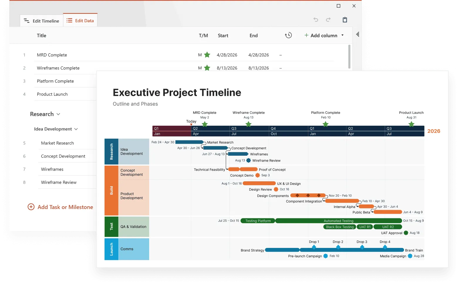
Complex projects generate information across multiple workstreams that a single-row timeline can’t display clearly. Multi-layer timeline visualization solves this by separating different categories of data, such as planning, resources, testing, and production, into distinct visual layers while keeping all activities aligned on the same chronological scale.
In the example below, the multi-layer layout clearly divides the project into four major swimlanes: Planning, Resources, Testing, and Production. Each layer shows milestones relevant to its function. This separation allows viewers to understand how parallel activities interact without visual clutter.

This example, created with Office Timeline, shows how layered swimlanes reveal cross-team coordination at a glance. Milestones appear grouped by functional area, yet remain chronologically aligned. This makes it easier to track progress across departments, understand handoffs, and identify timing conflicts early. The ability to collapse or isolate layers helps project managers focus on the specific information they need without losing sight of the overall schedule.
Resource-layer visualization highlights when materials become available, when drawings are released, and how these events support downstream activities. Testing and production layers provide further clarity by showing dependency-driven cycles, such as testing completion, pending results, and performance outcomes before production milestones begin.
Beyond functional workstreams, timelines can also include risk or budget layers. Risk assessment layers display probability and impact indicators directly on timeline elements. High-risk items have visual alerts, and mitigation steps appear next to the risks they address. Similarly, budget layers connect spending patterns to project phases, helping identify where overruns consistently occur.
Implementing multi-layer timelines requires careful technical structuring so each layer maintains its own data model while sharing the same timeline axis. Modern visualization tools achieve this by:
- Normalized time scales ensuring all layers align to the same dates.
- Independent styling systems that allow each layer to have distinct colors and marker shapes.
- Cross-layer relationship mapping to highlight dependencies between different types of data.
- Selective layer visibility so users can focus on specific layers without cluttering the view.
Professional timeline makers like Office Timeline, Microsoft Project, and Smartsheet make this multi-layer approach accessible by enabling users to create separate swimlanes for different data types while keeping the timeline visually consistent.
Interactive timeline data visualization methods
Static timeline charts give you an overview but lack the depth modern project management needs. Interactive timeline data visualization responds to your questions and changes displays based on what you're investigating.
Drill-down capabilities let you start with high-level project views then zoom into specific problem areas. A construction project manager might begin with a quarterly overview, spot a potential delay in the electrical phase, then drill down to see individual task dependencies and resource assignments causing the bottleneck. Each click reveals more detail while maintaining context from the broader view.
Contextual filtering shows only relevant information without losing project context. This means you can focus on specific aspects while still seeing how they connect to everything else. Useful filters include:
- team member workload views that show only one person's assignments across all projects;
- critical path analysis that highlights only tasks affecting the final deadline;
- budget variance tracking that shows only activities over or under budget;
- quality metric correlation that displays tasks with quality issues or excellence;
- external dependency monitoring that focuses on work waiting for outside inputs.
Real-time data integration keeps visualizations current with actual project status. When team members update task completion percentages, adjust estimated completion dates, or report resource availability changes, the timeline visualization shows these updates immediately across all related views. This eliminates the delay between when something happens and when everyone knows about it.
Tools like Office Timeline or Smartsheet integrate with Microsoft Project and other systems to provide this real-time updating capability, making it easier for teams to maintain current timeline information without duplicating data entry efforts.
Predictive modeling integration uses historical project data to forecast likely outcomes. The software analyzes patterns from similar past projects to provide probability ranges for milestone completion. This helps teams set realistic expectations and spot early warning signs before they become bigger problems.
Make data instantly clear
Try Office Timeline for free. Convert project data from tools like Microsoft Project into sharp, digestible timeline visuals.
Comparison analysis techniques for multiple projects
Organizations managing multiple projects or trying to improve performance over time benefit from comparison analysis techniques that reveal patterns across different efforts.
Template-based comparison helps standardize successful approaches by comparing current projects against proven methods. Project managers can overlay current timelines against historical templates to spot differences that might indicate risks or opportunities. For instance, if successful projects typically have three weeks between development completion and testing start, but your current project only has one week, this comparison flags a potential quality risk.
Performance benchmarking tracks important measurements across similar projects to identify best practices and problem patterns. These measurements help you understand what works and what doesn't. Useful metrics include:
- schedule adherence rates by project type, showing which kinds of projects your team delivers on time most often;
- resource utilization efficiency across teams, revealing which groups work most productively;
- quality metrics correlation with timeline accuracy, demonstrating whether rushed projects have more defects;
- client satisfaction scores relative to delivery performance, connecting timeline success with business outcomes.
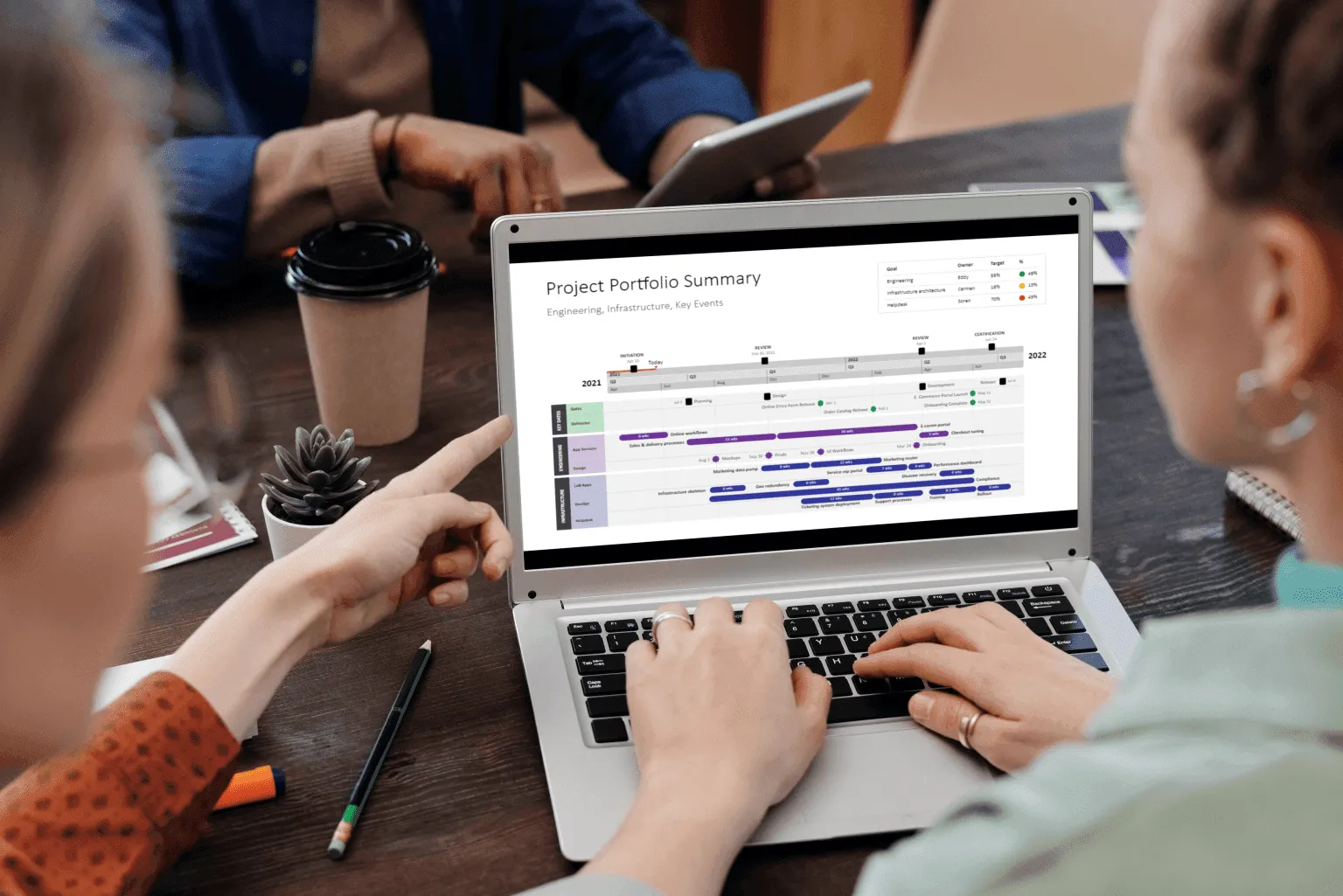
Portfolio timeline visualization displays multiple concurrent projects simultaneously, revealing resource conflicts, shared dependencies, and coordination opportunities that individual project views can't show. You might discover that two projects both need the same specialist during the same week, or that Project A's deliverable is actually needed for Project B to start its next phase.
Advanced visual encoding for timeline data
Good timeline data visualization depends on consistent visual languages that communicate complex information clearly. The most successful setups create clear encoding principles that users learn once and apply across different projects.
Color coding systems serve multiple analytical functions beyond making charts look nice. Smart color implementation helps users immediately identify different types of information. This works because our brains process color faster than text, so you can scan a timeline and instantly understand the situation. Effective color systems help users spot:
- project phases using logical color progressions (like light to dark blue for early to late phases);
- priority levels through saturation or brightness variations (bright red for urgent, pale red for low priority);
- team assignments via consistent color mapping (marketing always gets green, development gets blue);
- status indicators using universally understood color conventions (green for on track, yellow for at risk, red for delayed);
- risk levels through graduated color intensity (darker colors indicate higher risk).
Size and position encoding provides additional information dimensions without creating visual mess. Timeline elements use different visual properties to communicate multiple things simultaneously:
- Horizontal length represents task duration or effort required (longer bars need more time).
- Vertical height indicates resource requirements or priority levels (taller bars need more people or attention).
- Position offset shows certainty levels or approval status (items positioned directly on the timeline are confirmed, offset items are estimates).
- Shape variations represent different activity types (circles for meetings, rectangles for deliverables, diamonds for decision points).
Professional timeline visualization tools like Office Timeline, Visio, and Lucidchart provide extensive customization options for these visual elements, allowing teams to develop consistent visual languages that work across their organization. The drag-and-drop interface makes it easy to adjust these visual properties without requiring design expertise.
Interactive annotation systems allow users to attach detailed information directly to timeline elements. Click-activated panels can display detailed task information, resource allocation data, dependency maps, or historical performance comparisons without cluttering the main timeline view. This keeps the overview clean while making detailed information available when needed.
Industry-specific timeline visualization approaches
Different industries face distinct challenges that generic timeline tools can't address effectively. For example, construction projects must account for weather delays and sequential trade dependencies, while software development requires sprint-based visualization and continuous integration tracking. Healthcare projects need regulatory compliance monitoring, and marketing campaigns require multi-channel coordination across varying lead times. These industry-specific constraints demand specialized visualization techniques that go beyond standard project management approaches.
Software development timeline visualization works with iterative development cycles and continuous integration practices. Unlike traditional project management that assumes linear progression, agile development requires timeline tools that can handle changing requirements, overlapping sprints, and continuous delivery cycles.
Sprint planning forms the foundation, supported by velocity tracking and burn-down charts showing how much work teams complete each iteration. Feature delivery spans multiple releases, mapping when capabilities become available to users. Code review cycles align with development activities, revealing approval bottlenecks. Deployment pipelines highlight automated and manual processes that can impact release timing. Bug tracking layers connect quality issues to specific sprints or testing phases to reveal patterns across the development lifecycle.

The example above, built with Office Timeline, shows how a multi-layer timeline can bring order to the kind of fast-moving work you see in software development. It lays out milestones, sprints, work items, and releases in clean, parallel tracks that all follow the same timeline. This makes it easy to spot patterns, handoffs, and pacing at a glance, especially valuable when you're dealing with iterative workflows or constantly shifting priorities in agile teams.
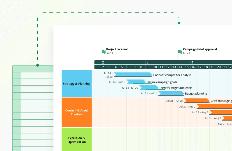
Marketing campaign timeline visualization presents unique coordination challenges. Social media posts, print advertisements, email campaigns, and events must sync precisely to maximize impact. Each channel operates on different production timelines with distinct approval processes.
Coordination areas include:
- content creation workflows that reveal approval bottlenecks and revision cycles;
- multi-channel synchronization across digital and traditional media with varying lead times;
- event planning integration requiring precise logistics and vendor coordination;
- performance measurement periods synced with campaign phases;
- budget allocation tracking across different campaign elements.
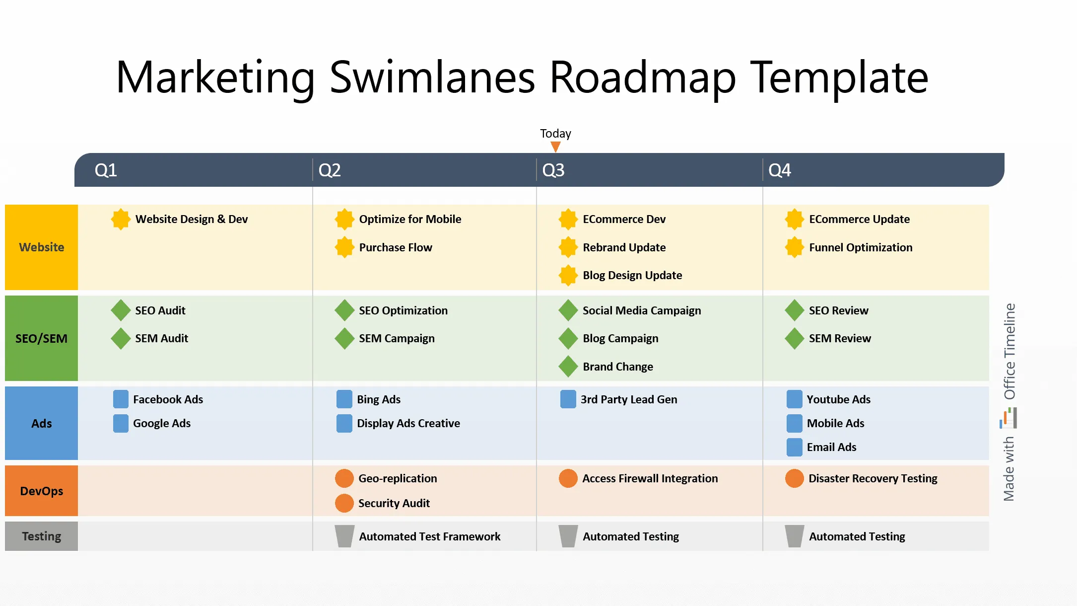
This example shows how a layered, swimlane-style timeline can simplify complex marketing schedules. Built with Office Timeline, it organizes website updates, SEO work, ads, DevOps support, and testing into clear parallel lanes, so it’s easy to see how each team’s work lines up across the quarter.
This kind of view is especially useful for marketing teams because it shows channel timing, cross-team dependencies, and production cycles in one place. Office Timeline handles this well by giving each stream its own space while keeping the whole plan aligned to a shared timeline. The result is a clean, high-level snapshot that helps teams coordinate campaigns without losing track of the details.
Research and development timeline visualization faces uncertainty that other industries rarely encounter. Experiments may fail completely. Regulatory approval timelines shift without warning. Breakthrough discoveries can accelerate or redirect entire project paths. R&D timeline tools must handle probability-based planning rather than fixed schedules.
Experimental phases need success probability modeling since research outcomes remain unpredictable. Regulatory approval processes create milestone dependencies lasting months or years, while intellectual property filing schedules coordinate with development phases to protect innovations. Market research integrates with product development for assumption validation. Clinical trial phases follow strict protocols for patient recruitment and data collection that cannot be compressed or accelerated.
While industry-specific approaches address visualization content and structure, the technical performance of timeline tools becomes equally important as organizations scale up their project portfolios and data complexity.
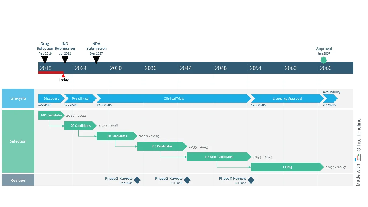
This example shows how advanced timeline visualization can make sense of long, uncertain research programs—something traditional project tools struggle with. Built with Office Timeline, it lays out decades of milestones, review cycles, and candidate progression in a way that stays readable even when timelines stretch far into the future or branch into multiple paths.
For R&D teams, this kind of view is especially useful because it brings structure to work that’s inherently unpredictable. You can see major lifecycle stages, selection funnels, and regulatory checkpoints all aligned on a single time scale, which helps teams communicate expectations and uncertainty without overwhelming stakeholders. Office Timeline handles these complex, multi-phase timelines well, giving R&D organizations a clear, high-level picture of programs that evolve over many years.
Performance optimization for large-scale timeline visualization
Organizations with many projects need timeline visualization tools that stay fast while processing lots of information. Enterprise-level implementations often involve hundreds of concurrent projects, thousands of tasks, and years of historical data that can overwhelm standard timeline tools.
Performance optimization becomes necessary when timeline loading takes minutes instead of seconds, or when adding new data causes system slowdowns that disrupt daily workflow.
Data virtualization techniques load only the timeline parts you can see, making everything start faster and use less computer memory. As you scroll through long timelines or zoom into specific periods, the system loads more data while removing parts you're no longer looking at. This prevents the common problem where large projects take forever to load and make your computer slow.
Progressive rendering strategies display timeline overviews immediately while loading detailed information in the background. You can begin analyzing projects without waiting for everything to load completely, improving productivity and preventing frustration.
Modern timeline tools use several performance optimization approaches:
- intelligent caching systems that store frequently used timeline configurations locally;
- distributed processing for complex calculations like resource optimization;
- compressed data formats that reduce network transfer times;
- background synchronization that updates data without interrupting user work.
Smart caching identifies usage patterns and preloads likely-needed data based on your work habits. If you always check the same three projects every Monday morning, the system learns this pattern and prepares that information ahead of time. Distributed processing handles complex calculations like path analysis and predictive modeling on separate servers, preventing user interface delays during intensive analytical operations.
Integration strategies for timeline visualization ecosystems
Modern timeline visualization tools work best when connected to tools teams already use rather than replacing everything.
API-based data synchronization connects timeline visualization with systems your team already relies on:
- project management platforms (jira, asana, monday.com) that track daily tasks and progresses;
- time tracking systems (toggl, harvest, clockwise) that record actual hours spent on work;
- resource planning tools (float, resource guru, smartsheet) that manage who's available when;
- financial systems (quickbooks, sap, oracle) that track budgets and expenses;
- communication platforms (slack, microsoft teams, discord) where teams coordinate and share updates.
Office Timeline's integration with Microsoft Office applications exemplifies this approach, allowing users to import data from Excel, Project, and other familiar tools while creating professional timeline presentations that integrate seamlessly with PowerPoint workflows.
Automated workflow integration triggers timeline updates based on external events. When project management systems register task completions, timeline visualizations automatically recalculate dependent activities, update progress indicators, and adjust resource allocation displays. This eliminates the manual work of keeping multiple systems synchronized and reduces errors from outdated information.
Custom dashboard creation allows organizations to build specialized views combining timeline data with other business metrics. Executive dashboards might integrate timeline progress with budget performance, customer satisfaction scores, and market indicators. This gives leaders a complete picture without forcing them to check multiple systems.
Analytical capabilities in modern timeline visualization
Contemporary timeline visualization goes beyond scheduling into predictive analytics and pattern recognition that support strategic decision-making.
Critical path analysis identifies task sequences that directly impact project completion dates. Interactive visualization highlights these activities and demonstrates how delays cascade through project schedules. This helps project managers prioritize resource allocation and risk mitigation efforts by focusing on the work that actually affects the final deadline. If a non-critical task runs late, it might not matter, but critical path delays always push back completion dates.
Resource optimization modeling shows how different staffing decisions affect timeline outcomes. Project managers can experiment with various resource allocation scenarios and immediately see projected impacts on delivery dates, budget requirements, and quality metrics. For example, adding one more developer might shorten the timeline by two weeks but increase costs by $20,000, while reassigning a senior developer from Project A to Project B might delay A by one week but accelerate B by three weeks.
Historical pattern recognition uses machine learning to identify factors that correlate with project success or failure. Analysis might reveal that projects starting in certain months have higher success rates, that specific team combinations deliver better results, or that particular task sequences create predictable bottlenecks. These insights help organizations make better decisions about project planning and resource allocation.
Scenario planning capabilities allow project managers to model different potential outcomes and their timeline impacts. What happens if a supplier delivers late? How does adding an additional team member affect the critical path? These simulations help teams prepare contingency plans and make more informed decisions before problems occur.
Measuring timeline visualization effectiveness
Organizations investing in advanced timeline visualization need concrete ways to evaluate impact on project management performance. Without measurable metrics, it's difficult to justify ongoing software costs or demonstrate the business value of implementation efforts. Many companies struggle to move beyond subjective assessments like "the tool feels helpful" toward quantifiable improvements in project outcomes.
Decision-making velocity typically improves when teams have immediate visual access to project status information. You can measure this improvement through several specific metrics that show real business value:
- time required to assess project health during status meetings drops from 30 minutes of discussion to 5 minutes of timeline review;
- speed of identifying and responding to schedule conflicts improves from weekly discovery to daily prevention;
- efficiency of resource reallocation decisions increases when managers can see conflicts visually rather than calculating them manually;
- accuracy of completion date predictions improves when based on visual trend analysis rather than intuition.
Communication effectiveness increases when stakeholders reference shared timeline visualizations instead of requesting status updates through meetings or email. Organizations can track this improvement through measurable changes in team behavior.
Reduced frequency of status update meetings occurs because information is always available visually. Shorter preparation time for executive reports happens since data is already organized and current. Decreased email volume regarding project status inquiries results from people checking timelines themselves, while improved stakeholder satisfaction with project communication can be measured through surveys and feedback.
Timeline tools that integrate with presentation software like Office Timeline help improve this communication effectiveness by making it easy to create professional timeline presentations for stakeholder meetings, reducing preparation time while improving information clarity.
Project delivery accuracy often improves as teams develop better understanding of realistic timelines through visual analysis of historical performance. Success metrics include:
- percentage of projects delivered on or before scheduled completion dates increases as estimation improves;
- variance between estimated and actual project durations decreases as teams learn from visual pattern analysis;
- client satisfaction scores related to delivery predictability improve when expectations match realistic timelines;
- repeat business rates increase when clients can rely on timeline commitments based on data rather than optimism.
These measurement approaches demonstrate that timeline visualization delivers quantifiable business value when implemented thoughtfully. Organizations that track these metrics consistently find compelling evidence for continued investment in timeline visualization tools and training.
Conclusion
Timeline visualization has evolved from basic scheduling charts into sophisticated analytical tools that reveal project patterns and predict potential problems before they occur. Advanced techniques like multi-layer visualization, interactive data exploration, and industry-specific approaches help project managers understand complex relationships between tasks, resources, and timelines that traditional methods miss.
The most successful timeline visualization implementations focus on solving specific organizational challenges rather than adopting every available feature.
Whether you're coordinating construction trades, managing software development sprints, or planning marketing campaigns, the right visualization approach can significantly improve decision-making speed, communication effectiveness, and project delivery accuracy.
Organizations that measure these improvements carefully often discover that timeline visualization tools pay for themselves through reduced meeting time, fewer project delays, and improved stakeholder satisfaction.
Frequently asked questions about timeline visualization
Teams considering timeline visualization often have specific questions about implementation, costs, and effectiveness. These answers address the most common concerns based on actual user searches and implementation experiences.
Timeline visualization includes Gantt charts but extends far beyond them. While Gantt charts show task duration and basic dependencies, timeline visualization tools add interactive features, real-time data integration, multiple information layers, and analytical capabilities. You can filter data, zoom into specific periods, see resource allocation patterns, track budget correlation, and analyze historical performance trends. Modern timeline visualization responds to your interactions and updates automatically with project changes, while traditional Gantt charts remain static until manually updated.
Timeline visualization tools range significantly in price based on features and team size. Here's what you can expect to pay:
- Free options: Google Sheets templates, basic Trello boards, simple Gantt chart makers that work for small teams with simple projects.
- Small team tools ($5-25/user/month): Asana, Monday.com, ClickUp with timeline features suitable for teams up to 50 people.
- Professional tools ($25-75/user/month): Microsoft Project, Smartsheet, Wrike with advanced visualization for larger organizations.
- Specialized timeline tools: Office Timeline offers different pricing tiers starting around $149 for individual licenses, with volume discounts for larger teams.
Factor in implementation time, training costs, and integration requirements when calculating total investment. Many organizations find the middle tier provides the best value for most project management needs.
Most professional timeline visualization tools offer Excel integration through multiple methods:
- Direct import/export - Upload Excel files to create timelines, export timeline data back to spreadsheets for further analysis.
- Real-time synchronization - Some tools sync with Google Sheets or Excel Online automatically, updating both systems when changes occur.
- API connections - Advanced tools connect with project management systems, CRM platforms, and financial software your organization already uses.
- Native Office integration - Tools like Office Timeline work directly within PowerPoint and integrate seamlessly with Excel and Project data.
Check integration capabilities before selecting a tool, especially if your team relies heavily on existing systems. Poor integration often causes more problems than it solves.
Agile teams benefit from timeline visualization that works with iterative development rather than traditional waterfall approaches:
- Sprint-based views showing iteration boundaries and velocity tracking to predict future sprint capacity.
- Release planning timelines coordinating multiple team efforts across product increments and major releases.
- Backlog visualization displaying user story progression through development stages from concept to deployment.
- Dependency mapping showing how team outputs connect across sprints and releases, preventing integration problems.
Tools like Jira with timeline plugins, Azure DevOps, or dedicated agile timeline tools work better than traditional project management approaches for agile workflows. These tools understand that agile projects change frequently and need flexible timeline visualization.
Mobile timeline apps work well for status checking and simple updates but have limitations for complex analysis. The smaller screen size and touch-based interface make mobile apps ideal for quick project checks and basic updates, while desktop versions excel at detailed analysis and timeline creation.
Mobile strengths include:
- quick status updates and progress reporting while away from your desk;
- timeline overview and milestone checking during meetings or travel;
- real-time notifications about changes or delays sent directly to your phone;
- photo uploads and simple note additions from job sites or client meetings.
Desktop versions provide advantages that mobile apps cannot match due to hardware constraints. Detailed timeline creation and editing require full keyboard and mouse control for precision. Complex filtering and analysis features need larger screens to display multiple data layers simultaneously. Multiple project comparison views require significant screen real estate to be useful, while integration with other desktop applications provides comprehensive project management capabilities.
Most teams develop a hybrid approach: using mobile for field updates and quick status checks, while relying on desktop for planning, analysis, and detailed timeline creation.
Projects with these characteristics see the greatest timeline visualization benefits:
- Multiple interdependent work streams (software development, construction, marketing campaigns) where coordination becomes complex;
- Shared or limited resources requiring careful coordination to prevent conflicts and overallocation;
- External dependencies like vendor deliveries, permit approvals, or client reviews that can delay everything;
- Long duration projects where patterns emerge over time and small delays compound into major problems;
- Regulatory or compliance requirements needing audit trails and documentation for legal or safety reasons;
- Distributed teams requiring clear communication about responsibilities and deadlines across time zones.
Simple projects with few dependencies may not justify advanced visualization investment, but most organizational work involves enough complexity to benefit from better timeline visualization.
Track these metrics to evaluate timeline visualization effectiveness and justify continued investment.
Time savings translate directly to cost reduction. Reduced hours spent preparing status reports often saves 2-4 hours per week per project manager. Faster problem identification and resolution means catching issues days or weeks earlier, while decreased meeting time for project coordination typically shows 30-50% reduction in status meetings.
Quality improvements that prevent expensive problems include:
- higher percentage of projects delivered on schedule (10-30% improvement common);
- reduced scope creep and change orders through better visibility and communication;
- better resource utilization rates preventing expensive overtime and contractor costs.
Business impact affects revenue and profitability through improved client satisfaction with delivery predictability, leading to repeat business. Increased project profitability comes from better resource management and waste reduction, while higher team productivity reduces overtime costs through better coordination.
Document baseline metrics before implementation to measure improvement accurately. Most organizations see measurable benefits within 3-6 months of implementation, with ROI calculations becoming clear once teams establish consistent usage patterns and measurement practices.
Timeline visualization adapts well to various planning scenarios beyond traditional project management:
Content marketing: Editorial calendars showing content production workflows, publication schedules, campaign coordination across multiple channels, and seasonal content planning.
Event planning: Venue booking coordination, vendor scheduling, marketing timeline development, logistics planning, and post-event follow-up activities.
Product launches: Development phases, marketing campaign coordination, sales training schedules, distribution planning, and competitive timing analysis.
Research projects: Study phases, data collection periods, analysis timelines, publication schedules, and grant application deadlines.
Training programs: Curriculum development, instructor scheduling, resource allocation, assessment periods, and certification tracking.
The key is having time-bound activities with dependencies and resource requirements that benefit from visual coordination. If your work involves coordinating multiple people or activities over time, timeline visualization probably helps.