When your project involves tracking customer interactions, system failures, marketing campaigns, and sales data simultaneously, a standard timeline falls short. Complex event timelines solve this problem by displaying multiple data streams in a single, coherent visualization that reveals patterns you might miss when analyzing each variable separately.
This article explores the technical aspects of creating effective complex event timelines, from understanding what makes them different from standard visualizations to implementing advanced techniques commonly used in advanced timeline visualization. You'll learn practical strategies for managing multiple variables, building causal relationships, and avoiding common pitfalls that reduce timeline effectiveness.
What makes an event timeline "complex"
A complex event timeline differs from basic timelines in three significant ways. First, it handles multiple concurrent data streams rather than a single sequence of events. Second, it shows relationships between different types of events across these streams. Third, it accommodates varying time scales within the same visualization.
Consider a software deployment timeline. A basic timeline might show only release dates. A complex event timeline displays release dates alongside user feedback spikes, system performance metrics, support ticket volumes, and marketing campaign launches. This multi-layered view reveals whether performance issues correlate with specific releases or if marketing campaigns actually drive user engagement.

The power lies in the connections. When you see a customer complaint spike immediately following a feature release, while support tickets remain normal, you know the issue affects user experience but not core functionality. This insight drives different solutions than if both metrics spiked together.
Understanding these foundational differences sets the stage for building effective visualizations. The next step involves examining the specific components that make event sequence visualization work in practice.
Core components of effective event sequence visualization
Building effective event sequence visualization requires understanding three fundamental components that work together to create coherent, actionable timelines. Each component serves a specific purpose in transforming raw data into meaningful insights.
Data streams and their hierarchies
Event sequence visualization requires organizing your data streams by importance and relevance. Primary streams contain your most critical events – product launches, system outages, or major customer interactions. Secondary streams provide context – social media mentions, weather data, or market conditions.
Each stream needs consistent formatting. Timestamps must align across all data sources. Event categories should follow the same naming conventions. Without this consistency, your timeline becomes confusing rather than clarifying.
Visual encoding strategies
Color coding remains the most effective method for distinguishing event types. Use distinct colors for each data stream, but maintain consistency across your organization. If marketing events are always blue in your timeline, keep them blue in every visualization.
Shape coding adds another layer of information. Circles for planned events, squares for actual occurrences, triangles for problems. This system lets viewers quickly identify event types even when colors blend together on busy timelines.
Size variations communicate magnitude. Larger markers for major events, smaller ones for minor occurrences. Revenue milestones get bigger markers than daily sales figures.
Time scale considerations
Different events require different time scales. A project timeline might span months, while system monitoring needs minute-by-minute precision. The best timeline maker tools for multi-variable timelines accommodate both scales within the same view.
Implement zoom functionality that maintains context. When users focus on a specific week, show that week in detail while displaying the broader timeline context above or below. This approach prevents users from losing sight of the bigger picture while examining details.
With these core components in place, you can begin building visualizations that communicate complex information clearly. The methodology you follow determines whether your timeline becomes a useful analytical tool or an overwhelming display of data.
Clarify multi-variable data
Try Office Timeline for free. Turn dense, multi-layered information into polished, easy-to-read timeline slides.
How to visualize complex timelines effectively
To create meaningful complex event timelines, you need a systematic approach rather than simply adding more data to existing visualizations.
Start with your core narrative
Before adding complexity, identify your primary story. Are you tracking project progress? Analyzing customer behavior? Monitoring system performance? This core narrative determines which data streams deserve prominence and which provide supporting context.
Structure your timeline around decision points. These moments where multiple factors converge often reveal the most insights. A product launch decision might involve market research completion, competitor analysis, technical readiness, and budget approval. Visualizing these convergence points helps teams understand decision-making processes.
Layer information strategically
Add data streams incrementally. Begin with your primary narrative, then introduce supporting information. This approach prevents overwhelming viewers with too much information at once.
- Base layer: Core events that drive your narrative
- Context layer: Supporting events that explain why things happened
- Detail layer: Granular information available on demand
Interactive features that matter
Static timelines limit exploration. Interactive features let viewers discover insights independently. Hover states reveal additional details without cluttering the main view. Click-through functionality connects timeline events to relevant documents or data sources.
Filtering capabilities prove essential for complex timelines. Users need to hide irrelevant data streams, focus on specific time periods, or highlight particular event types. Without these controls, your timeline becomes a wall of information rather than an analytical tool.
These visualization techniques form the foundation for more sophisticated analysis. When you move beyond simple chronological display to show relationships between events, you enter the realm of causal timeline construction.
Building causal event timelines
Moving from chronological display to causal analysis requires understanding how events influence each other across your timeline.
Identifying cause-and-effect relationships
Causal event timelines go beyond chronological ordering to highlight relationships between events. These relationships fall into three categories: direct causation, correlation, and coincidence.
Direct causation occurs when one event directly triggers another. A system failure causes user complaints. A marketing campaign drives sales increases. These relationships are often obvious and immediate.
Correlation appears when events tend to occur together without direct causation. Customer complaints might correlate with bad weather, not because weather affects your product, but because people become more irritable during storms.
Coincidence represents events that happen simultaneously without any relationship. Distinguishing coincidence from correlation requires domain expertise and careful analysis.
Visual techniques for showing causation
Connect related events with visual links. Arrows indicate direction of causation. Dotted lines suggest correlation. Solid lines represent confirmed causal relationships.
Color gradients can show the strength of relationships. Strong correlations get darker connecting lines, weaker ones get lighter lines. This approach communicates confidence levels in your analysis.
Grouping related events within visual containers helps viewers understand complex relationships. A marketing campaign container might include ad launches, social media activities, and promotional events. When these align with sales spikes, the causal relationship becomes clear.
Understanding causal relationships is just the beginning. Actually implementing these visualizations with multiple data streams requires careful attention to technical details and data management practices.
Timeline creation with multiple variables
Successfully managing multiple variables requires systematic approaches to data preparation, technical implementation, and ongoing maintenance.
Data preparation strategies
Multiple variables require consistent data preparation. Establish standard formats for dates, times, and event descriptions. Inconsistent formatting creates gaps and misalignments that destroy timeline accuracy.
Clean your data before visualization. Remove duplicates, standardize naming conventions, and verify timestamp accuracy. A single incorrectly formatted date can shift entire event sequences.
Create data dictionaries that define each variable and its possible values. This documentation ensures consistency across team members and maintains quality over time.
Technical implementation approaches
Spreadsheet-based solutions work for simple timelines with limited interactivity. They offer familiar interfaces and easy sharing, but struggle with complex visualizations and real-time updates.
Specialized timeline software provides purpose-built features for complex event visualization. These tools handle multiple data streams naturally and offer advanced interaction capabilities.
Custom development gives maximum flexibility but requires significant technical resources. Consider this approach only when specialized requirements exceed available tool capabilities.
Best practices for variable management
With your technical implementation approach selected, the next challenge involves managing the variables themselves effectively. This requires systematic approaches that respect human cognitive limitations while maximizing analytical value. Three core practices form the foundation of effective variable management:
- Limit visible variables to seven or fewer.
Human cognitive limitations make processing more than seven information streams simultaneously difficult. Use filtering and layering to manage complexity. - Group related variables together.
Customer-related events in one section, system events in another, business events in a third. This organization helps viewers focus on relevant information. - Provide variable legends that explain what each stream represents.
Include units of measurement, data sources, and update frequencies. This information helps viewers interpret the timeline correctly.
Once you have the basics of multi-variable timeline creation down, you can explore more sophisticated techniques that handle complex data relationships and visual challenges.
Advanced visualization techniques
Building on the fundamentals, advanced techniques address specific challenges that arise when working with diverse data types and complex relationships.
Handling different data types
Quantitative data requires different visualization approaches than qualitative events. Revenue figures might appear as line graphs overlaid on the timeline, while customer feedback appears as discrete event markers.
Categorical data benefits from consistent color coding and clear legends. Binary data (yes/no, pass/fail) can use simple visual indicators like checkmarks and X marks.
Temporal data with different granularities needs careful scaling. Daily sales figures shouldn't compete visually with quarterly reports. Use different marker sizes or separate visual tracks for different time scales.
Managing visual complexity
Complexity doesn't mean confusion. Well-designed complex timelines guide viewers through information systematically. Use visual hierarchy to prioritize important information and provide progressive disclosure for details.
Implement overview+detail interfaces that show the full timeline context while allowing detailed examination of specific periods. This approach prevents users from losing context while exploring specific events.
White space becomes more important as complexity increases. Don't fill every pixel with information. Strategic empty space helps viewers process complex visualizations more effectively.
Even with solid technical implementation and advanced visualization techniques, several common mistakes can undermine your timeline's effectiveness. Recognizing and avoiding these pitfalls makes the difference between useful analysis tools and confusing displays.
Common pitfalls and solutions
Despite careful planning, certain problems appear repeatedly in complex timeline projects. Understanding these issues helps you avoid them entirely or address them quickly when they arise.
Information overload
The most common mistake in complex timeline creation is showing too much information simultaneously. Symptoms include viewer confusion, inability to identify important patterns, and requests for "simpler" views.
Solution: Implement progressive disclosure. Show overview information first, then allow users to drill down into details. Provide filtering options that let viewers focus on relevant data streams.
Inconsistent scaling
Mixing different time scales without clear visual separation confuses viewers. Daily events mixed with annual milestones create interpretation problems.
Solution: Use consistent time scales within each section of your timeline. When multiple scales are necessary, separate them visually or use nested timeline structures.
Missing context
Complex timelines often focus on detailed events while losing broader context. Viewers see the trees but miss the forest.
Solution: Always provide context information. Show relevant background events, market conditions, or organizational changes that influenced the main timeline events.
Avoiding these pitfalls is important, but measuring whether your timeline actually works requires specific metrics and evaluation approaches.
Real-world applications
Understanding how different industries and use cases benefit from complex event timelines helps you identify opportunities in your own work.
Project management
Complex event timelines excel in project management scenarios involving multiple teams, dependencies, and external factors. They show how market changes, resource availability, and technical challenges affect project progress simultaneously.
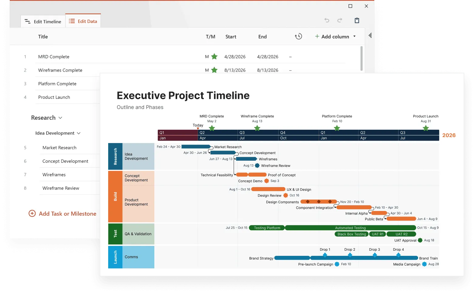
A software development timeline might track code commits, bug reports, feature requests, team changes, and market feedback. This comprehensive view helps project managers understand why certain phases took longer than expected and plan future projects more accurately.

This example shows how a complex event timeline can pull together multiple variables (tasks, dependencies, testing cycles, and delivery milestones) into one clear view. Built with Office Timeline, it demonstrates how layered events and cross-team handoffs can be visualized without overwhelming the reader. The tool makes it easy to align different data streams on a shared timeline, and produce polished visuals that clearly show how overlapping factors shape project progress.
Business intelligence
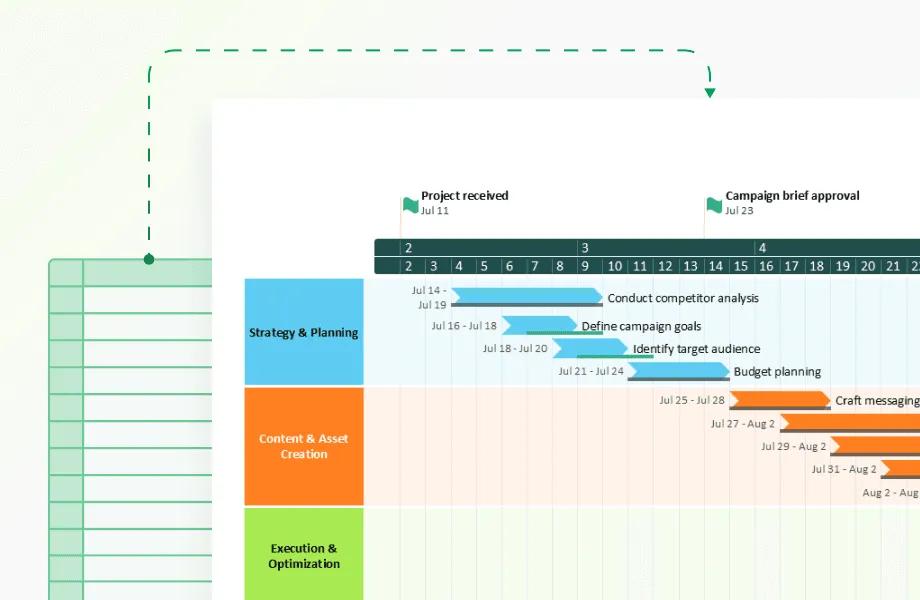
Business intelligence teams often need to combine insights from multiple departments (market research, strategy, campaign execution, review cycles, and documentation) into a single, digestible view. Instead of analyzing these activities in separate reports or dashboards, complex event timelines help BI teams see how actions across the organization connect and influence one another over time.
With this multi-variable perspective, BI leaders can identify bottlenecks, understand how strategic decisions ripple across workstreams, and pinpoint the timing patterns that drive successful outcomes. The value isn’t just in showing what happened, but in revealing how different phases and teams interact to shape overall performance.

This timeline is a strong example of how BI teams can turn scattered activities into a clear, executive-ready narrative. It organizes research, strategy development, campaign execution, review periods, and documentation into parallel swimlanes, making it easy to trace how each stage influences the next. Created with Office Timeline, it demonstrates how complex, multi-team processes can be visualized in a way leadership can absorb in seconds. The clean structure helps decision-makers spot gaps, understand timing dependencies, and quickly see the real sequence behind organizational outcomes, something that static reports rarely communicate well.
Crisis management
During crisis situations, complex event timelines help teams understand how multiple factors contributed to problems and track resolution efforts across different areas simultaneously.
A system outage timeline might show technical failures, communication efforts, customer impact, resolution attempts, and external factors. This comprehensive view helps teams identify gaps in their crisis response and improve future preparedness.
These current applications demonstrate the value of complex event timelines, but emerging technologies promise to expand their capabilities even further.
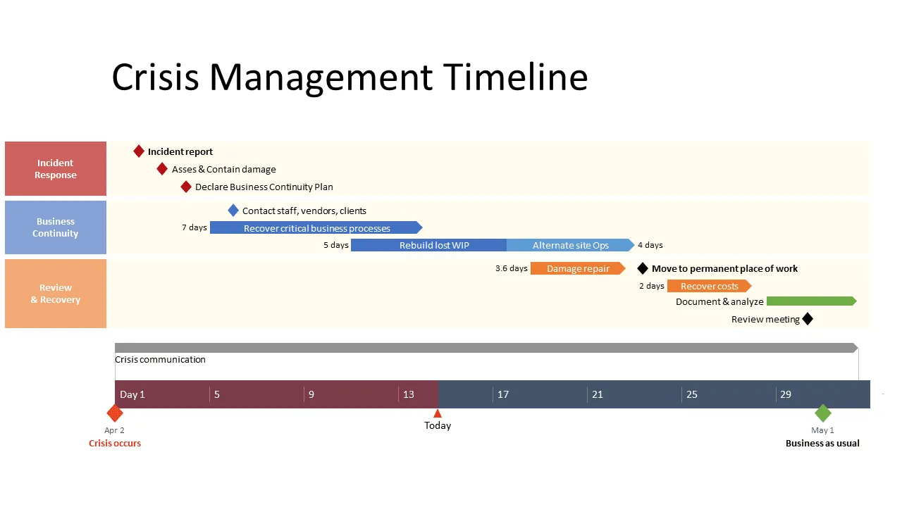
This example shows how a crisis timeline can bring order to fast-moving, high-pressure situations. Instead of sorting through scattered reports or chat logs, the timeline maps incident response, business continuity actions, and recovery steps in one coordinated view. Built with Office Timeline, it demonstrates how teams can quickly visualize what happened when, and summarize the entire event for leadership without manual reconstruction. It clearly shows how, during a crisis, a well-structured timeline is a decision-making tool.
Future developments in timeline visualization
Several technological trends are reshaping how we create and interact with complex event timelines, opening new possibilities for analysis and insight generation.
Artificial intelligence integration
Machine learning algorithms increasingly identify patterns in complex timeline data that human analysis might miss. These tools suggest causal relationships, predict future events based on historical patterns, and automatically flag anomalies.
AI-powered timeline tools can process vast amounts of data and highlight the most relevant information for specific use cases. They learn from user interactions to improve their recommendations over time.
Real-time data integration
Modern timeline tools increasingly support real-time data feeds, updating visualizations as events occur. This capability proves particularly valuable for monitoring applications and crisis management scenarios.
Real-time integration requires robust data pipelines and careful attention to performance. The visualization must update smoothly without overwhelming users with constant changes.
Collaborative features
Timeline visualization becomes more powerful when teams can collaborate on analysis and interpretation. Modern tools support shared annotations, discussion threads, and collaborative filtering.
These features transform timelines from static visualizations into dynamic collaboration platforms where teams build shared understanding of complex situations.
Conclusion
Complex event timelines represent a significant evolution from basic chronological displays to sophisticated analytical tools that reveal patterns across multiple data streams. The techniques covered in this article - from managing visual complexity to validating causal relationships - provide the foundation for creating timelines that drive real decision-making value.
Success with complex event timelines depends on balancing comprehensiveness with clarity. Start with your core narrative, add supporting variables systematically, and implement progressive disclosure to manage cognitive load. Remember that the most sophisticated visualization fails if users can't extract actionable insights from it.
The future of timeline visualization lies in real-time integration, AI-powered pattern recognition, and collaborative analysis features. However, these technological advances build upon the fundamental principles of clear visual hierarchy, consistent data management, and rigorous analytical validation that remain constant regardless of the tools you choose.
Frequently asked questions
Complex event timeline creation raises specific technical and practical questions that affect implementation success. These answers address the most common challenges based on real user experiences and proven solutions.
The practical limit sits around 5-7 variables for simultaneous display, based on cognitive load research in information visualization. However, this number isn't fixed. Domain experts can process more complexity than general audiences, and well-designed visual hierarchies extend these limits.
When you approach the upper bounds, implement progressive disclosure. Group related variables into collapsible sections, use filtering controls to show relevant subsets, and create multiple views for different analysis purposes. The goal is maintaining clarity while preserving analytical depth.
Missing data requires explicit visual treatment rather than empty gaps. Distinguish between "no data collected" and "zero value events" using different indicators like dotted lines for missing periods and solid markers for confirmed zero values.
Context matters more than the specific visual technique. Explain why data is missing through hover text or legends. Was the monitoring system offline? Did the event genuinely not occur? This information affects how viewers interpret surrounding data and prevents incorrect assumptions about patterns or relationships.
Tool selection depends on three primary factors: data complexity, team expertise, and integration requirements. Enterprise platforms like Tableau and Power BI handle large data volumes with robust API connectivity but require significant setup time. Specialized timeline software offers purpose-built features with faster implementation. Custom development provides maximum flexibility for unique requirements.
Evaluate based on:
- API connectivity to your specific data sources,
- update frequency capabilities matching your needs,
- performance with your expected data volume,
- team technical skills and available training time.
Start with simpler solutions and scale up complexity as requirements become clearer.
Statistical correlation provides the starting point, not the conclusion. Calculate correlation coefficients between event sequences, test for consistent time delays, and examine whether relationships hold across different periods. Strong statistical relationships suggest further investigation.
Domain expertise validates what statistics suggest. Subject matter experts understand business context that pure data analysis misses. They know whether proposed causal mechanisms make logical sense and can suggest alternative explanations for observed patterns. Combine statistical evidence with expert knowledge for robust causal claims.
Document your reasoning process. Record confidence levels, note data limitations, and update conclusions as new evidence emerges. This transparency builds credibility and helps others understand your analytical decisions.
Correlation appears when events occur together statistically without necessarily influencing each other. Ice cream sales and drowning incidents both increase in summer, but ice cream doesn't cause drowning. The correlation is real but misleading without context.
Causation involves direct influence through identifiable mechanisms. Marketing campaigns cause website traffic increases through customer attention and behavioral response. The mechanism is clear and testable.
Visual communication requires different treatments for each relationship type. Use solid connecting lines for confirmed causation, dotted lines for correlation, and include confidence indicators through line thickness or color intensity. Provide explanatory text that describes the evidence supporting each relationship claim.