Why project reporting still breaks down when decisions matter most
Explore why text-heavy project reporting fails in decision meetings, with insights from a PMI-backed white paper.


You're in a steering committee meeting. Your slide deck is open. The project status shows yellow. Maybe red.
Someone asks about the critical path. Someone else wants to know if marketing dependencies are factored in. The sponsor needs to understand the budget impact before approving the next phase.
You flip back to the status overview. Then forward to the risk matrix. Someone asks a clarifying question. Then another.
Thirty minutes later, you're still talking. No decision has been made.
Moments like this are rarely about how well project managers are doing their jobs. More often, they come down to how project information is presented. Even when updates are accurate and detailed, they are usually structured for documentation rather than for decision-making.
The executive summary trap
Here's what we’ve seen happening many times: project managers spend hours building detailed status reports. They format tables, update RAG status, write executive summaries that try to compress dense project data into three short paragraphs.
The next morning, executives open the document. They scroll. They skim the summary. Maybe they read the first bullet under each section. Three minutes later, they close it and head into the project meeting.
Then everyone spends the entire meeting reconstructing what the report was supposed to communicate.
Don’t executives read? Is this the problem? Not at all - they do! What breaks down is the medium. Text makes you hold multiple dependencies in your head while parsing sentences. Your brain simply can't do both well at the same time. For complex information, it's simply the wrong tool.
Think about the last time you tried to understand a project's health from a written status report. You probably found yourself scrolling back and forth, rereading the same paragraph, asking:
- "Wait, which milestone is blocking which?"
- "If marketing slips by two weeks, what else moves?"
- "Is this a scheduling risk or a budget risk?"
- "What exactly am I being asked to decide here?"
Then you probably grabbed a blank piece of paper and started sketching boxes and arrows, trying to draw the picture the report couldn't show you.
Were you dealing with a bad report? No. What broke down was the match between the medium (text) and the message (complex, interconnected project reality).
Why "more detail" makes things harder
When a project review goes wrong, most PMs know exactly what to do next: add more detail. Build the backup slides. Create the appendix. Send the pre-read deck two days earlier instead of one.
What happens next is predictable. More information takes longer to process, so the meeting runs over. Which means you can't schedule follow-ups as quickly. Decisions start to pile up. Small issues that could've been caught early become fires that need fighting. And suddenly you're spending your time responding to crises instead of preparing clear updates.
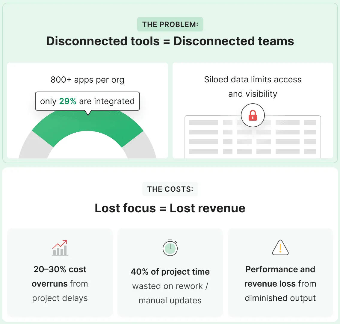
And there’s one more piece to make it harder: your project data lives scattered across hundreds of tools. Task details in Jira. Budget numbers in that finance spreadsheet. Timeline changes in someone's local copy of the project plan. Customer commitments in Salesforce. Resource availability in Workday.
Before you can even start the report, you are pulling data from several systems, checking numbers against last week’s version, and messaging three people to confirm which dates are current. Then you're hoping (because you can never be sure) that everyone's working from the same version of reality.
So you build another spreadsheet to consolidate the data. Create another dashboard to track the consolidation. Schedule another sync meeting to align on what the dashboard means.
At this point, more communication is not solving the problem. It is adding to it.
What moves decisions forward?
After sitting through hundreds of project reviews, a pattern becomes hard to ignore. The meetings that end with real decisions (not "let's take this offline") have something in common. Three pieces of information are immediately visible:
- Current state vs. intended state
Not "we're 73% complete," but a clear view: here's where we are, here's where we said we'd be, here's the gap staring back at us. - Cause and effect
Not "three workstreams are delayed," but the chain: this slipped, which pushed this, which now puts this outcome at risk. - Real trade-off options
Not "we have some risks to discuss," but clear choices: if we do X we get Y, if we do A we get B.
When these three things are clear, decisions happen in minutes. When people have to dig through text and reconstruct the connections themselves, decisions stretch out for weeks.
What separates these outcomes? Communication design. Decisions depend on what people can see and understand in the moment.
The Project Management Institute (PMI)'s ProjectManagement.com has been paying closer attention to this dynamic and what it means for decision-making in project environments. That focus is what led to its collaboration with Office Timeline around visual project communication.
Find out how PMI experts are framing this shift in the free downloadable white paper No room for guesswork: How project visualization fuels high-stakes decisions.
Project mapping: the visual clarity advantage
If decisions depend on what people can see and understand in the moment, the question becomes how to make complex project information visible in a way that drives action.
Military commanders don't walk into operation briefings with written status reports. They look at maps. Why? Because a map shows relationships, dependencies, and movement patterns in a single glance. Text forces you to construct that same picture, one sentence at a time, holding pieces in memory while you read.
Project communication works the same way.
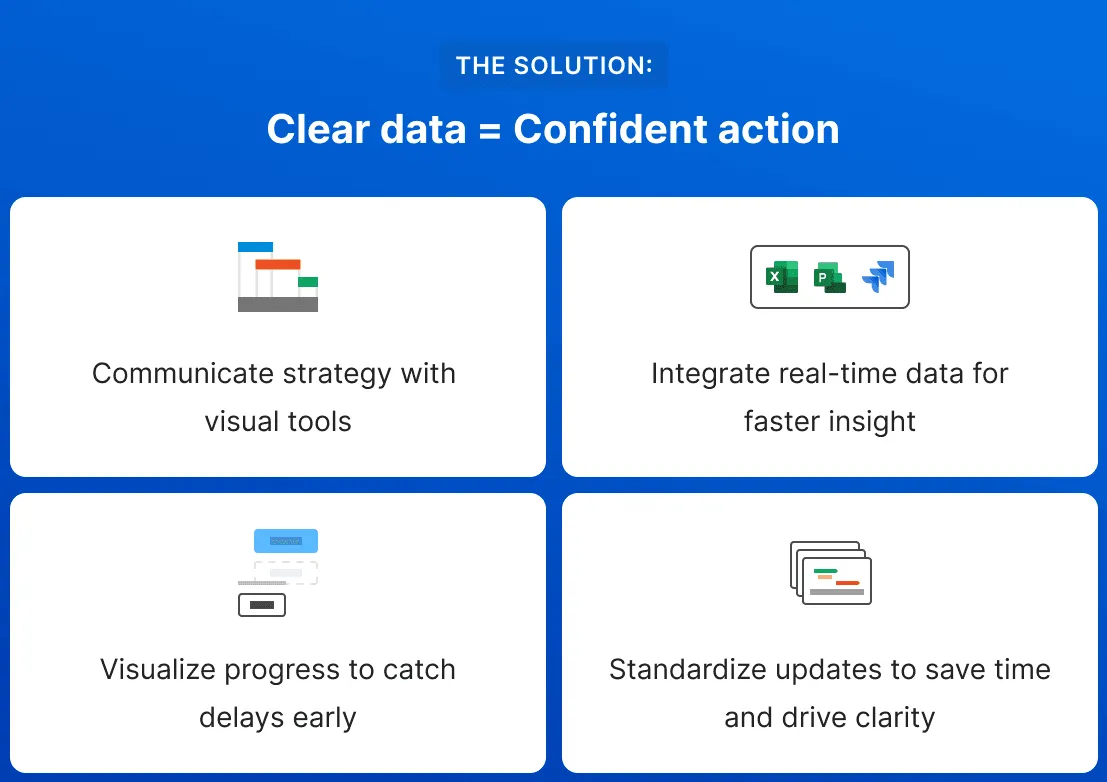
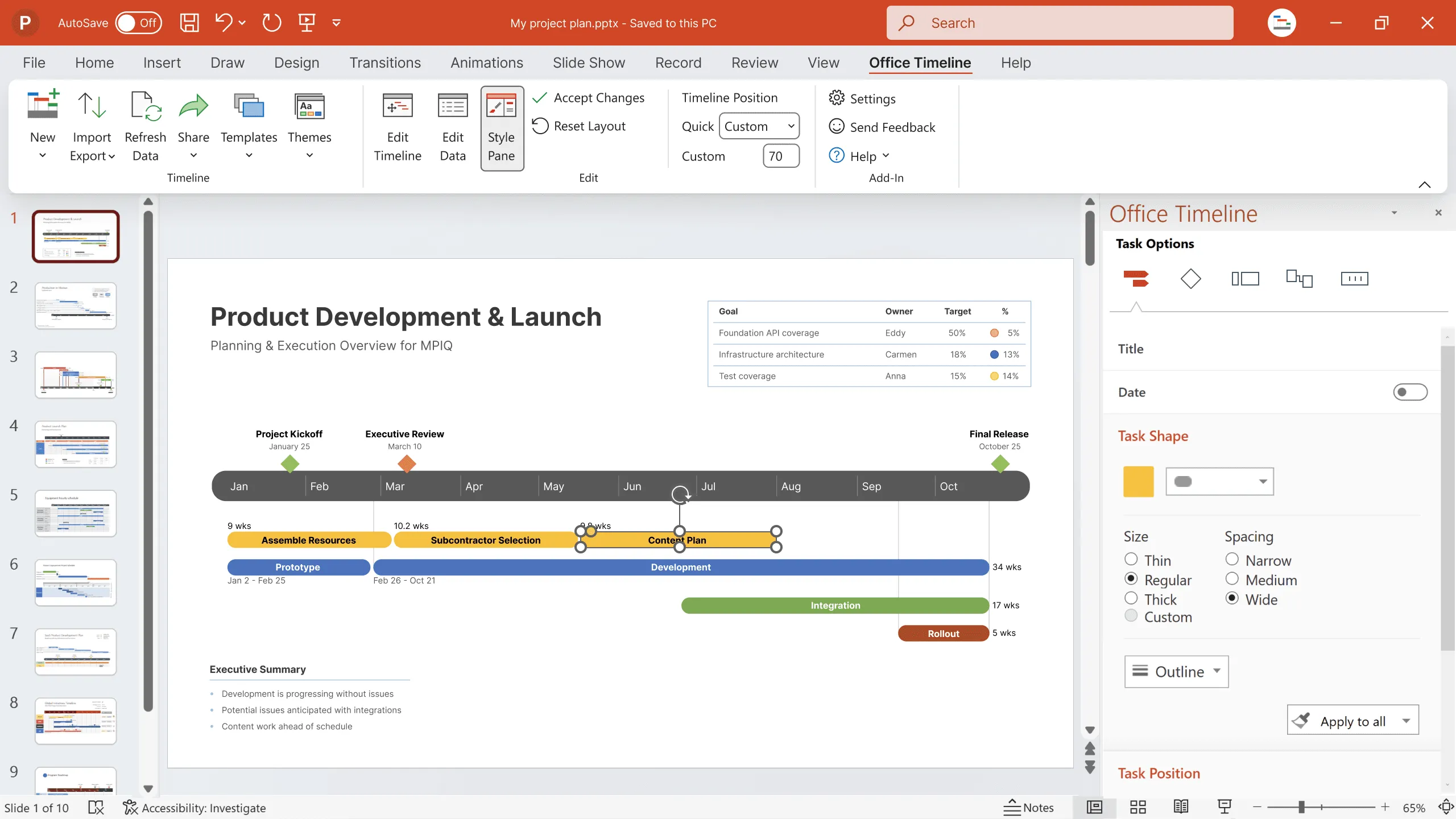
When you present project timelines visually, with clear dependency lines and status indicators, the dynamic in the room starts to change:
- Everyone aligns on reality immediately.
No more "wait, let me understand" moments. The picture is shared. - Dependencies become easier to grasp.
You don't explain "if-then" relationships. People see them. The arrow from milestone A to milestone B tells the story. - Risk becomes tangible.
"Marketing might slip" becomes "if marketing slips, watch what cascades", right there on the screen. - Decisions get properly framed.
Leadership sees what they're actually choosing between, rather than what you need to describe.
The shift focuses on how people understand information. You are matching how information is presented to how the human brain processes complex systems.
ProjectManagement.com's white paper No room for guesswork: How project visualization fuels high-stakes decisions reflects this direction and how project leaders are approaching executive communication today.
What happens when guesswork is removed
When project information becomes easier to understand and act on, the effects show up quickly.
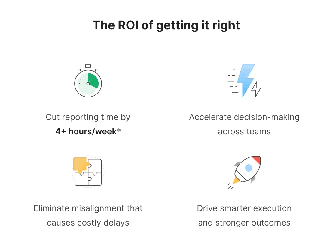
In the first few weeks, meetings get shorter. How? The amount of topics has remained the same, yet they simply run more efficiently. People aren't guessing about status or trying to reconcile different versions of the same story. Everyone is looking at the same picture. Decisions that once required follow-up begin to happen in the room.
A few weeks later, the conversation itself begins to change. Stakeholders ask fewer clarifying questions and spend more time discussing options. The discussion moves forward instead of looping back.
Decisions happen with less hesitation. When your sponsor can clearly see dependencies, progress, and risk clearly, approvals don't come with conditions like "pending further analysis" or "once I understand the full picture." The picture is there. The decision follows.
By this point, many project managers notice a quieter but meaningful change. Less time goes into preparing and reworking status reports. Evenings once spent on last-minute updates start to open up again. Several hours a week are returned, consistently.
The time savings are immediate and easy to measure. The longer-term impact shows up more gradually.
When executives can clearly see how work is progressing, they manage differently. Investment decisions are based on trends and momentum instead of piecing together updates. Stalled work becomes visible sooner, and resources are adjusted with greater confidence.
Over time, the role of the project manager changes as well. Less effort goes into assembling reports, and more goes into helping leaders understand what is happening and what to do next. That shift affects how project work is valued, how decisions are supported, and how careers develop.
The skill most project managers were never taught
Most project managers were never formally taught how to communicate projects visually.
PMI certification paths have traditionally focused on methodology, scheduling mechanics, and risk frameworks. Visual communication usually gets far less attention. Maybe a short module. Maybe a workshop, if one is available.
This is starting to change. PMI is placing more focus on how project information is communicated, alongside how it is planned and tracked. Its collaboration with Office Timeline reflects a growing recognition that the tools PMs use affect how their work is perceived.
At the same time, the executives PMs present to are overwhelmed with information. Slack messages, email threads, dashboards, budget reports. What they need is not more detail, but clarity.
Project managers who can provide that clarity stand out quickly. Those who rely on long, text-heavy status updates often struggle to hold attention, even when the work itself is solid.
Leaders and teams that pick up on this early start to see practical changes. Decisions that once dragged on for weeks get made in days. Problems show up sooner, when there is still time to address them. And hours that used to disappear into long meetings spent untangling project status are put back into doing the work itself.
Making the shift in practice
If you want to close this gap, start small.
Pick one meeting. Not every project update, just the one where decisions tend to stall. A steering committee. A quarterly business review. That monthly executive check-in where everyone leaves without committing. Start there.
Work backward from the decision. Before creating any material, be clear about what needs to be decided in that meeting. Then ask a few simple questions:
- What does someone need to see to make that call?
- What comparison matters?
- Which dependencies are critical?
- What pattern needs to be clear?
A quick way to test this is the five-second check. Show your visual to someone who is not familiar with the project. Give them five seconds, then take it away and ask what they understood. If they cannot explain the key message, it is a sign that the message is not landing clearly.
Getting feedback early also helps. If possible, share your approach with an executive you trust before the meeting. Ideally, choose someone who will be in the room. Ask one question: Can you make a decision based on this?
The answer usually makes the next steps clear.
ProjectManagement.com’s white paper No room for guesswork: How project visualization fuels high-stakes decisions serves as a concise reference for PMs thinking about how they present project information today.
Stop explaining. Start showing results.
Created in collaboration with PMI, this white paper reflects how the profession is thinking about visual project communication today, and why clearer visuals are are gaining more relevance in executive decision-making.
The bottom line
Project reporting structured as text-heavy status reports works best when a meeting is focused only on sharing updates. The breakdown comes when the conversation turns to decisions and the information on the table is still structured to record work, not to help people decide what to do next.
The data is already there. The tools to present it clearly exist. What is missing is a change in approach.
That often means stepping away from reports that feel familiar but do little to support decisions. Sometimes this means using simpler visuals. Other times it means letting go of detail that feels important but adds little clarity for the people in the room.
The next time you are in a meeting where the discussion keeps going but no decision is made, pause and ask yourself one question: are you showing people what they need to see, or are you making them connect the dots? Most of the times, the answer explains why decisions stall and shows what it takes to move things forward.
Project management tips and tricks
Turn project data into professional timelines
Get the advanced features of Office Timeline free for 14 days.