How to manage multiple projects in one Excel Gantt chart
Learn techniques for managing multiple projects in a single Excel Gantt chart. Keep portfolio visibility without overwhelming complexity.

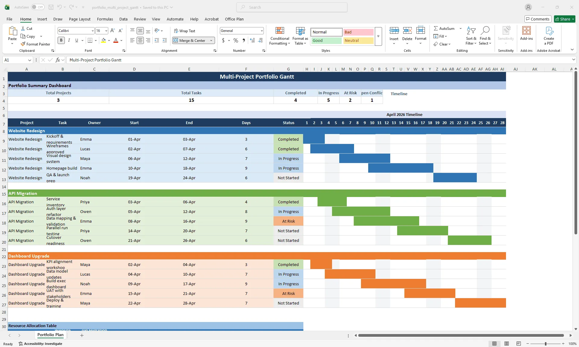
Multi-project Gantt chart in Excel showing three color-coded projects with a portfolio summary dashboard at the top
Quick answer
Manage multiple projects in one Gantt by grouping tasks by project (one section per project), using color coding to distinguish projects, creating a summary view at the top with rollup metrics, and keeping total tasks under 30–40 to maintain readability. Use filtering to focus on specific projects when needed.
Introduction
You're a portfolio manager or senior PM overseeing three concurrent projects. Each has its own Excel project plan. But your stakeholders need portfolio-level visibility: What's the status of all three projects? Are any at risk? Are there resource conflicts across projects?
You could switch between three separate Gantt charts, but that means opening and closing files, mentally stitching timelines together, and hoping you don't miss a conflict. What you need is one view that shows all projects, their timelines, their status, and any resource overlaps.
This is the multi-project challenge. A single-project Gantt in Excel is readable and manageable. A multi-project Gantt can quickly lose clarity if the structure and filtering aren't right.
This guide walks through how to consolidate multiple projects into one Gantt without creating chaos, and how to maintain portfolio-level visibility as projects evolve.
Why single-project views break at scale
The moment you need to see multiple projects, separate views create friction:
Context switching is expensive. You have Project A, Project B, and Project C in separate files. To compare timelines, you're opening and closing files. To check resource conflicts, you're manually comparing team members across three charts. It's slow and error-prone.
There's no portfolio overview. Are there resource conflicts? Which projects are at risk? Which project finishes first? You can't answer these questions without manually reviewing three files and holding the answers in your head.
Reporting is fragmented. When stakeholders ask "What's the status of our portfolio?" you have to synthesize three separate updates. There's no single source of truth.
Cross-project dependencies are invisible. If Project A feeds into Project B (e.g., requirements from A are input for B), that dependency doesn't show up across separate files. You might schedule them without seeing the handoff.
A multi-project Gantt solves all of these, but only if it's structured carefully.
Setting up a multi-project Gantt in Excel
Step 1: Organize by project section
Instead of mixing all tasks in one flat list, group tasks by project:
| [Summary Section - top] | | | | PROJECT A: WEBSITE REDESIGN | | [All Project A tasks] | | | | PROJECT B: API MIGRATION | | [All Project B tasks] | | | | PROJECT C: DASHBOARD UPGRADE | | [All Project C tasks] | | | | [Resource Conflict Notes - bottom] |
This makes it immediately clear which tasks belong to which project.
Step 2: Use project-level headers
Add a header row for each project that rolls up key metrics:
| PROJECT A: WEBSITE REDESIGN | | Status: ON TRACK | Start: Jan 1 | End: June 15 | % Complete: 45% | Owner: Alice | Resources: 4 FTE | | [Individual tasks for Project A...] | | | | PROJECT B: API MIGRATION | | Status: AT RISK | Start: Feb 1 | End: May 30 | % Complete: 20% | Owner: Bob | Resources: 3 FTE | | [Individual tasks for Project B...] |
These headers give you portfolio-level data at a glance: status, timeline, and resource count per project, without scrolling through individual tasks.
Step 3: Create a summary dashboard
At the very top of your spreadsheet, add a portfolio summary:
| PORTFOLIO STATUS SUMMARY |
| Project | Status | Start | End | % Complete | Next Milestone | Top Risk |
|---|---|---|---|---|---|---|
| Website Redesign | ON TRACK | 1/1 | 6/15 | 45% | Design (3/15) | Design approval |
| API Migration | AT RISK | 2/1 | 5/30 | 20% | API complete (4/15) | Vendor delay |
| Dashboard | ON TRACK | 3/1 | 5/15 | 10% | Design (4/1) | None |
| PORTFOLIO TOTALS | | Total Tasks: 45 | On Track: 30 | At Risk: 8 | Blocked: 2 | | Resources: 10 FTE | Next Major Milestone: Design (Website) on 3/15 |
This one table tells the portfolio story. No one needs to scroll through 45 tasks to understand where things stand.
Step 4: Use color coding to distinguish projects
In your Gantt chart, assign a distinct color to each project:
- Project A (Website): Blue bars
- Project B (API): Green bars
- Project C (Dashboard): Orange bars
Color makes it visually obvious which tasks belong to which project, even in a dense chart.
Color coding and grouping for readability
Color and grouping are what keep a multi-project Gantt scannable instead of overwhelming.
Color scheme:
- Project A bars: Dark blue
- Project B bars: Dark green
- Project C bars: Dark orange
- Milestones: Yellow diamonds (consistent across all projects)
- At-risk tasks: Red border or lighter shade of the project color
Grouping:
- Each project gets its own section, separated by a blank row
- Section header shows project name, status, and timeline
- Tasks are grouped by phase within each project
Example Gantt structure:
| [Summary Table] | | | | PROJECT A: WEBSITE REDESIGN (Status: ON TRACK) |
| Task | Start | Duration | End | Status | Owner |
|---|---|---|---|---|---|
| Requirements | 1/1 | 10 | 1/11 | Complete | Alice |
| Design | 1/12 | 14 | 1/26 | In Progress | Alice |
| Development | 1/27 | 21 | 2/17 | Pending | Bob |
| PROJECT B: API MIGRATION (Status: AT RISK) |
| Task | Start | Duration | End | Status | Owner |
|---|---|---|---|---|---|
| Vendor Integration | 2/1 | 10 | 2/11 | Delayed | Carol |
| API Testing | 2/12 | 14 | 2/26 | Pending | Dave |
| PROJECT C: DASHBOARD UPGRADE (Status: ON TRACK) |
| Task | Start | Duration | End | Status | Owner |
|---|---|---|---|---|---|
| Design | 3/1 | 7 | 3/8 | In Progress | Eve |
| Implementation | 3/9 | 21 | 3/30 | Pending | Frank |
You can scan project names, see status instantly, and understand the structure without reading every row.
Spotting resource conflicts across projects
One of the most valuable things a multi-project Gantt provides is visibility into resource conflicts. If two projects are using the same person at the same time, that's a risk you need to see before it becomes a problem.
Method 1: Resource Allocation Column. Add an Owner column for each task, then scan for duplicate names across overlapping time periods. For a small portfolio (3 projects, 45 tasks), manual scanning is acceptable.
Method 2: Resource Conflict Table. Create a helper table below your Gantt that flags conflicts explicitly:
| RESOURCE CONFLICTS | | Owner: Bob | | Period: 1/27 – 2/26 | | Projects: Project A (Dev: 1/27–2/17) + Project B (Testing: 2/10–2/26) | | Overlap: 2/10–2/17 (8 days) — CONFLICT | | Recommendation: Reschedule Project B testing start to 2/18, OR add second resource |
This forces conflict identification and a recommendation, not just awareness.
Method 3: Conditional Formatting for Overallocation. In a resource table, use conditional formatting to flag owners allocated above 100%:
| Owner | Project A | Project B | Project C | Total | Status |
|---|---|---|---|---|---|
| Bob | 50% (Dev) | 50% (Testing) | 0% | 100% | OK |
| Alice | 40% (Lead) | 60% (Vendor mgmt) | 0% | 100% | AT CAPACITY |
| Carol | 33% | 33% | 33% | 100% | AT CAPACITY |
Format the Total column: green if ≤100%, yellow if 100–110%, red if >110%.
Keeping the chart readable as projects multiply
With three projects and 45 tasks, your Gantt is still readable. Add a fourth and clarity starts to erode. These rules keep things manageable:
Task limit of 40–50 max. Beyond that, the chart becomes too tall to fit on a screen or slide. If you have more tasks, use filtering or separate views.
Use collapsible grouping. Group tasks by project and collapse non-critical projects to focus on one at a time. Project A expanded (16 tasks visible), Projects B and C collapsed (headers only). You maintain focus without losing portfolio context.
Create separate views for separate audiences. Instead of one massive chart, create three views: a detailed view (one Gantt per project for the team), a portfolio view (multi-project summary with phases only, for executives), and a resource view (allocation and conflicts). Each view serves a different purpose and a different audience.
Use filters to isolate projects. Add a Project column so you can filter to show only Project A, or all projects, or only at-risk tasks across the portfolio. Readers choose the view they need.
When a portfolio Gantt outgrows Excel
A multi-project Gantt works well for 2–4 projects with 40–60 tasks total. Beyond that, know the limits.
Signs you've outgrown the approach:
- The chart is too tall to fit on a screen
- Adding a new project makes the chart unreadable
- Filtering and sorting is slow
- Multiple team members are editing simultaneously (shared workbook conflicts)
- You're maintaining multiple versions (portfolio view, detail view, resource view) and they're falling out of sync
When to consider dedicated portfolio tools:
- 5+ concurrent projects
- More than 100 tasks across all projects
- Complex resource management (matrix teams, shared resources)
- You need real-time updates across multiple teams
- Automated dependency management is essential
Tools like Smartsheet, Monday, Microsoft Project, or Asana are designed for this scale. Excel stops being the right tool at that point.
For portfolios that still fit within Excel's strengths (2–4 projects, clear structure, manageable task counts), the right add-in can extend Excel's capabilities significantly.
Office Plan works directly inside Excel, turning your multi-project data into a professional portfolio Gantt with color-coded project sections, milestone markers, and dependency lines. Your data and your visual stay in the same spreadsheet, and when project timelines shift, the visual updates automatically.
Frequently asked questions
Add a "Project" column and a "Secondary Project" column if someone is allocated to multiple projects. In the resource conflicts section, flag the shared resource explicitly with dates and allocation percentages.
Cross-project dependencies are possible but complex in Excel (you'd use connecting arrows or notes). For clarity, create a dependency map as a separate sheet listing which projects block which. For visual dependency tracking, a dedicated Gantt tool handles this more cleanly.
It depends on your audience. For a portfolio view (executives), show phases only (1–5 per project). For a team operational view, show tasks (10–20 per project). You might create two views: one for executives (phases), one for the team (tasks).
Create individual Gantt charts per project (with the structure each owner prefers), then extract summary data into a portfolio-level Gantt. This avoids forcing a single structure on diverse projects.
The timeline axis shows the full range (e.g., Jan–Dec 2025). Projects that start later have blank space at the beginning. This is fine. It shows graphically that Project B starts later than Project A, which is useful context.
Yes, with formulas. COUNTIF can count how many tasks in Project A are "On Track" vs. "At Risk." AVERAGE can calculate overall percent complete per project. Build these formulas into your summary so it updates automatically as you update individual task status.
Key takeaways
- A multi-project Gantt gives you portfolio-level visibility: status, timelines, resource conflicts, and cross-project dependencies in one view.
- Organize by project section with clear headers that roll up key metrics. The summary dashboard at the top tells the portfolio story at a glance.
- Color coding and grouping keep the chart readable. Without them, a multi-project view becomes noise instead of clarity.
- Resource conflict visibility is one of the biggest advantages. Use owner columns, conflict tables, or conditional formatting to surface overlaps before they become problems.
- Keep total tasks under 40–50 and projects under 4 to maintain readability. Use filtering and collapsible grouping for detail.
- Know when to move on. Beyond 4 projects or 100 tasks, dedicated portfolio tools are the better fit.
- For portfolios that fit within Excel, tools like Office Plan turn your multi-project data into a professional visual directly inside your spreadsheet, keeping data and visuals connected as projects evolve.
Project management tips and tricks
Keep portfolio visibility as your projects scale
Managing multiple projects in Excel works, until the formatting takes longer than the planning. Color-coding bars by hand, maintaining summary dashboards, and rebuilding the visual every time a timeline shifts pulls your attention away from the work that matters. Office Plan keeps your portfolio Gantt connected to your data. It reads your multi-project structure and generates a professional, color-coded visual with milestones and dependencies, right inside Excel. When projects shift, the visual stays current. One spreadsheet, full portfolio clarity.