The 5-second executive test: designing roadmaps that communicate status without a meeting
Learn the 5-second executive test for roadmaps and timelines. Create project visuals that communicate status, timeline, and risks instantly.

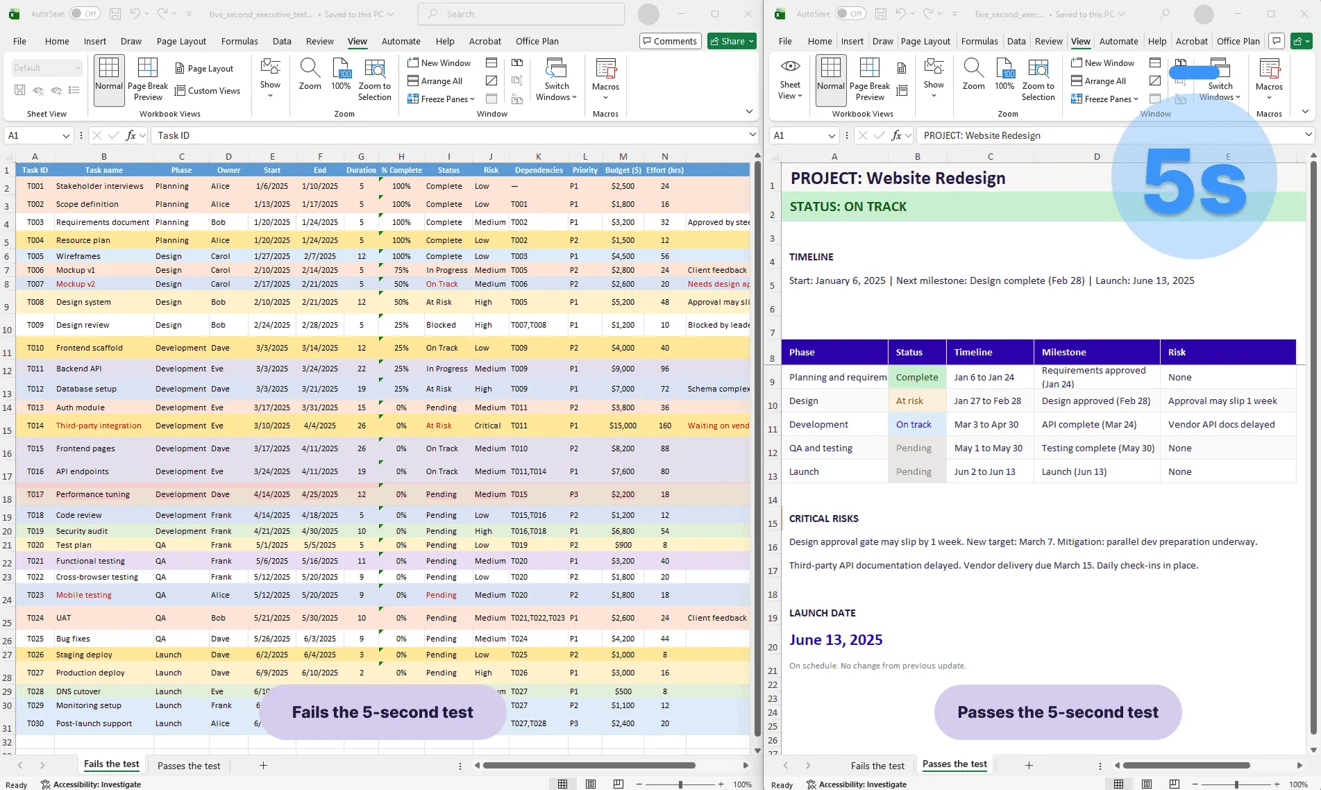
Before and after comparison of a project roadmap: a dense Gantt chart that fails the 5-second executive test on the left, and a clean roadmap with clear status, phases, and risks that passes the test on the right.
Quick answer
The 5-second executive test asks: "Can an executive grasp the project's status, timeline, and risks in 5 seconds, without explanation?" If not, your roadmap is too complex. Successful roadmaps are designed for instant comprehension: phases, milestones, status indicators, and critical risks in a single visual that answers the questions stakeholders actually ask.
Introduction
You send your project roadmap to your VP in an email. Two hours later, they reply asking basic questions that should have been answered by the visual: "When does design finish?" "Are we on track?" "What are the risks?"
This is a communication failure. They're asking questions the roadmap should have answered. Either your roadmap is unclear, or they didn't spend enough time reading it. Either way, the visual didn't do its job.
The problem: most project roadmaps are designed for people who have time to study them. They're not designed for busy executives who skim, glance, and move on.
The 5-second executive test is a framework for designing roadmaps that communicate instantly. It forces you to prioritize ruthlessly: what's essential? What's noise? What does an executive actually need to understand in the first 5 seconds?
This guide walks through the framework and how to apply it so your roadmaps deliver clarity without requiring a meeting.
What the 5-second test is
The test is simple: show your roadmap to someone with no context and give them 5 seconds. Then ask:
- Is the project on track?
- When does it finish?
- What's the biggest risk right now?
If they can answer all three questions accurately without explanation, your roadmap passes. If not, it needs redesigning.
Why 5 seconds? Because that's how long executives actually spend looking at a visual before moving on. If you design for 30-second comprehension, you've already lost them. Five seconds is brutal but realistic.
Why most project reports fail this test
Too much detail. Your Gantt chart has 30 task rows, 20 columns of metadata, and color-coded bars stretching across months. It's accurate. An executive looking at it sees chaos. The signal is buried.
Unclear status. The roadmap doesn't explicitly say "on track," "at risk," or "blocked." The executive has to infer it from colors or patterns. Inference takes time they don't have.
Confusing timeline. Is the timeline in weeks, months, or quarters? Are the dates readable? A confusing timeline makes "when does it finish?" unanswerable in 5 seconds.
Invisible risks. Risks are mentioned in small text in a corner, or color-coded without a legend, or embedded in task descriptions. An executive scanning the visual doesn't see them.
Missing the hook. There's no clear answer to "why should I care?" A timeline without context about stakes or importance communicates data without meaning.
The 4 elements executives actually need to see
Strip away the noise. Executives need exactly four things:
Overall project status
In 5 seconds, they need to know: is this project okay, at risk, or in trouble?
Communicate this with a single, unmissable indicator. Green for on track. Yellow for at risk. Red for in trouble or blocked. Place it at the top of your roadmap, large and obvious. Don't bury it.
Example:
| PROJECT: Website Redesign STATUS: ON TRACK (Yellow: Design phase at risk) |
Three words. But now the executive knows the project status before they read anything else.
Timeline and key dates
Executives need to know when critical events happen. Show the project start date, the project end or launch date, the next milestone with its date, and any critical external deadline.
Use dates, not durations. "2-week design phase" is vague. "Design: March 4 to 16" is clear.
Example:
| Project Start: March 1, 2025 Next Milestone: Design complete (March 16) Launch: June 15, 2025 |
Major phases (not tasks)
Show what's happening when, but at the right level of abstraction.
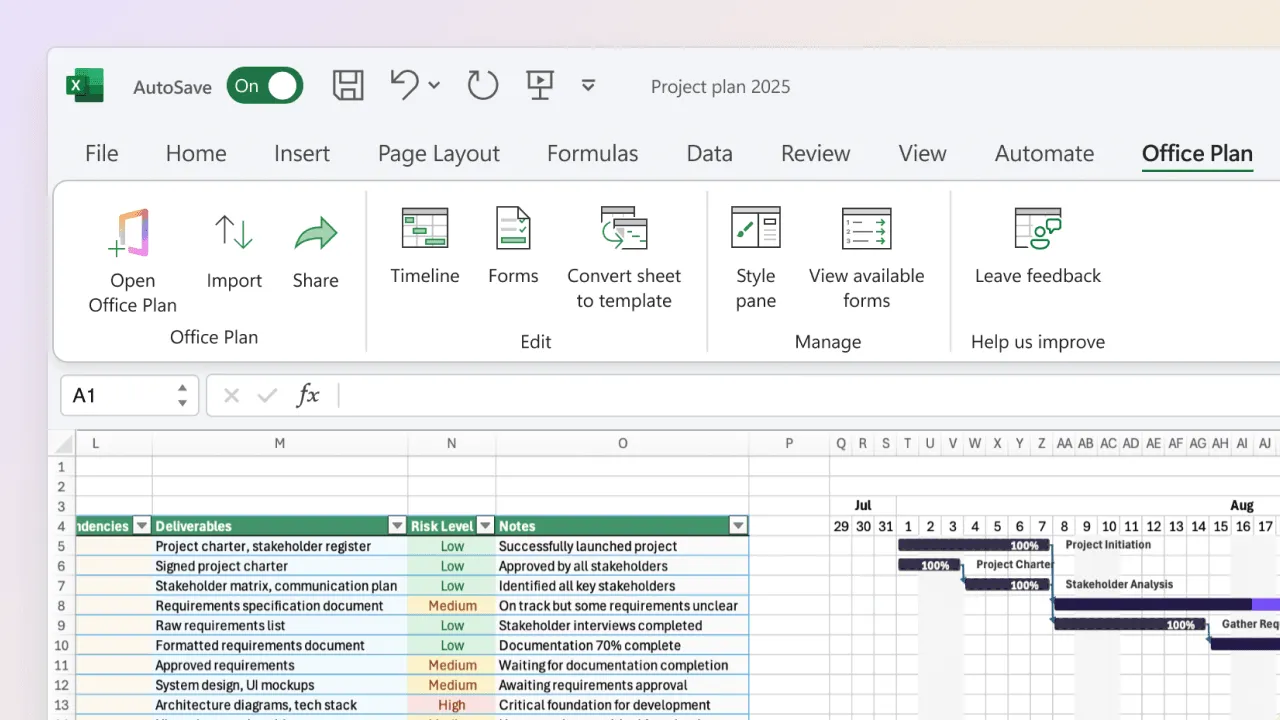
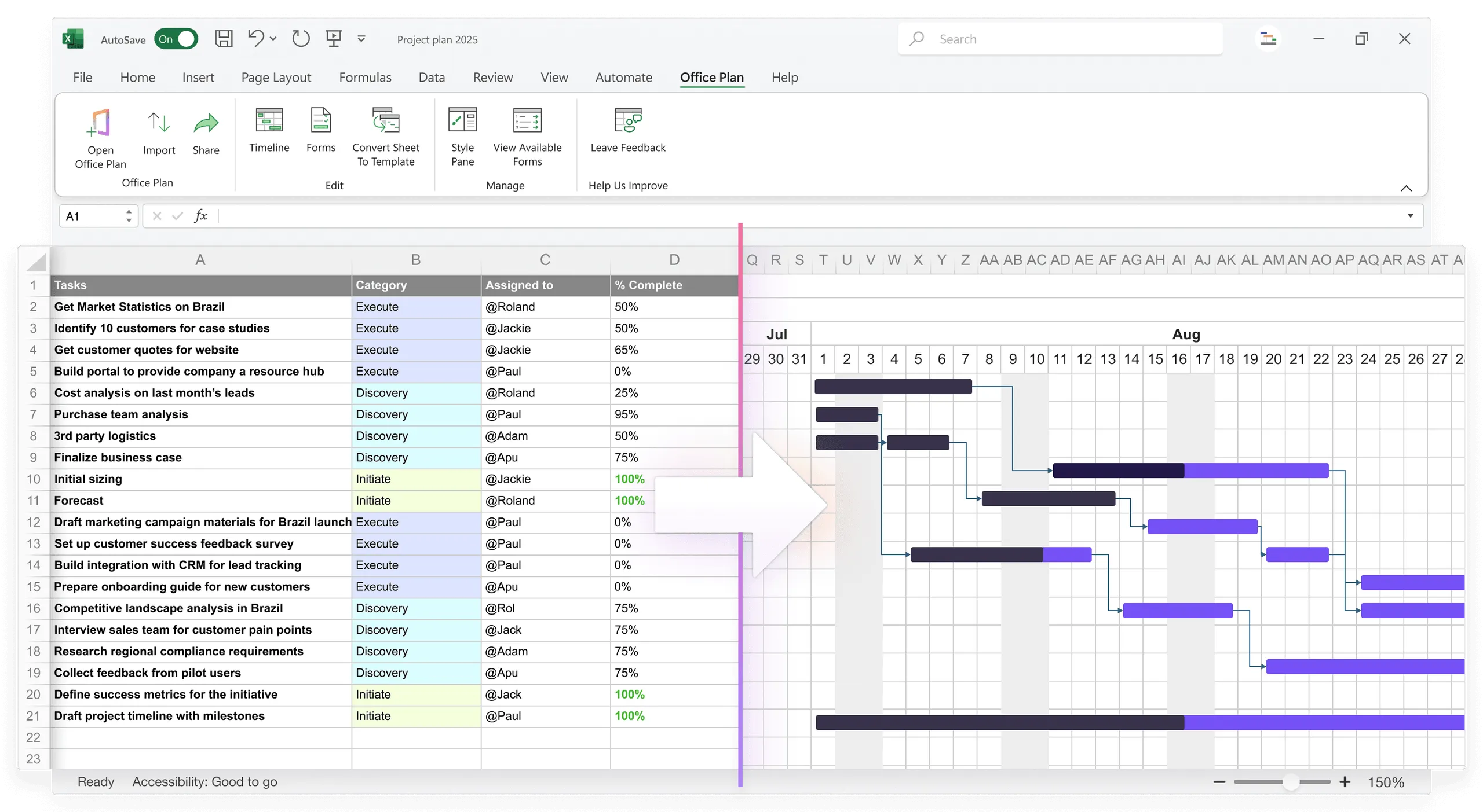
Right level: Discovery, Design, Development, Testing, Launch (5 phases). Wrong level: Stakeholder interviews, Mockups, API design, Frontend dev, Database schema, Unit testing, Integration testing, Deploy scripts, User training, Documentation (12 tasks).
Executives don't care about granular tasks. They care about major phases. Keep it to 5 to 7 phases maximum.
Critical risks or blockers
If something can derail the timeline, it must be visible. Two to three sentences maximum.
Example:
| CRITICAL RISKS: ⚠ Design phase is 1 week behind (compensating with compressed dev timeline) ⚠ Third-party API dependency: waiting on vendor documentation (due 3/20) |
The executive now knows what to worry about without reading a 10-item risk register.
Designing for signal, not noise
Now that you know what to show, here's how to design for clarity:
Hierarchy. Most important: overall status (top, bold, large). Important: timeline and next milestone (clear dates). Medium: phases and their dates (color-coded). Lower: details (if included at all). Your eye should flow naturally to status first, timeline second, phases third.
Color as information. Use color intentionally. Status colors: green, yellow, red for overall health. Phase colors: 3 to 4 distinct colors. Avoid rainbow palettes and more than 5 colors total. Use color-blind-friendly combinations (avoid red-green only; include yellow or blue).
Whitespace. Empty space makes the visual feel controlled and easy to scan. Don't fill every pixel. Leave room between phases, above and below the timeline, and around labels.
Type hierarchy. Large and bold: status and project name. Medium and bold: phase names and milestone names. Small and regular: dates and supporting details. Make it skimmable. Your eye should find status in 1 second and timeline in another 2.
One message per visual. If you want to communicate status, timeline, and risks, that's three clearly separated sections within one visual. Don't mash them together.
How to apply the framework to your current roadmap
Step 1: Strip to skeleton
Take your current roadmap. Remove everything that's not one of the four elements. Remove task names (unless they're phase names), owner assignments, dependencies and arrows, extraneous metadata. Keep status, timeline, phases, and risks.
Odds are, you've removed 50% of the visual.
Step 2: Add clear status
At the top, add a one-line status:
| PROJECT STATUS: [On Track / At Risk / Blocked] |
Make it large. Make it obvious.
Step 3: Clarify dates
Ensure every date is readable with no ambiguity about what it refers to.
| Start: Jan 1, 2025 Next Milestone: Design complete (March 15) Launch: June 1, 2025 |
Step 4: Visualize phases simply
Show phases as horizontal bars or blocks across a timeline. Use 5 to 7 phases max. Color each phase distinctly.
| [Discovery & Planning] [Design] [Dev] [Testing] [Launch] Jan 1-15 Jan 16- Feb 1- May 1- June 1 Feb 15 May 1 May 31 15 |
Step 5: Highlight critical risks
Below or adjacent to the timeline, add a risks section (3 to 4 items max):
| CRITICAL RISKS: • Third-party API dependency (waiting for docs, due March 15) • Design approval gate may slip by 1 week (mitigation: parallel dev prep) |
Step 6: Test it
Show someone with no context. Give them 5 seconds. Can they answer the three questions?
- Is the project on track? (Answer: Yes, on track)
- When does it finish? (Answer: June 1, 2025)
- What's the biggest risk? (Answer: Third-party API docs / Design approval)
If they answered all three accurately, your roadmap passes.
Before and after: a 5-second test redesign
Before (fails the test):
| PROJECT GANTT CHART - Website Redesign Initiative [Complex spreadsheet with 30 task rows, 15 columns including Task Name, Owner, Start Date, End Date, Duration, % Complete, Status, Risk Level, Dependencies, Budget, Resource Hours, Notes, and more. Color-coded bars stretch across a timeline. Zoomed out to show 12 months. Text is small. Multiple shades of blue and red. Dense and busy.] |
Executive reads this for 5 seconds. Sees chaos. Can't answer the three questions. Closes it.
After (passes the test):
| PROJECT: Website Redesign STATUS: ON TRACK Timeline: Jan 1 - June 15, 2025 [Timeline visualization with 5 major phases across 6 months] DISCOVERY & PLANNING | DESIGN | DEVELOPMENT | TESTING | LAUNCH Jan 1-20 | 21-Feb 28 | Mar 1-May 2 | May 3-31 | June 1-15 (Complete) | (At Risk) | (On Track) | (Pending)| (Pending) NEXT MILESTONE: Design Complete (Feb 28) CRITICAL RISKS: ⚠ Design approval gate delayed 1 week (new date: March 7) ⚠ API vendor documentation: waiting on delivery (due March 15) LAUNCH DATE: June 15, 2025 |
Executive reads this for 5 seconds. Understands immediately: project is on track overall, design is slightly at risk, two items to monitor, launches in Q2. All questions answered. Status understood. Meeting not required.
The difference between these two visuals isn't the data. It's the clarity.
Building a visual that passes the 5-second test by hand is possible, but it takes time. And every time your data changes, you rebuild.
Office Plan generates this kind of visual directly from your Excel project data, right inside your spreadsheet. It's designed for exactly this: turning operational detail into a clean, scannable roadmap with phases, milestones, and status indicators that communicate instantly. When the data changes, the visual stays current.
Frequently asked questions
Include a "Details" section below the main roadmap, or provide a link to the full project plan. But the main visual should pass the 5-second test. If they want details, they'll ask. You've given them the option without cluttering the primary view.
Every time the project has significant structural changes (adding or removing phases, major date shifts). If your roadmap changes weekly, you're updating content, not redesigning. Most roadmaps are updated monthly or quarterly.
Executives don't need to see dependencies. That's operational detail. Show dependencies in a detailed Gantt chart for the team. Show phases and milestones in the executive roadmap. Two views for different audiences.
Only if it's a critical concern for your executives. If the CFO is asking about budget, include a one-line status ("On budget" or "3% over"). But keep it minimal. The roadmap's primary job is timeline and risk, not financial detail.
Group related phases. Instead of "Requirements gathering, requirements review, requirements approval," call it "Requirements" (1 phase). Consolidation is what makes the 5-second test passable.
Absolutely. The 5-second test applies to status reports, executive updates, dashboards, and any visual communication. If you can't communicate the core message in 5 seconds, the visual is too complex for its audience.
Key takeaways
- The 5-second executive test measures whether an executive can understand status, timeline, and risks from a single glance. If your roadmap requires explanation, it's too complex.
- Most roadmaps fail because they're designed for 30-second study, not 5-second scanning. Executives skim. Design for their attention, not yours.
- Show only four elements: overall status, timeline and key dates, major phases (5 to 7 max), and critical risks. Everything else is noise.
- Use visual hierarchy, intentional color, whitespace, and type size to guide the eye to what matters. Status first, timeline second, phases third.
- Strip ruthlessly. Remove every element that doesn't directly answer one of the three questions: Is the project on track? When does it finish? What's the biggest risk?
- Test your design with someone unfamiliar. If they can't answer the three questions in 5 seconds, simplify further.
- Tools like Office Plan generate 5-second-test-ready visuals directly from your Excel data, keeping the roadmap current as the project evolves without manual reformatting.
Project management tips and tricks
Make your roadmap answer the question before it's asked
The best project communication is the update that doesn't require a meeting. A roadmap that passes the 5-second test gives your executives what they need at a glance: status, timeline, and risks. Clear, instant, trustworthy. Office Plan generates that visual directly from your Excel project data, right inside your spreadsheet. Phases, milestones, and status indicators, designed for instant comprehension. When the project moves, the visual moves with it.