How to build a project tracker in Excel that actually works
Learn to build an Excel project tracker with essential columns, automatic formulas, and dashboard summaries that keep projects on track.

Excel project tracker showing a dashboard summary with project health metrics at the top and conditional-formatted task rows with green, yellow, and red status indicators below.
Quick answer
Build a functional Excel project tracker by including 7 essential columns (Task, Owner, Due Date, Status, % Complete, Priority, Notes), using formulas to auto-calculate progress and flag at-risk tasks, adding conditional formatting for visual status, and creating a dashboard summary that shows project health at a glance. A tracker that works is one your team actually maintains.
Introduction
Your team is juggling 20 tasks across multiple workstreams. Some are on track, some are overdue, some are blocked waiting on external dependencies. You send emails asking for updates. People tell you "it's going fine" but won't specify what "fine" means. By Friday, you have no clear picture of what's actually happening.
This is where visibility breaks down. A project tracker bridges the gap between the official project plan (Gantt chart, timeline) and day-to-day execution. It's where you track what's actually happening this week, not what was supposed to happen according to the 3-month timeline.
Many PMs try to use their Gantt chart for this. But Gantt charts are timeline-focused (when is everything happening). Trackers are status-focused (what's happening right now, what's blocked, what needs attention). They answer different questions, and trying to use one for both creates noise instead of clarity.
In this guide, we'll build a tracker that makes status visible, surfaces risks early, and requires minimal effort to maintain.
What makes a project tracker actually work
Before we build, let's define what success looks like. A tracker that actually works has five characteristics:
Low friction to update. If the tracker is hard to update, people won't update it. A good tracker means one row per task, three columns to update per week (status, % complete, blocker flag), and five minutes per person.
Automatic calculations. Status roll-ups, priority calculations, and overdue flags should be formula-driven, not manual. This reduces errors and saves time.
Clear risk visibility. Overdue tasks, at-risk tasks, and blocked tasks are highlighted so you can't miss them. Red means "pay attention."
One source of truth. The tracker is the authoritative source of current status. Not email, not Slack, not memory. This spreadsheet tells the truth about where things stand.
Minimal context required. Someone reading the tracker for the first time should understand what's due this week, what's blocked, and what's at risk. No explanation needed.
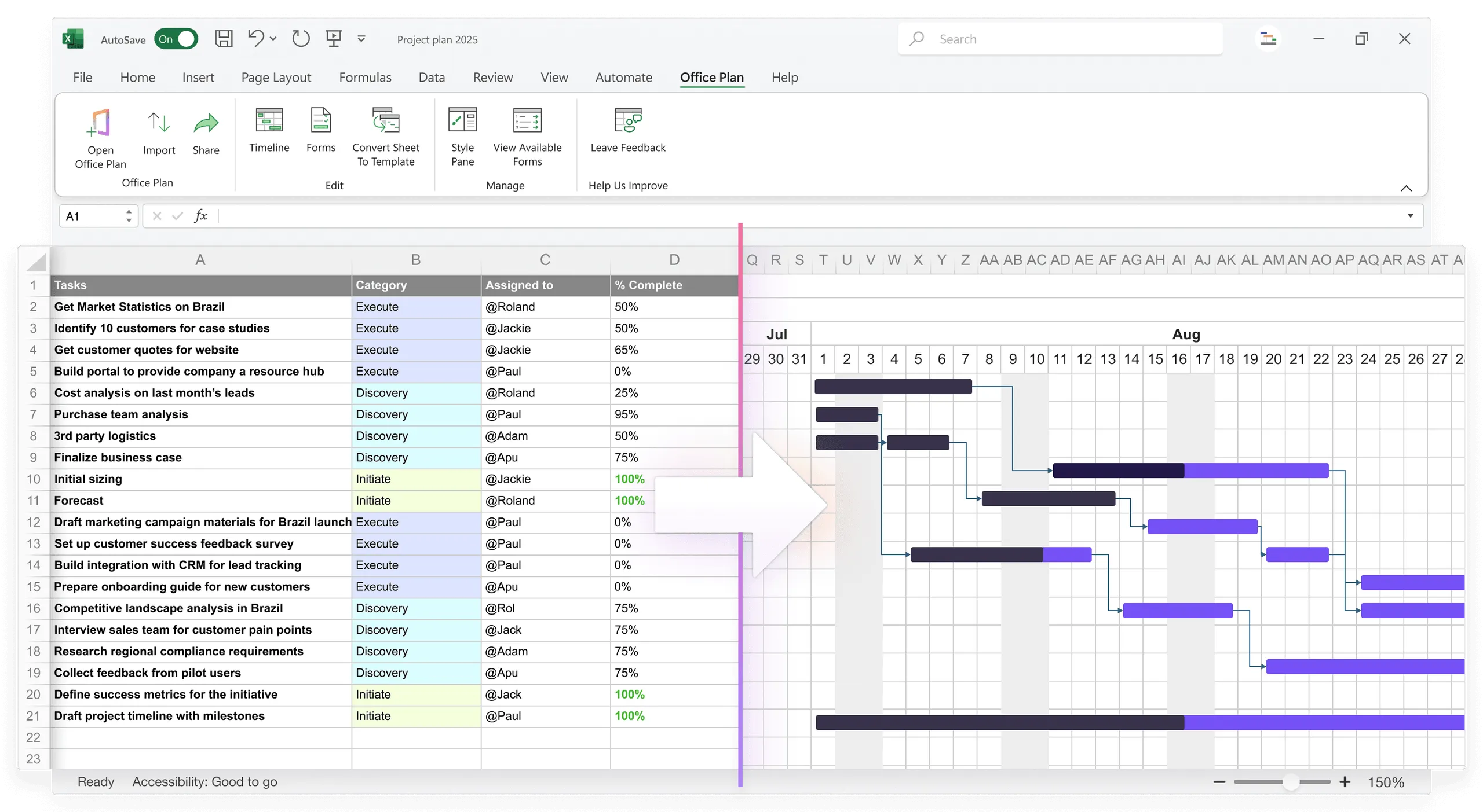
The 7 essential columns
Start with these. You can add more later, but these are the foundation:
| Column | Purpose | Example |
|---|---|---|
| Task | What's being done | "Design phase sign-off" |
| Owner | Who's responsible | "Alice" |
| Due Date | When it's due | "3/15/2025" |
| Status | Current state | "In Progress" / "Blocked" / "Complete" |
| % Complete | Progress toward done | 75% |
| Priority | Importance | "High" / "Medium" / "Low" |
| Notes | Blockers, risks, context | "Waiting on design review from Bob" |
Optional columns (add if relevant): Task ID, Phase, Effort (hours remaining), Dependencies, Actual Completion Date.
Keep your tracker lean. Every column you add is a column people have to maintain. Start with the 7 essentials and expand only when you have a clear reason.
Setting up automatic status calculation
Use formulas to flag status based on date and completion automatically:
| Status formula (in Status column): =IF(% Complete=100%, "Complete", IF(TODAY()>Due Date, "OVERDUE", IF(% Complete < % Complete that should be at this point, "AT RISK", "On Track"))) |
This formula shows "Complete" if done, "OVERDUE" if past due date, "AT RISK" if progress is behind where it should be for this date, and "On Track" otherwise.
For AT RISK detection, compare expected progress to actual:
| Expected % Complete = Days Elapsed / Days Total × 100% If Actual % < Expected %, task is AT RISK |
The formulas do the thinking. You just update the numbers.
Using conditional formatting to make risks visible
Highlight tasks by status so risks jump out visually:
- Select the Status column
- Go to Home > Conditional Formatting > New Rule
- Create rules:
- "OVERDUE" → Red fill
- "AT RISK" → Yellow fill
- "On Track" → Green fill
- "Complete" → Light green fill
- "Blocked" → Gray fill
With 20 tasks on screen, you can scan the Status column and know in seconds which ones need attention. Extend the conditional formatting to the entire row for even stronger visibility.
Building a dashboard summary
Above your task list, add a summary that tells the project story in 10 seconds:
| PROJECT TRACKER SUMMARY As of: 3/10/2025 OVERALL HEALTH Total Tasks: 20 Complete: 5 (25%) ✓ On Track: 12 (60%) ✓ At Risk: 2 (10%) ⚠ Overdue: 1 (5%) ✗ Blocked: 0 (0%) UPCOMING DEADLINES (next 2 weeks) - Design sign-off (due 3/15) — On Track, Alice - API spec (due 3/18) — At Risk, Bob [2 days behind] - QA testing (due 3/20) — On Track, Carol BLOCKERS & RISKS - Design review (waiting on Bob's feedback) — impacts API spec, high priority WORKLOAD THIS WEEK - Alice: 3 tasks - Bob: 4 tasks [2 are at-risk] - Carol: 3 tasks |
Build this with formulas:
| Complete count: =COUNTIF(Status:Status, "Complete") At Risk count: =COUNTIF(Status:Status, "AT RISK") Overdue count: =COUNTIF(Status:Status, "OVERDUE") Next deadline: =MIN(IF(Due Date>TODAY(), Due Date)) |
This dashboard is what you glance at in a standup. It gives you and your team full visibility into project health without scrolling through every row.
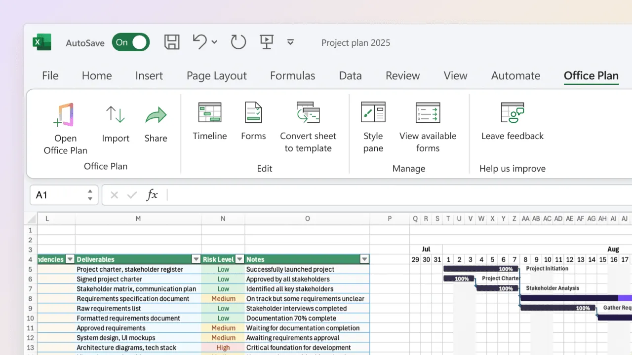
From tracker data to visual timeline
Your tracker has Task, Owner, Due Date, and % Complete. That's exactly the data a Gantt chart or timeline needs. The question is how to get from one to the other without losing time.
Manual method: Build a Gantt from your tracker using the stacked bar method. Your structured data flows into the visual, but the formatting is tedious and breaks when data changes.
Pivot method: A tracker is task-focused (rows are tasks, columns are fields). A Gantt is timeline-focused (rows are tasks, columns are time periods). You're pivoting the same data into a different view, which requires manual restructuring.
Connected method: Office Plan reads your tracker data and generates a Gantt chart or timeline directly inside Excel. Your tracker stays as the operational source of truth. The Gantt is a visual layer built on top of it. When you update the tracker, the visual stays current automatically.
The connected method is what keeps both views aligned without duplicate maintenance. Your team works in the tracker. Your stakeholders see the Gantt. Both draw from the same data.
Maintaining your tracker: the weekly update ritual
A tracker only works if it's current. Establish a consistent cadence:
Monday morning (5 minutes per person): Update % Complete for their tasks. Update Status if any blockers emerged. Add Notes on what's blocking or what's next.
Tuesday morning (15 minutes, PM): Review all updates. Identify at-risk or overdue tasks. Flag blockers that need escalation. Prepare standup talking points from the dashboard.
Friday afternoon (10 minutes, PM): Snapshot the tracker (save a copy with the week's date). Summarize status for stakeholders. Update any milestone or phase completions.
This 30-minute weekly ritual keeps the tracker current and trusted. Skip it for two weeks and the tracker becomes stale. Nobody trusts a stale tracker.
Common tracker mistakes
Too many columns. You add budget, risk score, dependencies, skill level, and suddenly the tracker is 15 columns wide. Maintenance burden explodes and people stop updating. Start with 7 columns. Add more only if truly needed.
Unclear status definitions. "In Progress" means different things to different people. Does it mean "started" or "more than 50% done"? Without clarity, status is meaningless. Define status values at the top of the sheet:
| Status Definitions: - Complete: 100% done, delivered - On Track: >= expected % for this date, no blockers - At Risk: < expected % for this date, or minor blocker - Blocked: Cannot proceed until external dependency resolved - Overdue: Past due date and not complete |
No clear ownership. Tasks without a single owner don't get done. "Someone" is always nobody. Every task needs exactly one owner.
Not reviewing the tracker. Building the tracker and collecting updates isn't enough. If you don't review it weekly, identify at-risk tasks, and act on what you see, it becomes a filing system instead of a management tool.
Duplicate trackers. You maintain a tracker, your team lead maintains one, the PMO has another. Three trackers means three sources of truth, which means no source of truth. One shared tracker, clearly designated as authoritative.
Tracker vs. Gantt: when to use each
Use a tracker when you need current status (what's happening this week), you have 10–30 tasks, status changes frequently, and your audience needs to know what's blocked rather than when everything finishes.
Use a Gantt when you need timeline visibility (months of work, phases, dependencies), the timeline is relatively stable, and your audience needs to understand schedule and sequencing.
Use both when you have complex projects with timeline dependencies and frequent status changes, your team needs task-level detail and stakeholders need timeline context, or your project has 30+ tasks with multiple audiences.
The tracker is operational (this week's work). The Gantt is strategic (overall timeline). They answer different questions, and the strongest teams keep them connected so both views stay current from the same source of truth.
Frequently asked questions
Include tasks that take 1+ day of effort. Tasks under a day (quick fixes, short emails) clutter the tracker and make it harder to read. Group small tasks into larger work items for tracking purposes.
Make it low-friction and mandatory. Set a clear update time (Monday morning), keep it to 5 minutes, and tie it to standups. If you don't update the tracker, you don't speak in standup. Make it a habit, not a request.
Excel works well for small teams (5–10 people) and projects under 30 tasks. For larger teams or complex projects, specialized tools (Asana, Monday, Jira) are easier to maintain. But Excel is free, familiar, and requires no new software adoption.
A tracker can show blockers in the Notes column, but it's not designed for complex dependency management. If you have complex sequencing, use a Gantt chart. If you just need "this task is blocked waiting on X," the Notes column is enough.
Yes. The tracker is your source of truth. You can build summary reports (status by phase, overdue tasks by owner, blocker analysis) using formulas or pivot tables directly from the tracker data.
Slipping due dates usually signal one of three root causes: estimates are unrealistic, scope is unclear, or the team is overallocated. The tracker will highlight this pattern over time. Use the pattern to fix root causes, not just push dates forward.
Key takeaways
- A project tracker gives your team operational clarity: what's happening now, what's blocked, what needs attention this week.
- Start with 7 essential columns: Task, Owner, Due Date, Status, % Complete, Priority, Notes. Add more only when you have a clear reason.
- Use formulas to auto-calculate status and flag at-risk tasks. The tracker should surface problems automatically, not wait for someone to notice.
- Conditional formatting makes risks visible at a glance. Green, yellow, and red tell the story without reading every row.
- Build a dashboard summary that shows project health in 10 seconds. That's what you bring to standups.
- Update weekly. A stale tracker provides no visibility and earns no trust.
- One tracker, one source of truth. Duplicate trackers create confusion, not clarity.
- Your tracker is the operational layer. Tools like Office Plan turn that same data into a Gantt chart or timeline directly inside Excel, giving stakeholders strategic clarity without duplicate maintenance.
Project management tips and tricks
Turn your tracker into a visual your stakeholders trust
Your tracker gives your team the operational view: what's happening now, what's at risk, what needs attention. But when stakeholders need the strategic view (timeline, milestones, overall progress), they need a visual built from the same data. Office Plan reads your tracker and generates a professional Gantt chart or timeline right inside Excel. One source of truth, two views. Your team works in the tracker. Your stakeholders see the timeline. Both stay current.