How to build a project roadmap in Excel using timelines and milestones
Create a professional project roadmap in Excel with timelines and milestones. Learn to design roadmaps that communicate strategy to stakeholders clearly.

Quick answer
Build a project roadmap in Excel by mapping phases and milestones horizontally across a timeline, using color-coded bars for each phase and marking key deliverables as milestone points. A roadmap shows high-level strategy and key dates without the task-level detail of a full project plan.
Introduction
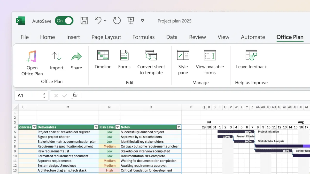
You have a detailed Excel project plan with 40 tasks, dependencies, and resource assignments. It's comprehensive, it's accurate, and it's completely useless for your board meeting in 15 minutes.
The problem isn't your plan—it's the audience. Your executive stakeholders don't need a task-by-task breakdown. They need to understand the strategy: what are the major phases, when do they happen, and what are the critical milestones we're delivering? They need to see the shape of the project, not every brick in the wall.
This is where a roadmap is different from a project plan. A roadmap is a high-level timeline that communicates strategy and key delivery dates. It strips away the task-level noise and shows the skeleton: phases, major deliverables, and critical dates. It's designed to be understood in 30 seconds by someone who knows nothing about your project.
In this guide, we'll walk through how to build a clear, effective roadmap in Excel—one that tells your project story without overwhelming your audience.
What is a project roadmap vs. a project plan?
These terms get used interchangeably, but they're fundamentally different documents.
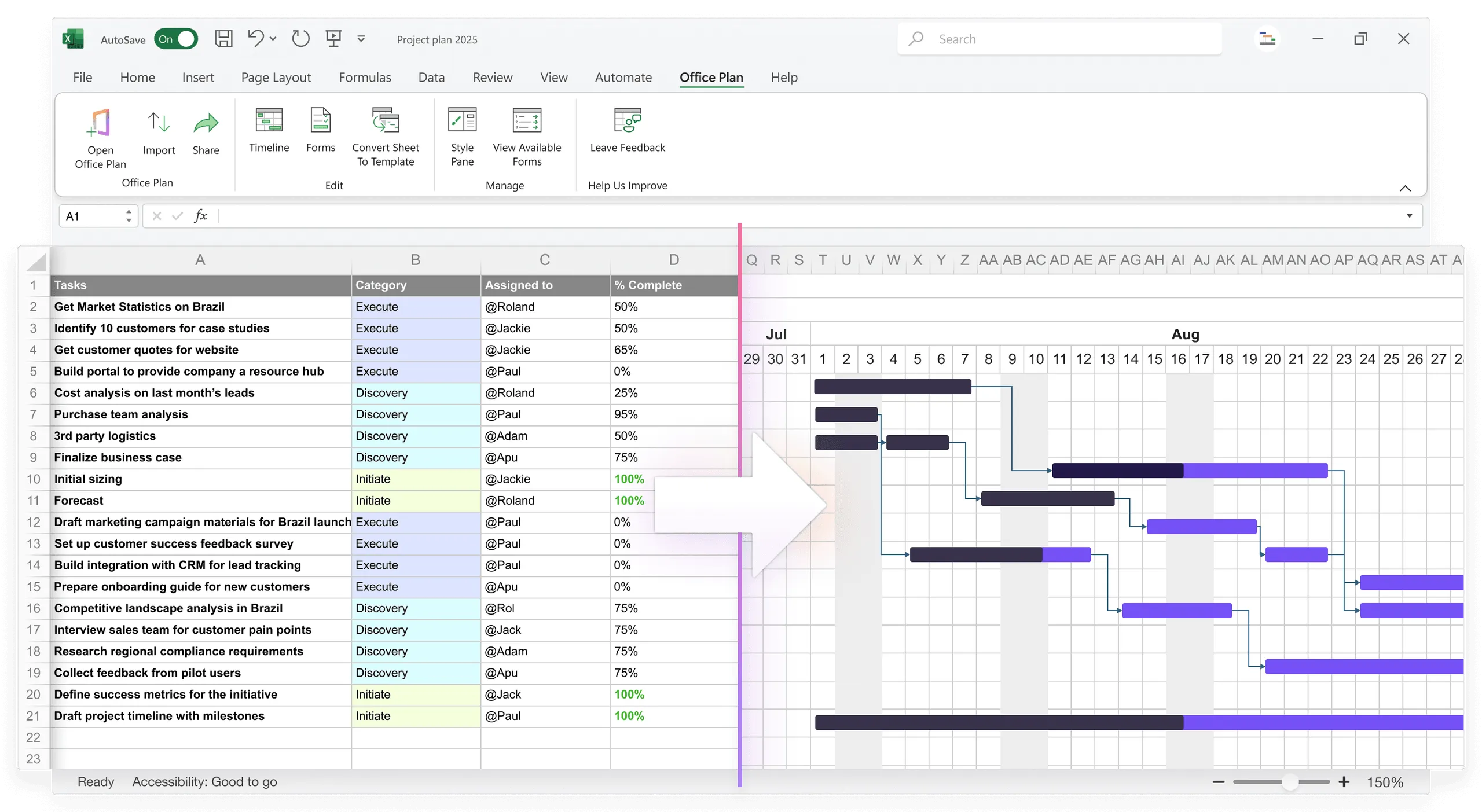
A project plan is detailed, task-focused, and operational. It includes:
- Individual tasks and subtasks
- Specific start and end dates
- Task owners and assignments
- Dependencies (what must finish before what)
- % complete and status for each task
- Risk flags and notes
Audience: Team leads, project managers, individual contributors
A project roadmap is strategic, phase-focused, and high-level. It includes:
- Major phases or workstreams
- Key milestones and deliverables
- Phase start and end dates (not task dates)
- Color-coding or grouping to show categories or themes
- Overall timeline and critical path
Audience: Executives, stakeholders, product leaders, board members
Think of it this way: Your project plan is the instruction manual. Your roadmap is the architectural blueprint. Both are necessary, but they serve different purposes and are consumed by different people.
What belongs on a roadmap
A roadmap should answer these questions in a single visual:
- What are the major phases or workstreams? (Design, Development, Testing, Launch)
- When does each phase occur? (Q2 2025 - Q3 2025, for example)
- What are the critical milestones? (Design approved, Beta launch, Production launch)
- Are there any dependencies or sequence constraints? (Development can't start until design is done)
- What's the overall project timeline? (When do we start, when do we finish?)
What shouldn't be on a roadmap:
- Individual task names (too granular)
- Task owners (unless it's a very small roadmap)
- Detailed status updates for every task
- Technical jargon or implementation details
- Resource allocation or workload charts
A roadmap is about communicating the "what" and "when" at a level that makes sense to people who don't live in your spreadsheet.
Step-by-step: building a roadmap in Excel using timeline bars
Step 1: Define your roadmap structure
Decide how many rows you need. Your rows will be:
- Row 1: Headers and timeline axis (months/quarters)
- Rows 2-N: Major phases or workstreams
For a typical project roadmap, 5-7 rows is ideal. If you need more than 10 rows, your roadmap is too detailed—consolidate phases.
Example structure:
| Phase | Q2 2025 | Q3 2025 | Q4 2025 |
| Discovery & Planning | |||
| Design | |||
| Development | |||
| Testing & QA | |||
| Launch & Rollout |
Step 2: Set up your timeline axis
Decide your time unit: months, quarters, or weeks. For executive roadmaps, quarters or months work best.
Create a header row with time periods:
- Q2 2025 (Jan-Mar 2025) or Mar - May 2025
- Q3 2025 (Apr-Jun 2025) or Jun - Aug 2025
Adjust column widths so each time period gets proportional space. A 3-month quarter could be 3-4 inches wide.
Step 3: Map phases to the timeline
For each phase (row), mark where it starts and ends on your timeline. You have two methods:
Method 1: Color-coded cells
Fill cells with color to show when a phase is active. For example, fill the "Design" row with blue cells for the months when design work happens.
| Phase | Mar-May | Jun-Aug | Sep-Nov |
| Design | [Blue] | [Blue] | |
| Development | [Blue] | [Blue] | |
| Testing | [Blue] |
This is quick and visual, but loses precision about exact start/end dates.
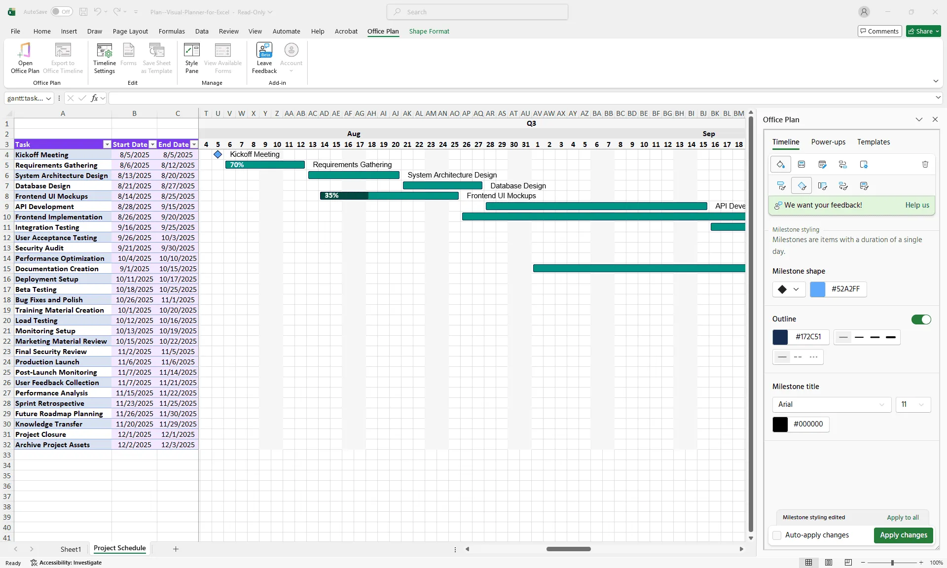
Method 2: Bars within cells
Create horizontal bars (similar to a Gantt chart) that sit within cells. This is more precise but requires more Excel formatting.
For each phase, calculate:
- Start date (e.g., 3/1/2025)
- Duration (e.g., 12 weeks)
- End date (e.g., 5/24/2025)
Then use the stacked bar method from our Gantt chart guide to create bars that stretch across the timeline cells.
Step 4: Add milestone markers
Milestones are specific dates or deliverables you want to highlight. Mark them on your roadmap using:
- Diamond shapes positioned at the end of bars
- Vertical lines at key dates
- Milestone markers within the timeline row
Common milestones to include:
- Phase completion dates
- Major deliverable dates (Design approved, Beta ready, Launch date)
- Go/no-go decision points
- Regulatory or external deadlines
Example:
| Phase | Mar-May | Jun-Aug | Sep-Nov |
| Design | [Blue bar] ◇ | ||
| Development | [Blue bar continues] ◇ | [continues] | |
| Testing | [Blue bar] ◇ | ||
| Launch | ◇ |
The diamonds mark milestone dates.
Step 5: Add phase labels and context
For each phase row, add a label that describes what's happening:
- Discovery & Planning: Requirements gathering, stakeholder alignment, resource planning
- Design: UI/UX design, design approval, design system setup
- Development: API development, frontend development, database setup
- Testing: QA testing, user acceptance testing, bug fixes
- Launch: Deployment, training, go-live support
You can add these as a column next to the phase name, or as a note below each phase.
Step 6: Format for stakeholder readability
A roadmap should look clean and professional. Follow these formatting rules:
Color scheme:
- Use 2-3 consistent colors (e.g., blue for development, green for testing, orange for launch)
- Avoid rainbow colors—they look chaotic
- Use color-blind-friendly palettes (avoid red-green combinations)
Typography:
- Bold phase names
- Use a readable font (Arial, Calibri, or similar)
- 14-16pt font size minimum (readable on a slide)
Whitespace:
- Add padding (empty rows) between phases for breathing room
- Don't crowd phases together
Legend:
- If using colors or symbols, include a legend explaining what they mean
- Include date ranges (e.g., "Q2 2025 = Mar-May 2025")
Step 7: Add key dates and critical path
Below or next to your roadmap, note critical dates:
| Project Start: March 1, 2025 Design Milestone: May 23, 2025 Development Begins: June 1, 2025 Testing Begins: September 15, 2025 Launch Date: November 15, 2025 |
Optionally, highlight the critical path—the sequence of phases that determines the overall project duration. If design finishes late, the whole project slips. That's critical path. Non-critical phases have some slack.
Formatting for stakeholder readability
Executives skim. They allocate 30 seconds to your roadmap. Here's how to make it count:
The Rule of Five:
- Max 5-7 phases (if you have more, group them)
- Max 5 critical milestones
- Max 5 colors
- Max 5 quarters of timeline shown
White space is your friend: Don't fill every cell. Leave room to breathe. A cluttered roadmap looks chaotic and uncontrolled.
One message per visual: What's the one thing you want them to understand? Is it "We're on track," "We're at risk," or "Here's our delivery timeline"? Make that clear in the title and color scheme.
Hierarchy: Make the critical path (the phases that determine overall timeline) stand out. Make supporting phases less prominent (lighter colors).
Turning your roadmap into a professional visual
Once your Excel roadmap data is structured, you need to turn it into a clean, presentation-ready visual. You have a few options:
- Option 1: Manual formatting in Excel Use cell coloring, shapes, and conditional formatting to style your roadmap by hand. This works, but it's time-consuming and fragile — one row insertion can break the entire layout.
- Option 2: Screenshot and paste into slides Copy your roadmap visual and paste it into PowerPoint as an image. Quick, but static — future updates require creating a new image every time.
- Option 3: Use an Excel add-in that generates the visual for you Tools like Office Plan work directly inside Excel, turning your roadmap data into a professional timeline visual without leaving your spreadsheet. Your source of truth and your visual live in the same place — no exporting, no syncing, no maintaining two versions.
The challenge most teams hit: manually formatting a roadmap visual in Excel is tedious, and every data change means re-doing the formatting work. The best workflow? Keep your roadmap data in Excel and let a purpose-built add-in handle the visual layer automatically.
When to use a roadmap vs. a Gantt chart
Both are timelines, but they serve different purposes:
Use a roadmap when:
- Presenting to executives or boards
- Communicating strategy, not task details
- You have 5-10 major phases
- Timeline spans months or quarters
- Audience has limited time
Use a Gantt chart when:
- Communicating to the project team
- Showing task-level detail and dependencies
- Tracking progress on specific deliverables
- Timeline spans weeks
- Audience needs to understand sequencing and resource allocation
Many projects benefit from both: a Gantt chart for internal management and a roadmap for stakeholder communication.
Frequently asked questions
A timeline is any visual representation of events over time. A roadmap is a specific type of timeline that communicates strategy and high-level phases. All roadmaps are timelines, but not all timelines are roadmaps. Roadmaps are typically presented to stakeholders; timelines are often internal planning tools.
Include only critical milestones—usually 3-5 for a typical project. These are decision points, major deliverables, or externally significant dates. Too many milestones (10+) clutter the visual. If something isn't critical enough for an executive to care about, it shouldn't be on the roadmap.
Not typically. Roadmaps are strategic; task ownership is operational. If you must show ownership, consider a separate "owners" row below the timeline showing which team or department owns each phase. Avoid listing individual names—it clutters the visual.
Yes, but keep it simple. Draw arrows or lines between phases if one phase blocks another. For complex dependencies (multiple paths, parallel work with constraints), a Gantt chart is clearer. Roadmaps should show sequence, not intricate logic.
Use visual indicators: a dashed line for uncertain phase endpoints, a red milestone for high-risk delivery, or a note explaining the risk. Avoid showing all possible scenarios—it becomes confusing. Show the most likely timeline, and note major risks separately.
Monthly or quarterly, depending on how fast your project moves. If your roadmap changes every week, either you're over-managing it (it's too detailed for a roadmap) or your project is genuinely unstable. Stable projects have stable roadmaps.
Key takeaways
- Roadmaps communicate high-level strategy and delivery dates to stakeholders—not task details
- Structure roadmaps with 5-7 major phases mapped across a timeline of months or quarters
- Use color-coding and milestone markers to highlight critical deliverables
- Format for clarity: bold labels, white space, readable fonts, limit to 5 key dates
- Generate professional roadmap visuals directly from your Excel data — no manual reformatting or app-switching needed
- Roadmaps differ from Gantt charts: use roadmaps for stakeholders, Gantt charts for team operations
- Update your roadmap monthly or quarterly; more frequent changes suggest it's too detailed
Project management tips and tricks
Take the formatting work off your plate
You've built a solid Excel roadmap that tells your project story — phases, milestones, timeline, and all. Now you need it to look boardroom-ready, but manually formatting bars, colors, and milestone markers in Excel is tedious busywork. And every time your data changes, you're redoing it all over again. Office Plan eliminates the formatting loop. It's an Excel add-in that turns your roadmap data into a professional, presentation-ready visual — right inside your spreadsheet. Update your data, and your roadmap visual updates automatically. Your planning and your visuals live in the same place. No exporting. No copy-pasting into PowerPoint. No maintaining two versions that fall out of sync.