Automated continuity: eliminating the Friday afternoon Excel "formatting loop"
Break the Friday afternoon Excel formatting loop. Strategies to automate status reporting and eliminate repetitive manual visual updates.

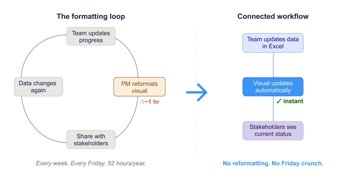
Two diagrams: the formatting loop showing manual steps of updating data, reformatting visuals, and sharing with stakeholders repeating weekly, and the automated version where the visual updates automatically from the data.
Quick answer
The "formatting loop" is the repeating cycle of manually redrawing Gantt bars, color-coding cells, and reformatting visual timelines every week as project progress changes. Eliminate it by separating data (formulas, conditional formatting) from visual output (charts), using templates, and connecting your data to a visual layer that updates automatically when the underlying numbers change.
Introduction
It's 4:47 PM on Friday. You have 13 minutes before you can close your laptop for the weekend. You've spent the last 45 minutes manually updating your project Gantt chart: adjusting bar lengths to reflect new percent complete values, re-coloring cells, repositioning milestone markers, ensuring the timeline visuals match your updated data.
This is the formatting loop. It's an exhausting, repetitive cycle that happens every week:
- Team updates tasks and progress (percent complete, new dates, status)
- You update the data in Excel
- You spend an hour reformatting the visual (colors, bars, markers)
- By Monday, the cycle starts over with new changes
The formatting loop is the reason PMs say "I spend 80% of my time on reporting, 20% on managing." It's not deliberate. It's the natural friction of working in a tool where data and visuals are disconnected.
This guide examines the formatting loop, why it exists, and how to eliminate it so your Friday afternoons are spent on the project, not on the spreadsheet.
What the formatting loop is (and why it happens)
The formatting loop is born from a fundamental mismatch: Excel stores data and visuals in the same file, but they require different types of updates.
When a task's percent complete changes from 50% to 75%, the data cell updates instantly. But the visual bar in your Gantt chart doesn't automatically expand. You have to manually adjust the bar length, update the color intensity, and possibly reposition adjacent bars if they've shifted.
This disconnect exists for four reasons:
Manual chart bars. Most Excel Gantt charts use stacked bar charts or manually colored cells to visualize timelines. These are semi-manual. The formulas update the underlying data, but the visual requires manual tweaking.
Formatting is separate from data. Data (task name, start date, duration) is stored in cells. Formatting (bar color, cell background, font emphasis) is applied separately. When data changes, formatting doesn't follow automatically.
Multiple disconnected versions. You have your source Excel file, a Gantt chart version, maybe a separate stakeholder summary, and possibly a shared team version. Each version requires separate formatting and manual syncing.
Excel assumes manual maintenance. Excel was built for single-user analysis, not continuous collaboration and reporting. It doesn't assume your data changes weekly and your visuals need updating. So it doesn't automate that process.
The result: every Friday afternoon, you're trapped in a formatting loop, doing repetitive busywork instead of analysis, risk management, or project leadership.
The real cost of the formatting loop
If you spend one hour per week reformatting your project visual:
- Per year: 52 hours
- In dollars: 52 hours at $60/hour = $3,120 annually
- In opportunity cost: 52 hours you could spend on risk mitigation, stakeholder communication, or strategic planning
But the cost goes deeper than dollars:
Cognitive load. Switching between analysis (reviewing project status, identifying risks) and formatting (adjusting bar colors) breaks focus. You lose the strategic thread every time you drop into formatting mode.
Error risk. Manual formatting means manual errors. A bar misaligned by one week. A milestone moved in the visual but not the data. A status color applied incorrectly. These errors compound and erode trust in the plan.
Burnout. Repetitive, low-value work is draining. It's why PMs feel exhausted, not from hard decisions, but from mechanical busywork that never ends.
Communication delay. Your 4:47 PM Friday update takes so long that stakeholders don't see it until Monday morning. The delay reduces the impact and timeliness of your communication.
Strategies to break the loop within Excel
You can work within Excel and reduce the formatting loop significantly:
Use conditional formatting instead of manual coloring
Instead of manually changing cell colors every week, use conditional formatting rules that auto-apply based on cell values.
| Conditional Formatting Rule: If: [% Complete Cell] >= 75% Then: Fill with green color |
Now when someone updates percent complete, the color changes automatically. No manual formatting required.
Build template-based formats
Create a reusable format template for your project. Define column structure once, apply conditional formatting rules once, and when you start a new project, copy the template. Data changes; formatting is automatic.
This eliminates the "build the format from scratch" work that happens on every new project.
Use data validation for consistency
Force team members to enter data in consistent formats using data validation dropdowns.
| Data Validation Rule: Status column must be: "On Track" OR "At Risk" OR "Blocked" |
Consistent data makes conditional formatting rules reliable. Inconsistent data breaks them.
Automate chart updates with dynamic ranges
Build charts that reference your data ranges dynamically, so when data changes, charts update automatically:
| Chart Data Range: =Sheet1!$A$1:$G$100 |
As you add rows, the chart expands. As data changes, the chart recalculates.
Use Power Query for data consolidation
If you're importing project data from multiple sources (timesheet system, task tracker), use Power Query to automatically consolidate and reformat it:
| Power Query: Import data from [System A] → Transform → Load to Excel Import data from [System B] → Transform → Load to Excel Consolidate → Output to Project Plan sheet |
Instead of manually copying and formatting imported data, one button refreshes it automatically.
Why automation alone doesn't close the visual gap
Even if you fully automate your Excel formatting, you still hit a wall: the visual layer.
Your data is updated, your conditional formatting is working, your formulas are solid. But when it's time to communicate the project visually (a Gantt chart, a timeline, a roadmap), Excel's built-in chart tools aren't designed for project timelines. You end up manually building visuals with shapes, stacked bars, or cell coloring. And every time the data changes, you rebuild.
This is the second formatting loop: data-to-visual formatting. Excel automation solves the first loop (keeping the data current) but not the second (keeping the visual current).
To close this gap, you need the visual layer connected to the data layer, updating automatically when the underlying numbers change.
The case for connecting data to visuals
The fundamental solution is architectural: connect your data directly to a visual layer that updates from it.
Data layer: Task details, dates, percent complete, status. Formulas and calculations. Updated weekly by team members. Source of truth.
Visual layer: Gantt charts, roadmaps, timelines. Professional formatting, colors, styling. Generated from data. Presented to stakeholders.
When the visual layer is connected to the data layer:
- Data can be updated frequently without touching the visual
- The visual updates automatically when data changes
- No manual reformatting or repositioning
- One source of truth, one visual output
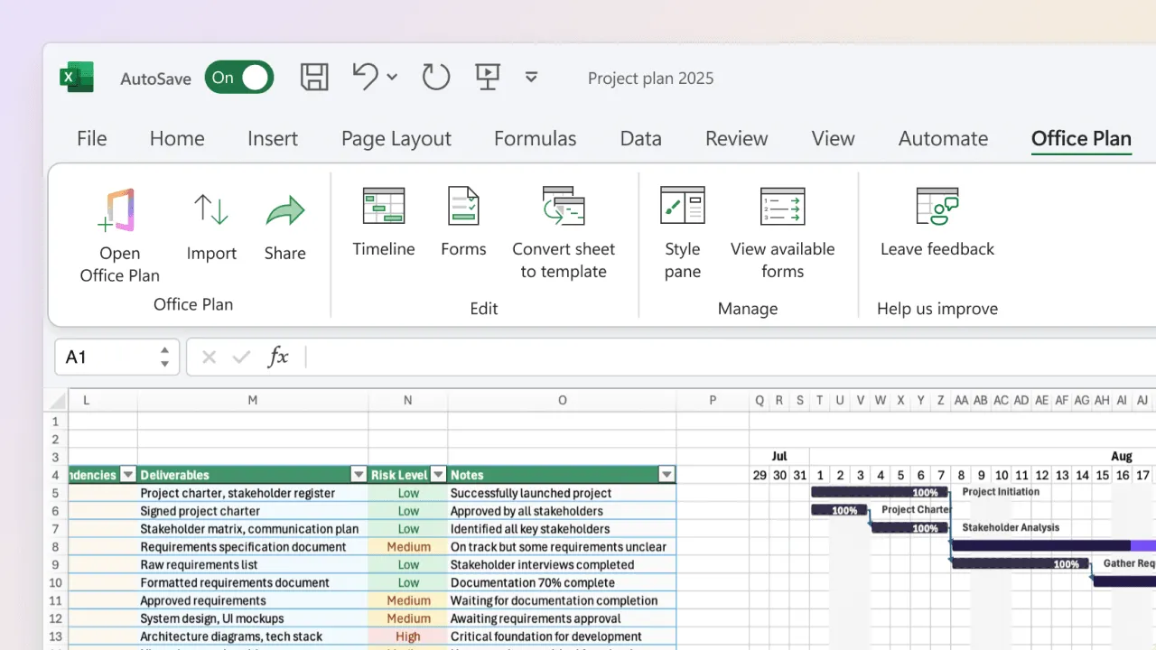
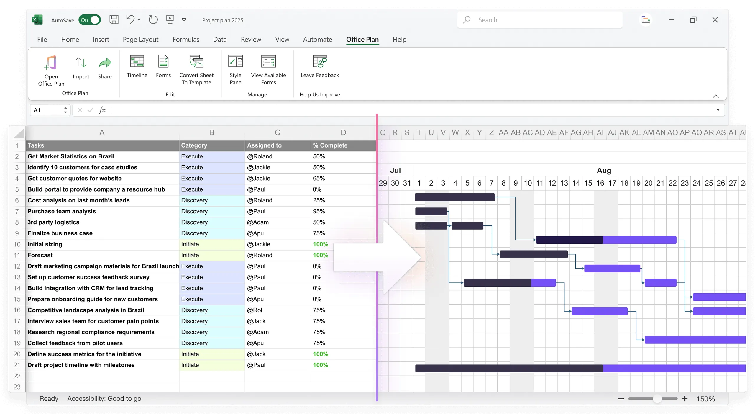
Office Plan is built for exactly this. It's an Excel add-in that reads your project data (tasks, dates, percent complete, milestones, status) and generates a professional Gantt chart or timeline right inside your spreadsheet. When the data changes, the visual updates. No manual bar adjustment, no color re-application, no Friday afternoon formatting session.
Both layers live in one file. Your data is the source of truth. Your visual stays connected to it. The formatting loop is eliminated because the connection handles formatting, not you.
When you eventually outgrow Excel's approach
Automation and templating can stretch Excel's utility, but there's a limit:
Signs you've hit the ceiling:
- Your project has more than 30 tasks (too many for a readable Gantt)
- Multiple workstreams need separate timelines that must be consolidated
- You're spending more than 3 hours per week on formatting, regardless of automation
- You need real-time updates (data changes as work happens, not in weekly batches)
- Stakeholders need visuals that look polished, not "Excel chart with formatting"
At that point, consider dedicated project management tools (Microsoft Project, Asana, Monday.com, Smartsheet) that are built for this separation from the ground up.
For teams between "pure Excel" and "dedicated PM tool," an Excel add-in like Office Plan is the practical middle ground. You keep the familiar Excel workflow. You gain the connected visual layer. The formatting loop disappears without a full tool migration.
Frequently asked questions
You can automate 60 to 70% of the formatting work with conditional formatting, templates, and dynamic ranges. The remaining 30 to 40% (visual layer updates, timeline formatting) requires either manual work or a connected tool like Office Plan.
If you're importing data from multiple sources weekly, yes. Power Query can save 3 to 5 hours per week of manual consolidation. If your data is mostly manual entry, the return is lower.
Comfort is real, but it's also the enemy of improvement. Most teams adapt quickly to better processes once they see the time savings. Pilot a new approach with one project, measure the time savings, and share the result.
Slightly. Google Sheets handles simultaneous edits better and has cleaner chart auto-refresh. But it still has the same architectural gap: data and visual formatting are separate, requiring manual sync. It's a marginal improvement, not a solution.
Not effectively. Publish to web creates a web link to your Excel sheet, but it doesn't auto-update embedded visuals in other files. You need the visual layer connected directly to the data, which is what an add-in like Office Plan provides.
For teams staying in Excel, Office Plan is designed specifically for this: it reads your Excel data and generates project timelines directly inside your spreadsheet. For teams ready to move beyond Excel, Smartsheet, Monday.com, or Microsoft Project offer built-in visual layers. The best choice depends on your team size, project complexity, and willingness to adopt a new tool.
Key takeaways
- The formatting loop is a weekly cycle of manual visual updates that drains time, focus, and energy. It exists because Excel separates data from formatting, requiring manual sync every time something changes.
- The cost is real: 52 hours per year, $3,000+ in direct overhead, plus cognitive load, error risk, burnout, and delayed stakeholder communication.
- Conditional formatting, templates, data validation, and dynamic chart ranges can reduce the loop by 60 to 70% within Excel.
- Full elimination requires connecting your data layer to your visual layer so the visual updates automatically when the data changes.
- Office Plan closes this gap inside Excel. It reads your project data and generates a professional Gantt chart or timeline that stays current as the data evolves. No manual reformatting. No separate file to maintain.
- For complex projects with frequent updates, the choice is between spending Friday afternoons formatting or spending them on the work that actually moves the project forward.
Project management tips and tricks
Reclaim your Friday afternoons
The formatting loop costs your team hours every week. Most of that time goes to one thing: manually rebuilding a visual from data that's already in Excel. Office Plan connects the visual to the data. When your project plan changes, the Gantt chart, timeline, or roadmap updates automatically, right inside your spreadsheet. No reformatting. No repositioning. No Friday afternoon crunch. Your data does the work. Your visual stays current. You get your time back.