[Guest post] 3 rules for creating effective data visualizations
Discover the art of data visualization with our 3 simple rules to transform complex data into clear, impactful graphics for effective presentations.

Have you ever read a report and gotten lost in an overwhelming number of statistics?
Or maybe you were presented with so many specific details about a topic that you lost sight of the big picture?
It happens all the time and it’s no surprise why. As a species, we are now producing 2.5 quintillion bytes of data every single day. That’s one million times one trillion pieces of data, and it’s too much for the human mind to keep up with.
That’s why when it comes to presenting data and getting your point across, I’ve got two words for you: data visualization.
Data visualization is the secret art of translating your information into effective graphics, charts and visuals that your audience can understand, to help you make more convincing arguments during your presentations.
When people start to see the big picture (literally) instead of all the small numbers, they’re more likely to pay attention to what you’re saying.
The benefits of using data visualization in your presentations
When done properly, data visualization has three core benefits:
- Increases the clarity of your message.
- Increases people’s confidence in your proposals and conclusions.
- Creates interesting talking points out of otherwise overwhelming amounts of information.
That’s why if you plan on using data to inform or persuade during your next presentation, it’s worth taking the time to create clear data visualizations to back up your points.
But how do you do that?
How to use data visualization
Here are three general data visualization techniques you can use to create clear graphics and visuals out of almost any type of data you have.
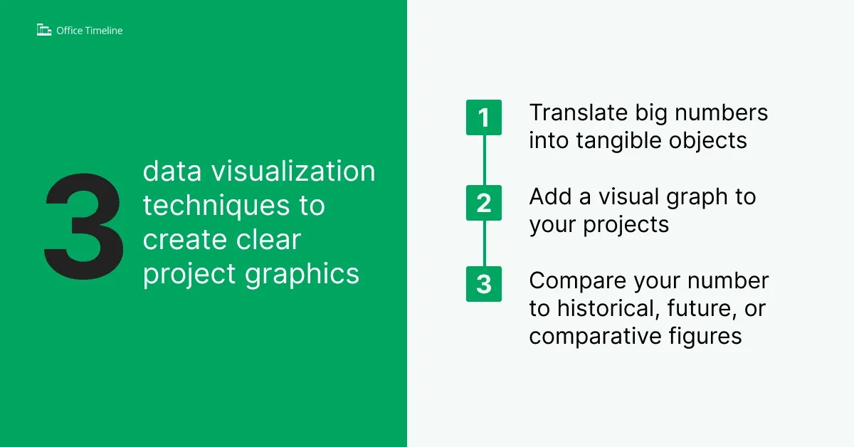
Rule #1: Translate big numbers into tangible objects
Large numbers can be hard for your audience to relate to. This is especially true if you are presenting numbers in the billions and trillions. While everyone knows that 1 billion or trillion is a large number, it’s too big for your audience to connect with on an emotional level.
The first rule of creating effective data visualizations is to break your large numbers down to some tangible unit that your audience can grasp like miles, pounds, length, height, etc. The reason this works so well is it translates your vague number into something that everyone can visualize.
For example, the U.S. National Deficit in 2018 was $21.6 trillion dollars. While $21.6 trillion is big, how big is it really?
If your point is that this is an extremely large number, here are two different ways you could try to break that number down into a more tangible number your audience can appreciate.
Method #1: Break it down by the length of U.S. $100 bills
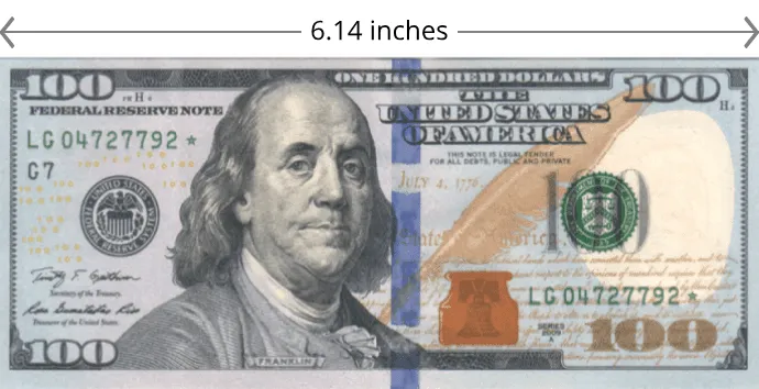
The U.S. $100 bill is just over 6 inches long. Translated into $21.6 trillion dollars, that equates to 20.9 million miles of U.S. $100 bills lined up end to end. That is enough to wrap around the planet approximately 842 times.
Method #2: Divide the number by the world population of 7.7 billion
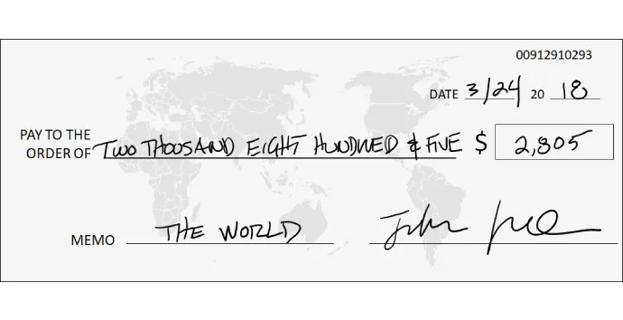
$21.6 trillion divided by the world population of 7.7 billion is $2,805. That’s like the U.S. government owing every man, woman and child on the planet a check for $2,805.00 in 2018.
Rule #2: Add a visual graphic to your projects
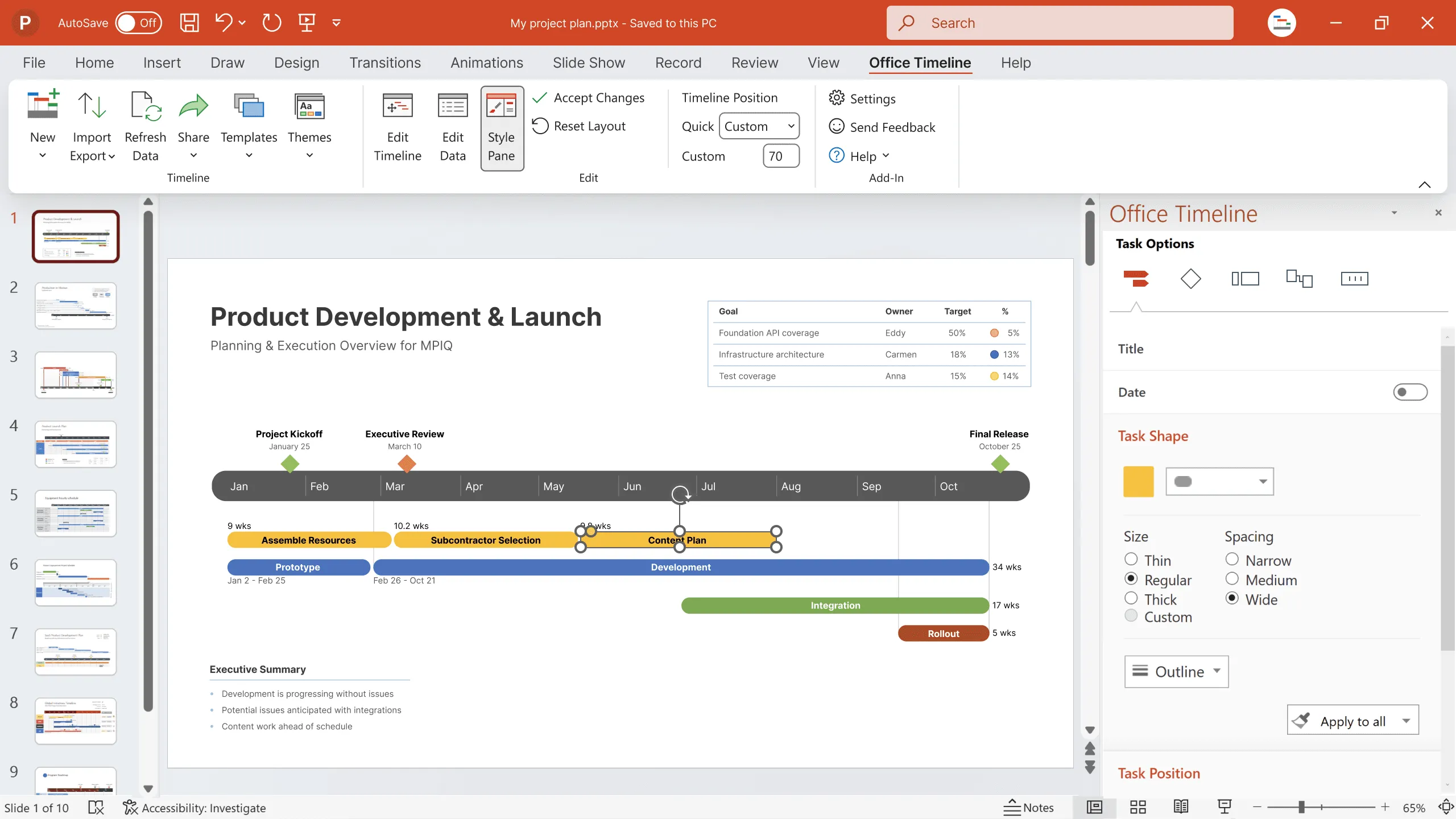
If you are presenting dates, times or steps to a process, explain your project using a Gantt chart or timeline to visualize your data. The reason this data visualization technique works so well, is it makes your overall project easier to understand and digest in comparison to simply listing your dates out in a table or text box. Here’s an example so you can see for yourself:
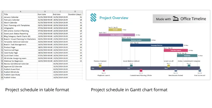
In the picture above, notice how much clearer the project is when presented in a visual graphic instead of a table. That gives your audience a spatial awareness of your project, allowing everyone to more fully understand how your project will progress.
Rule #3: Compare your number to historical, future or comparative figures
If you have a specific number or statistic you want to present, you can make your number more impactful by comparing it to something to give it context. The reason that this data visualization technique works so well is that a number by itself doesn’t mean much without context.
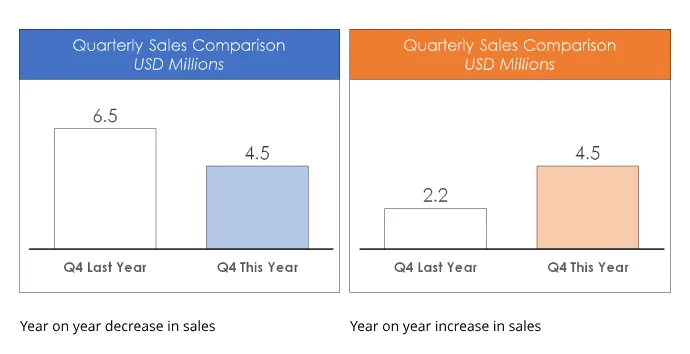
For example, having quarterly sales of $4.5 million doesn’t mean much unless you compare it something. Notice how in the chart on the left, $4.5 million is a year on year decrease in sales, while on the right it is a year on year increase. It all depends on your reference.
When you are looking to give your numbers context, the three easiest pieces of data you can use are:
- A future forecast – comparing how you did against your projections.
- Historical figures – comparing how you did against your historical, past performance.
- Your competitors – comparing how you did against your competitors over the same time period.
Conclusion
To recap, here are the three most effective data visualization techniques you can use to deliver presentations that people understand and remember: compare to a real object, include a visual, and give context to your numbers. Try using one or more of these techniques in your next presentation. The clearer your data visualizations, the easier it will be to inform and educate your audience.
Leading provider of PowerPoint training
Turn project data into professional timelines
Get the advanced features of Office Timeline free for 14 days.