
How to make a Gantt chart in PowerPoint
This step-by-step PowerPoint Gantt chart tutorial explains how to make professional Gantt charts both manually and automatically inside the popular presentation tool.
Microsoft PowerPoint is one of the most commonly used tools for presenting plans, proposals or reports to high-level audiences. Although the tool doesn't have a built-in Gantt feature, professionals who need to include a Gantt chart in their presentations do have options to build and edit it right inside PowerPoint.
The first option is to use the tool's Stacked Bar feature and a bit of formatting to manually create a Gantt, while the other lets you automatically generate your graphic using a simple PowerPoint plugin. On this page, we will show you both ways to make a PowerPoint Gantt chart.
Which tutorial do you want to see?
How to manually make a Gantt chart in PowerPoint
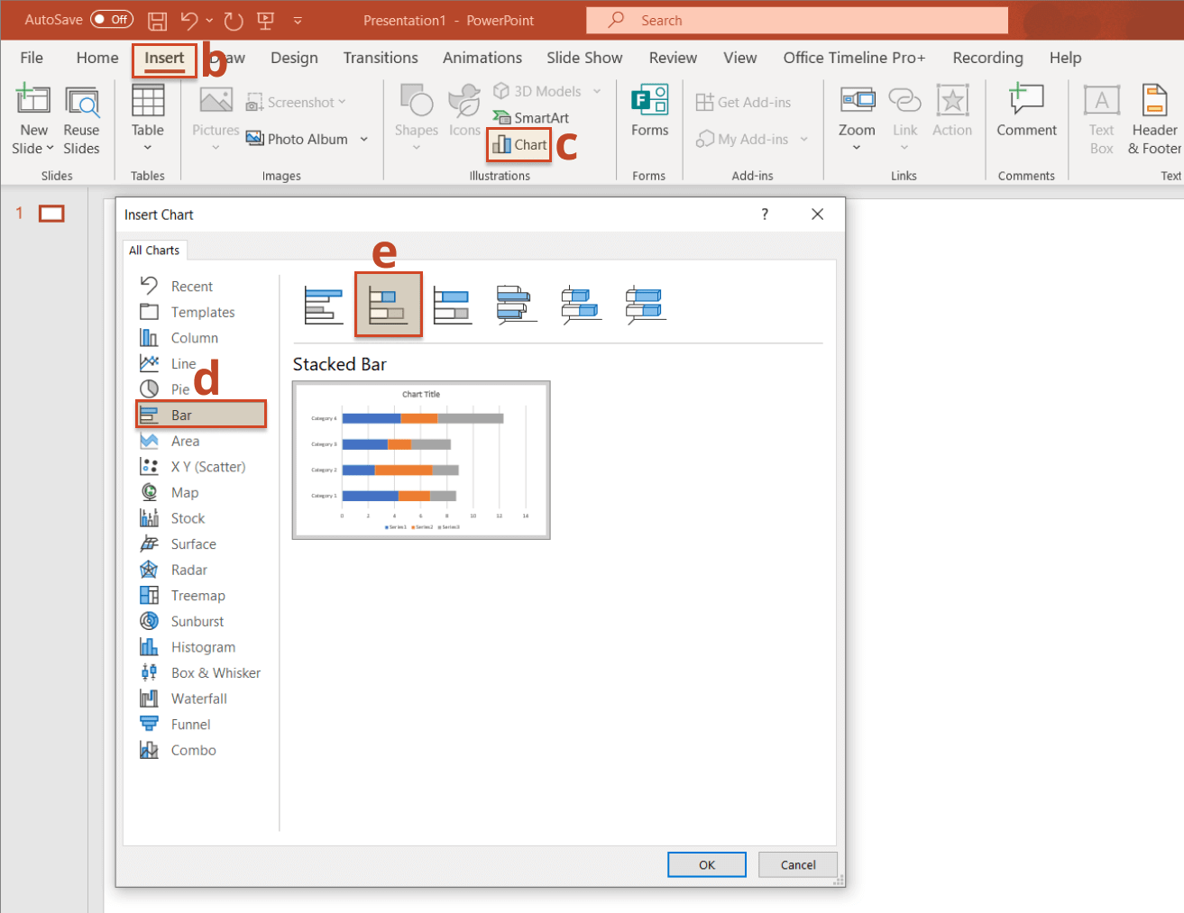
1. Create a basic graphic by setting it up as a Stacked Bar chart.
-
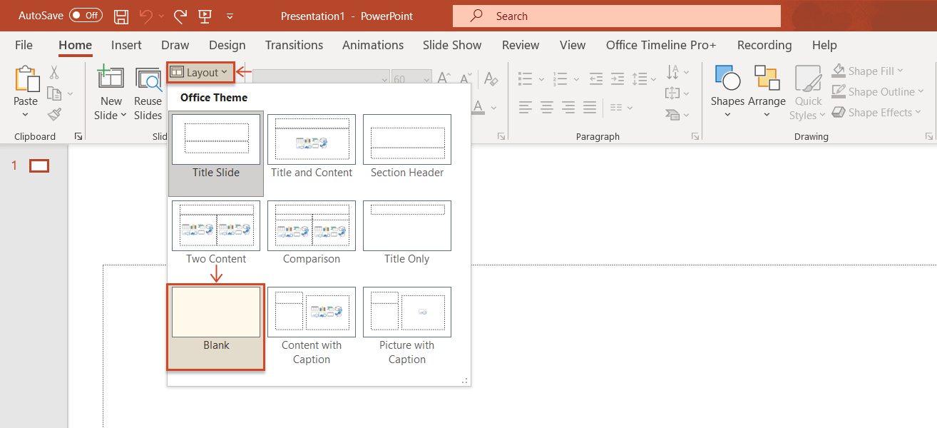
Open PowerPoint, select Layout from the Home tab and then choose the Blank type for your slide.
-
Go to the Insert tab.
-
Click on Chart from the Illustrations section.
-
Select the Bar category from the All Charts list.
-
Choose the Stacked Bar type for your Gantt chart.
2. Enter your project schedule data.
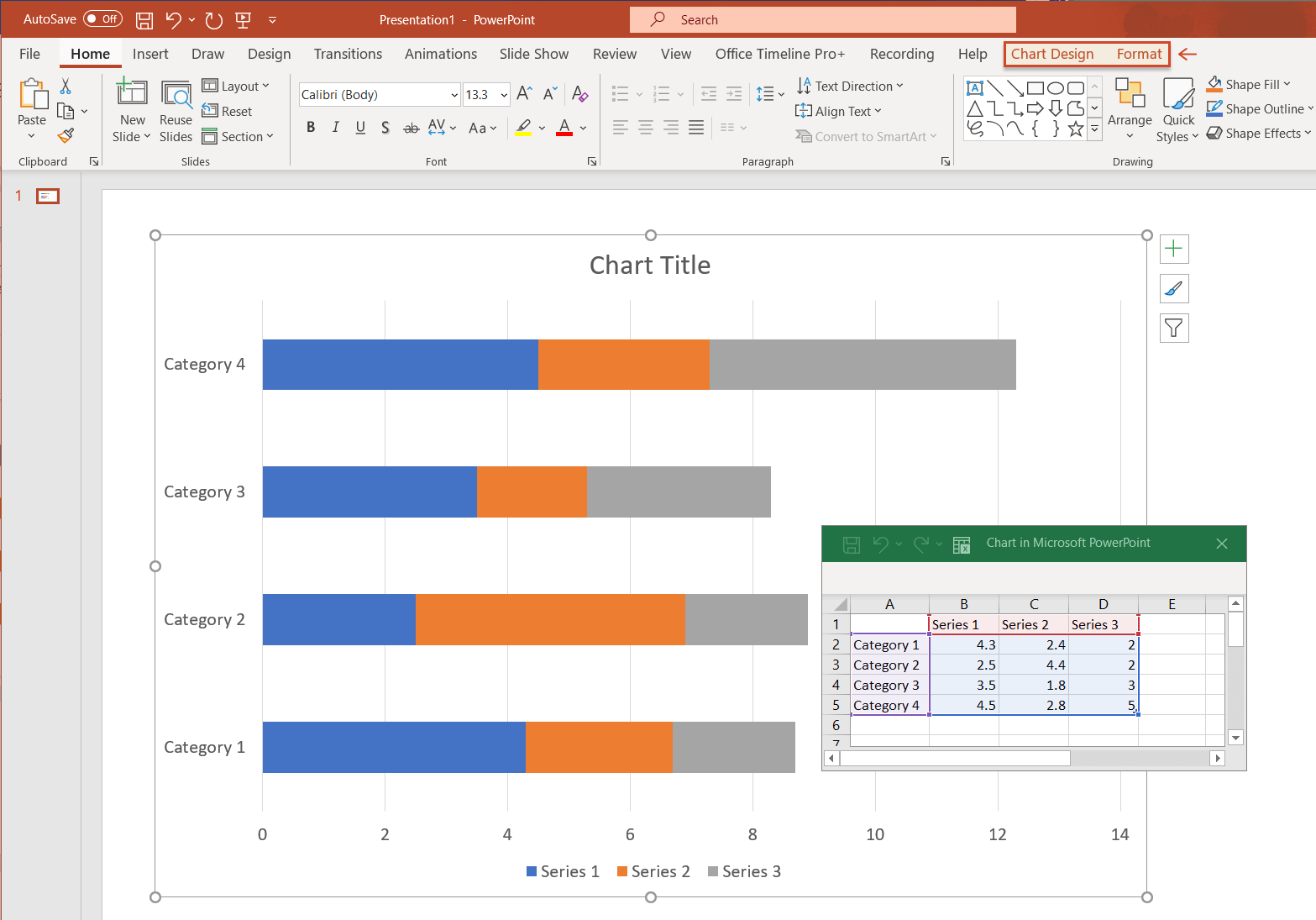
After completing all the steps listed above, a standard chart like the one below will be inserted onto your PowerPoint slide, along with an Excel table pre-filled with placeholder data, which you can replace with your own.
 Quick tip: You can change the style and color scheme for your chart by clicking on the small brush symbol on the right side of the graphic.
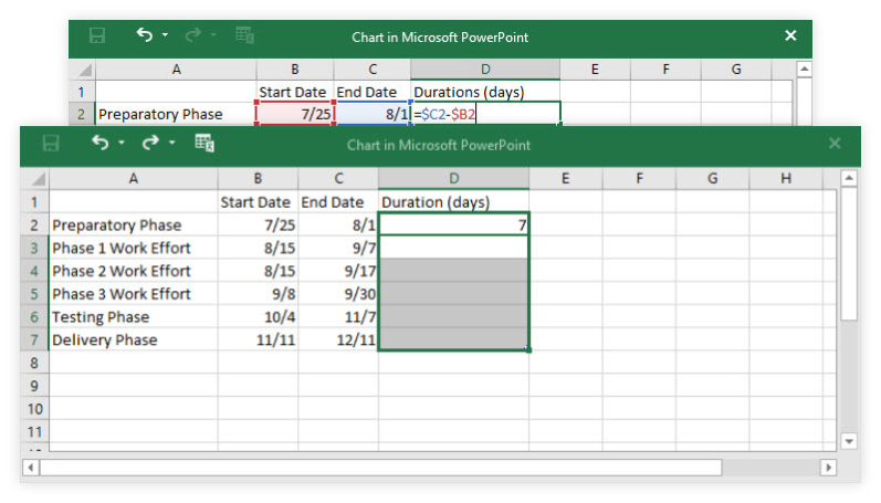
To start working on your Gantt chart, you first need to break down your project into main phases or tasks, which will make up the basis of the graphic. After defining these project tasks, assign a start date, end date and duration (number of days required to carry out a task) to each of them:
-
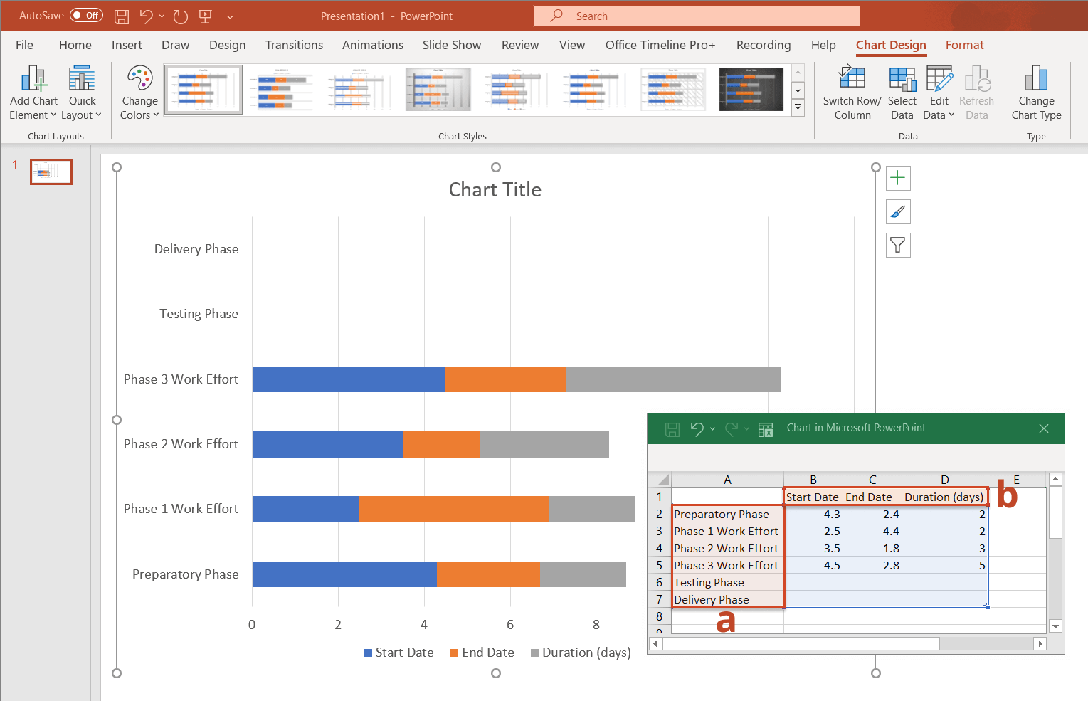
List your tasks’ descriptions or titles in column A of the Excel table opened by PowerPoint (you can just replace the existing data with your own). As you insert the task names, the items will be stacked upwards on the graphic, with the first task being at the bottom of the graphic and the last one displayed at the top.
-
Rename the column entitled Series 1 into Start Date, the Series 2 column into End Date, and the last column into Duration (days).
-
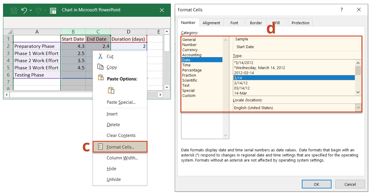
Before entering the dates of your project tasks under Start Date and End Date, you may need to format the two columns to properly display this type of content. To do so, select columns B and C, right-click on them, and choose Format Cells from the menu that appears.
-
In the Format Cells dialogue box that pops up, select Date from the Category list on the left, and then pick the desired date format from the Type menu.
-
Once you’ve set the right format for the Start Date and End Date columns, insert the dates for each of your tasks. Note: Don’t worry if your chart looks like it’s “broken” after entering your dates. This is normal and we’ll deal with it very soon, after filling out the Duration column.
-
To calculate the duration of your tasks, type the formula =$C2-$B2 in cell D2 (the one corresponding to your first task). Next, select the cell, and then drag its fill handle (the small green square at the bottom-right corner of the cell) downwards across the column. This will apply the same formula to the other cells under the Duration column and fill them with the appropriate count of days.
-
After calculating the task durations, you can now remove the End Date series from the graphic - this will make room for the Duration series to be easily visible and get your graphic closer to what it should look like. First select your chart, and then:
i. Click on the Chart Filters icon visible in the upper right of the visual;
ii. In the Series group, uncheck the box next to End Date;
iii. Click on Apply.
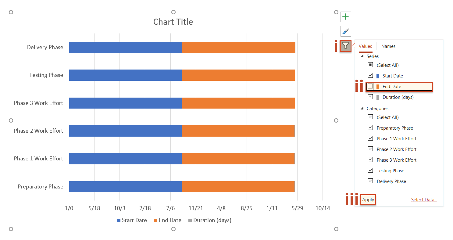
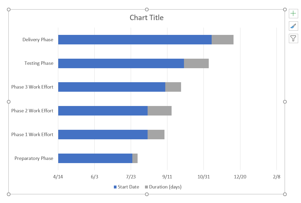
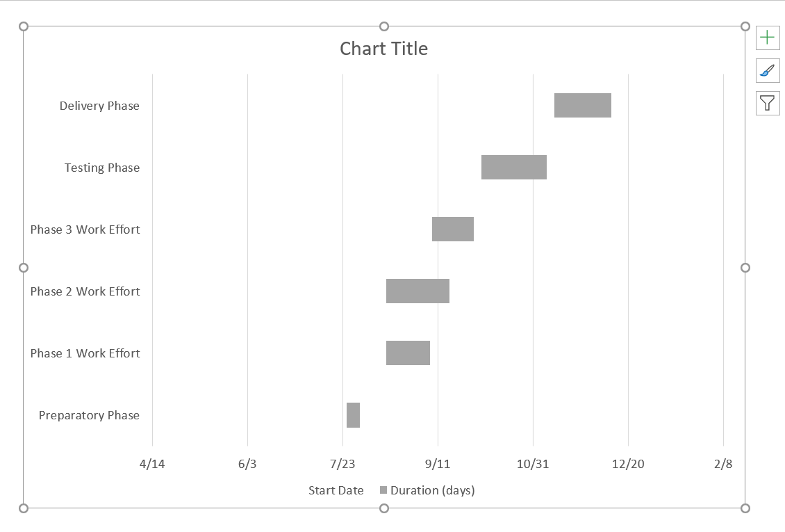
After filtering out the End Dates, your chart should now look like this:
3. Format your graphic to turn it into a Gantt chart.
You have built a stacked bar chart so far. To turn it into a Gantt chart, you need to format the graphic so that the blue sections become transparent and only the grey ones remain visible. The remaining bars will represent the tasks of your Gantt chart. To do this:
-
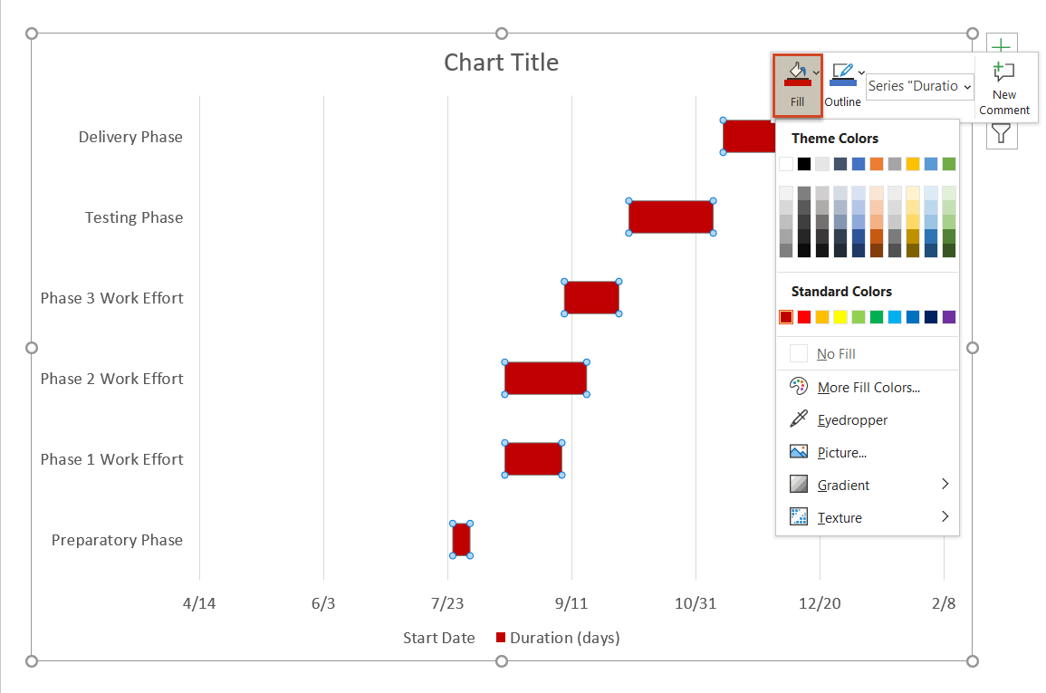
Click on any of the blue bars on your chart. This will select all of them at once.
-
Right-click on the selection to open the mini toolbar.
-
In the mini toolbar, click on the Fill icon and select No Fill.
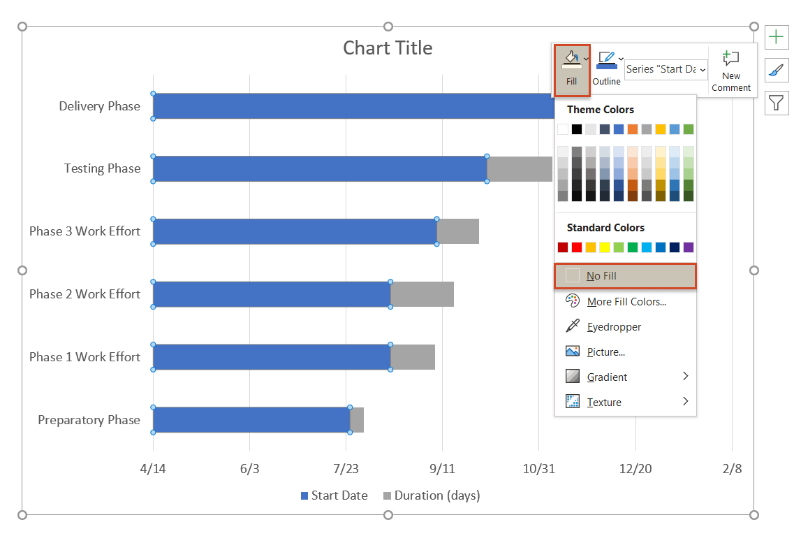
Your Gant chart should now look like this:
4. Customize your Gantt chart.
Now that you’ve outlined your Gantt chart, you can customize it further to make it look more unique:
-
To change the color of all tasks simultaneously, click on any of them once to select them all, right-click the selection, and go to Fill in the mini toolbar, where you can choose whatever color you please. In our example, we chose a dark red.
-
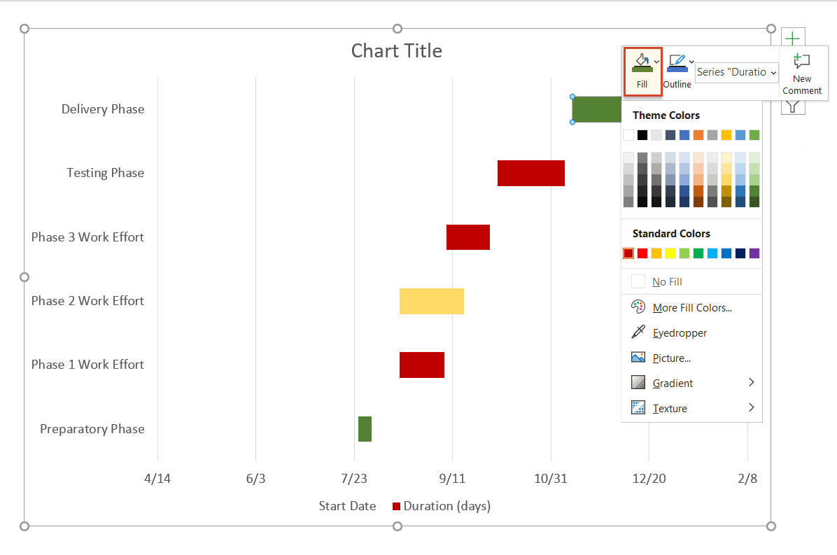
If you wish to make individual tasks stand out, you can easily recolor each of them. Simply click twice on the desired task to select it and use Fill to choose a new shade for it.
While here, you may want to replace the default chart title with your own by double-clicking on the corresponding text box to select it, and then typing in your preferred title.
-
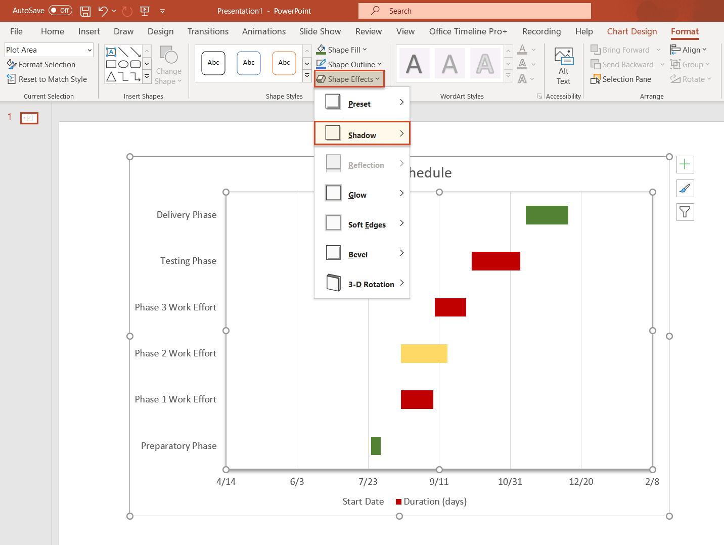
You can also apply a variety of styles and effects to your graphic using the Chart Tools Format tab on the ribbon. However, we’d recommend keeping such effects to a minimum to ensure legibility. In our example, we chose to add a shadow to the plot area to make it stand out better.
-
You might also want to reverse the order of tasks so that the first one is displayed at the top of your Gantt chart and the last one at the bottom. To do so, double-click on the list of task descriptions on the left side of the graphic. This will open the Format Axis pane, where you’ll need to tick the checkbox in front of Categories in reverse order, under the Axis Options group.
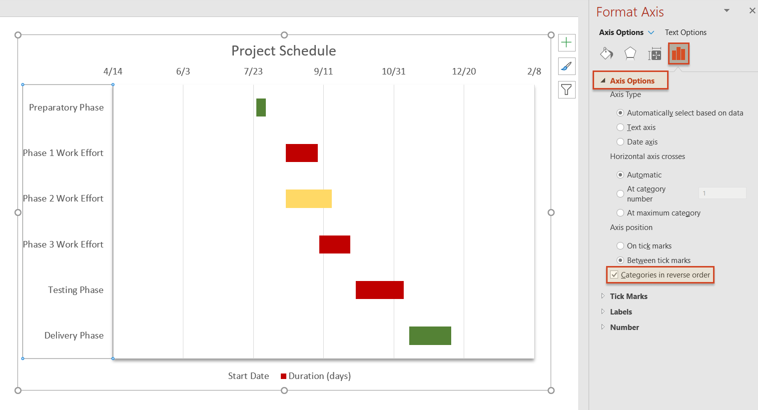
Once you do so, you will notice that the order of tasks has been reversed, with the date markers having also been moved from beneath to the top of your Gantt chart.
-
To bring your tasks closer to the vertical axis of your Gantt chart, you’ll need to remove some of the blank space where the blue bars used to be. To do so:
i. Select any of the dates above the bars, right-click on the selected area and choose Format Axis from the small menu that pops up.
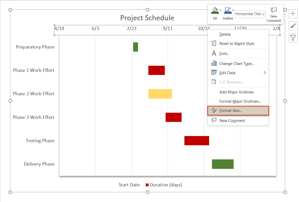
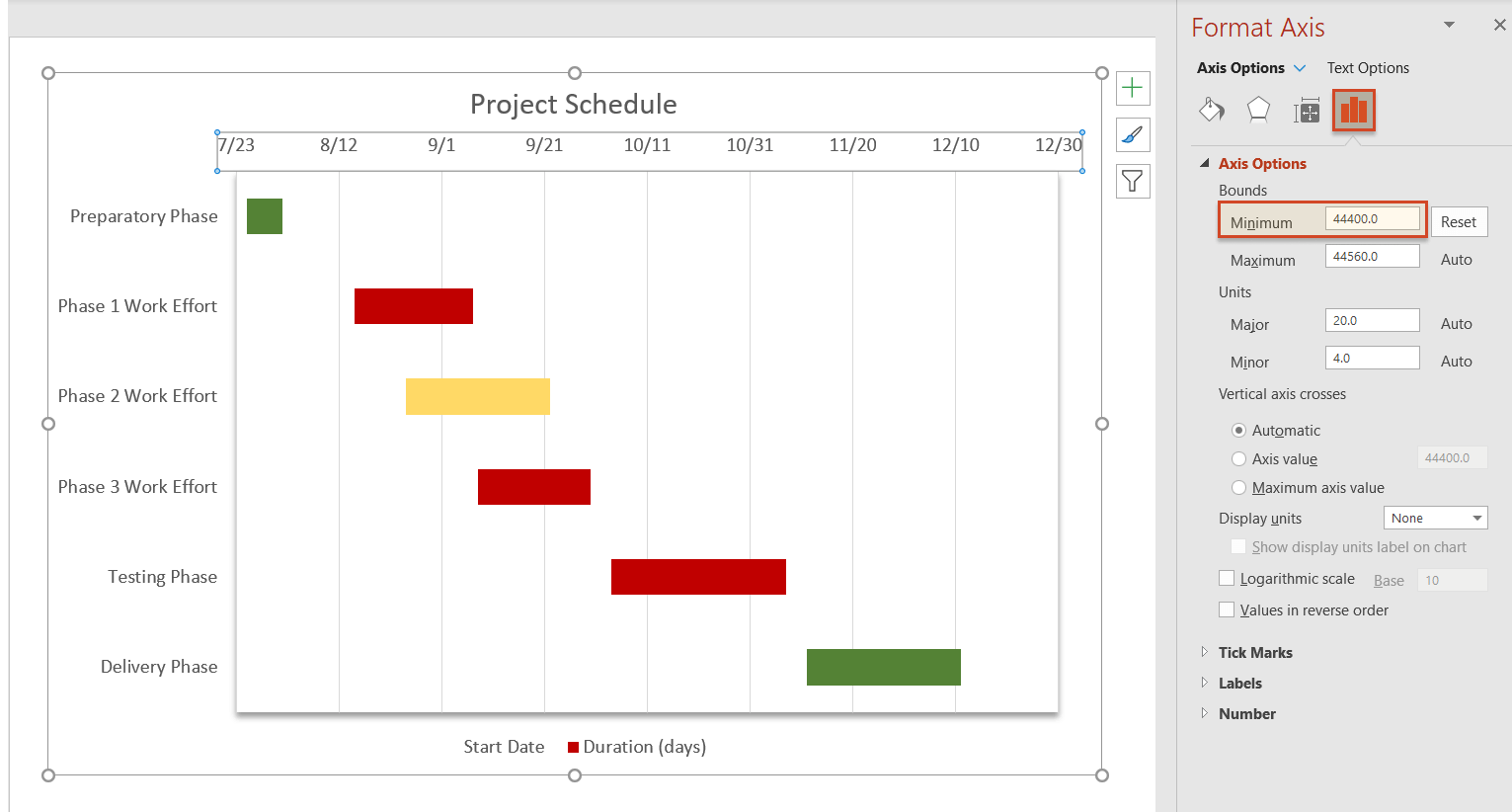
ii. In the Axis Options window opened on the right, increase the Minimum Bounds number under the header called Bounds to adjust the leftmost boundary of your chart. In our case, we changed the initial number from 44300.0 to 44400.0.
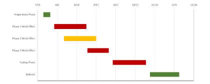
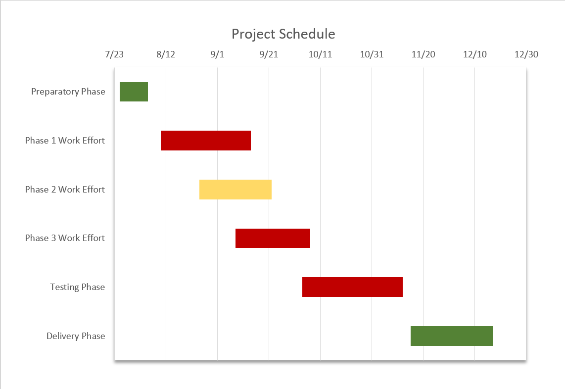
-
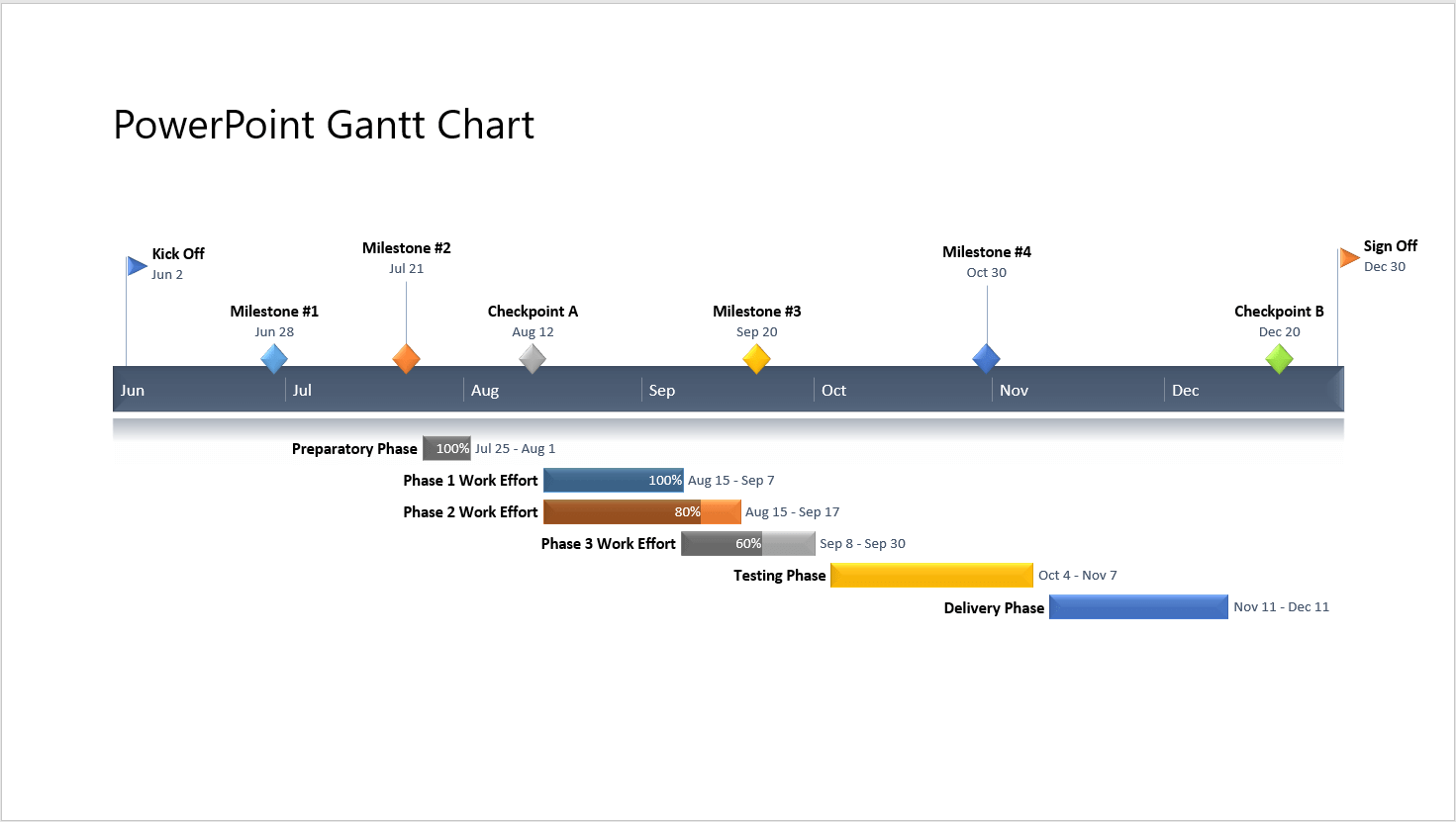
As a final adjustment, we also removed the legend from the graphic as it seemed to create more confusion rather than help. To do so, we simply selected it and pressed Delete. In the end, our PowerPoint Gantt chart looked like this:
How to automatically make a Gantt chart in PowerPoint
Manually building a Gantt chart in PowerPoint is not so complicated, but it does take time and effort. To make the whole process simpler and more time-efficient, you can use an intuitive add-in for PowerPoint called Office Timeline. It allows you to use pre-formatted, easily customizable Gantt chart templates and copy-paste or import data from Excel and other productivity tools.
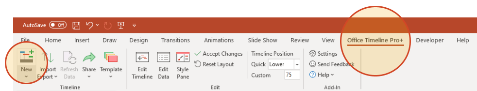
In the steps below, we will show you how to automatically make a Gantt chart using the PowerPoint add-in. To get started, you first need to install Office Timeline Pro+, which will add a Gantt chart maker tab to the PowerPoint ribbon.
1. Open PowerPoint and enter your data into the Office Timeline Pro+ wizard.
-
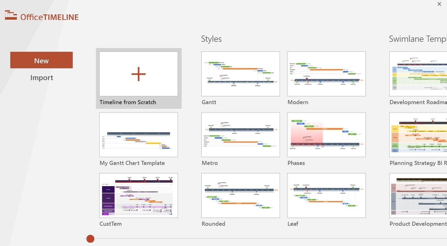
Go to the Office Timeline Pro+ tab you’ll see on the PowerPoint ribbon and click on New.
This will open a gallery where you can choose from a variety of templates and styles to use for your graphic.
-
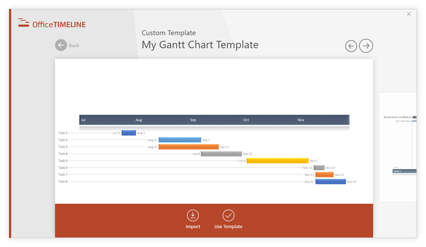
Double-click to select the template you prefer and then click Use Template in the preview window. For our example, we will use a custom Gantt template made earlier.
-
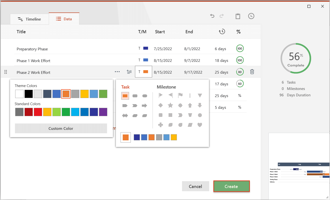
Now, in the Data Entry wizard, you can either enter your tasks and dates manually, or you can copy-paste them from an existing Excel file. Here is where you can also make a few customization choices, such as changing the shape or color of each task. When ready, click the Create button.
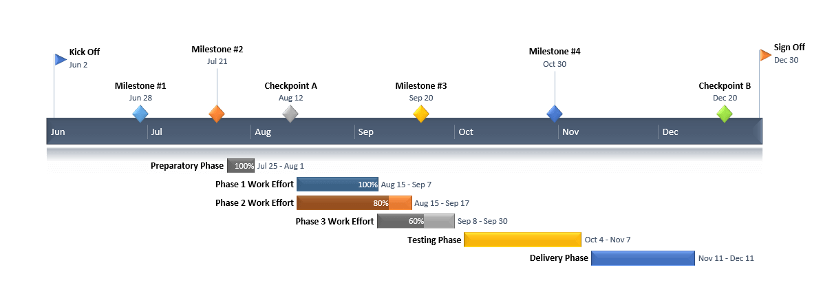
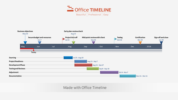
2. A new Gantt chart slide will be instantly generated in PowerPoint.
-
Depending on the template chosen and the customizations you make, you can get a Gantt chart that looks similar to this:
-
Once generated, your Gantt chart can be restyled or updated automatically using Office Timeline Pro+. You can add or edit data at any time, format fonts and shapes, and include details such as task duration, percent complete or Today marker, among others. In our example above, we’ve entered a few milestones too, repositioned task titles, and added % complete to provide more clarity.
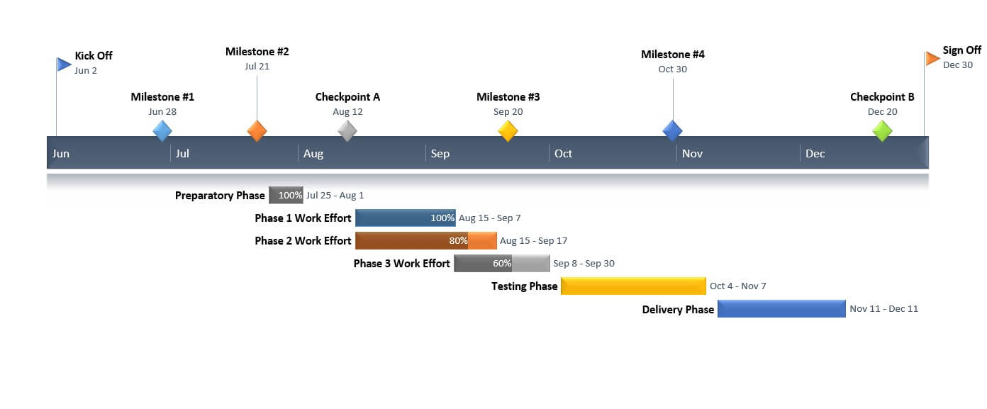
Download auto-generated PowerPoint Gantt chart slide
FAQ about making Gantt charts in PowerPoint
Here is where you can find the answers to the most frequently asked question on how to make a Gantt chart in PowerPoint.
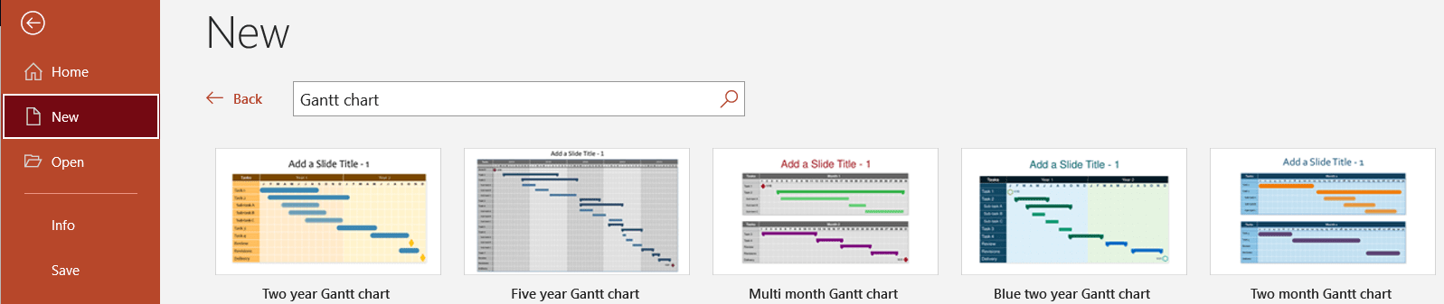
Is there a Gantt Chart template in PowerPoint?
There are several Gantt chart templates in Microsoft PowerPoint. You can find them going to File > New > Office, then typing “Gantt chart” in the search box. You’ll get 5 templates that you can manually customize and use. However, the process might prove to be time-consuming and frustrating if you need to recurrently update your graphics.
Alternatively, if you want to make a Gantt chart in PowerPoint faster, you can copy and paste your project data from Excel and instantly generate a professionally looking visual that you can update as often as necessary and even use as a template for future work. Learn how you can do so with our short video below:
How to make a PowerPoint Gantt Chart from Excel in less than 60 seconds:
How do I edit a Gantt chart in PowerPoint?
PowerPoint lets you manually edit and update your data after creating your presentation or visual. To edit any text placeholders and virtually any text appearing in your PowerPoint file, simply click over the corresponding shape and place the cursor over the editable text. Then, update the content as needed.
In PowerPoint charts and visuals made with Office Timeline Pro+, it’s even easier – you just click on the Edit Data button on the Office Timeline ribbon, and you can make any needed changes to your data.
- Additional resources
- Make a Gantt chart
-
Make a timeline from Excel data in under 1 minute. -
-


See our free Gantt chart template collection

Clinical Trial Roadmap
Large-scale PowerPoint clinical trial roadmap template featuring color-coded elements to highlight the main phases necessary for a drug or procedure to receive FDA approval.

Business Continuity Plan
Swimlane timeline template that outlines the major components of business continuity management in order to guide professionals in their risk-mitigation efforts.

Technology Roadmap with Swimlanes
Swimlane diagram example that includes diverse milestones and tasks to mark distinct phases and major events for managing technological updates in your organization.

Product Development Roadmap
Color-coded swimlane sample for showcasing the journey of a product with smartly grouped milestones and tasks, which reduces clutter and eliminates overlapping.

IT Migration Swimlane Chart
Clear swimlane chart template that lets you easily map out an organization’s migration process from one system to another on stages and organize milestones and tasks according to scheduled intervals.

Basic Gantt Chart
Simple Gantt chart diagram with well-defined tasks and milestones that help you clearly outline any project schedule.

Free Gantt Chart
The Gantt chart template was designed for professionals who need to make important project presentations to clients and execs.

Project
Simple yet professionally-designed project template focusing on major milestones and due dates for you to be able to create easy-to-follow, high-level project timelines for proposals, campaigns, status reports and reviews.

Project Management Plan
A visual template highlighting project key tasks and milestones so that you can present just the right amount of detail to both project and non-project audiences.